Is there a place for Celtic art today?
 I have written a number of articles about ‘hard’ faceted patterned art and how it manifests sacred number, here. There is another decorative art tradition which might be termed, in contrast, 'soft'. This has the flowing and spiraling lines that we are accustomed to seeing in what generally seems to be referred to as Celtic art (although digging around, I have find Anglo-Saxon manuscripts that look similar to me). I am talking of manuscripts such as the Book of Kells or the Lindisfarne Gospels.
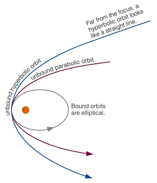
However, it is not confined to this period, Romanesque, gothic and even the baroque periods had their own versions. It is non representational, but to me evokes the natural world in two ways. First it looks like the twisting and swirling shapes of vegetation, perhaps a creeping vine. This graceful, calligraphic flow of line gives it great beauty. Second, I am reminded of the mathematical functions that describe the natural world. I studied physics at university and the parabolas, hyperbolas and elliptical curves that are used in the mathematic description of the natural order (here in astro-physics) so often seem to jump out at me from these elaborate designs. Considering now exclusively the 'Celtic' style. It has an appeal way beyond sacred art and there are many artists today working designs directly inspired by these forms into media ranging from tattoos to jewelry. There is also a strong association with new-age-crystal ‘spirituality’. As a result, I find it difficult not to associate most modern attempts at sacred art incorporating this style with 1970s-vintage folksy Masses trying too hard to be trendy.
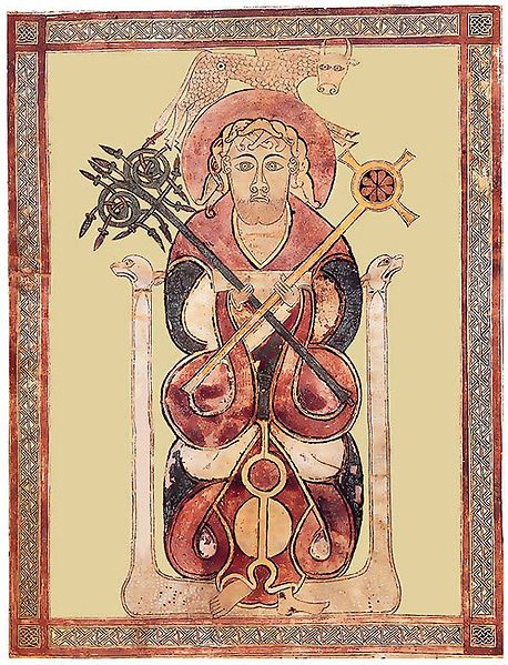
  Despite this, given the striking beauty and broad appeal today of the originals, I do think it is worth considering how we can use it for a genuine Christian purpose. Looking at reproductions of the old manuscripts, the decoration is not usually produced in isolation but as an embellishment on something else, a cross, script or figurative art. I am particularly interested in the figurative art because it is an authentic Western variant of the iconographic form. It is interesting to me that their figurative work not only has a decorative additions such as border (which other Christians have also) but their representations of the human form incorporate the swirl and flow into the lines as well. This makes them as highly stylized as any iconographic form that I know. (Interestingly, and I have no explanation for this, I cannot find images of Our Lady or Our Lord in this style.) As a result of this high level of abstraction, and correspondingly low level of naturalism, the form is even more two-dimensional than other iconographic forms.
 If you have the figure in any pose other than straight on (we see St Luke from the Lichfield gospels left), staring out of the page, then it becomes very difficult to incorporate it succesfully. First, the image relies on a balanced symmetry to work. As soon as the figure is rotated, perhaps to three quarter profile, it makes it asymmetrical to a degree that erodes this balanced harmony. Second, the more that you introduce poses in the figure that are not face on, then more that you need the illusion of space in the image to describe the form. Take the simple example of a face in three-quarter profile; that is slightly rotated. Due to the rotation of the head, one eye is further away from us than the other. In order to make this read, usually the artist will make the more distant eye slightly smaller than the nearer one and in doing so introduces a slight natural perspective. Consequently a few inches of illusionary depth is introduced into the image. If trying to work in this ‘Celtic’ style, the artist then has to consider how to apply this rotation to the decorative element, which has an unavoidably flat, two-dimensional form. It is very difficult to accommodate both while retaining a sense of consistency in style. Any artist today, who is not naturally working in this style, living and breathing it as it were, will find these poses very difficult to create without them looking out of place. (The masters of the past did mange it, however, the four evangelists of the Lindisfarne gospels are not drawn front. St Luke is shown below.)
For a similar reason, this style does not lend itself to narrative imagery. In order to relate, for example, a scene from the life of the saint, each figure to turn and interact with others in the scene. The problem of style consistency in these scenes would be harder again for a the modern-day artist. I was very interested recently to see the work of Daniel Mitsui. He is unusual in that he is trying to recreate the figurative art in this style (not just the decorative swirly parts). I recently had a discussion about him because I saw examples of his work and liked them. I contacted him because I wanted to encourage him to do more. His ‘In principio’ and the St Patrick work well I think. The figurative piece is clearly based upon the traditional form (with figure fully facing us). It has also a contemporary feel, but this, in my opinion, doesn’t detract. His St Columba works less well. The face of the main figure is fine, but the narrative scenes below the main figure are struggling to grapple with the difficulties I describe above. As a rule, I am very reluctant to focus on any negative publicly. However, with his permission that I bring them to your attention, because I think it illustrates exactly the way in which artists learn, by doing it first, then analyzing (often with the help of others) and finally, one hopes, learning from these early attempts we can go on and produce even better work.
There is the question also, even assuming we can master this style today, as to where it is appropriate. I find it difficult to imagine a 6ft mosaic or fresco in a church in this style. I can see it, however, working in the setting from which we draw most of the originals, in books - say a Book of Hours or lectionary.
Above, three pieces by Daniel Mitsui.
Below, St Matthew, Book of Kells


