Edward Hopper - the Art of Summary
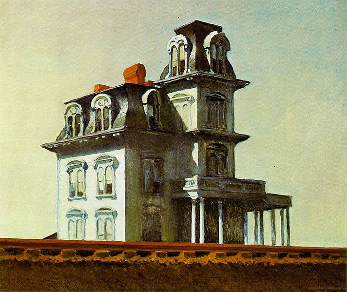
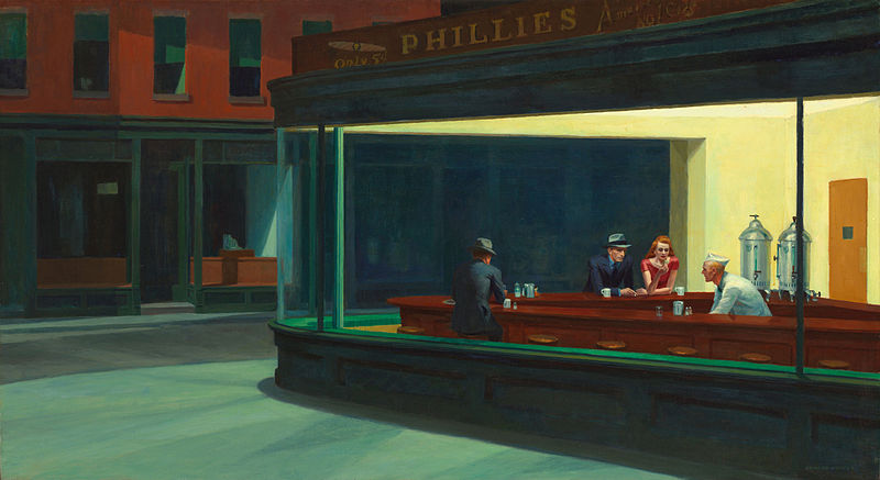
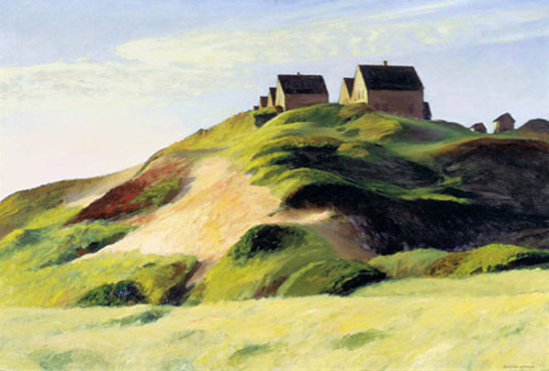
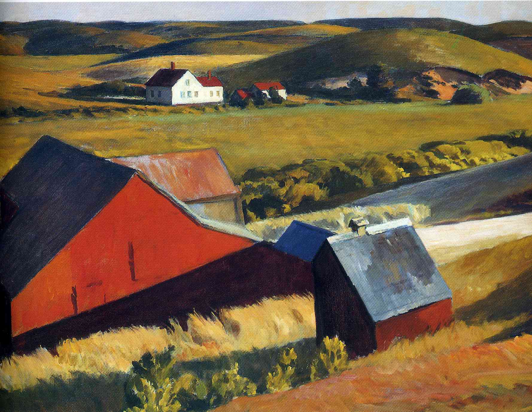
 Edward Hopper is an American artist who died quite recently - 1967 - and is worth looking at. His style is clearly influenced by 20th century forms with his strong colouration. He is famous for his paintings of city scenes, such as the laundromats and diners and I have shown one or two these here, however, it is his landscapes and seascapes that I love particularly. These portray New England, and especially Maine and so there are plenty of examples of his work on display in the museums around Thomas More College. He has managed to use high register, ie light and bright, colouration without it looking unnatural. The effect is of bright sunlight. The quality of light he portrays is exactly what you see in Maine. Another characteristic of his approach is that he summarises form very well, in my opinion. If you have to paint something that in reality is immensely detailed such as a tree, with all its leaves, or even a field with every blade of grass; it takes great skill to make it convincing. On the one hand you need enough suggestion of detail, leaves and branches in the case of a tree, so that you know it isn't just an amorphous sponge on the end of a stick; on the other, we have to have a sense of the broad shape of the tree so that there is a unity to it. If there is too much detail so that every leaf is painted individually then we feel as though it is overloaded (the Victorian pre-Raphaelites tended to do this).
In the spectrum of balancing broad form against representation of detail, Hopper tends to towards summarisation and a stronger sense of the broad form. Nevertheless he gives us enough sense of detail so that they are convincing representations.


