From the Atelier of Thomas More College, A Major Commission for an Oakland law firm
 A collaboration between Catholic patron and artist demonstrates how even the decor of the office of a law firm can contribute to the New Evangelization Just before Christmas I was contacted by Ray Tittman who is founding partner of the California office of law firm Edison, McDowell & Hetherington. Ray, a Catholic, wanted a large oil painting for his office. He told me he wanted something appropriate for this modern office block in downtown Oakland (the Kaiser Building about a 100 yards from the new cathedral). This meant, he thought, that it should have a contemporary feel to it, but at the same time he wanted something that would be consistent with the Faith and which would in some way bear witness to it. He didn't feel that the modern art he was being presented with was explicit enough, however, as he put it to me, he thought that to go to the other extreme and have a six foot painting of Our Lady would not be right either.
I suggested that I visit him in California and have a look at the office and the color schemes being used; after talking to him and considering his personal tastes I would come up with some suggestions. I enjoyed this part of the process very much. Ray had a good sense of what he wanted and what would suit his clients and the other members of the office, but at the same he was open to ideas. The final result therefore really is the product of collaboration, I feel.
What we came up with was the idea of an abstracted landscape with a color scheme that would set a mood for the room in harmony with the existing colors of the walls and furniture. The would be sufficient focus for it to be recognizably a natural scene, but it was important that this wasn't too detailed - if it was it would distract. After all, this picture is not meant to be the main attraction, so to speak, but rather a support for Ray in his good work as a lawyer. It was vital, we agreed that in order to fulfill its function that the painting should be beautiful.
Compositionally, through the arrangement of the parts within it, it should point beyond itself to Ray at his desk. Then I suggested, he should discretely place in his personal space a small piece of obviously Christian devotional art (rather as one does with photographs of loved ones). Ideally this would have the face of Our Lord clearly visible. I suggested that he put in behind the desk and on wall facing seated clients and clearly visible. I believe that it is through his work as a good lawyer that Ray most powerfully bears witness to Christ, but people are helped to make that connection with Our Lord by the presence of this piece of devotional work and a beautiful office in which all aspects are, to the best that one can achieve it, participating in divine Beauty.
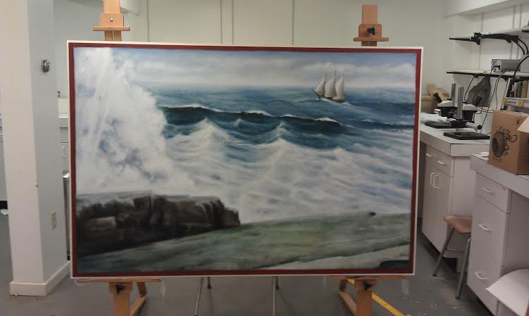
For this large oil painting, Ray said he wanted a seascape - appropriate for the California coast. We had to decide on the degree of abstraction so I sent him a selection of paintings from highly abstracted, through to very detailed. In the end he decided to go for something at the middle level of abstraction as seen in a landscape I painted several years ago (shown below).
After this, I was left to produce the painting.
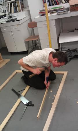
In producing this painting I needed the help of students from Thomas More College's woodworking guild, the Guild of St Joseph in stretching a canvas. Local artist Josh O'Donnell (who trained at the Ingbretson Studios) directed students from the Guild in building the frame and stretching the canvas. We see him here with students Oliver Kress and Mary Tardiff.

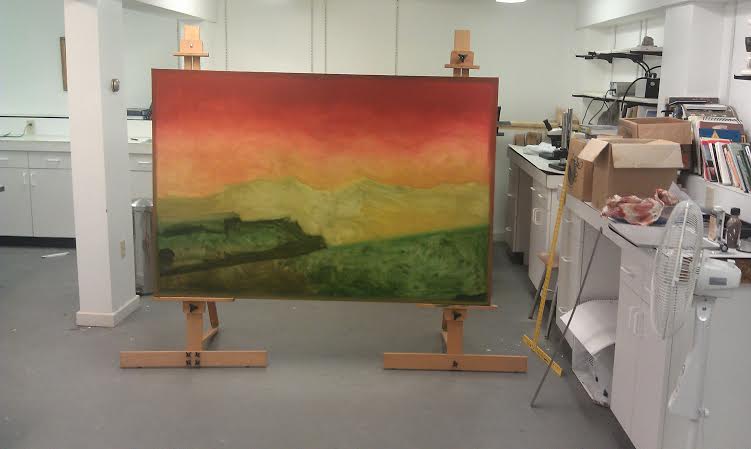
Then I did the painting working through from underpainting to final version. You may be surprised at the colors of first application, given the final look!
You'll notice in the above picture, there is a fine cream line that borders the painting. This was added by the Guild of St Joseph. In the final week, visiting artisan Tom Ford directed TMC student Lachelle Scott from the Guild of St Joseph in making and painting a wooden edging to the canvas (in the modern style of framing).


