

I see nothing of Scotland in this design. t reminds more of a hurriedly erected concrete seaside hotel that might be seen in the home country of the architect, Spain.

The Vision for You is a process by which we discovered our true calling in life—what we call our ‘personal vocation’; and through which we discovered the Great Fact—that we have a choice in life: WE CAN CHOOSE TO BE HAPPY OR TO BE MISERABLE.
Rudolph Wittkower (1901-1971) contrasts the approach of architects from the High Renaissance period, who relied largely on musical theory for their mathematics, with those of the ancient Greek and the medieval period, who used geometric constructions based upon the triangle, the square, and the pentagon.


We tend to think of abstract as something that has come about only within the last one hundred years. But liturgical artists have had their own form of abstract art for nearly two thousand years. Geometric pattern is the abstract art of Christianity.
God made all of creation, visible and invisible, to teach us about Himself. When we perceive the order and pattern that is inherent in creation, the numbers that underlie all of creation, we see the thumbprint of God.
Geometrical forms, built up from mathematical (numerical) forms, are a symbolic expression of Christian Truth. They represent the thoughts of God.
In the Christian world, numbers have both a quantitative meaning and a qualitative meaning. They tell us the amount of some thing (quantity) but they also tell us about the thing itself. (qualitative.)
A carton of a dozen eggs, for example, holds a quantity of 12 eggs. But the number 12 also has a symbolic meaning. it may represent the 12 tribes of Israel, the 12 apostles, 12 signs of the zodiac, or 12 months of the year. Which of these symbols the number represents will depend on the context in which it is used.
In the context of a work of sacred art, depending on the other elements of the work, 12 eggs could represent the New Covenant, a new Church emerging from the "sealed tomb" of the old Law, resting on the foundation of the twelve apostles.
But this qualitative and quantitative language of numbers can also be used to construct abstract, i.e. non-representational, patterns that can lead us to contemplate heavenly things. Medieval manuscript paintings often have a geometric pattern serving as the background as a symbol of the order of heaven.
The work above is a design for a church floor, completed as part of the Masters of Sacred arts program at Pontifex University. It incorporates a specific type of scrolling pattern known as a guilloche. This is a meditation on Christ in the form of a geometric pattern.
Down the middle axis of the design are three shapes. The first shape at the top contains the symbol for "alpha," the first letter of the Greek Alphabet, The bottom shape holds the symbol for "omega," the last letter. Alpha and omega, the first and the last, the beginning and the end, come together in the middle in a "Christogram" a symbol representing Christ. Jesus Christ is the alpha and the omega, the first and the last, the beginning and the end. Christ is the mediator between man and God. In the ancient world, the number "2" was a mediator between the numbers 1 and 3. The number "2" then, represented a mediation between two extremes, heaven and earth, divine and human, God and man. We might also say then that Jesus, the second person of the Holy Trinity, mediates between God the Father and God the Holy Spirit.
Flowing around these central shapes is a bough of laurel leaves in a guilloche pattern. Laurel leaves are a symbol of victory, Christ is victorious over sin and death. The laurel bough weaves around eight medallions which contain another type of Christogram, in this case a cross and the letters INRI. They serve to remind us that Christ obtained His victory through death on a cross, a death at which He was proclaimed Jesus of Nazareth, King of the Jews.
And "eight" medallions also have a hidden meaning. Eight is the number of the victorious resurrected Christ and a redeemed world. Eight is the sum of "7" the number of totality and completion, and the number "1," representing the singularity of God. The number "8" is used in baptismal fonts as a symbol of a new life brought from darkness into light.
The victorious Christ is the eight day, heralding a new birth and a new creation. He brings the world from darkness into light.
There is no reason we cannot imbue the design of our churches with such geometric patterns and symbols that hold a rich symbolic language revealing the truths of the invisible world that are hidden within the visible. All it takes is the knowledge, and the will.
this article originally appeared at www.DeaconLawrence.org
______________________________________
Pontifex University is an online university offering a Master’s Degree in Sacred Arts. For more information visit the website at www.pontifex.university
Lawrence Klimecki is a deacon in the Diocese of Sacramento. He is a public speaker, writer, and artist, reflecting on the intersection of art and faith and the spiritual “hero’s journey” that is part of every person’s life. He maintains a blog at www.DeaconLawrence.org
 I recently visited the OQ Farm near Woodstock in rural Vermont. It is a retreat center which is connected to The Sword and Spoon Foundation, an ecumenical group interested in promoting a Christian culture of faith and beauty. The occasion was a gathering of Christian artists, musicians, and filmmakers, who gave talks about their work and shared ideas about the transformation of the culture.
I was curious to see this place that is quietly become a hub for artistic renewal. If you look at the program of events over the summer, for example, there are two workshops by internationally known Russian iconographers, Anton and Ekaterina Daineko, who are coming from Russia to teach here. Also, the highly respected Catholic playwright and screenplay writer Buzz McClaughlin is offering a a workshop on story development. I first met Buzz about 10 years ago, and read his book on the structure of story narrative; I have kept in touch with him ever since, because his ideas regarding engagement with the culture, in the context of film, are in harmony with my own. The organizer of these events for the OQ Farm is Keri Wiederspahn, who is herself an accomplished icon painter and teacher in the Russian tradition.
One evening while I was at this event, as the sun was going down, I took a walk around the property and a particular detail caught my eye, a red English telephone box sitting between the farmhouse and the barn. This was a nice coincidence, since the K2 telephone box was described in a book I had just read, Roger Scruton’s excellent How to Be A Conservative (a review of which will appear on this blog shortly).


I asked about this and was told that it had been at the farm for some years, placed there by previous owners, but the current management had decided to keep it.
Why would someone have gone to the trouble of importing a heavy chunk of painted steel at a cost of what must have run to thousands of dollars in the first place?
I suggest that the story of the K2 telephone box can explain why, in many ways a humble piece of street furniture could become an icon of what we are seeking in cultural renewal, and how, unlikely as it may seem, the liturgy is connected to this.
This begins with the Victorian Neo-Gothic movement in architecture, which had its roots in the mid-18th century, but became popular in the first part of the 19th with the rise of High Anglicanism and the legalization of Catholicism in Britain. One of the most influential figures during its rise in popularity was the Catholic convert, architect A.W. Pugin.
It has been said that “historically, all the great art movements began on the altar,” and this includes Neo-Gothic architecture. A style which began as the model for new churches then became a standard for civic buildings and homes in Victorian England. Many of these English architects were hired by Americans, and introduced the Neo-Gothic to cities int he United States. In the eastern part of the country in particular, there are many wonderful churches, colleges, and civic buildings in this style.
Some time ago, I featured on the NLM a small Neo-Gothic church in Maine, St Andrew’s, which was designed by the English architect Henry Vaughan. He was involved in the design of many grand churches in New England, and also one of the architects of the Episcopal Washington National Cathedral.
St Patrick’s Cathedral in Manhattan is another famous American Neo-Gothic church, built in the middle of the 19th century.
 |

With these liturgical buildings as their archetype, we see architects bringing the Neo-Gothic style out into the civic buildings of the city. As a result, their form is derived from, and points to, that which is connected to and in harmony with the liturgy.
Here is St Pancras Station hotel in London designed in the 1850s by George Gilbert Scott, exterior and interior:
 |
 |
It was George’s son, Sir Giles Gilbert Scott, who designed the last completed Gothic church in England, Liverpool Anglican Cathedral. This was started in the early years of the 20th century and completed in 1978, when it was opened by the Queen. I was a schoolboy living about 10 miles from Liverpool at the time, and I can remember being awestruck when I visited it. We were told stories at school of stonemasons who had worked on this one building for their whole working lives, just as in medieval times.


Contrast the above with Liverpool's Catholic Cathedral, started and finished in the 1960s. It is known by the locals as 'Paddy's wigwam'.
 |
| Image from Wikipedia by John Driscoll |
Moving on as quickly as we can from the concrete teepee, we can consider another civic building that is derived from the liturgical style, one of the most famous buildings in the UK. Westminster Palace, including the Houses of Parliament, was designed by Sir Charles Barry. The iconic Elizabeth Tower, as it was re-named in honour of our present Queen, which houses Big Ben, was designed by Pugin, who was working under Barry on the project.

And now, in the foreground we see the familiar site of the red telephone box, looking at home in its urban surroundings.
The telephone box was designed by the same man who designed Liverpool Anglican Cathedral, Sir Giles Gilbert Scott. Although this designer was steeped in Neo-Gothic architectural design, the inspiration for this came from the architecture of the 18th century Neo-Classical architect, Sir John Soane, whose in London house is a famous museum. At the time of the design competition for the K2 in the early 1920s, Giles Gilbert Scott was a trustee of the Soane museum; his telephone box is influenced by the mausoleum which Soane himself designed. This is in the gardens of St Pancras Old Church, just around the corner from the railway station in London.

Scott designed the K2 and the subsequent modifications including the most common, the K6 designed by him in 1935. This telephone box sits as happily in the city, in the shadow of the Houses of Parliament, as it does beside the rural colonial architecture of America (which, incidentally, has its roots in Neo-Classical, Palladian architecture, but that’s another story.)
Scott’s sense of proportion is influenced by his training as an architect. The basic proportional scheme is common to both styles, and broadly speaking, to all traditional Western architecture prior to about the Second World War, going back to the ancient Greeks.
I think that it is interesting that one of the leading architects in the nation took the design of a piece of street furniture so seriously the he applied to it all the skill and experience that he might also employ in designing a cathedral, while realizing that one uses greater restraint and simplicity in designing a phone box than one would in designing a cathedral.
The design of the phone box directs us intuitively to the liturgical architecture that traditionally the design of the civic buildings participates in, in all styles, not just the Neo-Gothic. Ideally, this crystallizes in exemplary fashion in the place of worship, which contains the heartbeat of the city. As the tabernacle and altar should be the focal points of the church design, so the cathedral should be the focal point of the city.
The numerical source of traditional proportional schemes was originally derived in the pre-Christian classical world from the observation and analysis of the order of the cosmos, which it was believed gave rise to its beauty. These were adopted by Christian culture, and employed by architects as a matter of course until the period between the wars in the last century. Because it conforms to this cosmic beauty, this little telephone box, like a village church, looks at home in the rural beauty of both an English village and a Vermont farm. It is a simpler design than a cathedral, or a hotel, or even a farmhouse, but that is as it should be; after all, one of the attributes of beauty is due proportion - it is appropriate to its place in the hierarchy of human activity.
While the ultimate expression of this beauty will ideally be in the place of worship, this is not the end, for the beauty of the cosmos and the beauty of the culture direct us to heavenly beauty, and ultimately, to the beauty of the Creator Himself, who left His mark on Creation and inspired the culture of beauty created by man.

Here are some more pictures of phone boxes in English villages. They are so beloved that even in this age of mobile phones, when the need for them has long since past, people keep them as familiar and beautiful icons in the scenery. Sometimes they find an alternative use for them, such as a miniature lending library.

The Vermont phone box is one of many that have been transported to the US, because of their beauty. Here is one on the campus of the University of Oklahoma:

This is the first photograph so far in which the box looks somewhat incongruous in its setting. The imposter in this scene is not the phone box, however. Rather, it is the featureless brick wall of a building, which dominates as a result of its size and aggressive ugliness. This is the building that dissents from a participation in cosmic beauty.
You might ask why the box is K2, and not K1? The answer is that the K1 design was rejected by the phone company because they couldn’t persuade the London boroughs to allow it on their streets because of its ugly design. So they ran a competition for a new design which, they hoped, would be appealing enough to persuade the local governments to adopt this new, cutting edge technology. One wishes that today’s utility companies would go to similar lengths in the design of such things as electricity pylons or wind turbines!
This is the reason why the OQ Farm is appropriate as an artistic retreat. It’s the countryside, the buildings, and even the telephone box all speaking to us of the cosmic beauty, which in turn directs us to Beauty itself, giving us, as Benedict XVI puts it, an insight into the “mind of the Creator!” This is an inspiration for all hoping to create beauty for the greater glory of God!


A perfect exemplar of traditional harmonious proportion. And how modern research supports the traditional consensus for what is beautiful.

This is a picture that is only referred to in the book. For various reasons we were unable to include it in the book. I visited Attingham park in Shropshire in the Midlands area of England with my icon painting teacher Aidan Hart. We went primarily to enjoy the extensive grounds which are beautifully landscaped. I always thought that it was made in the 17th century, but in fact I notice now that it was build in the late 18th century.
It is a National Trust property, which means that it is owned by the state and considered a place of outstanding interest and beauty. When I was there I noticed the proportional layout of the main house, as seen in this view above. What makes this particularly worthy of study is how simple the design, yet how beautiful. If it were not for the Palladian style portico (the grand columned porch that leads to the entrance of the building) the main house would be just a square block. One might argue that there was very little in terms of design to differentiate it from a modern housing block.

Both have windows and doors in a rectangular facade. Yet the modern building is no tourist attraction. In fact it was described in the website where I saw it as one of the seven most notorious housing projects in the US.
What gives Attingham House its beauty is the proportion? Proportion is the consonant relationship between three or more objects of different size. You cannot have pleasing proportion when everything is the same size as in the modern building shown. The basis for theories of harmonious proportion are consensus - people have observed since the ancient Greeks how most people react psychologically to different proportions. The Attingham House proportions are made apparent by the different window sizes associated with the three stories. If you count the panes of glass there are 6 in the lower floor, 4 in the second floor and 2 in the upper floor windows. The proportion would be expressed mathematically as 3:2:1. This corresponds exactly to the traditional proportions based upon the lengths of pipes that produce pleasing combinations of musical notes developed by the ancient Greek philosopher, Pythagoras (who we talked about in the last of these features, here.)
It seems that modern science is beginning to catch up. Someone recently contacted me to tell me about this book by Colin Ellard, Places of the Heart in which a psychologist conducts studies to see how different designs affect the mood of people.
If the designers of modern housing projects had made use of such proportions, even such mass housing could elevate the spirit in the same, way.
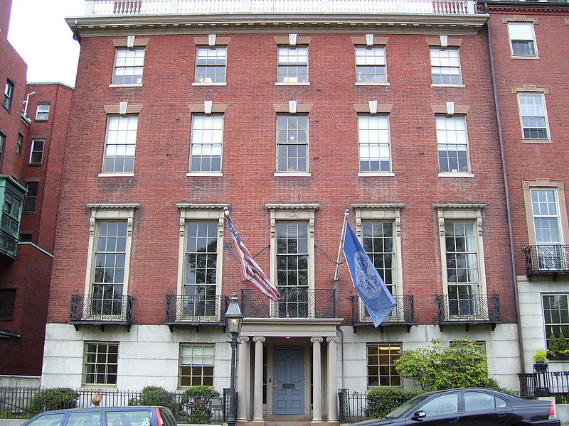
![]() We can make a Beacon Hill anywhere This past weekend I drove down to Boston from southern New Hampshire to meet a friend who was visiting for the weekend. As we walked around town we wandered into the Beacon Hill area. This is the old heart of the town and full of elegant 18th-century terraced homes. They are built in a variation of the style that in England we would call Georgian. I’m not sure what it is called here, perhaps ‘colonial’ style? These are right at the top end of the price range for property in Boston.
Why are they so sought after? Well location will have a lot to do with it certainly. You would probably pay a fortune for the ugliest shoebox here if it could take a bed. But I would say also that their beauty is a big factor too. Beauty adds value because it stimulates greater demand and pushes the price tag up. And why are they beautiuful? Two hundred years of New England weather softening the edges on the red-brick or cobblestone forms probably adds something. But it is more than this. The main reason, I suggest, is their harmonious proportions.
We can make a Beacon Hill anywhere This past weekend I drove down to Boston from southern New Hampshire to meet a friend who was visiting for the weekend. As we walked around town we wandered into the Beacon Hill area. This is the old heart of the town and full of elegant 18th-century terraced homes. They are built in a variation of the style that in England we would call Georgian. I’m not sure what it is called here, perhaps ‘colonial’ style? These are right at the top end of the price range for property in Boston.
Why are they so sought after? Well location will have a lot to do with it certainly. You would probably pay a fortune for the ugliest shoebox here if it could take a bed. But I would say also that their beauty is a big factor too. Beauty adds value because it stimulates greater demand and pushes the price tag up. And why are they beautiuful? Two hundred years of New England weather softening the edges on the red-brick or cobblestone forms probably adds something. But it is more than this. The main reason, I suggest, is their harmonious proportions.
 What struck me about these houses is how simple and reproducible their design is. They have a simple symmetrical arrangement of windows, one above the other, and a pointy roof. There is some decorative work around the doors and the windows, but it could never be called flamboyant. If I knew about building materials then I reckon I could design one myself. Yet despite their simplicity they look good and it is as a result of the traditional proportionality.
Given this simplicity and the value that beauty adds to buildings, I am surprised that it hasn't occurred to more developers and architects to study traditional proportion and use it, if only for economic reasons.
Look at the photos in this article. Notice how in every case the window size varies, storey to storey, so that the first is to the second as the second is the third and so on. When this rhythmical progression corresponds to the traditional pattern then the result is elegance. Sometimes the order changed around slightly so that it is not always the largest at the bottom. The dimensions of the first and second might be changed so the biggest storey is always the main living area. These architects didn't play tricks - they put things where you expected them to be, so that the outward signs give an indication of the internal purpose. Similarly, the main door is always more prominent than the servants' entrance. (You can't count on this now. I was at an art gallery recently, which was a modern building made completely of reflective glass and the doorway was indistinguishable from any other panel. There was no indication through the external design where the door was. In fact it was placed offset to one side in a counter-intuitive position, presumably deliberately. I had to wait until I saw someone coming out before I knew where I could get in!)
 Coming back to Beacon Hill, I am convinced that these houses looked just about as good the day they were built and if anyone chose to conform to these basic patterns today, then it would look good and sell at a high price. This has to be the simplest way for an architect to add greatest value for minimal investment of time and money. There is no need for pastiche – we are not bound slavishly to follow the decorative style of the period in every way, but provided the principles are adhered to, then here is way for modern architect to stand out from the crowd. The mathematics is relatively simple but largely unknown.
 So come on architects and town developers. Here’s your chance to make a killing. So let’s see a new Beacon Hill in the US!
Incidentally, the Prince of Wales built an experimental new town on the outskirts of Dorchester in England that conformed to traditional proportions, called Poundbury (right, click to enlarge). The experience there was that although they were slightly more expensive to build, their beauty made demand so high that their price on the open market made the modest extra investment more than worthwhile. You can see more of Poundbury here.

![]()
![]()

This program designed by The Way of Beauty's David Clayton gives you a unique formation in beauty and a Catholic inculturation. For artists of any creative disciplines, catechists and all who love beauty. Learn more at www.Pontifex.University.


