baroque

The Baroque is Tridentine Art for the Latin Mass

The Baroque is Tridentine Art for the Latin Mass

if we want to inspire a powerful Counter-Modern or Counter-Postmodern Catholic culture today, then we need to reconnect today's worship with art so that people are engaged with it in the course of their worship. This means modifying our worship — even in the Latin Mass - and painting art that connects with people today.

Do We Need A New Christian Symbolism in Art - Aren't Pelicans and Peacocks Redundant?

Should we resurrect the old Christian symbolism? Or are pelicans and peacocks just nonesense, like cabbages and kings.  

Is there a danger that trying to reestablish traditional Christian symbols in art would sow confusion rather that clarity? Lots of talks and articles about traditional Christian art I see discuss the symbolism of the iconographic content; for example, the meaning of the acacia bush (the immortality of the soul) or the peacock (again, immortality). This is useful if we have a printed (or perhaps for a few of you an original) Old Master in church or a prayer corner as it will enhance our prayer life when contemplating the image. But is this something that we ought to be aiming to reinstate the same symbolism in what we produce today? Should we seek to educate artists to include this symbolic language in their art? If symbols are meant to communicate and clarify, they should be readily understood by those who see them. This might have been the case when they were introduced – very likely they reflected aspects of the culture at the time – and afterwards when the tradition was still living and so knowledge of this was handed on. But for most it isn’t true now. How many would recognize the characteristics of an acacia bush, never mind what it symbolizes? If you ask someone today who has not been educated in traditional Christian symbolism in art what the peacock means, my guess is that they are more likely to suggest pride, referring to the expression, ‘as proud as peacock’. So the use of the peacock would not clarify, in fact it would do worse than mystify, it might actually mislead. (The reason for the use of the peacock as a symbol of immortality, as I understand it, is the ancient belief that its flesh was incorruptible). So to reestablish this sign language would be a huge task. We would not only have to educate the artists, but also educate everyone for whom the art was intended to read the symbolism. If this is the case, why bother at all, it doesn’t seem to helping very much, and in the end it will always exclude those who are not part of the cognoscenti . This is exactly the opposite of what is desired: for the greater number, it would not draw them into contemplation of the Truth, but push them out. I think that the answer is that some symbols are worth persevering with, and some should be abandoned. First, it is part of our nature to ‘read’ invisible truths through what is visible. This does not only apply to painting. The whole of Creation is made by God as an outward ‘sign’ that points to something beyond itself to Him, the Creator. Blessed John Henry Newman put it in his sermon Nature and Supernature as follows: "The visible world is the instrument, yet the veil, of the world invisible – the veil, yet still partially the symbol and index; so that all that exists or happens visibly, conceals and yet suggests, and above all subserves, a system of persons, facts, and events beyond itself.” It is important to both to make use of this faculty that exists in us for just this purpose; and to develop it, increasing our instincts for reading the book of nature and in turn, our faith. However, coming back to the context of art again, some discernment should be used, I suggest. I would not be in favour of creating an arbitrarily self-consistent symbolism. The symbol must be rooted in truth. The symbolism in the iconographic tradition is very good at following this principle. This is best illustrated by considering the example of the halo. This is very well known as the symbol of sanctity in sacred art. There are very good reasons for this. The golden disc is a stylized representation of a glow of uncreated, divine light, shining out of the person. Even if this were not already a widely known symbol, it would be worth educating people about the meaning of it, because in doing so something more is revealed. When however, the representation of a halo develops into a disc floating above the head of the saint, as in Cosme Tura’s St Jerome, or even a hoop, as in Annibale Caracci’s Dead Christ Mourned, (both shown) then it seems to me that the symbol has become detached from its root. Neither could be seen as a representation of uncreated light. These latter two forms, therefore, should be discouraged.

Similarly, those symbols that are rooted in the gospels or in the actual lives of the saints should be encouraged and the effort should be made, I think, to preserve or, if necessary, reestablish them. The tongs and coal of the prophet Isaias relate to the biblical accounts of his life. The inclusion of these, will generate a healthy curiosity in those who don’t know it, and so might direct them to investigate scripture. The picture shown, is one of my own icons.

In contrast consider the peacock and the pelican. The peacock, as already mentioned, does not, we now know, have incorruptible flesh. The pelican is a symbol of the Eucharist based upon the erroneous belief in former times that pelicans feed their young with their own flesh. My first though is that these symbols should not be used should not be used, because the reason for their symbolism in invalid, given that we no longer believe it to be true. However, I will admit that I am torn by the fact that both of these are beautiful and striking images, even if based in myth. Also, it might be argued, and this is particularly true for the pelican, that to use it is not resurrecting an obscure medieval symbol. It is an ancient symbol certainly - and St Thomas Aquinas's hymn to the Eucharist, Adore te devote called Christ the 'pelican of mercy'. But it lasted well beyond that. It was very widely understood even 50 years ago. Awareness of it is still common nowadays amongst those who are interested in liturgy and sacred art. Perhaps an argument could be made that even when the reason for the use of symbol is based in myth, if that is known and understood, and when that symbol recognition is still widespread enough to be considered part of the tradition, it should be retained. We should also remember that modern science is not infallible, and we moderns could be those who are mistaken about the pelican! My Googling research (admittedly even less reliable than modern science) revealed that the coat of arms of Cardinal George Pell has the image of the pelican. If this is so, I imagine he would have something to say about the issue also!

A baroque period (17th century) tabernacle door

Titian the trailblazer - showing us how to balance naturalism and symbolism

titian.self.portraitTitian is one of the greats of Western art. He lived from about 1480 to 1576, in Venice, and was active almost right to the end of his life. He began painting in the period of the High Renaissance and when he died was in the latter part of the 16th century which was characterized by individual artistic styles collectively called 'mannerism'. Titian's style, though individual to him when he established it, was highly influential and much of what characterized the baroque tradition of the 17th century was derived from his work. In some ways he can be considered one of the pioneers of the baroque style that dominated in the 17th century. This is important because the baroque is the one artistic traditions that Pope Benedict describes, in his book, the Spirit of the Liturgy, as being an authentic liturgical tradition. Some people may be surprised, as I was, to discover that the High Renaissance (the style of Leonardo, Michelangelo and Raphael from about 1490 to 1525) is not considered fully and authentically liturgical (ie right for the Catholic liturgy). This is not to say that there are not individual works of art from these great artists that might be appropriate, but that it was not yet a coherent tradition in which a theology of form had been fully worked out, as was later to happen for the baroque. Pope Benedict argues that for the most part it was too strongly influenced by the pagan art of classical Greece and Rome and reveals the self-obsessed negative aspects of classical in a way that is not fully Christian.

As a young man Titian trained during the High Renaissance and the influence of this can be seen in this early painting of his, the Enthronement of St Mark. At the feet of St Mark are Ss Cosmas and Damien on the left, and St Sebastien and St Roch on the right. This was painted in 1510 and one could be forgiven for thinking it was painted by Raphael. Notice how sharply defined all the figures and all the details are, even the floor tiles.

800px-Titian_-_St_Mark_Enthroned_with_Saints_-_WGA22765


If you compare this with the following paintings we see how his work changed as he got older. The first is Cain and Abel painted in 1543; and the second is the entombment of Christ, painted in 1558. In the latter Joseph of Arimathea, Nicodemus and the Virgin Mary take Christ in the tomb watched by Mary Magdalene and Saint John the Evangelist.

Titian_-_Cain_and_Abel

Titian - Entombment

We can see how, in contrast to the first painted how diffuse and lacking in color much each painting is. The edges are blurred in many places and only certain areas have bright or naturalistic color. Those areas of primary focus are painted with sharper edges and with bright colors. This is done to draw our attention to the important part of the composition. He cannot apply bright color to the figure of Christ but notice how he uses the bright colors from the clothes of the three figures who are carrying him to frame his figure. In contrast the two figures in the background are depleted of color and detail. He wants us to be aware of them, but not in such a way that they detract from the most important figure. He uses the white cloth draped over the tomb in the same way, making sure that the sharpest contrast in tone, light to dark is between this and the shadow of the tomb. They eye is naturally drawn to those areas where dark and light meet and this is how Titian draws our gaze onto Christ.

It is suggested that this looseness of style in Titian's later works occured because as his eyesight declined, he was unable to paint as precisely as he had done as a young man. This may well have been what forced him to work differently, but if so, all I can say is, my, how he accomodated his handicap so as to create something greater as a result!

If we go forward now to early 17th century Rome, it is the artist Caravaggio who is often credited with creating the characteristic visual vocabulary of exaggerated light and dark of the baroque style. We have seen deep shadow and bright light before this time, but Caravaggio exaggerated it and embued it with spiritual meaning in a new way. The shadow represents the presence of evil, sin, and suffering in this fallen world; and it is contrasted with the light which represents the Light, Christ, who offers Christian hope that transcends such suffering.

Caravaggio_-_The_Incredulity_of_Saint_Thomas

This visual vocabulary of light and dark can be seen in the painting above. Notice how it is so pronounced that in this example we do not see any background landscape; all apart from the figures is bathed in shadow. One thing that Caragaggio does retain from the visual style of the High Renaissance is that generally his edges are sharp and well defined, even if partially obscured by shadow. Other artists looked at this and while adopting Caravaggio's language of light and dark, incorporated also the controlled blurring edges that characterized Titian. What we think of as authentic baroque art is a hybrid of the two.

Look at the following painting by the Flemish artist, Van Dyck, St Francis in meditation, painted in 1632:


We can see how much he has taken from Titian in this painting. Van Dyck trained under Rubens. As a young man in 1600, Rubens travelled to Italy where he lived for eight years. His travels took him to Venice (where he saw the work of Titian), Florence and Rome (where much of Caravaggio's work was). He was influenced strongly by both and passed on these influences to his star pupil.


Sassoferrato's Virgin at Prayer - for the Nativity of the Blessed Virgin Mary

Sassoferrato_-_Jungfrun_i_bön
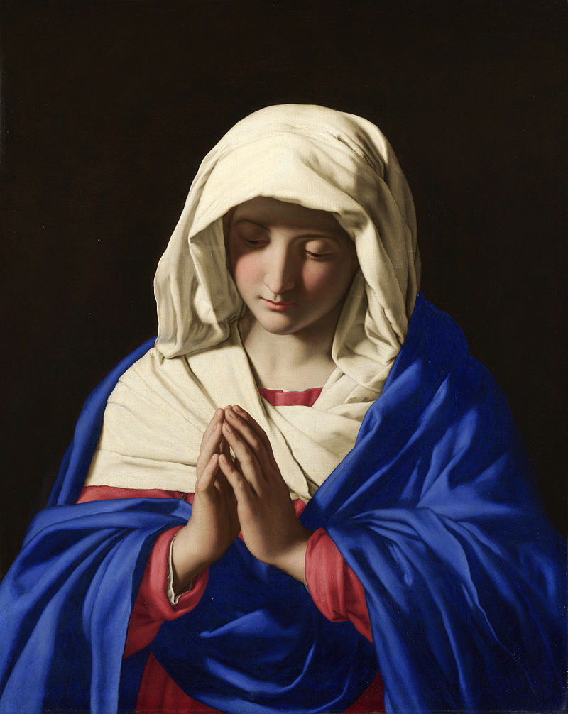
For today's Feast of the Birthday of the Blessed Virgin Mary here is the Virgin at Prayer by the Italian artist Giovanni Battista Salvi da Sassoferrato who is generally known simply as Sassoferrato. He lived from 1609 to 1685. Records of the commemoration of the Nativity of the Blessed Virgin Mary on September 8th go back to the 6th century. The Solemnity of the Immaculate Conception of Mary was later fixed at December 8, nine months prior.

There is a commentary on the Feast from the following information is drawn, here, by Fr Matthew Mauriello: 'The primary theme portrayed in the liturgical celebration of this feast day is that the world had been in the darkness of sin and with the arrival of Mary begins a glimmer of light. That light which appears at Mary's holy birth preannounces the arrival of Christ, the Light of the World. Her birth is the beginning of a better world: "Origo mundi melioris." The antiphon for the Canticle of Zechariah at Morning Prayer expressed these sentiments in the following way: "Your birth, O Virgin Mother of God, proclaims joy to the whole world, for from you arose the glorious Sun of Justice, Christ our God; He freed us from the age-old curse and filled us with holiness; he destroyed death and gave us eternal life.

'The second reading of the Office of Readings is taken from one of the four sermons written by St. Andrew of Crete ( 660-740 ) on Mary's Nativity. He too used the image of light: "...This radiant and manifest coming of God to men needed a joyful prelude to introduce the great gift of salvation to us...Darkness yields before the coming of light."

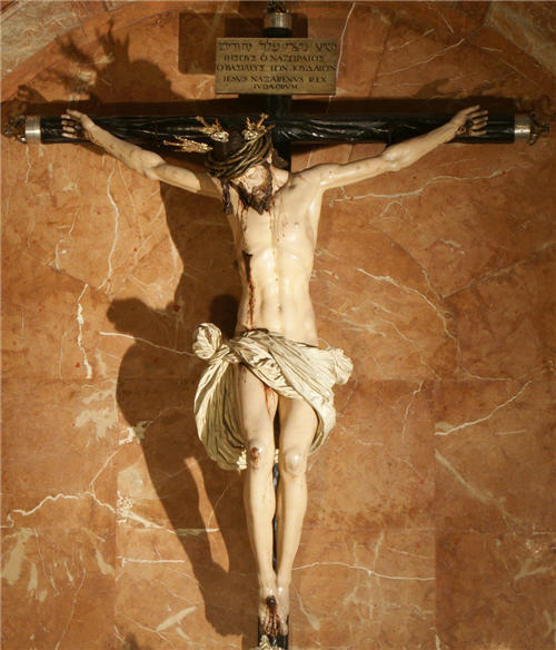
This painting, like the painting of Gregory the Great by Vignali, described last week, is in the baroque style of the 17th century. Again, we see the sharp contrast between light and dark symbolizing the Light overcoming the darkness, and again like the Vignali, the face is in partial shadow ensuring that this is distinct in style from a portrait (I described the reasons behind this in more detail in the earlier posting). There is an additional element here in the portrayal of the face that was not so strongly present in Vignali's painting. The facial features are highly idealized and bear the likeness of the ancient Greek classical ideal.

Sassoferrato_-_Jungfrun_i_bön Sassoferrato's training and influences were all in the classical baroque school. This is a stream within baroque art that looks to Raphael from 100 years before as its inspiration. Raphael's faces, in turn, strongly reflected the classical Greek ideal and this was picked up by the Caraccis in the late 16th century (most famously Annibale) who founded a school from which most of line of influential figures in the classical baroque line emerged.

All Christian sacred art must have a balance of idealism, which points to what we might become; and naturalism which roots the image in the particular and what we see and know in the here and now. The different styles of Christian sacred art look different from each other because they look to different sources for their ideal, and because of the exact balance of idealism and naturalism they reflect. Baroque classicism is called so to distinguish it from 'baroque naturalism' in which, though still partially idealized in accordance with what is good for Christian sacred art, has a greater emphasis on natural appearances. Ribera would be an example of the naturalistic school and Poussin was one of the most famous proponents of baroque classicism.

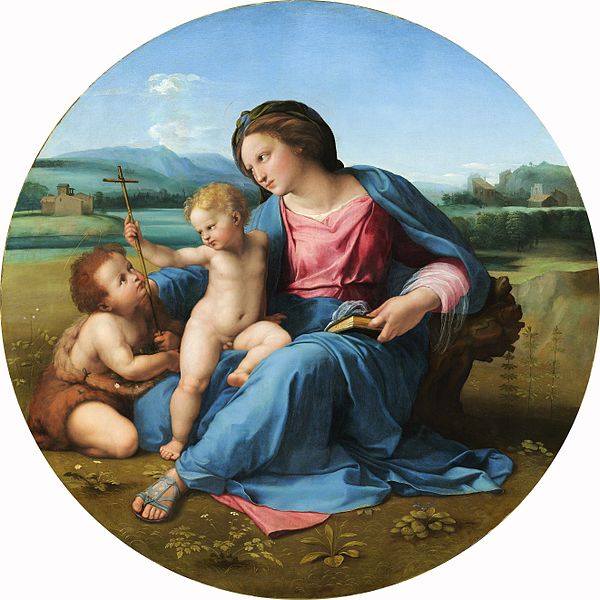
We can see the similarities in the facial features of the Sassoferrato Virgin, Raphael's Alba Madonna (which I describe in more detail in a posting here) and the ancient Greek statue the Venus of Arles from the Louvre. This strong idealization is another way that the artist ensures that portrayal of Our Lady is a piece of sacred art and avoids it looking like a portrait of the girl from next door dressed in historical costume.

600px-RaphaelAlba

Here is the Venus of Arles:

Venus_of_Arles_Louvre_Ma439_n04

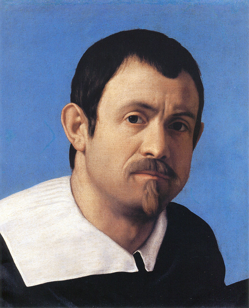
We can see the difference between the way in which sacred art and mundane art are painted by contrasting what these works with Sassoferrato's self portrait. Notice how in the portrait the image engages the viewer much more directly and we look deeply into his eyes, the deep shadow is absent and background is blue rather than black so the contrast between light and dark is not so pronounced. There is still some shadow in the face certainly - this necessary in order to describe form - but it is not so marked. Also there is not such an obvious fusion of the natural features of the face with those of the Greek ideal as we would see in the sacred art.

Sassoferrato Sassoferrato's Virgin is in the National Gallery in London and I have a great fondness for it, even long before my conversion, it was one of those paintings that I always made a point of going to look at every time I visited the gallery. As a gallery that has no entrance fee, I often used to just drop in for 20 minutes on my way home from work, or even sometimes just to escape the rain! The peaceful repose and expression of Our Lady, which is even more apparent if you see the original, always drew me in.

Sassoferrato_-_Jungfrun_i_bön

— ♦—

My book the Way of Beauty is available from Angelico Press and Amazon.

JAY W. RICHARDS, Editor of the Stream and Lecturer at the Business School of the Catholic University of America said about it: “In The Way of Beauty, David Clayton offers us a mini-liberal arts education. The book is a counter-offensive against a culture that so often seems to have capitulated to a ‘will to ugliness.’ He shows us the power in beauty not just where we might expect it — in the visual arts and music — but in domains as diverse as math, theology, morality, physics, astronomy, cosmology, and liturgy. But more than that, his study of beauty makes clear the connection between liturgy, culture, and evangelization, and offers a way to reinvigorate our commitment to the Good, the True, and the Beautiful in the twenty-first century. I am grateful for this book and hope many will take its lessons to heart.”

Baroque case study and meditation: Pietro da Cortona's Christ Appearing to Mary Magadalene

Pietro_da_Cortona_-_Cristo_appare_a_Maria_MaddalenaI will post an article next week about Christian environmentalism. I believe that this scene, portrayed in this beautiful example of 17th baroque painting, in which Mary Magdalene sees Christ in the garden and mistaking him for the gardener gives us insights into the Christian understanding of man's relationship with the rest of creation, and so to a Christian environmentalism. You can read how when it comes out on Monday. Here is the account from St John's gospel, Chapter 20: 11 Now Mary stood outside the tomb crying. As she wept, she bent over to look into the tomb 12 and saw two angels in white, seated where Jesus’ body had been, one at the head and the other at the foot. 13 They asked her, “Woman, why are you crying?” “They have taken my Lord away,” she said, “and I don’t know where they have put him.” 14 At this, she turned around and saw Jesus standing there, but she did not realize that it was Jesus. 15 He asked her, “Woman, why are you crying? Who is it you are looking for?” Thinking he was the gardener, she said, “Sir, if you have carried him away, tell me where you have put him, and I will get him.” 16 Jesus said to her, “Mary.” She turned toward him and cried out in Aramaic, “Rabboni!” (which means “Teacher”). 17 Jesus said, “Do not hold on to me, for I have not yet ascended to the Father. Go instead to my brothers and tell them, ‘I am ascending to my Father and your Father, to my God and your God.’”

Pietro_da_Cortona_-_Cristo_appare_a_Maria_Maddalena


In this painting, painted around 1645 by the Italian Pietro da Cortona, he uses the classic elements of the baroque style, the deep shadow contrasted with the light, which represents, in this case literally, the Light, that overcomes the darkness. He ensures that the main focus is on the person of Christ by retaining the sharpest focus and the most colour around him and his garments. Much of the parts in the periphery of the painting are painted in monochrome (in one colour, in this case sepia) and are blurred. This draws the eye to the most important part of the painting that is lighter, more coloured, and in sharper focus.. The only other part which is in light is the upper body and face of Mary Magdalene. The deep shadow and murky light in the rest of the composition, which is so prevalent in baroque painting (the style that originated in the 17th century) is appropriate for this - we are told by John that this took place 'early on the first day of the week' that is Sunday. The medium in which it is painted - oil on canvas - is ideal for for this shadowy light. It allow the smooth blending of tone and colour over long distances (in contrast with egg tempera, the medium of icons which is very difficult to blend).

All of these stylistic elements are derived from a theology whereby the artist is seeking to represent heavenly and supernatural truths via the visual. In order to do so he does not paint photographically, but deliberately alters the appearances from what is seen so that we infer invisible truths also. The theology behind the style of baroque painting and the dynamic by which we pray with it in the liturgy is described in detail in my book, the Way of Beauty.

The artist, Pietro da Cortona was one of the leading artists of the Italian baroque and was seen in his time as a rival in fame and reputation of Bernini (who is more well known today). Like Bernini he was an architect as well as an artist (Bernini being primarily a sculptor). He lived from 1596-1669.  Below we see the church of Santi Luca e Martina in Rome, which was designed by Cortona.

Santi_Luca_e_Martina

— ♦—

My book the Way of Beauty is available from Angelico Press and Amazon.

JAY W. RICHARDS, Editor of the Stream and Lecturer at the Business School fo the Catholic University of America said about it: “In The Way of Beauty, David Clayton offers us a mini-liberal arts education. The book is a counter-offensive against a culture that so often seems to have capitulated to a ‘will to ugliness.’ He shows us the power in beauty not just where we might expect it — in the visual arts and music — but in domains as diverse as math, theology, morality, physics, astronomy, cosmology, and liturgy. But more than that, his study of beauty makes clear the connection between liturgy, culture, and evangelization, and offers a way to reinvigorate our commitment to the Good, the True, and the Beautiful in the twenty-first century. I am grateful for this book and hope many will take its lessons to heart.”


Should We Paint God the Father?

One of the most famous pieces of sacred art that exists is Michelangelo’s fresco, in the Sistine Chapel, of God giving the spark of life to Adam. Despite its popularity and familiarity, I had often wondered about the validity of representing God the Father. My own instincts run against the idea of portraying God the Father in a painting at all, even when I was a child (I always thought that the white-whiskered God looked more like God the Grandfather, than God the Father). Later on in life, this was reinforced by the fact that my icon painting training led me to believe that it was wrong.  I was pretty sure, but not certain, that it was not part of the tradition. Certainly, I have never painted an icon of God the Father. Furthermore, the theology of Theodore the Studite in regard to sacred imagery, which is accepted by both Eastern and Western Churches, bases the argument for the creation of any figurative art upon the fact that we can portray the person of Christ as man. The person of God the Father is a spiritual being and most certainly not man. This would seem to suggest that we should not portray the Father as man either.

I quietly suspected that the white-bearded God of Michelangelo or William Blake or even my favourite baroque artist Velazquez were all in error, his Crowning of the Virgin by the Trinity is to the right. I wasn't too worried about Blake, an eccentric non-Catholic, but Michelangelo and Velazquez?

I was approached recently to do a commission that involves the portrayal of the Father. Rather than reject it out of hand, I thought I had better find out where the Church stands on this.

Here’s what my first investigations have revealed. For the first thousand years or so of Christianity, East and West, there was little portrayal of the Father figuratively. Then images started to appear in both the Eastern and Western traditions, though it was more common in the West.

There are two simple arguments that I have found for the representation of the Father: the first is that Christ said in John 14:9 that whoever has seen me has seen the Father. This would seem to open up to a representation of the Father as the Son. So, one could say, seeing an image of the Sacred Heart of Jesus is also seeing one of the Sacred Heart of the Father, with the heart of the Father understood as a symbol of His love.

The second is that the white-bearded figure, which we are all familiar with is the Ancient of Days in the book of Daniel (7:9, 13, 22). This is the source of so many familiar portrayals of the Father. In the East there is a tradition known as the New Testament Trinity. This title would distinguish it from the Hospitality of Abraham (in which three angelic strangers represent the three persons of the Trinity). Right is a Greek Orthodox New Testament Trinity from the ceiling of the entrance Vatopedion Monastery at Agion Oros (Mount Athos), Greece. The Catholic Church, allows for the interpretation of the Ancient of Days as the Father, which justifies the portrayal of the Father. (I have been told that Pope Benedict XIV [fourteenth, not sixteenth!] in 1745 pronounced this, though beyond a Wikipedia reference I have not been able to validate this). It also allows for the interpretation of the Ancient of Days as Christ. The Russian Orthodox Church, since the synod of Moscow in 1667 has forbidden the portrayal of God the Father as a man. Consistent with this it interprets the Ancient of Days strictly as the Son. It is this decision of the pronouncement by the Russian church that gave me the idea, wrongly, that it had never been part of the Eastern tradition and that the whole present Eastern Church forbids it.

There is a Western tradition of portrayal of the trinity in a type known as the Throne of Mercy, in which the Father sits on his throne and presents his crucified son to the viewer while a dove rests on the cross or hovers just above it. It was this that was explicitly mentioned by Benedict XIV. A 16th century German version is shown left. This tradition goes right back the Medieval times in the Western Church and we have this continued even into the 20th century with Eric Gill in England doing woodcut of this image in a modern gothic style.

So where do I stand on this now? Clearly the portrayal of the Father as a grey-haired man is permitted. I would feel on safest ground following the traditional presentations, such as the Mercy Throne image. Outside that, I would be consider images, but would be cautious, unwilling to promote, as Caroline Farey of the School of the Annunciation put it to me, ‘any trend of anthropomorphizing God the Father in case the transcendence of God is further compromised in people's imaginations.’

It is worth pointing out also, that when God is portrayed as a single person in the form of the Ancient of Days, we cannot be sure that it is the Father who is portrayed. The artist might, quite justifiably, have the intention of representing the Son. I have not, for example, been able to find an authoritative text that tells us precisely which person of the Trinity either Michelangelo or Blake intended us to be looking at (I would welcome comments from readers on this point).

Below: an early gothic Mercy Throne; a 20th century version by the Englishman, Eric Gill; an early gothic pieta in which God the Father supports the son; a baroque Mercy Throne by Ribera, 17th century; and William Blake's Ancient of Days.

Spanish Polychrome Sculpture, Ancient and Modern

When I think of sculpture, I usually think first of something that is monochrome - in one colour, that of the material that it is made from. Perhaps stone or cast in bronze. If I think of coloured sculpture, what probably comes to mind is the kitsch stuff of gift shops. There is however, a wonderful tradition of  ‘polychrome’ meaning many colours sculpture. First, many of the statues that we now see in just stone would have originally been painted (for example the pre Renaissance sculpture of the Middle Ages. There is also a great baroque tradition of polychrome carving and some of the greatest examples are from the Spain in the 17th century.

In the examples show, which are from this period, you can see the same stylistic features used by the stone sculptors of the time, even though these artists are not ‘painting in shadow’, as stone sculptors such as Bernini did (as I wrote about last week, here). For example, they display the same exaggerated angular folds in the cloth to give the form vigour. One of the greatest of these Spanish artists is a man called Alonso Cano.

There is an artist in Spain today who is producing work in a similar vein called Dario Fernandez. Unfortunately, I couldn’t find any images that I am able to reproduce here, but there are plenty on his website www.dariofernandez.com and he is well worth looking up.

Works shown (all from the 17th century), from top: Scourging at the Pillar, Gregorio Fernandez; John of God, Alonso Cano; The Scourging at the Pillar, Alonso Cano; Suffering Christ, Gregorio Fernandez; St Teresa of Avila, Gregorio Fernandez; Christ of Sorrows, Pedro de Mena; Crucifixion, Juan Martinez-Montanez