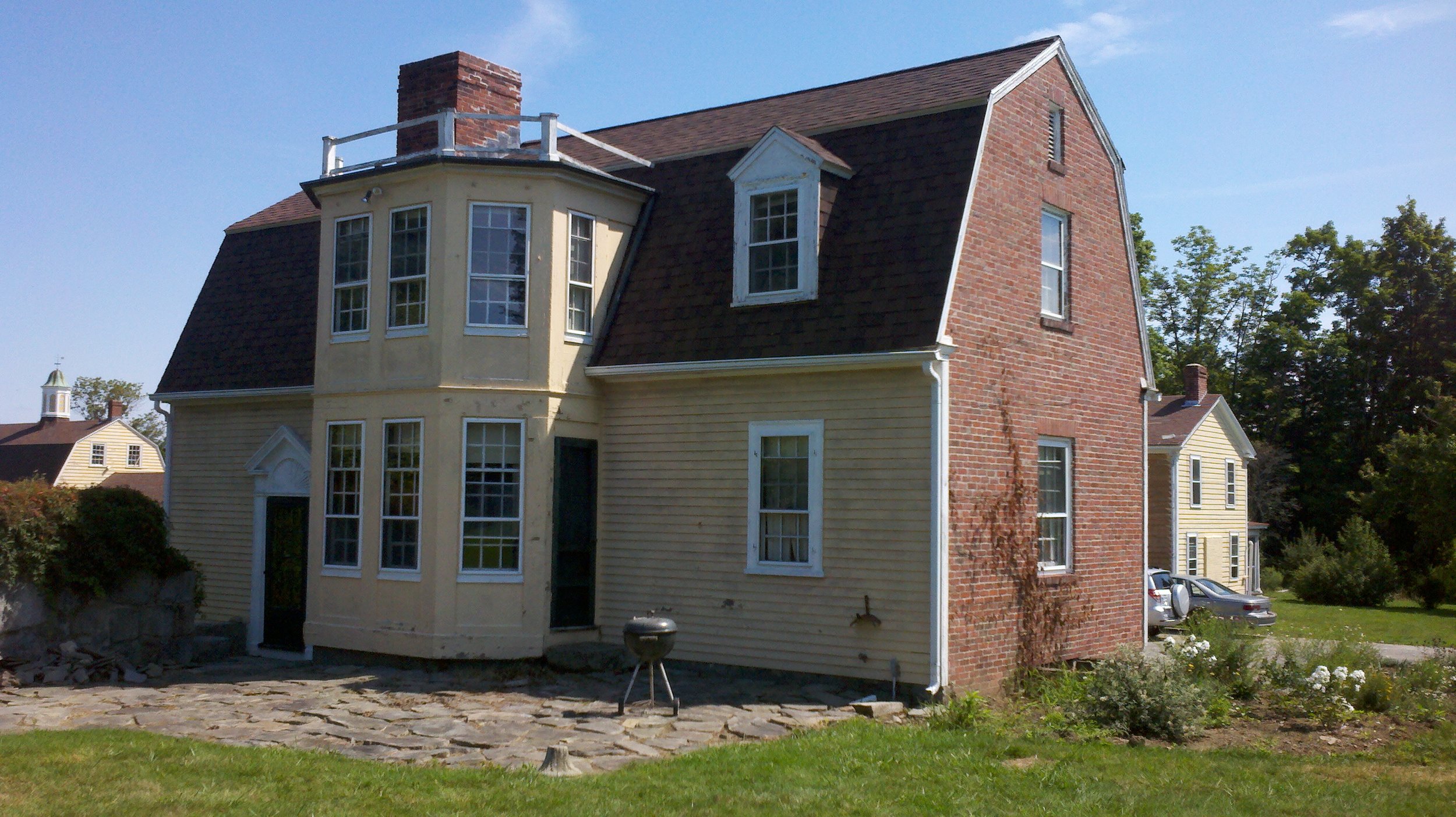
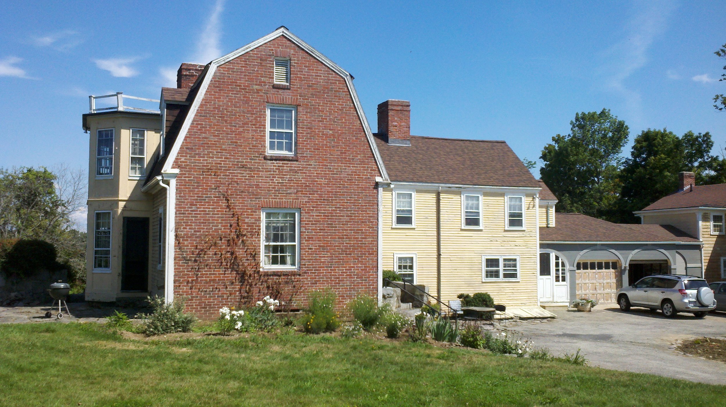
 Take a look at these photographs of a farmhouse in Groton, Massachusetts. This is a 19th century house on the site that eventually will become the new campus for Thomas More College of Liberal Arts. Look first at the gable end in which there are three windows, one on each floor. Notice how the first is bigger than the second. The second is, in turn bigger than the vent at the top that aerates the loftspace. There is a sense of rhythmical progression as we go up, the first relates to the second as the second relates to third. The are three objects and two relationships. Each relationship, for example how the first window relates to the second, can be described as a mathematical ratio between two magnitudes - the magnitude of each window. Due proportion is defined as a consonant relationship between two or more ratios. When the proportion is appropriate ('due') for what contains it, in this case a house, then is pleasing to the eye. We can think of due proportion therefore as a harmonious relationship between two or more relationships.
Now look at the bay windows that are built into the wall at right angles to the gable end, which are painted a yellow cream. The windows are not the same size and so look as though they could be completed with a third which is smaller still, like those just around the corner. This implied proportion is common in buildings - you can't always afford to build three storeys (or in this case, three bay windows). So this is good, it is like having two notes that are different but still harmonious. You can't have harmony between identical things, that is why in modern buildings in which all the windows are the same size, it looks dull and sterile. However, as I look at these bay windows, something isn't quite right. Although the windows look in harmony, the top storey looks top heavy. This is because the adorning strip of wood that separates one floor from the other is placed at a level that is too low. Although the windows are of different size, the storeys are of equal size. When I look, it see something that would look more natural if the the upper storey was smaller that the lower, (just as the trunk of a tree gets smaller as you go up, it gives a sense of stability). It is a shame that this is off, because everything else seems right.
However there is something that could be done to restore harmony without any new building at all. We are just in the process of repainting the house (you can see the sanded garage door and its surround painted slate grey). The whole house will be this colour and the trim will be cream. The answer is to repaint these bay windows so that the lower floor is separated from the upper, perhaps if it is painted this slate grey colour, separate them with a trim band. You paint the band of cream perhaps 10 inches wide above the wooden rail that now appears. The final photograph shows how painting can be used to create harmony even when the windows are identical in size. It is of a hotel on the seafront in Llandudno in North Wales, close to where I grew up.
This harmony of three is just as it is in the area that you think of first when harmony is mentioned - music. We hear harmony between two notes, for example a perfect fourth, a perfect fifth or an octave and it is pleasing. And this is good on its own. However, whenever I ask any musician if this is the full chord, they will always tell me that it is incomplete. You need to third note to create a second interval, so we know if we are hearing part of a major chord, or a minor chord.
This is the Somerset Hotel on the promenade at Llandudno, north Wales.


