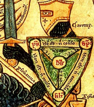
 The Trinity Shield is a diagrammatical way of representing the Trinity. This is useful in couple of ways:
First, pedagogically - ie as a teaching tool - it demonstrates simply the idea that there is one God but three distinct persons, and that each person is always in relation to another (being in relation to another is the essence of being a person, in fact).
Second, it is way of representing the Trinity artistically while avoiding what can be a tricky debate over what is appropriate for imagery when representing the persons of the Trinity directly. To be true, the image must be consistent with the idea that Christ is one person, both human and divine in nature; and that the Father and the Holy Spirit are both spirit. It took about 500 years for that to be resolved dogmatically by the Church in regard to Christ, and almost another 500 years for the implications of this in regard to sacred images of Christ. Even if we feel that we have now clearly sorted out the issue of whether or not images of Christ are legitimate, some might still object to the idea of representing what are in truth spiritual beings - the Father and the Holy Spirit - as a agrey-haired old man and a dove, for example. I discuss this in greater detail in a past article, Should We Paint God the Father. Even if we agree that representing them in this way is legitimate, we might decide that it not prudential today, given the difficulty many modern people have in reading a symbolic language and the tendency to see things a literal and material. Anything that would make people thing that the Father really is a man - ie to 'anthropomorphize' Him' would be unwise.
In the following example we can see how it explains the nature of the Trinity so clearly. We can read the shield as follows: each person, Father, Son and Holy Spirit (Pater, Filius, Sanctus Spiritus) is not (non est) either of the other two, but each is God (est Deus).
This diagram was popular in France and England in the middle ages and the illumination in the Way of Beauty is a detail from a 13th century manuscript by and artist called William Peraldus. It shows the knight armed with the shield of the Trinity preparing for battle with the seven vices. It is similar in style to the gothic 'School of St Albans' style from a similar period and which relies heavily on line drawing to describe the image and the uses washes of colour in moderation.
— ♦—
My book the Way of Beauty is available from Angelico Press and Amazon.
—JAY W. RICHARDS, Editor of the Stream and Lecturer at the Business School of the Catholic University of America said about it: “In The Way of Beauty, David Clayton offers us a mini-liberal arts education. The book is a counter-offensive against a culture that so often seems to have capitulated to a ‘will to ugliness.’ He shows us the power in beauty not just where we might expect it — in the visual arts and music — but in domains as diverse as math, theology, morality, physics, astronomy, cosmology, and liturgy. But more than that, his study of beauty makes clear the connection between liturgy, culture, and evangelization, and offers a way to reinvigorate our commitment to the Good, the True, and the Beautiful in the twenty-first century. I am grateful for this book and hope many will take its lessons to heart.”


