Art

Fra Angelico's Theology of Light

I thought I would do a short series (I intend three at this stage) of articles focussing on paintings by the gothic artists, looking at two of my favourites Fra Angelico and Duccio. Fra Angelico, the 15th century Florentine artist is normally considered late gothic in style. Duccio, from Siena, worked earlier, in the late 13th and early 14th centuries. Duccio's work represents the more iconographic based style and Fra Angelic the more naturalistic. Looking at these two exemplars of early and late gothic art gives us a good sense of what characterises this tradition. This is not just for the purpose of an art history discussion. I think that there is much to benefit from artists today who are trying to spark the ‘new epiphany of beauty’ by looking at the gothic tradition. First, it is one of the three authentic Catholic liturgical traditions cited by Pope Benedict XVI in The Spirit of the Liturgy. Also, I often find in conversation that his work appeals to people who have a similar understanding of the Faith, the liturgy and Catholic culture as I do. It seems that for many, Fra Angelico in particular has the balance of naturalism and idealism that nourishes the prayer of modern man. John Paul II gave him a special mention in his Letter to Artists. I think therefore that perhaps this could be a good starting point for artists to study and from which a distinctive art of Vatican II could develop in the future (just as the baroque, which developed from the base of the stylistic developments of the High Renaissance, might be considered the art of the counter-Reformation and of the Council of Trent). Only time will tell if I am right in this regard, of course.

The gothic style arose from a different understanding of man's perception of the natural world through his senses. The ideas that drove it developed from about 1000AD onwards with the rediscovery of the philosophy of Aritotle and the subsequent incorporation of his ideas into Christian thinking by figures such as St Thomas. The love of nature of Franciscan spirituality was also influential in popularizing the ideas. I have written more about this here.

As I wrote in a commentary on his Annunciation, Fra Angelico working late in the period is very interesting to study for his selective use of the features of the well observed naturalism such as perspective, shadow and figures in profile; and his retention at other times of those features of iconographic art.

If we look his Resurrection a fresco from one of the cells in the monastery of San Marco in Florence, we see Christ rising in an almond shaped mandorla, the traditional symbol of His glory, carrying the red and white Resurrection penant. The background is shadowy and dark and we see the tomb drawn with naturalistic perspective. The angel is in profile, which would never be seen in an iconographic painting, though shining with uncreated light which one would expect in iconographic art.

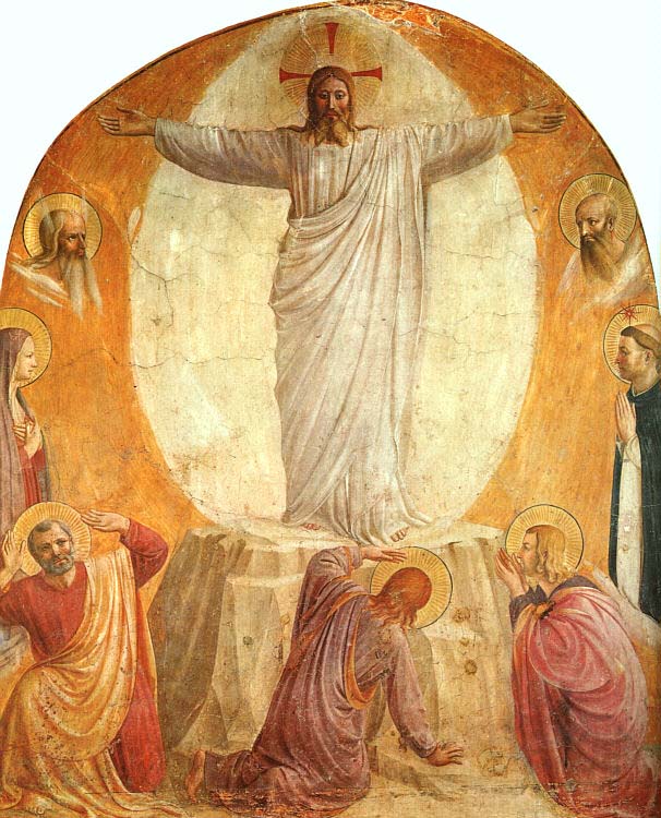
There is one stylistic feature that Fra Angelico uses that interests me greatly. This is his habit of putting the face of Christ in shadow. On first sight this is strange, since he shows the rest of the person of Christ shining with light and the face of the angel, a great, but nevertheless lesser being is totally in light. When I first noticed this I wondered why? A Dominican friar in England told me his interpretation of this: Fra Angelico is showing a light that is brighter still. In fact it is so bright that it blinds us - it is too much for us, fallen human beings who are observing Him, to bear. I find this explanation convincing, especially because we see in in other paintings by Fra Angelico, for example the Transfiguration and the Sermon on the Mount have the same feature.

Fra Angelico and the Gothic

When I first decided that I’d like to try to paint in the service of the Church I decided I wanted to paint like Fra Angelic (or perhaps Duccio). I suppose you might as well aim high! Fra Angelico, who worked in the 15th century, had the balance of naturalism and idealism that appealed to me. It seemed just right for prayer. It’s just an anecdotal observation, but when I meet people who have the same outlook in regard to the liturgy and orthodoxy in the Church, it seems that invariably they feel the same about him; and John Paul II described him in his Letter to Artists as one whose painting is ‘an eloquent example of aesthetic contemplation sublimated in faith’. Unfortunately, the late-gothic style of Fra Angelico is not a living tradition and I couldn’t find anyone who painted that way who could teach me. I decided that as it appeared to sit stylistically between the Romanesque (which is an iconographic form) and the baroque and these were forms that are taught today, to some degree, I would learn both and try to work out how to combine the two. I am still working on that now!

What is it that characterizes gothic figurative art? We start to see a change in figurative art around 1200AD. The departure from the iconographic prototype occurred due to a different sense of the reliability of human experience. Information received through the senses was seen much more as a possible means of the grasping of truth. Tied in with this is the belief that the world we live in, although fallen and imperfect, is nevertheless good, ordered and beautiful. So there may be evil and suffering in the world, and it may not be as good and beautiful as it ought to be, but it is nevertheless God’s creation and still good and beautiful.

This change caused both the rise of naturalism in art and the development of science fostered by the Church. I have read of two main reasons for this. One is the incorporation of the philosophy of re-discovered works of Aristotle (who trusted the senses more than his teacher, Plato) into Christian thinking, by figures such as Albert the Great and Thomas Aquinas. This provided the intellectual basis for the development. Second is the spirituality of St Francis of Assisi. He loved nature as the work of God and as Franciscan ideas spread so did an enthusiasm for, and curiosity about, nature.


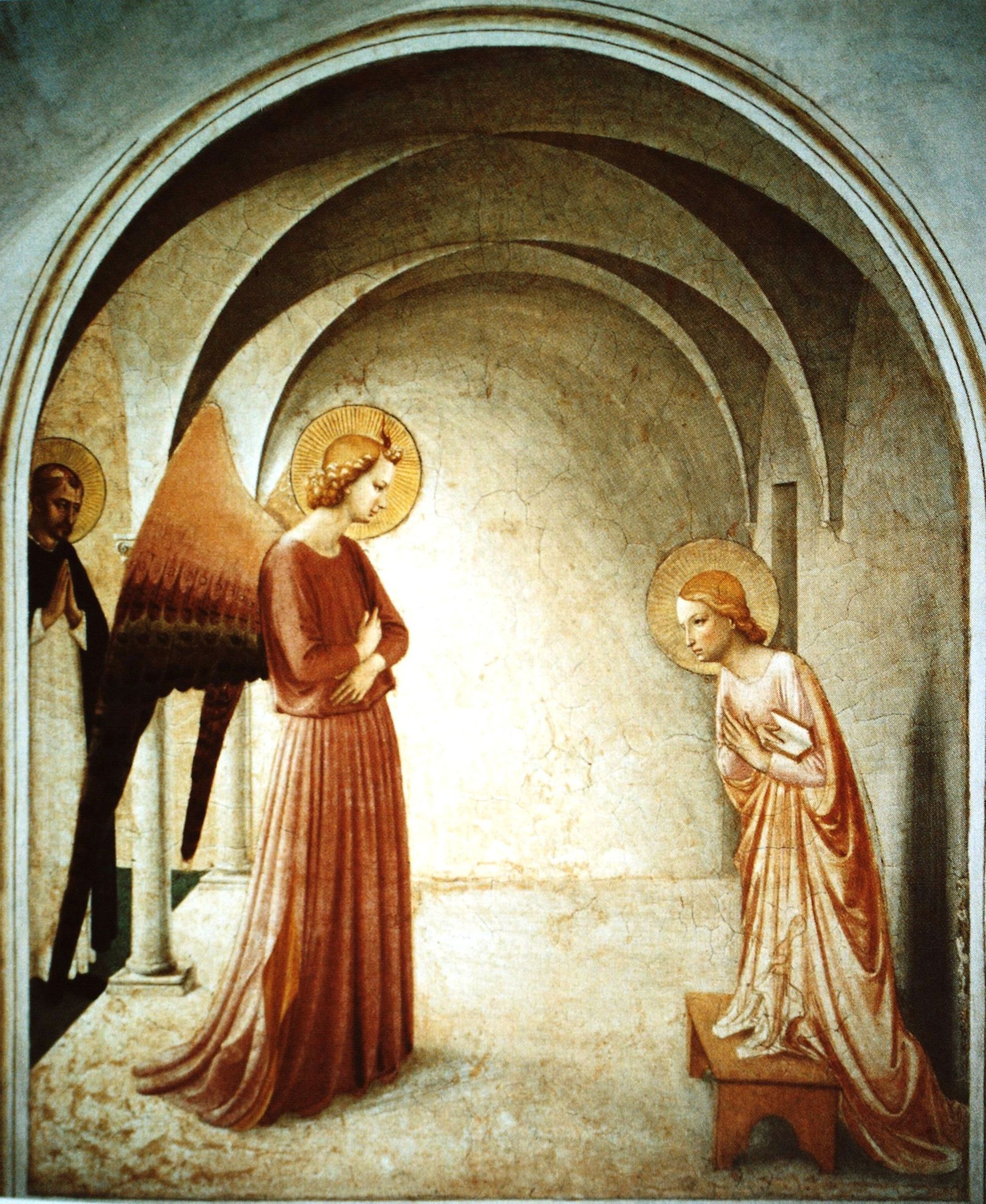
Let’s look at a very famous fresco by Fra Angelico of the Annunciation on the walls of a cell at San Marco in Florence. He consciously employs some of the developments of the new naturalism: there is cast shadow, there is single-point perspective creating a sense of depth in the covered cloister; the archangel is in profile. But there are also stylistic aspects that we are accustomed to seeing in iconography: the figures are painted in the middle distance, the edges of each shape are all sharply defined and the colour is evenly applied (unlike the baroque which has selectively blurred or sharp edges and selective use of colour or monochrome, usually sepia, rendering).

If we examine the further, we can see that the light source that is casting shadow is from the left. If cast light were the only source, the face of the Archangel would be dark, yet it is bright. Fra Angelico is showing the face of the Archangel glowing with the uncreated light of holiness, which is what we are used to seeing in the Byzantine iconographic form.

I was giving a lecture once about this painting and a student asked me about the shadow. He pointed out that Our Lady is a saint, he could see that her face wasn’t in shadow and there was strong halo, representing he uncreated light coming from her. But also pointed out that there is a strong cast shadow on the wall behind her. Wouldn’t you expect her radiance to obliterate that, he asked? I agreed with him, you would. But I couldn’t say why Fra Anglelico had painted it like this. I speculated that perhaps it was due to the fact that there were two light sources from the left – the natural light and the uncreated light from the angel and that the combined intensity of light would cause the shadow against the wall. I had to admit even as I said it that my answer sounded contrived. Nevertheless, it did seem deliberate. Another Annunciation, shown below, has the same shadows.

He suggested an answer: Fra Angelico was a Dominican, and not a Franciscan. At this time the question of her Immaculate Conception had not been decided and the Dominicans did not accept the Immaculate Conception and were in dispute with the Franciscans over the issue. Perhaps Fra Angelico was making a theological point to the Franciscans, he suggested by dimming her light ever-so slightly. This was an ingenious suggestion, and I couldn’t say that it wasn’t what Fra Angelico had in mind. I certainly preferred it to my answer!

Later, someone in another class, a priest, gave the most convincing reason so far. Luke 1 tells us that the words of the angel Gabriel were:, “The Holy Spirit will come upon you, and the power of the Most High will overshadow you.”


Giovanni Battista Tiepolo and the Immaculate Conception

The baroque style exemplified

It might be said of Venetian painter Giovanni Battista Tiepolo (1696-1770) that he is one of the last great painters of sacred art who painted in the baroque tradition (when he died, in Spain, he was swimming against the neo-classical current). Tiepolo is a master who added his own developments to the form of the baroque as it developed in the 17th century, but without compromising on the principles of the tradition. This makes him worthy of attention today.

The mark of a living tradition is that it able to reapply its principles without compromising on those aspects that define it; when it does this it always speaks to and of its time. This is different from pastiche, which is a rigid copying of style. (Although frankly I think pastiche is underrated – I’d take decent pastiche of the 17th century baroque over modernism every time.)

This style of the Immaculate Conception was developed in Spain. Francisco Pacheco (1564-1644) who was the teacher of Spanish baroque masters Alonso Cano and Velazquez (he was also Velazquez’s father-in-law), described the iconography of the Immaculate Conception in his influential book, The Art of Painting (Arte de la Pintura) published posthumously in 1649. (By the way, I have only ever seen small excerpts of this book in English and have not been able to get hold of a translation of the full document. Can anyone help here at all?)

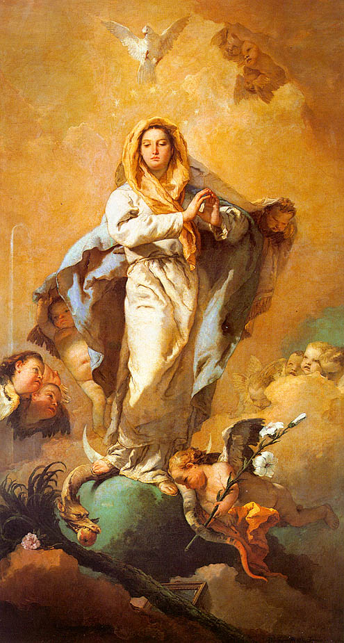
With reference to the Immaculate Conception, Pacheco wrote: "The version that I follow is the one that is closest to the holy revelation of the Evangelist [John writing in Revelation] and approved by the Catholic Church on the authority of the sacred and holy interpreters...In this loveliest of mysteries Our Lady should be painted as a beautiful young girl, 12 or 13 years old, in the flower of her youth...And thus she is praised by the husband: tota pulchra es amica mea, a text that is always written in this painting. She should be painted wearing a white tunic and a blue mantle...She is surrounded by the sun, an oval sun of white and ochre, which sweetly blends into the sky. Rays of light emanate from her head, around which is a ring of twelve stars. An imperial crown adorns her head, without, however, hiding the stars. Under her feet is the moon."

He also specified that her hands are to be folded on her bosom or joined in prayer. The sun is to be expressed by a flood of light around her. The moon under her feet is to have the horns pointing downwards, because illuminated from above. Round her are to hover cherubim bearing roses, palms, and lilies; the head of the bruised and vanquished dragon is to be under her feet. She ought to have the cord of St. Francis as a girdle, ‘because in this guise she appeared to Beatriz de Silva’, a noble Franciscan nun, who was favored by a celestial vision of the Madonna in her beatitude.

All these accessories are not absolutely and rigidly required and the 17th century Spanish artist, Murillo, who is perhaps the painter most known for the Conception, strayed from Pacheco without being considered the less orthodox for it. An example is shown right. His moon, for example, is sometimes full, or when a crescent, the horns point upwards instead of downwards. I prefer Tiepolo's Immaculate Conception to this or any of Murillo's that I have seen.

The rose symbolizes Our Lady, and the white colour, as with that of the lily, symbolizes the purity of the Virgin. Palms, deriving from Palm Sunday, symbolize spiritual victory and triumph over death (often used with martyrs). In this case it is emphasizing Mary’s crucial role in the victory achieved by her Son. The dove, of course, symbolizes the Holy Ghost.

In this example, Tiepolo varies the focus and where he mutes the colour he uses tonal variation to describe form, in characteristic baroque mode. Look, for example, at the mantle. This is intended to be seen in our mind’s eye as uniformly blue in accordance with Pacheco’s specifications. However, only part of it in his painting of it is actually blue. Much is rendered tonally in brown ochre and sepia.

Tiepolo is noted for giving his paintings a lightness and airiness that did not exist in those works by artists who worked in the previous century. He has achieved this by using colours in a higher register than many of his 17th-century counterparts would have done – more pale blue, bright yellow and orange for example. Also he deftly varied the colour that he used for the purely tonal description. As mentioned in connection with the mantle, he uses sepia and brown ochre. Elsewhere he uses yellow ochre. Contrast this with, for example, Rembrandt’s St Bartholomew: all his tonal description is in a dark sepia, which creates a sense of heavy shadow wherever it is used. Tiepolo used quite a range of colours as well. For example in his John the Baptist Preaching, we see him modelling tonal areas in blue-greys and green-greys. all this helps to lend a mood in a Tiepolo that is more joyful and less somber than a Rembrandt.

Rembrandt - St Bartholomew

Tiepolo - John the Baptist Preaching