Blog

More information about the painted dove in the Newman Center, Lincoln, Nebraska

Showing us how to re-establish a cultural tradition

In my recent posting about most recent edition of the Adoremus Bulletin, I showed the cover photo of the publication, which is of a beautiful wall panel.

I was delighted to hear just now from the architect James McCreery whose firm was the design architect for the Thomas Aquinas Chapel of the Newman Center. He sent me this fine photo of the panel in its setting, which shows that this was a detail of an arched recess designed as a backdrop for the chapel's Baptismal font...hence the descending dove! The painting work was done by artists at the Evergreene Studios, he tells me.

He explained to me that the font itself is hand-carved oak dating from the English Arts and Crafts / Gothic Revival period of the late 19th/early 20th centuries. This is the movement that came out of the work of Pugin, Ruskin and Morris particularly.

I am an admirer of this style, what might be termed Victorian neo-gothic art and architecture. Some talk of it as though it is a pale version of what went before. I don't think of it that way at all. To me this is an authentic model of Christian art and architecture that characterizes the 19th century.

In many ways I see theirs as a lesson of how revivals ought to take place, one which can help us today. There method was one of the study of underlying principles from the great models of the past - in this case looking at gothic architecture, and gothic and romanesque art and decoration - and then the application of those principles in a comtemporary setting - the 19th century. The desire was to change as little as possible, but it was not an unthinking copying of the past. There was a willingness to modify or change those aspects that were no longer appropriate to needs of the Church of the time; and those aspects that might, when considered in humility, might be improved upon.

Now, 100 years or so later, the same process goes on. This time the model of the past is the Victorian style and the Church to which it must relate is that of the early 21st century. This is how it works!

Film review: The Intern

Entertaining, funny, easy to watch...and noble (mostly). This film offers us lessons in how to promote the New Evangelization and offer the Mass to the masses. Really, I mean it!

The Intern is an entertaining and very funny feelgood movie which has a good story and along the way reinforces good traditional values. It has greater depth than most critics give it credit for and furthermore, I think that this shows us how the mass culture could be used constructively to draw people back to the Church and the Mass more powerfully, entertainingly and in about the half the viewing time that Into the Great Silence ever could. It also shows us what the strengths of movies are in this regard.

It is not without flaws but, I suggest, these could be easily remedied and so that it could have made a strong endorsement of Catholic social teaching. I am hoping there are some Catholic film makers watching who might take note.

Any who read last week's review will be aware of my view of what makes a good film, but for those who didn't: I hate self-consciously arty films that stress character development or visual beauty at the expense of the plot. I think that all these have to be there but a movie is successful when all serves the narrative. This means that in my view the American film industry, which understands this, is superior to the British and European; and as a rule I avoid anything that has sub-titles because I assume I'm going to be bored to death. The famous line that sums up why the British film industry is so unsuccessful (a question that discussion panels on BBC Tv and radio programs have discussed ad infinitum) is that the British directors always make films to impress their friends at dinner parties and nobody else...and they do it very well.

For this film I read the reviews first and the critics seemed to split. Some found it entertaining and funny, while others disliked it for being shallow and lacking philosophical depth. Given what most film critics require to be philosophically stimulated - angst and doom - I took both types of review as an endorsement!

As it turned out it certainly wasn't self-consciously philosophical but in fact it reveals a natural philosophy of life that is, broadly speaking, good and derived from Christian principles. It doesn't feel deep because it doesn't challenge our sense of what is good, it affirms it.

The plot is simple. A retired 70-year-old business executive and widower, Ben (Rober De Niro), is bored and looking to 'fill the hole' in his life. He had already tried getting out and being involved in activities that gave him some human contact, but this was not enough. He needed to a have purpose and so he applied for a job at a new internet startup that had subscribed to a 'senior intern' program as part of a publicity exercise. He had a job interview with the 'talent acquisition' executive in which he was asked what was obviously a standard question given to all applicants, regardless of the job: 'Where do you see yourself in 10 years' time?' De Niro's perfectly timed response was, 'You mean when I'm 80?'

This being an internet startup, Ben is just about the only employee over thirty. The comic moments relate to the clash of the generations in which each misunderstands the other. Without pushing himself on them, or complaining, he gently offers his wisdom based upon life experience and the younger people around him realise that he can help them in their work and their personal lives.

Gradually, the founder and CEO of the company, Jules Austin, (played by Anne Hathaway) starts to rely on him for advice in the same way. We realise that he is filling the hole in his life not by getting a second career, but rather by being of service to all around him in the workplace. His new job is his opportunity for service. Through his example, others start to adopt his approach in what would be an otherwise cut-throat commercial environment. We see how, through his personal interractions with the people around him, he is affecting this society in microcosm for the good and helping to make it a community.

The climax of the film revolves around troubles in the marriage of Jules Austin. Her husband, a stay-at-home dad who gave up his career when the hers took off, feels neglected and retaliates badly (if you want the details you'll have to watch the film). The film does not justify the behaviour of either, however, but instead takes them to a point of reconciliation whereby each reflects on the situation and admits independently the part they have played. Each resolves to make personal sacrifices for the other and for the marriage (there is a synchronicity to it that reminds us of O Henry and Gift of the Magi).

Anne-Hathaway-The-Intern-Movie-Set (2)

Although the story is simple, it is believable and the wisdom imparted through it seems true. It was also very funny and I wonder how much of this is down to the great performance of Robert De Niro whose timing and delivery are impeccable.

On the negative side, there's one risque joke, which stands out in contrast with the tone rest of the film and which, unfortunately, appears in all their publicity trailers that I have seen. Also, incidental to the plot, there are moments that go against Christian morality - for example, there is some reference to promiscuity that presents it in a positive light. These are almost to be expected nowadays, sadly.

Aside from these, the major regret that I had is the writer and director, Nancy Myers, did not in some way connect the good standards to that the De Niro character lived up to to their true source - God and his Church. I wouldn't expect a scene in which a character reads a passage from the Catechism, but it would have been nice if we had found out that Ben was a virtuous man because he was a Christian. I am guessing that the reason that this was not done is that Myers doesn't believe.

However, she almost did it.

There was an allusion to spirituality, at least, as the source of his strength. In the opening scene of the film we see Ben in the park participating in a controlled exercise routine - it looked to me like the Chinese practice of Qigong. We hear him in the voiceover describing his general disatisfaction at life as we see him doing it. In the final scene of the film, all seems to have turned out well and Jules is looking for Ben at work to thank him. She is told that he took the day off. She eventually found him in the park, back with the Qidong group. There was no discussion of what he was doing or reference to it in any other way. We just saw it as an aspect of his previous life that was something good and he he wanted to retain. This was reinforced by the fact that he asked her if she wanted to join in with him before they talked, and she did so.

I don't know if this was the director's intention but occurred to me that in an understated but powerful way, what the film had portrayed was a bit of Qidong New Evangelization! She had portrayed (perhaps unintentionally) the Christian idea of the cycle of worship: the exitus and reditus (exit and return) by which we are inspired by God and are dismissed to go out to love our fellow man. Then, transformed by our love for God through man, we come back to God as greater lovers, and the positive cycle is repeated.

How wonderful this film would have been if this little detail - the topping and tailing of the film with a spiritual reference - had been a one by which he went to a beautiful Mass. And rather than joining the stretching in the park, Jules was sat silently in the pews at church contemlating what was going on and listening to Ave Verum Corpus before they left to have their conversation.

If we want to get more people back into the Church, this film is showing us, is a small way, how to do it. So, Catholic screenwriters here's your challenge! Create a Catholic version of a film like, this. Once you have your script all you need is several million dollars and Robert De Niro and you'll have a box-office hit that promotes the Faith.

https://www.youtube.com/watch?v=thv8myYCUQE

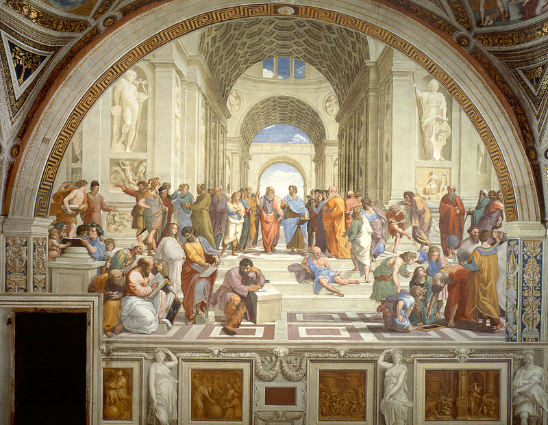
Pictures from the Way of Beauty: Pythagoras in Raphael's School of Athens

Scuola_di_atene_16_pitagora The wall painting, the School of Athens, was commissioned by Pope Julius II from Raphael in the first part of the 16th century at the height, if you'll forgive the pun, of High Renaissance. It is considered by some as his greatest work and is part of a whole series of frescoes that decorate the wall of what were Julius's private rooms in the papal palace at the Vatican. It shows all the greats of Classical Greek philosophy.

This painting also highlights the point that for the Christian the bible is not the only source of knowledge on matters spiritual. We can get an understanding, even of God, by reason based upon information mediated from the senses. We cannot know all things this way - some things are known only because God revealed them to us through scripture, such as the existence of the Trinity. The truths that cannot be deduced by natural philosophy are called the 'mysteries' of the faith.

800px-Sanzio_01

The two central figures in the painting are the giants of Greek philosophy: Plato, who is pointing upwards to his non- material world of ideals; and Aristotle, who points downwards and was so interested in the material world and information discerned by the senses.

In my book, the Way of Beauty, I focused on one figure in particular, who is front left: Pythagoras. Many know his name today because of his theorem that enables us to calculate the length of the third side of a right angled triangle given the length of the other two. However, he was better known in ancient Greece and by Christians up to the Enlightenment for his discernment of the spiritual significance of numerical relationships in the cosmos. Pythagoras suggested that once they are known they can become guiding principles by which the culture can manifest this cosmic beauty too, and by which a pattern of living and worship is ordered. This beautiful pattern of life is for the good of man and in harmony with the rhythms and patterns of the cosmos. Although Pythagoras's fame is great, very little is known about him directly and what we do know is handed down to us by later figures who wrote about him, such as Plato.

Scuola_di_atene_16_pitagora

It may surprise many moderns that not only is the passage of the Catholic liturgy through the seasons of sacred time built on these patterns of cosmic beauty, but even today in this aggressively secular culture, the pattern of time that we live - days, weeks, months years - follows this cosmic rhythm. It is natural for man to do so. Attempts to depart from it, such as after the French revolution, caused such disruption to the society that they quickly returned to heavenly time...even if they didn't believe in it.

Plato, who lived about 150 years after Pythagoras, is shown in Raphael's portrayal carrying the Timeaus. This book refers to Pythagoras, and Plato incorporates his mystical number theory into his own account of the world. For centuries the Timeaus was the most known of Plato's works in the West. Two leading figures who brought the ideas of Pythagoras into the Christian thought and reconciling them with scripture were St Augustine and St Boethius whose lives together spanned the fourth, fifth and sixth centuries AD. Boethius, who is the later of the two, is the source I rely on most heavily in my book when describing how these Pythagorean ideas govern the beauty of the cosmos and the culture. If you look at the fresco there is a figure behind Pythagoras looking over his shoulder at the chalk board (which is a diagrammatical representation of the numerical relationships that create musical harmony). The identity of this figure is disputed, but some think that it is Boethius. I would certainly like to think that this is the case.

The medium of this painting is fresco, in which finely ground pigment is suspended in water (like clay in stream water when the bottom is disturbed). This is then painted in onto the wet plaster in multiple washes. As the plaster dries it chemically binds with the pigment and fixes it in place. It is one of the most durable of mediums and if the surface is clean the painting will look as fresh as the day it was painted. It is always difficult to paint deep shadow in fresco, as with egg tempera which is used in icons, black tends to look like soot sitting on the surface. For this reason artists tend to work in the upper register of light and frescos often have this light, airy look to them.


Pictures of the house and gardens of the Weathersfield estate in New York

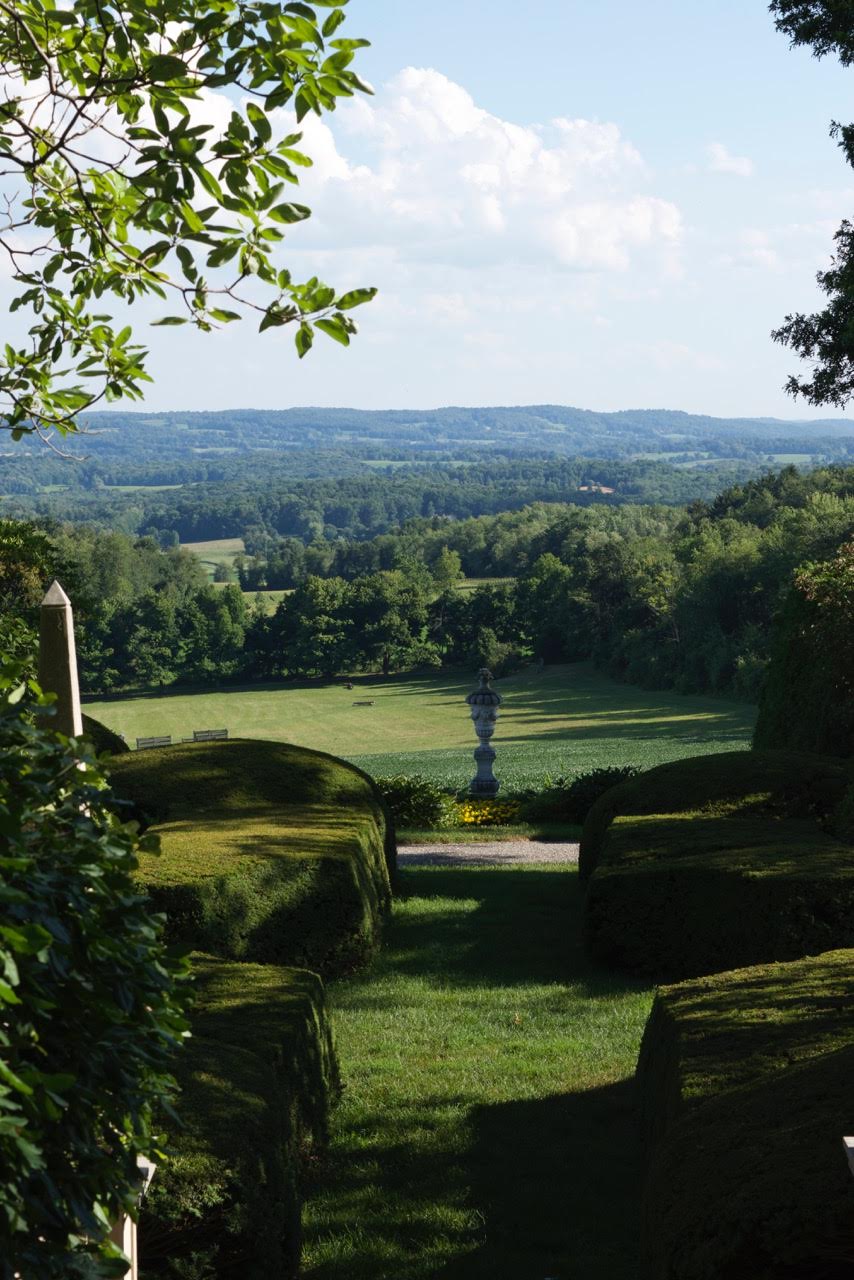
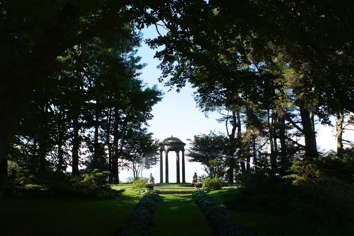
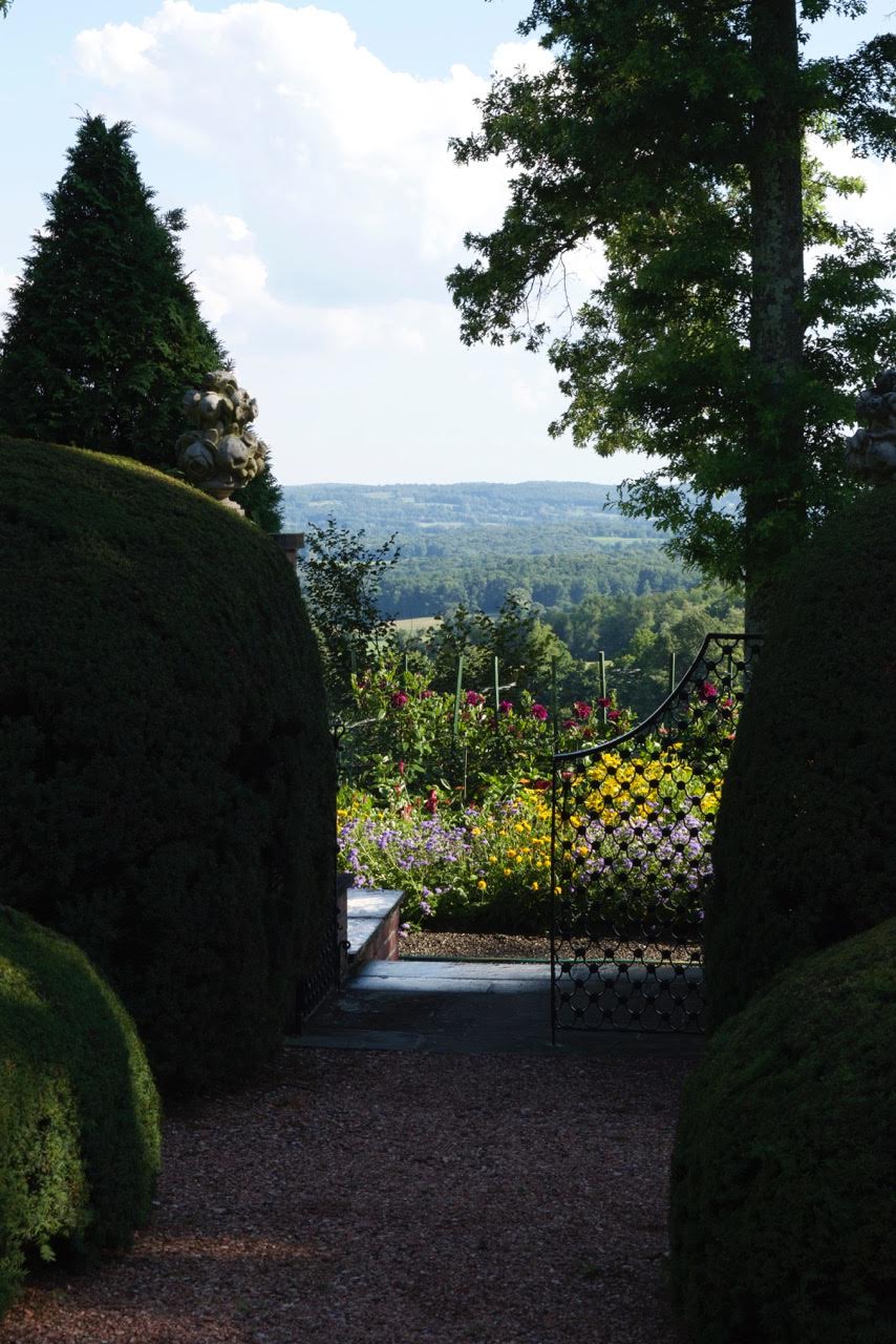
weathsssssThis has everything I love - beautiful house, gardens, landscaped farmland views...and even a Little Oratory! I have just had an email from a former student of mine at Thomas More College of Liberal Arts, Nicole Martin who tells me that she and two other recent graduates, Amy Green and Gracey Lloyd have spent the summer at the Weatherfield estate in New York State cataloguing the art collection.

The estate is 1200 acres, 20 miles of carriage and walking trails, with a three-acre formal Italian/English medieval garden. The house is Georgian style brick and brownstone. As Nicole said to me, 'It is very beautiful and very interesting!' It certainly is.

The late owner Chauncey D. Stillman was of "old" New York money and he built up this estate in 1950's and 60's. He converted to Catholicism and gave generous donations of money to the church and Catholic organizations (including Thomas More College).

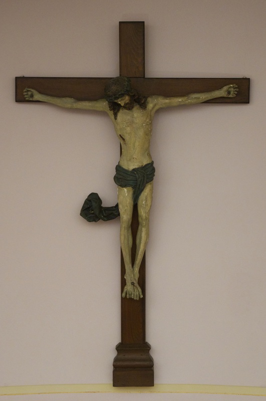
The estate website tells me that the chapel, which he called his 'Oratory' (I am liking this more and more!) contains a painting by the Spanish baroque master, Murillo; a 16th century Swabian crucifix and a mannerist painting from the school of the 16th century Greek painter based in Spain, El Greco.

What a place to spend a summer. Thank you for sharing this with us Nicole!

Weath


Weathsss


weesssss


wweathers


Weathers


wee16thcentury swabian crudfix


weeeths murillo


weeethere


weeesss


weeeee


weathsssss


we


— ♦—

My latest book the Way of Beauty is available from Angelico Press and Amazon.

JAY W. RICHARDS, Editor of the Stream and Lecturer at the Business School of the Catholic University of America said about it: “In The Way of Beauty, David Clayton offers us a mini-liberal arts education. The book is a counter-offensive against a culture that so often seems to have capitulated to a ‘will to ugliness.’ He shows us the power in beauty not just where we might expect it — in the visual arts and music — but in domains as diverse as math, theology, morality, physics, astronomy, cosmology, and liturgy. But more than that, his study of beauty makes clear the connection between liturgy, culture, and evangelization, and offers a way to reinvigorate our commitment to the Good, the True, and the Beautiful in the twenty-first century. I am grateful for this book and hope many will take its lessons to heart.”


September edition of the Adoremus Bulletin now out

AdoremusTitle-1I have just heard that the latest edition of the Adoremus Bulletin is available. As usual there are many points of interest concerning the liturgy in particular details of preparations for the liturgies for the upcoming visit of Pope Francis; and about the new translation of the Order of Confirmation.

One piece that caught my eye is the reproduction of an article by Virgil Michel, OSB written during the Depression entitled City or Farm?. In this he describes the importance of an awareness of nature and man's place within it. He is an advocate of back-to-the-land movements in the context of the typical cityscape of 1939. He describes how people were so unaware of where their milk came from that a cow was paraded through the streets of one metropolis in order to show them.

In the accompanying and thoughtful commentary the writers (the 'Adoremus Editors') point out, that this is a subject that is important 'not only for its own relevance to the life of grace generally, but as a topic supremely relevant to the celebration of and participation in the Church’s sacred liturgy'. The glory of nature directs man to God, reflects the pattern of our worship and inspires us to want to do so.

Some may feel that the cities of 2015 are not much better - I guess it depends on which city and which part the city we want to focus on. I can think of cities are at both ends of the spectrum. Nevertheless the points that Virgil Michel makes will almost certainly resonate with many today. I think that the editors hit the nail on the head when they comment on this and say: '..it must be acknowledged at the same time that the city is also a key locus for the Christian faith. It is toward the heavenly city of Jerusalem that we journey (Rev. 21:2).'

For my part, I think that the answer to the question, city or farm? is neither one nor the other but both. The ideal is a society in which each has his part to play and this incorporates city and farm...and garden! This is the glory of man in harmony with the rest of creation in which both the culture and the cultus (field) point to the cult (the liturgy) and each is derived from the forms contained within the liturgy.

The link to the Adoremus website is here; while the link through to the online presentation of the Bulletin itself is here.

 The cover image of the bulletin has wall panel from the Newman Center at Lincoln, Nebraska. Love this depiction of the dove of the Holy Spirit with the Romanesque style design behind it. This image speaks to the discussion on the Sacrament of Confirmation.

Newman center.2
and here's the full panel in situ:
newman full

Film review: A Walk in the Woods

a-walk-in-the-woods-robert-redford-nick-nolte-a-wa1 (1)All films need a good story. This one is funny, it has great acting, has beautifully photographed scenery...but it isn't enough because there isn't enough plot to keep you interested.  One of running themes in the arts when I was living in Britain was about just how unsuccessful the British film industry is. We seemed to have good actors who seem to be able to compete with the Americans. Our guys cans can knock Shakespeare out the summer-festival park; and we could make great TV adaptations of Jane Austin novels and our TV advertising is much cleverer and more sophisticated and wins awards all over the world for art direction. But our film industry is a dead loss. No one seems to want to go to see the films.

One view as to why came from a Brit who directed box-office hits in Hollywood called Michael Winner (who made Death Wish films starring Charles Bronson in the 1970s). He said that the difference between British film makers and their American counterparts was that the Americans tried to make films that were commercially successful, whereas British filmmakers tried to make films that would impress their friends at dinner parties, and unfortunately that's all they manage to impress.

If you were characterize what he is getting at, British (and European film) tries to be high art, while American film tries to entertainment. I think he's right. I go to see movies because I want to be entertained first, and for all the Shakespearean talent they employ, and no matter how deep and profound the character development, often as not I find British and European films dull. I studiously try to avoid anything with subtitles. I know I'm going to find them self-consciously arty and as dull as watching paint dry...there was even Spanish film about watching paint dry called the Quince Tree Sun. This is possibly one of the dullest movies ever made. It won loads of awards of course.

quince tree sun - cinema quad movie poster (2).jpg

What seems to be forgotten by the Europeans is that film is basically a medium for telling a story, and if you don't have a good story well told, you don't have a good film. This is the problem with A Walk in the Woods. It is an American film, but it seems to be suffering from the British disease!

It is based on the book by the travel writer Bill Bryson about walking the Appalachian Trail. I went to see it because I like Bill Bryson's books. Each one is usually a serious of very amusingly related stories and encounters. The only threads connecting each event are Bryson's presence and the place where the book is set. This seems to work in the books, but it just doesn't work in this film. There just isn't enough plot -  we want a logical transition from beginning, to middle and to end - to hold it together and it isn't there.

a-walk-in-the-woods_Nolte_Redford

The jokes are funny, Robert Redford is good as the laconic, deadpan Bryson; Nick Nolte is brilliant as his bad tempered companion. The encounters with bears and with eccentric walkers in the trail are hilarious, and the scenery is beautiful. But in the end we really can't work out why these two guys who are so obviously unsuited physically for the job are trudging this 1,000 mile trail from Georgia to Maine; or what makes it interesting enough to film it. Finally, it seemed neither could the characters. It finished with Redford asking Nolte, 'You want to go home don't you?' At which point Nolte answers, 'Yes.' And they leave the trail. Nolte catches the greyhound back to the Midwest, Redford to Hanover, New Hampshire...and that's the end of the film.

It also the end of this review.

A walk in the


0

St Matthew the Evangelist from the Lindisfarne Gospels - lessons for all who wish to pray...and for all who wish to paint

Matthew.LindisfarneTo mark the Feast of St Matthew here is the illumination from the 8th century British manuscript (the original is in the British Library). There are profound lessons here for those who wish to pray, and for those who wish to paint...or both. This simple painting, which is over 1200 years old and was created by an obscure monk working on a bleak island of the northeast coast of England in the North Sea can tell us so much. It reveals truths about St Matthew, and from its style we can discern things about the whole history of Christian art. These are lessons that budding artists can apply today, even if we want to paint in completely different styles such as the baroque. Matthew.Lindisfarne

To be able to see these things in the painting we will look first at the historical context. This little painting even tells us about the history of Britain! Art historians - (and the font of all knowledge, Wikipedia of course!) - will describe the style of this art as 'insular' or 'hiberno-saxon'. This refers to the Celtic style of art and literature of the Christians who remained in the British Isles and Ireland after the retreat of the Romans. It is viewed as 'insular' in two ways - first more literally as it belongs to the islands of Britain and Ireland; and secondly because it is often viewed as a style that is distinct from others of this period. There is a third reason particular to this gospel, in that Lindisfarne, the site of an abbey, is an remote island off the coast of Northumberland in northeast England. The artist of this painting was a monk called Eadfrith and he later became the abbot of Lindisfarne Abbey.

lindisfarne-priory

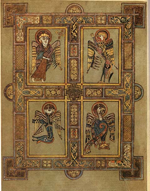
The British islanders who remained after the retreat of Roman troops in the 5th century were culturally Roman and so wrote in Latin. Gradually over the following centuries they were overwhelmed by the incursions of German and Nordic tribes. Even in the 8th century, there were pockets of Latin culture left and most of the Lindisfarne Gospel is written in Latin. In this page 'Mattheus' is in Latin and he is referred to as a saint with the word 'Hagios' (Greek). Matthew is depicted writing his gospel with the figure of the winged man, the symbol of Matthew, standing on his shoulder (imago hominus - the image of a man). This, is one of the four faces of the cherub described by Ezekiel in his vision. Over time Germanic and Viking culture dominated more and more and by the 9th century Latin was not so widely spoken; and so on other pages the original Latin gospel text is translated into the vernacular in red ink. The curtains are present to indicate that the person is inside and are drawn back to reveal the scene to the observer. Some commentaries refer to this as a symbolic unveiling by which the truth is revealed. I have to be honest and say I do not know who the figure peeping out from behind the curtain is. Can anyone help me here? The painting is ink on vellum, made from the skin of sheep. Vellum is a material that is resistant to decay over time and was also very expensive and so rare. This is one reason, incidentally, that so many Icelandic sagas remain I found out recently - because there were so many sheep on Iceland and such a small population, vellum was more plentiful and so unusually they recorded a much higher proportion of their folk tales on vellum and this is how we know of so many today. Tolkien was an expert in all of these ancient forms of British and of the Icelandic language and literature - so this is the world that fired his imagination so strongly. Back to this painting - the style of Lindisfarne gospels art is certainly distinctive. While retaining its unique look, it still conforms largely to the iconographic prototype, which governed Christian art, East and West from about the 5th century through to the 13th century. This is a Western variant, so while it doesn't look like a Russian icon, it still conforms in many ways to the same prototype. So this has the characteristic flatness and lack of perspective that one expects in an icons, revealing the heavenly dimension which is outside space. In order to emphasize this the bench upon which Matthew is sitting is in inverse perspective. He has his feet on a pedestal indicating a holy person. There is one little anomaly however. A feature that pulls it away from strict conformity to the icon is the fact that the symbolic winged man is in profile. Generally, in icons faces are in three quarter profile or full face (like the other two figures) indicative of a saint who is happy to reveal is person to the viewer because in his purified state he has nothing to hide. Generally images from this period conformed fully to the iconographic prototype. Here is a portrayal of the symbol of St Matthew along with those of the four evangelists in the Book of Kells, which was produced about 100 years later and is considered of the same period and style. We can see St Matthew portrayed in three quarter profile, the standard for human forms. I don't know why Eadfrith departed from this in his version. It might be a mistake or even an act of defiance, or perhaps a little bit of ignorance. Kells There is another aspect to this and it relates to how we know what an icon is. What is it that makes an icon rather part of the gothic tradition? Anyone who has done an icon painting class or read a book about icons is aware that there are stylistic principles which govern what they do. What many do not know is that the rules that they are being given are a modern construct. They were for the most part written and popularized in the 20th century. I have researched and asked many people and am not aware of any writings prior to the recent period that represent a codification of the stylistic elements that make in icon an icon, rather than, say, a piece of gothic art. There are no writings by Church Fathers for example. The rules that you come across in the books were devised by a group of Russian ex-patriots in Paris, especially influential were two men called Ouspensky and Lossky. They looked at the images that they judged to be good and worthy of veneration and the devised a set of rules that seem to apply to them to aid people to create art in a similar style in the future. To my knowledge no such code was in existence in writing when Eadfrith was active. We do not know the degree to which the style, which seems to have been preserved by force of tradition, was directly linked to the theology of style in the way that it is presented today. Perhaps, in fact, there was more leeway than we imagine and Eadfrith was just making what would have seemed a legitimate artistic decision. Make no mistake, people such as Ouspensky and Lossky did a great job, in my opinion. they provided a set of guidelines by we have seen the re-establishment of what was in the 19th century a wayward tradition in Russian and Greece, into a strong and clearly defined form so that  icon painters today can be every bit as good as the top icon painters of the past. These Russians were not without their own agenda in setting this down however. They were Eastern Orthodox and deliberately set down the rules so as to reflect their belief that the Western forms of art were inferior ('degenerate' is the term I have heard used to refer to the gothic and the baroque for example) . Catholics should be aware of this. The idea that all sacred art has to look like an icon is, from the point of view of the Catholic Church flat wrong. Unfortunately that doesn't stop many Catholics unquestioningly accepting and repeating the anti-Catholic rhetoric that they have heard in their icon painting class. Contemporary Orthodox commentators are motivated to make Western forms that were created prior to the schism between East and Western Church (around 1000AD) , such as this example of insular art, fit in with the iconographic prototype because it supports and argument that Christian culture was unified before the schism and then fragmented afterwards. Then, the argument runs, we can see that the Eastern Churches remain faithful to the original forms of Christianity, while it is the Roman Church that has veered away. We don't have space here to give the full theology of the image that governs the Western traditions in art, but to give you a general picture of what is legitimate for the liturgy and what is not, I take my lead from Benedict XVI. He said in his book, the Spirit of the Liturgy that the icon is appropriate for the liturgy (in this he agrees with the Orthodox) but in addition, he says, for the Roman Rite, the gothic and the baroque styles are appropriate too. So you can continue to enjoy and worship with paintings in the style of people such as Duccio and George De La Tours. I would say that the one thing where the Eastern Church does lead the West is in the reestablishment of these traditions. We are 60 years behind in propogating a theology of style of the uniquely Western styles, in the way that it has been done for icons. My book, the Way of Beauty, was an attempt to do for the theory of the gothic and the baroque traditions what Lossky and Ouspensky did for the iconographic tradition. Below, classic baroque - St Matthew and the Angel by Guido Reni of the 17th century - with the angel...legitimately... in profile; and the same evangelist by Duccio

— ♦—

My book the Way of Beauty is available from Angelico Press and Amazon.

Guido_Reni_-_St_Matthew_and_the_Angel_-_WGA19308   Duccio     Matthew.Lindisfarne

Film review: the War Room - portraying a suburban alternative to the Benedict Option

War-Room_300It also proves that Christian morality sells - the film making is not that great, but the message is good and that is why it is popular! I went to see this film because I noticed that it has been in the top three in box office receipts since it was released; and because it is clearly Christian in inspiration and is pushing a moral and spiritual message.

The War Room is about a troubled marriage in which the wife begins to pray for her husband and we see how this changes her and in turn her interaction with her husband and their daughter for the good. The plot is simple, the message is moral and uplifting and the portrayal of the prayer, if  a little on the protestant charismatic side of things for my temperament, is authentic, I think. There are no appearances of angels or visions - which while they do happen in reality are not the experience of most people in their relationship with God and so this helps to give the film a down to earth reality. The prayers are answered with happy results that work their way through via positive outcomes in ordinary events. All negative turns in the plot were neatly and happily resolved (and perhaps over simply treated).

The reviews of the film are mixed. Some critics, I sense, are reacting to the message itself which is good and overtly Christian. This can work both ways depending on the personal belief of the critic. Others do seem to be trying to detach from their personal beliefs and critique the quality of the film making. Most of the latter do not like it. Even in my inexpert opinion it could have been a lot better - the dialogue is wooden, the interplay between the characters is superficial and unsophisticated and the jokes are fairly obvious. This is no Christian Woody Allen film...but still, I do think it is worth seeing! I can see why it is popular and despite the negatives, I found myself genuinely enjoying it. I was uplifted by the message and it transmitted a strong affirming message of faith.

War room 16b25577-6c36-4459-a9ad-c1337371f31c

I am pleased that such a film was made and is so popular. What this tells me is that the market for good films is huge and if something like this, notwithstanding the negatives can be so popular, then anything that has the essential elements of truth and is at the same time well made cannot help but be a box office smash. Furthermore, it seems to me, if it were in addition overtly Catholic, then it would have the popularity of the Sound of Music and It's a Wonderful Life all rolled into one.

warroom-mv-2

The 'war room' of the title is the converted closet that became he inner sanctuary of prayer. The young wife in the family posted prayer requests on the wall, prayed and then checked them when they were answered. She had been instructed by an elder mentor to develop a prayer strategy in the real war, which was not as she supposed, against her husband, but against the devil and his influence.

There is a point here for those of the Benedict Option mentality who wish to retreat from society, re-group and then emerge at some point in the future when the next Charlemagne creates a safe environment to be openly Christian. This film is about personal transformation and engagement, rather than withdrawal. I do think that retreat is needed but it is not geographical or cultural, but spiritual. The wilderness is the place where we meet the devil and we deal with him in prayer, then we emerge to engage with society wherever we are now, transformed by prayer. The inner room is the symbol of the place inside ourselves where we pray and engage with our demons. As I was watching I was thinking how a similar film could show the person engaging in the pattern of prayer described by Benedict XVI in his paper on the New Evangelization, and the person was praying not in the broom closet, but to the home altar or icon corner! The film strikes me as being closer to the Benedict XVI Option of personal transformation in Christ by which we transfigure the culture right where we are now; than it is the Benedict Option.

War room

Interestingly, there was an, apparently inadvertent, reference to the need for praying for the dead. I don't know if the protestant film producers did this consciously but as my friend Fr Nick, with whom I went to see the film, pointed out, it probably wasn't  a deliberate pitch for the existing of purgatory (which it can only have reflected in logic). Rather, it reflected something that is innate, a desire to pray for those who are gone, which has been planted in us by God.

I doubt that this film is going to convert many non-Christians, but I think it would act to help reinforce a lukewarm faith - this seemed to be what it was trying to do. The protagonists were just that, people of faith who were not fervent until the events of the story caught up with them. Nevertheless, it is heartening that a film is of ordinary quality in other ways should be so successful. It demonstrates, perhaps, that, despite what Hollywood is supposed to believe, morality sells!

War-Room_300


Images from the Way of Beauty: Christ Enthroned and the Quincunx - Symbolic Images of the Gospels

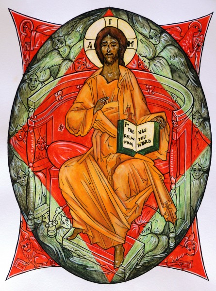
Santa_Croce_in_Gerusalemme_Kosmaten_2009-600x450This week we show images, one is representational are and one is geometric art. First is Christ Enthroned. I painted this for the childrens coloring book, Meet the Angels. It went on the back cover. It shows Christ, as described in the vision of Ezekiel and the Book of Revelaton, enthroned with the four faces of the Cherubim in each corner. Around the throne also are many six-winged seraphim - just wings and faces - and who are transparent so the colours of the background show through. This is a standard iconographic image and if you look on Google images for 'Christ Enthroned' or 'Christ in Majesty' you will see many in this style. It is painted in egg tempera. The almond shape around Christ is called a Mandorla (Italian for almond!) and represents the cosmos.
 

Christ-Enthroned-JPEG-445x600 (1)


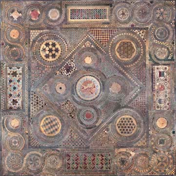
The other images are examples of cut stone floorwork and are geometric designs in the 'Cosmatesque' or 'Cosmati' style. It is named after the Cosmati family which, over several generations, developed this distinctive style of work. If they were covering a large area, such as a whole church floor, they worked on three scales. For the grand form they tended to compartmentalize into rectilinear shapes. Then the sub-form would be a geometric design consisting of faceted polygons or interconnected circles. The final stage would be an infill of with very small repeated regular geometric shapes such as squares, triangles of hexagons (which are the three forms that can put together without creating gaps).

One of the standard designs is the ‘quincunx’. This the generic name for the arrangement of five equivalent shapes that has four arranged symmetrically around the fifth which is centrally place (it is also a game-winning word in Scrabble so it'll pay to remember this, if for no other reason). The five dots on dice, for example, are in a quincunx shape. I understand the name comes from the Latin for five-twelfths, a coin of this fraction value of the currency had this name and often had this arrangement of dots on it.

This one is in Westminster Abbey:

Westminster Abbey, Cosmati floor, photomosaic


..and this is in Santa Croce in Rome:

Santa_Croce_in_Gerusalemme_Kosmaten_2009-600x450


In the context of geometric patterned art, it is the shape of four smaller circles spinning of larger secondary one was not limited to the Cosmati craftsmen. It is seen in both Eastern and Western Churches and across many centuries and was seen in Roman floor mosaics.

What is the connection between the geometric and representational forms?

The answer is that both sybolize the Word of God being taken to the world through the gospels. Around the central image of the enthroned Christ we see four figures representing the four evangelists carrying the Word to the four corners of the world. Wikipedia describes the source as follows:.

'Matthew the Evangelist, the author of the first gospel account is symbolized by a winged man, or angel. Matthew's gospel starts with Joseph's genealogy from Abraham; it represents Jesus' Incarnation, and so Christ's human nature. This signifies that Christians should use their reason for salvation.

Mark the Evangelist, the author of the second gospel account is symbolized by a winged lion – a figure of courage and monarchy. The lion also represents Jesus' Resurrection (because lions were believed to sleep with open eyes, a comparison with Christ in the tomb), and Christ as king. This signifies that Christians should be courageous on the path of salvation.

Luke the Evangelist, the author of the third gospel account (and the Acts of the Apostles) is symbolized by a winged ox or bull – a figure of sacrifice, service and strength. Luke's account begins with the duties of Zacharias in the temple; it represents Jesus' sacrifice in His Passion and Crucifixion, as well as Christ being High priest (this also represents Mary's obedience). The ox signifies that Christians should be prepared to sacrifice themselves in following Christ.

John the Evangelist, the author of the fourth gospel account is symbolized by an eagle – a figure of the sky, and believed by Christian scholars to be able to look straight into the sun. John starts with an eternal overview of Jesus the Logos and goes on to describe many things with a "higher" christology than the other three (synoptic) gospels; it represents Jesus' Ascension, and Christ's divine nature. This symbolises that Christians should look on eternity without flinching as they journey towards their goal of union with God.'

One of the reasons that the Church settled on four gospels was to emphasis this symbolism (see St Irenaeus writing in the 2nd century AD in Against Heresies). The quincunx also symbolizes Creation, as the number four represents the cosmos. The symbolism is of, again the four corners of the world - Christ spoke of the 'four winds' and the symbolism of the four points of the compass comes from this.

Sassoferrato's Virgin at Prayer - for the Nativity of the Blessed Virgin Mary

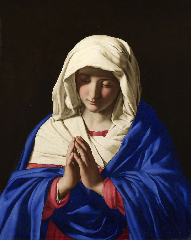
Sassoferrato_-_Jungfrun_i_bönFor today's Feast of the Birthday of the Blessed Virgin Mary here is the Virgin at Prayer by the Italian artist Giovanni Battista Salvi da Sassoferrato who is generally known simply as Sassoferrato. He lived from 1609 to 1685. Records of the commemoration of the Nativity of the Blessed Virgin Mary on September 8th go back to the 6th century. The Solemnity of the Immaculate Conception of Mary was later fixed at December 8, nine months prior.

There is a commentary on the Feast from the following information is drawn, here, by Fr Matthew Mauriello: 'The primary theme portrayed in the liturgical celebration of this feast day is that the world had been in the darkness of sin and with the arrival of Mary begins a glimmer of light. That light which appears at Mary's holy birth preannounces the arrival of Christ, the Light of the World. Her birth is the beginning of a better world: "Origo mundi melioris." The antiphon for the Canticle of Zechariah at Morning Prayer expressed these sentiments in the following way: "Your birth, O Virgin Mother of God, proclaims joy to the whole world, for from you arose the glorious Sun of Justice, Christ our God; He freed us from the age-old curse and filled us with holiness; he destroyed death and gave us eternal life.

'The second reading of the Office of Readings is taken from one of the four sermons written by St. Andrew of Crete ( 660-740 ) on Mary's Nativity. He too used the image of light: "...This radiant and manifest coming of God to men needed a joyful prelude to introduce the great gift of salvation to us...Darkness yields before the coming of light."

This painting, like the painting of Gregory the Great by Vignali, described last week, is in the baroque style of the 17th century. Again, we see the sharp contrast between light and dark symbolizing the Light overcoming the darkness, and again like the Vignali, the face is in partial shadow ensuring that this is distinct in style from a portrait (I described the reasons behind this in more detail in the earlier posting). There is an additional element here in the portrayal of the face that was not so strongly present in Vignali's painting. The facial features are highly idealized and bear the likeness of the ancient Greek classical ideal.

Sassoferrato_-_Jungfrun_i_bön Sassoferrato's training and influences were all in the classical baroque school. This is a stream within baroque art that looks to Raphael from 100 years before as its inspiration. Raphael's faces, in turn, strongly reflected the classical Greek ideal and this was picked up by the Caraccis in the late 16th century (most famously Annibale) who founded a school from which most of line of influential figures in the classical baroque line emerged.

All Christian sacred art must have a balance of idealism, which points to what we might become; and naturalism which roots the image in the particular and what we see and know in the here and now. The different styles of Christian sacred art look different from each other because they look to different sources for their ideal, and because of the exact balance of idealism and naturalism they reflect. Baroque classicism is called so to distinguish it from 'baroque naturalism' in which, though still partially idealized in accordance with what is good for Christian sacred art, has a greater emphasis on natural appearances. Ribera would be an example of the naturalistic school and Poussin was one of the most famous proponents of baroque classicism.

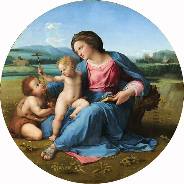
We can see the similarities in the facial features of the Sassoferrato Virgin, Raphael's Alba Madonna (which I describe in more detail in a posting here) and the ancient Greek statue the Venus of Arles from the Louvre. This strong idealization is another way that the artist ensures that portrayal of Our Lady is a piece of sacred art and avoids it looking like a portrait of the girl from next door dressed in historical costume.

600px-RaphaelAlba

Here is the Venus of Arles:

Venus_of_Arles_Louvre_Ma439_n04

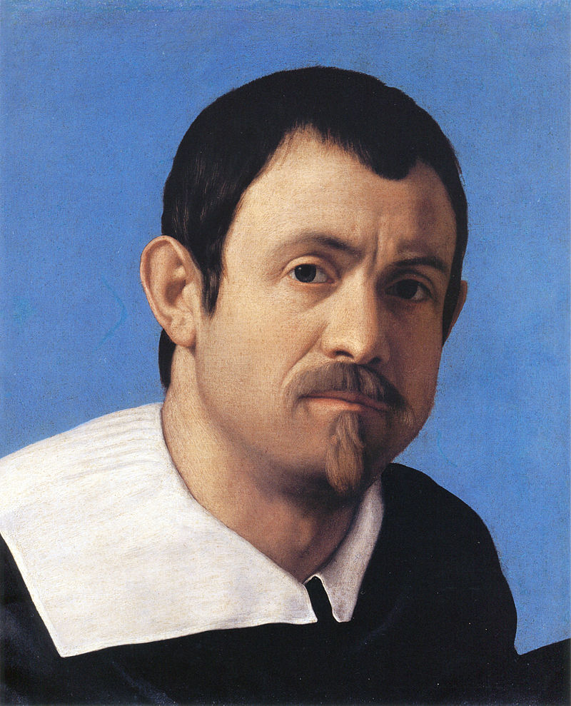
We can see the difference between the way in which sacred art and mundane art are painted by contrasting what these works with Sassoferrato's self portrait. Notice how in the portrait the image engages the viewer much more directly and we look deeply into his eyes, the deep shadow is absent and background is blue rather than black so the contrast between light and dark is not so pronounced. There is still some shadow in the face certainly - this necessary in order to describe form - but it is not so marked. Also there is not such an obvious fusion of the natural features of the face with those of the Greek ideal as we would see in the sacred art.

Sassoferrato Sassoferrato's Virgin is in the National Gallery in London and I have a great fondness for it, even long before my conversion, it was one of those paintings that I always made a point of going to look at every time I visited the gallery. As a gallery that has no entrance fee, I often used to just drop in for 20 minutes on my way home from work, or even sometimes just to escape the rain! The peaceful repose and expression of Our Lady, which is even more apparent if you see the original, always drew me in.

Sassoferrato_-_Jungfrun_i_bön

— ♦—

My book the Way of Beauty is available from Angelico Press and Amazon.

JAY W. RICHARDS, Editor of the Stream and Lecturer at the Business School of the Catholic University of America said about it: “In The Way of Beauty, David Clayton offers us a mini-liberal arts education. The book is a counter-offensive against a culture that so often seems to have capitulated to a ‘will to ugliness.’ He shows us the power in beauty not just where we might expect it — in the visual arts and music — but in domains as diverse as math, theology, morality, physics, astronomy, cosmology, and liturgy. But more than that, his study of beauty makes clear the connection between liturgy, culture, and evangelization, and offers a way to reinvigorate our commitment to the Good, the True, and the Beautiful in the twenty-first century. I am grateful for this book and hope many will take its lessons to heart.”