As a regular photo feature, I am going to post a photo of a building that displays clear harmonious proportion. Each time I will contrast it with something either monotonous - with dull even spacing; or cacophonous, which has random proportions. For more information on the mathematics of beauty and proportion see my book, The Way of Beauty or the Mathematics of Beauty course at Pontifex University, which goes into even greater depth. This course is offered both for Master's credit or Continuing Education Units. These trace the development of this field back to the ancient Greeks and Romans and early Christian figures such as Boethius and Augustine.
Today here is the side view of the Parry Mansion, an 18th-century house in New Hope, Bucks County, Pennsylvania, which is now preserved in historical form and houses the local historical society. I took the side-on snaps myself on a walk around the town. The engraved stone block set into the structure up high say Benjn Parry 1784.
The windows show a perfect chord in stone. Three different magnitudes work together visually like three notes in a major triad. As we move upwards we get a sense of the rhythm: the first relates to the second as the second relates to the third. For some context, I have added photos of other views below too.
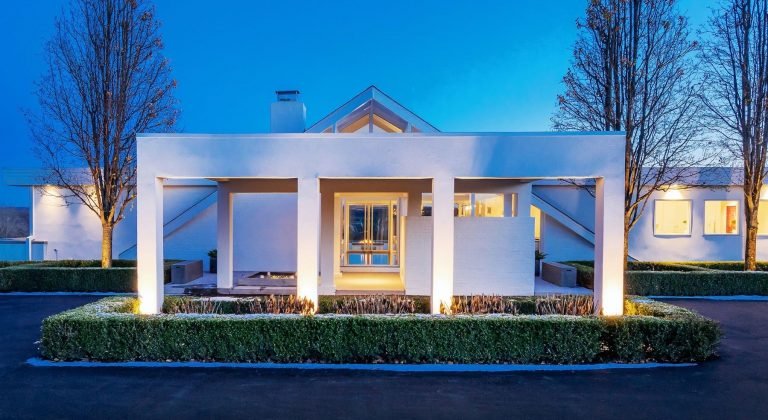
And in contrast here’s some cacophony. This house has random proportions. The porch doesn’t fit the entrance and bears no relation to the windows to the right. It’s probably a nice house to live in, as as long as you are inside you only have to look out from it and so don’t need to be worried too much about how ugly it looks
It has clean-cut sharp lines that give it some attractiveness, perhaps, when viewed in isolation, but there is no discernable pattern of proportion here that relates the parts to each other. I want to strip that porch away so that I can see what the rest of the house looks like! Similarly, its randomness means that it will be almost impossible to harmonize its design with other buildings around it and so will make the neighborhood look random and ugly, with houses that bear no relation to each other. It will sit unhappily in a natural setting too, looking like a concrete scar on the landscape, for the dimensions of traditional harmonious proportion, which this artist rejected are based upon the observation of the cosmos. The only way to stop it from looking as though it doesn’t belong is to remove as much nature from around it as possible - as has been done here and hide the view of nearby buildings: or alternatively to have so much climbing ivy and shrubs that the proportions of the building itself are hidden from view altogether.


