Soft geometric art

The Treasury of Ornament - Pattern in the Decorative Arts, by Heinrich Dometsch.

Here is a book worth considering for students of traditional patterned art. The series is the Library of Design and the title is Treasury of Ornament - Pattern in the Decorative Arts by Heinrich Dolmetsch.  This and a number of similar books by the author are available here. I came to it by way of one of the freshman students at Thomas More College, Meg Berger, who has a personal interest in these traditions. It is a recent publication of a book first produced around the turn of the last century in Germany, the first English edition coming out in 1908. Each plate is an arrangement of up to 15 or so different patterns from different original sources in each classification discussed. He covers both 'hard' geometric patterns and 'soft', more calligraphic forms in ancient non-Christian and Christian traditions, East and West. Particular examples are numerous plates in each category of Egyptian, Greek, Roman, Chinese, Japanese, Arabian, Turkish, Persian and Indian. Two thirds of 85 plates are Christian covering Celtic, Western 'medieval', Byzantine, and Renaissance styles.

This will be of interest, I think, to those who are seeking to re-establish (or perhaps one might say at the very least reinvigourate) the Christian tradition of geometric and patterned art. While one does not want to look exclusively at Christian traditions now any more than those who formed these traditions in the first place did, one must look discerningly at the art of non-Christian cultures. The principle of universality is very important in this process of discernment. (though not the only one). The task, therefore in studying the art of other cultures is to try to separate out the universal qualities from the parochial. This is not absolutely straightforward. We might look for visual elements that are common to all of course. That is helpful, but also restricting because as every general principle is manifested through the creation of a particular example it might cut out some forms that are worthy of consideration even though unique.That is because principles are unchanging, but their application is not. We might have two distinct forms that neverthless participate fully in one governing principle. In other words the idea behind two things that look quite different, might be the same. It is that idea that we are trying to discern.

A way of looking at universality was described to me recently by Thomas More College's Composer i Residence, Paul Jernberg. As a composer he is always trying to create new applications of the general principles that define sacred music. He talks of particular forms, with plainchant being the best exemplar, that might characterise a time and place, but nevertheless are accessible to people who are not from either. Universality, is therefore, another way of describing this noble accessibility.

In the context of art, a lot of this will be a judgement call on the part of the artists. We cannot always define precisely what it is we are looking for, but that does not mean we should not try. If we ask the question, at least, will this appeal across different cultures, then we are more likely to get a satisfactory result.

The images below are, from the top: Byzantine, Chinese, French Renaissance, Italian Renaissance, Arabic-Moorish, and Italian Renaissance pottery.


The Quincunx - a Geometric Representation of Christ in Majesty

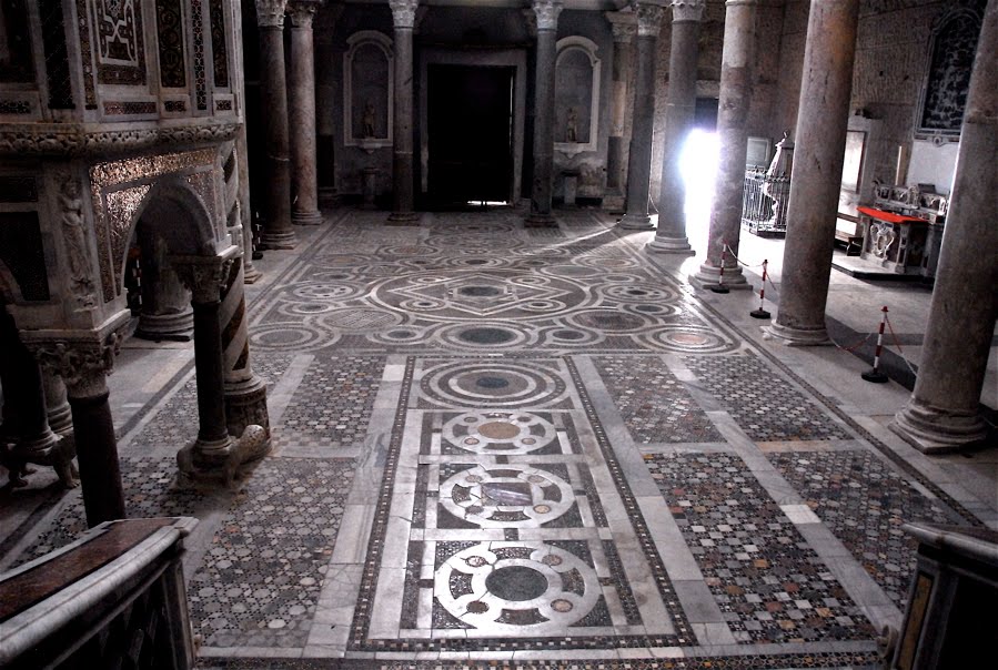
One of my hopes for the cultural renewal is the revival of a Christian form of geometric patterned art. With this in mind I have done my best to study past work, and try to discern the principles that underlie its creation. I wrote about resources that help in this respect in a previous article, here. If tasked with the design of an ornate sanctuary floor now, for example, how might one go about it? One approach, which was used by the Cosmati craftsmen of the middle ages was to have a large design for to fill the whole shape and then to infill with a variety of different geometric patterns. The Cosmatesque style is named after the Cosmati family which, over several generations, developed this distinctive style of work. If they were covering a large area, such as a whole church floor, they worked on three scales. For the grand form they tended to compartmentalize into rectilinear shapes. Then the sub-form would be a geometric design consisting of faceted polygons or interconnected circles. The final stage would be an infill of with very small repeated regular geometric shapes such as squares, triangles of hexagons (which are the three forms that can put together without creating gaps).

Cathedral of Sessa Aurunca, 13th century

One of the sub-forms is called the ‘quincunx’. This the generic name for the arrangement of five equivalent shapes that has four arranged symmetrically around the fifth which is centrally place (it is also a game-winning word in Scrabble so it'll pay to remember this, if for no other reason). The five dots on dice, for example, are in a quincunx shape. I understand the name comes from the Latin for five-twelfths, a coin of this fraction value of the currency had this name and often had this arrangement of dots on it.

In the context of geometric patterned art, it is the shape of four smaller circles spinning of larger secondary one was not limited to the Cosmati craftsmen. It is seen in both Eastern and Western Churches and across many centuries. I am going to setting my class at Thomas More College the task of designing and drawing a sanctuary floor based upon this design later this term.

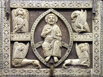
In some respects the quincunx can be thought of as the geometrical equivalent of the traditional image of Christ in Majesty. Around the central image of the enthroned Christ we see four figures representing the four evangelists carrying the Word to the four corners of the world. One of the reasons that the Church settled on four gospels was to emphasis this symbolism (see St Irenaeus writing in the 2nd century AD in Against Heresies). The quincunx also symbolizes Creation, as the number four represents the cosmos. The symbolism is of, again the four corners of the world - Christ spoke of the 'four winds'; and the four ‘elements’ of the ancients from which all matter is comprised. These elements are fire, water, earth and air. In modern science the work element has come to mean something more specific than this. However, this does not invalidate this symbolism, to my mind, for they still symbolise very well, I feel the phases or states by which modern science categorises matter – solid, liquid, gas and energy (or alternatively plasma).

In his book on the Westminster pavement, which is the one example of Cosmati work in England, Richard Foster suggests that the inscriptions indicate that rather that signifying Creation, the quincunx signifies the final end. That is, rather than emanating from God, all is returning to God.

An 8th century German manuscript showing Christ in Majesty

A 13th century French  ivory carving, in the Musee de Cluny

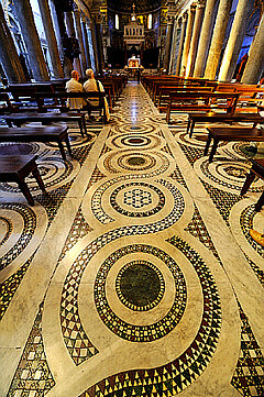
A sub-form of interconnected circles other than a quincunx, at S Maria in Trastever, Rome

Is there a place for Celtic art today?

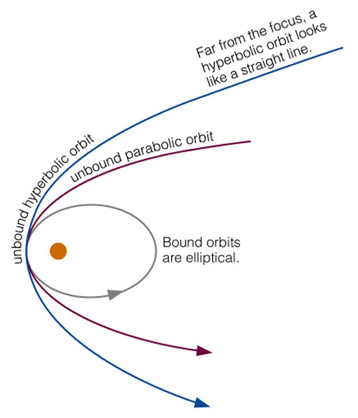
I have written a number of articles about ‘hard’ faceted patterned art and how it manifests sacred number, here. There is another decorative art tradition which might be termed, in contrast, 'soft'. This has the flowing and spiraling lines that we are accustomed to seeing in what generally seems to be referred to as Celtic art (although digging around, I have find Anglo-Saxon manuscripts that look similar to me). I am talking of manuscripts such as the Book of Kells or the Lindisfarne Gospels. However, it is not confined to this period, Romanesque, gothic and even the baroque periods had their own versions. It is non representational, but to me evokes the natural world in two ways. First it looks like the twisting and swirling shapes of vegetation, perhaps a creeping vine. This graceful, calligraphic flow of line gives it great beauty. Second, I am reminded of the mathematical functions that describe the natural world. I studied physics at university and the parabolas, hyperbolas and elliptical curves that are used in the mathematic description of the natural order (here in astro-physics) so often seem to jump out at me from these elaborate designs. Considering now exclusively the 'Celtic' style. It has an appeal way beyond sacred art and there are many artists today working designs directly inspired by these forms into media ranging from tattoos to jewelry. There is also a strong association with new-age-crystal ‘spirituality’. As a result, I find it difficult not to associate most modern attempts at sacred art incorporating this style with 1970s-vintage folksy Masses trying too hard to be trendy. Despite this, given the striking beauty and broad appeal today of the originals, I do think it is worth considering how we can use it for a genuine Christian purpose. Looking at reproductions of the old manuscripts, the decoration is not usually produced in isolation but as an embellishment on something else, a cross, script or figurative art. I am particularly interested in the figurative art because it is an authentic Western variant of the iconographic form. It is interesting to me that their figurative work not only has a decorative additions such as border (which other Christians have also) but their representations of the human form incorporate the swirl and flow into the lines as well. This makes them as highly stylized as any iconographic form that I know. (Interestingly, and I have no explanation for this, I cannot find images of Our Lady or Our Lord in this style.) As a result of this high level of abstraction, and correspondingly low level of naturalism, the form is even more two-dimensional than other iconographic forms.

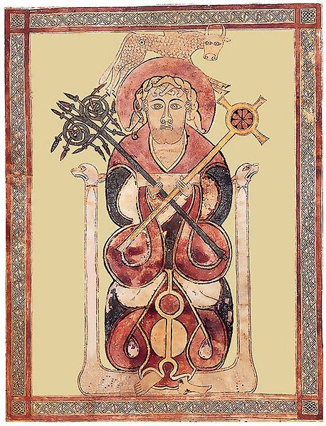
If you have the figure in any pose other than straight on (we see St Luke from the Lichfield gospels left), staring out of the page, then it becomes very difficult to incorporate it succesfully. First, the image relies on a balanced symmetry to work. As soon as the figure is rotated, perhaps to three quarter profile, it makes it asymmetrical to a degree that erodes this balanced harmony. Second, the more that you introduce poses in the figure that are not face on, then more that you need the illusion of space in the image to describe the form. Take the simple example of a face in three-quarter profile; that is slightly rotated. Due to the rotation of the head, one eye is further away from us than the other. In order to make this read, usually the artist will make the more distant eye slightly smaller than the nearer one and in doing so introduces a slight natural perspective. Consequently a few inches of illusionary depth is introduced into the image. If trying to work in this ‘Celtic’ style, the artist then has to consider how to apply this rotation to the decorative element, which has an unavoidably flat, two-dimensional form. It is very difficult to accommodate both while retaining a sense of consistency in style. Any artist today, who is not naturally working in this style, living and breathing it as it were, will find these poses very difficult to create without them looking out of place. (The masters of the past did mange it, however, the four evangelists of the Lindisfarne gospels are not drawn front. St Luke is shown below.)

For a similar reason, this style does not lend itself to narrative imagery. In order to relate, for example, a scene from the life of the saint, each figure to turn and interact with others in the scene. The problem of style consistency in these scenes would be harder again for a the modern-day artist. I was very interested recently to see the work of Daniel Mitsui. He is unusual in that he is trying to recreate the figurative art in this style (not just the decorative swirly parts). I recently had a discussion about him because I saw examples of his work and liked them. I contacted him because I wanted to encourage him to do more. His ‘In principio’ and the St Patrick work well I think. The figurative piece is clearly based upon the traditional form (with figure fully facing us). It has also a contemporary feel, but this, in my opinion, doesn’t detract. His St Columba works less well. The face of the main figure is fine, but the narrative scenes below the main figure are struggling to grapple with the difficulties I describe above. As a rule, I am very reluctant to focus on any negative publicly. However, with his permission that I bring them to your attention, because I think it illustrates exactly the way in which artists learn, by doing it first, then analyzing (often with the help of others) and finally, one hopes, learning from these early attempts we can go on and produce even better work.

There is the question also, even assuming we can master this style today, as to where it is appropriate. I find it difficult to imagine a 6ft mosaic or fresco in a church in this style. I can see it, however, working in the setting from which we draw most of the originals, in books - say a Book of Hours or lectionary.

Above, three pieces by Daniel Mitsui.

Below, St Matthew, Book of Kells