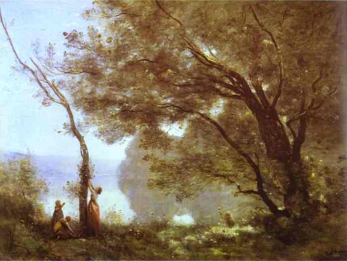
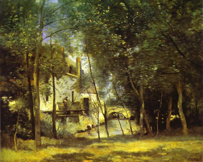
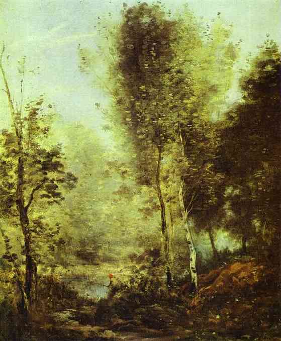
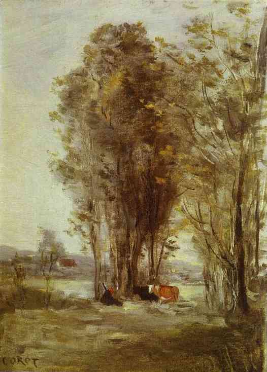
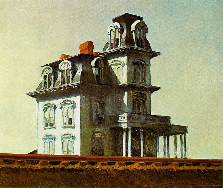
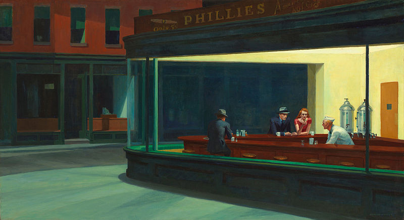
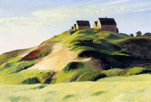
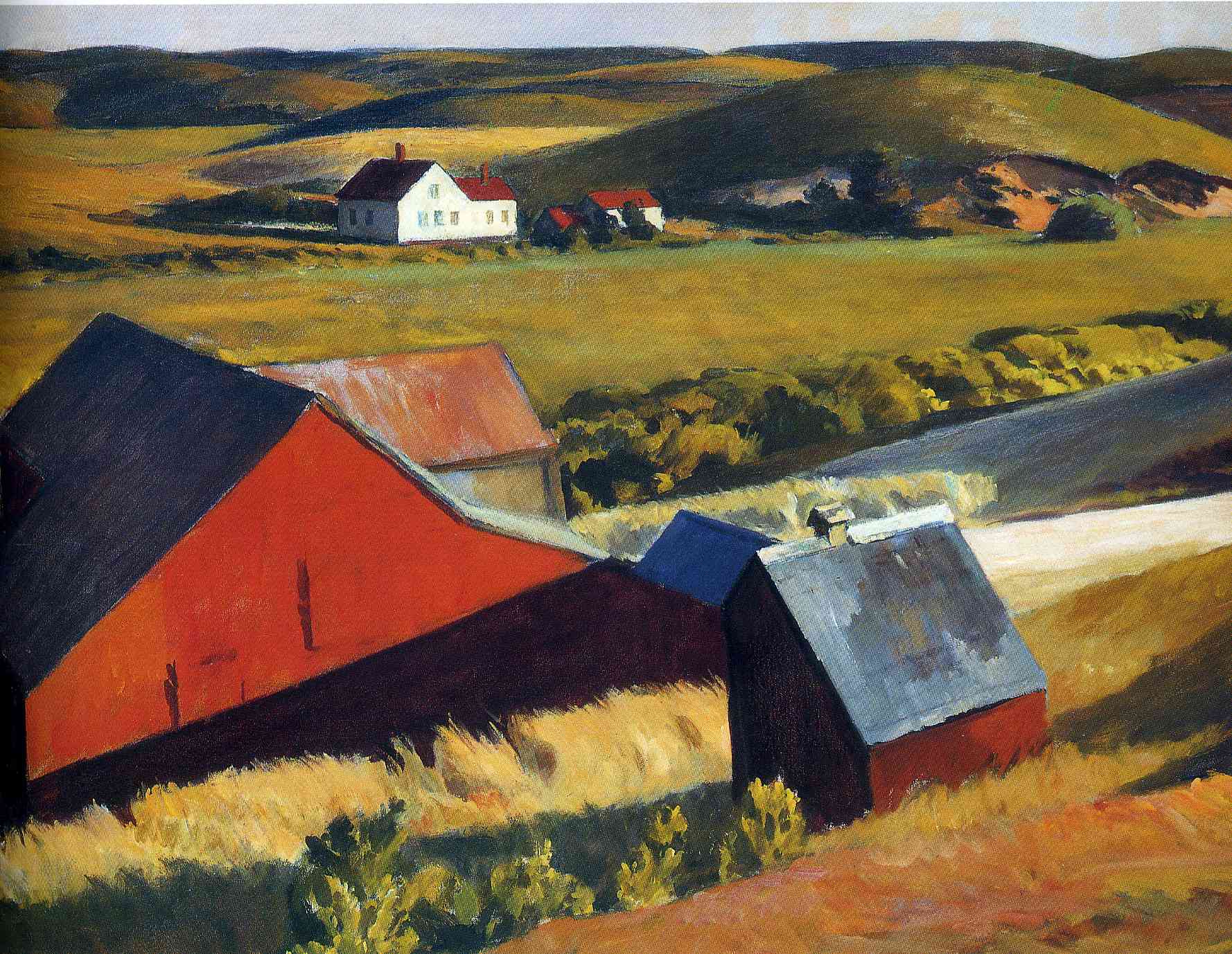
These obstinate pioneers all bucked the trend, by painting well in traditional styles. They also made a good living by selling their work because it was beautiful and of high quality.
Baroque Landscape: Jean-Baptiste-Camille Corot
 I can only marvel at the work of French artist Corot (1796-1875). He follows that baroque format of variation in focus rendering much of out blurred and out of focus. In this respect some might liken him to the Impressionists who followed him. But to my eye he differs in that he retains the sense of a sharp focus. There are enough edges and sharp contrasts for give the roving eye places to rest comfortably. Corot was part of movement of landscape painters, called the 'Barbizon' (after a village near Fontainbleau Forest where they gathered). They consciously modelled their work on John Constable's landscapes and ideas. Constable's work had been popular in France and he had exhibited his work there. I think that my comments on his approach are, not surprisingly, similar to those I made in regard to Constable. For example, he tends to work tone into the natural colour of what is being painted, greens, for example, of the landscape. However, Corot seems to have developed further what Constable did and is perhaps even more masterly in his ability to combine all these competing considerations in a unified beautiful image. His rendering of foliage and especially the appearance of trunks and branches within the form of the tree or shrub is immensely skilfull. I would refer those who haven't read them to my other articles on baroque landscapes in previous weeks. Beyond the general comments about landscape I have very little to say other than just enjoy the beauty of his work.
Baroque Landscape
Baroque Landscape: Chinese Baroque!
Romantic Baroque: the Landscapes of William Turner
19th Century Baroque: the Landscaps of John Constable
The Landscapes of John Constable
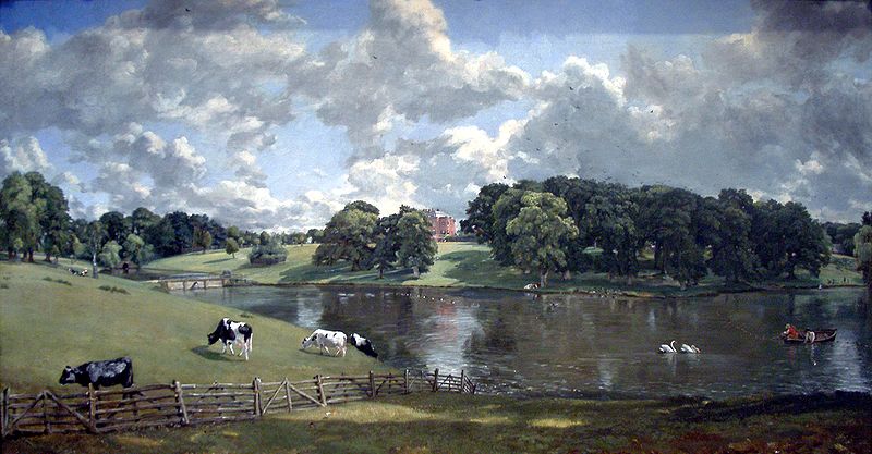
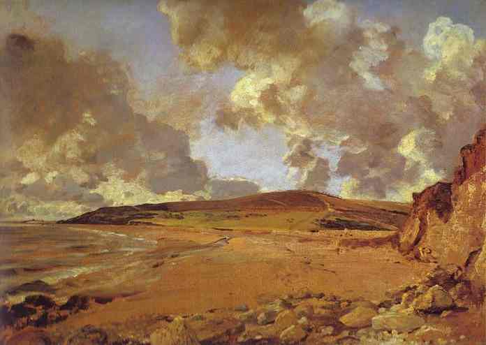
 There are two difficulties with baroque landscape. First was the inclination in the 17th century baroque to represent those areas where the colour is muted in sepia. This meant that they very often gave the appearances of very deep shadow everywhere that was not the primary focus of interest. Second was the technical difficulty in describing the form of trees and foliage. It may sound like a small thing, but anyone who has ever tried to paint trees will know that they are fiendishly difficult to represent. The artist must give the sense of a united form, like a sponge, but also of one composed of many individual leaves. The paintings of trees from the earlier period tended, to my eye, to look to 'feathery'. They focussed too much on the detail and not enough on the overall form. Turner overcame this in an idiosyncratic way by adopting the colour theories of Geothe for his tonal representation and, as far as I can see, avoiding painting any trees at all! Other artists overcame this problem by representing the tonal areas in a muted version of the original colour. So, in landscape this usually means toned down greens - grey greens, blue greens, brown greens although sometimes retaining sepia for deep shadow when the composition requires it. As with Turner, the choice depends upon two factors: consideration of whether or not the area being painted is in sunshine or shadow; and how far in the distance the area is. Distance and degree of illumination both of these factors affect our perception of colour and tone and so these two variable must be reflected in any scheme that the artist devises. John Constable (1776-1837) is happy to use compositions that involve deep shadow in the foreground and he uses sepia for these areas. But he also renders areas in sunshine well. He also seemed happy to turn his hand to a wide variety of landscapes and seascapes. His watercolours or sketches, painted in situ are of interest to the modern eye (or mine at least) because of the spontaneity with which they are rendered. These would not have been considered finished works of art at the time but preparatory works for the pictures done in the studio.
This is speculation on my part, but I wonder if this use of watercolour especially as the means of capturing the moment is influential the form of the finished works of the artists of this time. The finished studio based work will have been a composite of detail from a number of spontaneous sketches - and so in this case oil paint copies of watercolours. Turner almost seemed to use oil paint as though he was painting in watercolour - lots of thin washes.
Constable is one of the first that I know of to be able to render the balance of broad form and detail in foliage and trees well. He simultaneously represents the broad shape through light and dark, and provides some detail without overloading it, importantly, in a way that allows that mind to infer what the whole is comprised of. This is one of a series of article intended to read as such: Baroque Landscape Baroque Landscape: Chinese Baroque! Romantic Baroque: the Landscapes of William Turner Paintings above, from top: Lighthouse at Harwich; Wivenhoe Park
View of Salisbury
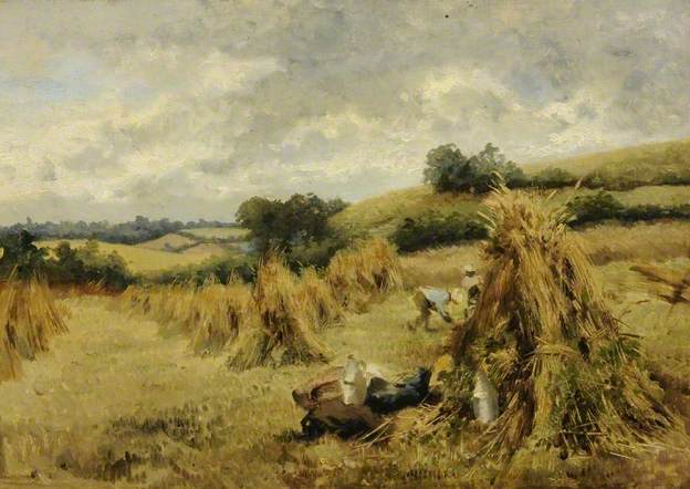
Cornfield
Weymouth Bay
Brighton Beach with Colliers
Romantic Baroque: the Landscapes of William Turner
 It might seem contradictory that the landscapes of the Romantic movement (with which William Turner’s work is usually associated) are so beautiful. The Romantics of the 18th and 19th century were responsible in many ways for destroying the traditional forms that preceded them and opened the way to ugliness of modern art. Their emphasis on personal feelings and especially intense emotion of the artist is contrary to the traditional idea of painting in conformity to objective standards for the greater glory of God.
There is a desire to communicate emotion in the baroque also, but it is not the emotion of the artist that is emphasized. Rather, it is the emotion of the person painted or sculpted that is portrayed. Bernini’s St Theresa of Avila, for example, reveals her emotional state, not his.
Subjectivity is not necessarily a bad thing however: when those subjective feelings coincide with what is objectively true, there is the possibility of something good. Broadly speaking, this is the case for Romantic landscapes, provided the desire of the artist is to communicate the beauty of nature (and other things being equal). The training the artists received in the 18th and 19th centuries was essentially the same as that from the previous period: which was an adaptation of the academic method - originally developed for the study of the human person -for landscape. It transmitted the baroque visual vocabulary of form without departing from core Christian principles (although steadily becoming more and more detached from a Christian understanding of them).
 As mentioned before, baroque landscape employed control of focus and intensity of colour that corresponded to the way that the human person naturally perceives the world around him. The inclination in the 17th century baroque was to represent those areas where the colour is muted in sepia. This meant that they very often gave the appearances of very deep shadow everywhere that was not the primary focus of interest. This of course, is not always appropriate. To overcome this artists started to become more sophisticated in the range of colours they used for those areas rendered tonally.
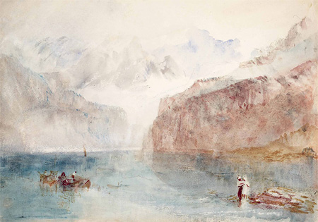
The great English artist, William Turner developed a striking answer to the problem. Drawing on the colour theory of Goethe, he developed a system in which he rendered form tonally, but in a variety of colours rather than just sepia. It is not easy to discern a strict format, but broadly speaking and as best as I have been able to discern it, in the foreground he used yellow for those areas in sunlight, and red through to deep red ochre and finally sepia for shadow. Then those areas that are in the distance he used blues for sunlight and, violets and blacks for shadow. All this is varied subtly dependant also upon the natural colour of the objects. The skill needed to combine all of this and yet still give the painting an impressional unity is immense. What I have described applies to land, building and trees. His skies are rendered in blues, greys and if painting sunsets, red and yellow; and seas in this system seem to sit between the two because the water reflects the light of the sea and land.
It appears to me that in many of his watercolours, which would be painted quickly, he relies on this more (perhaps he is developing and perfecting the technique through them). In his oil paintings he uses this variation but the control is more subtle – after all the background areas, which these are, should be subordinate to the main foci of interest, which are going to be rendered more literally.
 Another feature of Turner’s art is the reduction of the area which is sharp focus (with a corresponding decrease in the areas which are painted blurred. The out-of-focus areas are painted as though in peripheral vision. Turner used to practice painting his peripheral vision. This accounts for the looseness of many of his works. However, he never abandons the points of focus altogether. The oil painting Snowstorm, left, for example, is almost all blurred blizzard, there is, nevertheless the sharp line of a mast and a daub of bright colour for the boat, so that the eye has somewhere to rest. Many of his later oils are painted as thin washes of colour, mimicking his watercolour method there are many of these in Tate Britain museum in London - I am not sure if Turner considered all of them finished although to the modern eye they look splendid.
What is interesting is that to my knowledge the colour theory of Goethe is not consistent with ideas of modern physics, yet it works well in Turner’s paintings. It may be a lucky inspiration (or perhaps there is something to Goethe after all!). Regardless of the validity of Goethe’s theories, the success of the paintings is a tribute to Turner’s great skill and intuitive sense of what works once he has painted it.
The paintings shown are watercolours except for Snowstorm, above and the two at the bottom of the series below, which are oils.
The Landscapes of John Singer Sargent
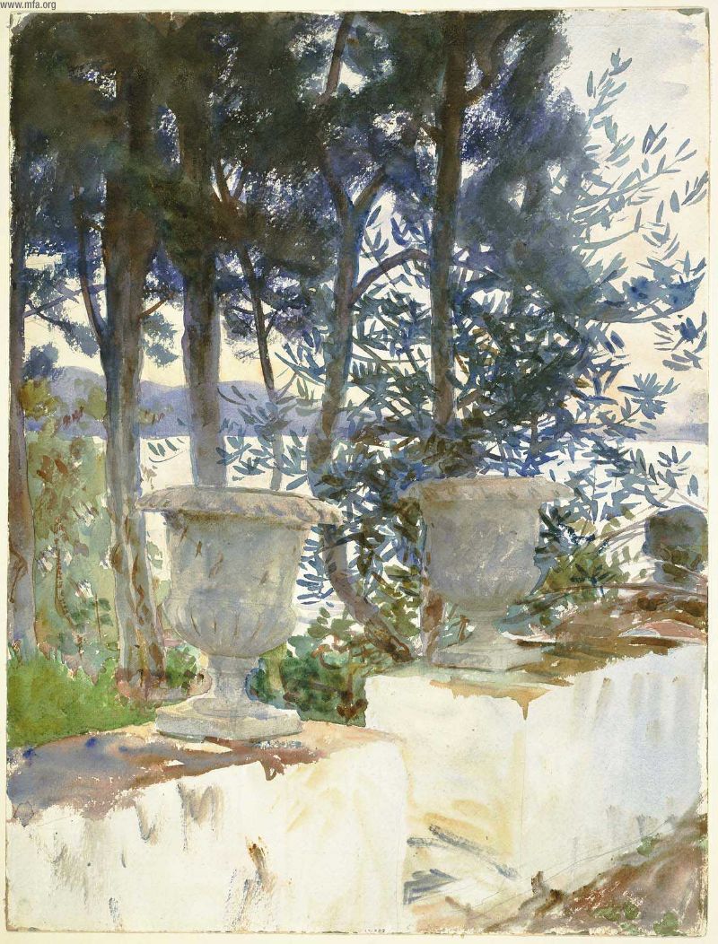
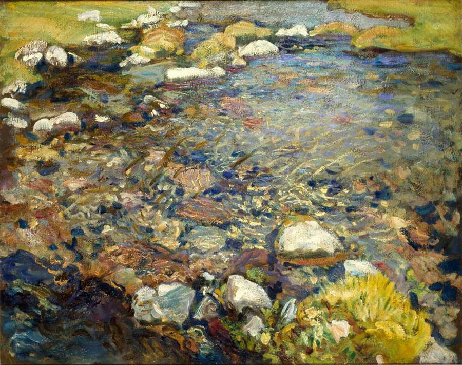
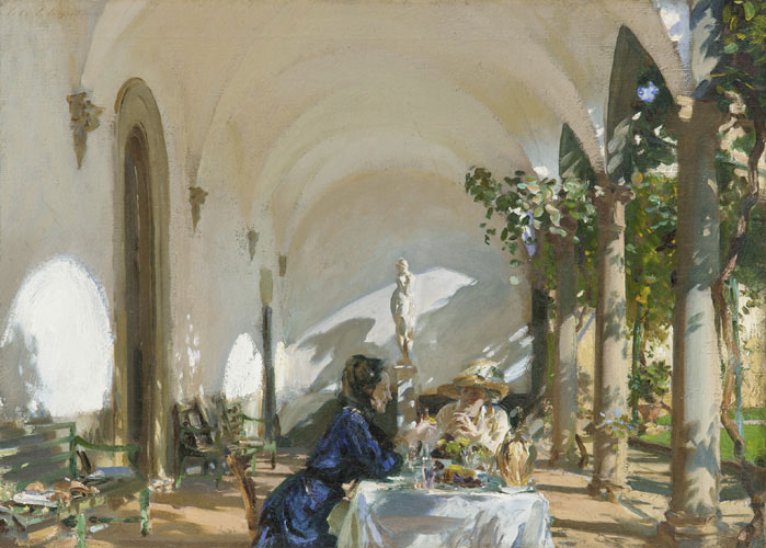
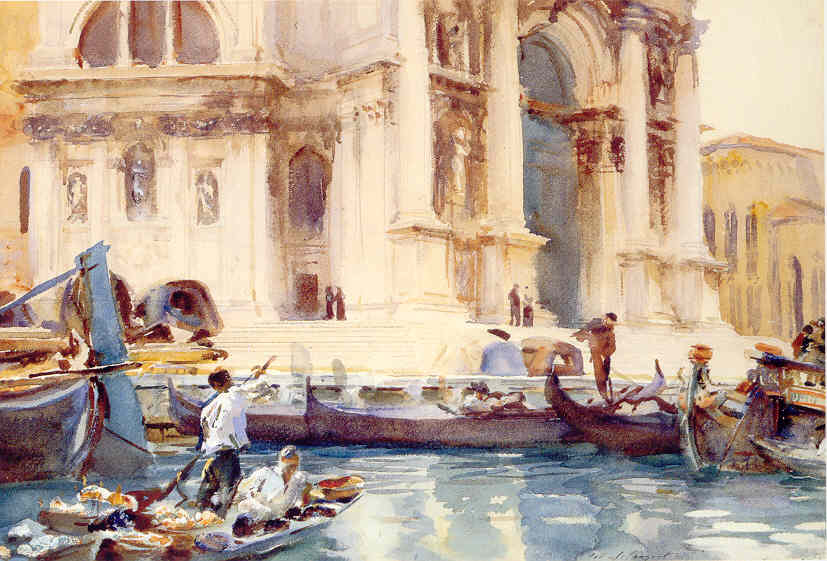
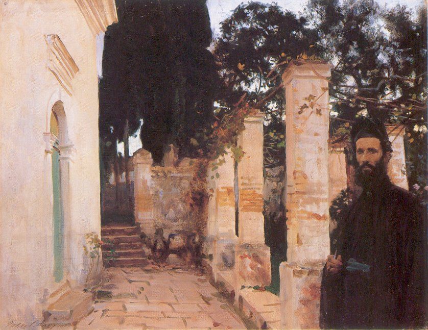
 John Singer Sargent (1856 - 1925) may well be the last great artist in the academic tradition. He was an American, born in Florence in Italy and who spent much of his life in Europe. He was prolific, painting hundreds of oil paintings and thousands of watercolours and sketches. Painting alongside the Impressionists (and sometimes referred to as one) he has clearly incorporated their sense of shimmering light. He copes well with sunlight and shadow and the balance between general impression and focus on particular detail (especially in regard to foliage). His compositional style is affected, again like the Impressionists, by Japanese landscape prints, and so he generally provides a focus in the foreground, large and near to the viewer. Although, as I mentioned, he is often grouped with the Impressionists, in my opinion he is superior because he retains that balance of focus and soft edge that one associates with a baroque style (the Impressionist tending towards an even blurr).
The spontaneity of his watercolours is wonderful and because the medium forces him to summarise far more, it gives us an insight into how he looked at what was in front of him.
Interestingly, Sargent had no faith at all, to my knowledge. He is one of those people who just seems to have been naturally open to inspiration in his painting. God inspires whomsoever He pleases!
Sargent was a very popular society portrait painter and his focus on the personalities of those he paints always comes through. His more conventional portraits, incidentally are wonderful too, and you can see why he was in demand, but that’s for another day.
Corfu
Baroque Landscape: Chinese Baroque!
 This is another in the series about baroque landscape…and its not about baroque landscape, but bear with me. It is relevant to the topic. I am fascinated by the beauty of Chinese landscape. Once I started to learn about the baroque style I noticed that the same basic features are present in the form of Chinese art too. Further investigation revealed that the traditional Doaist understanding of the natural world and man’s relation to it, as manifested in Chinese art, are in accord in many ways with the Catholic worldview.
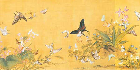
Considering form first: if we look at any of the paintings shown here we see these features. There are a limited number of principle foci of interest which are more detailed and more coloured. The areas in between these are muted in colour and rendered in monochrome, usually black and grey ink washes.
In fact in Chinese painting the contrast in the treatment of the focal points and background areas is even more pronounced. The areas between the foci are often no more than a hazy mist. However, there is always a unity to the painting. It looks like a single scene not painting containing three unconnected scenes.
I began to investigate a bit and read a book called The Mustard Seed Garden Manual of Painting. This was written in China in the 1600s (which, coincidentally, is the baroque period in the West). What struck me is that their understanding of the natural world and how man relates to it is in accordance with the Christian worldview. The Daoist worldview does not include God, but it does recognize heaven, a place that is non-material. The natural world reflects a heavenly order and the task of man and his work is to act in harmony with it. Therefore, just like the Christian painters of the same period, they saw the beauty of the natural world as something that pointed to a place beyond it that was non-material. When we apprehend the beauty of nature, we perceive intuitively the harmonious relationships that exist between the parts; and the harmonious relationship of the whole to God (for the Christian), and to heaven (for the Daoist). As a Catholic I say that all harmony is derived from the harmonious relationships that are intrinsic to God, between the persons of the Trinity.
Compare, for example, two quotes that follow. The first by St Thomas Aquinas and the second by the Chinese sage, Lao Tzu:
‘The order of the parts of the universe to each other exists in virtue of the order of the whole universe to God’ St Thomas Aquinas (Questiones disputatae de veritate, 7,9)
‘Man’s standards are conditioned by those of Earth, the standard of Earth by those of Heaven, the standard of Heaven by that of the Way [Tao] and the standard of the Way is that of its own intrinsic nature.’ Lao Tzu, (from Tao Te Ching, XXV, 6th century BC)
 It seems strange to me, that with their view of an ‘empty’ heaven they did not, historically at least, welcome the revelation of a God. It is though they had already deduced the existence of heaven but with an empty throne, and Christianity could provide the only King who is worthy to sit on it. Christ even told us that he is ‘the Way’ (John 14:6)
So, coming back to painting, when they painted a landscape they sought to capture its beauty by mimicking the way that man observes nature. Again, this is just like the baroque method.
The landscape tradition is much older in the China than in Europe, and I would say that this representation of the balance between the particular and the whole was at a much more mature in Chinese art than in the baroque landscapes of this period. Part of the training of any artist should be the study of the work of Masters in their tradition. Any artist wishing to specialize in landscape could benefit from the study of Chinese landscapes, I suggest, even if the ultimate aim is a Western form.
This has happened in the past. There has always been an easy crossover between Chinese and Western naturalistic landscape painting. Nineteenth century French landscape artists, especially the Impressionists, were fascinated by Chinese and Japanese landscape and incorporated many compositional elements into their own work.
It works the other way too. To demonstrate the point, I should now come clean and explain that not all the paintings in this article were painted by a traditional Chinese artist. The second is, but the first and third are by a classically trained Italian artist, who was also a Jesuit missionary to China in the mid-eighteenth century, called Giuseppe Castiglione. He was admired in China for his work and was patronized by the Emperor. I first came across his work at an exhibition at the Royal Academy a couple of years ago.
The first painting below is by Castiglione again. The others are by a contemporary artist, Henry Wo Yue-Kee, based in Alexandria, Virginia. He was sitting in a shop front working one day when I walked past and noticed him. He told me that he had moved here from Hong Kong where he was trained.
I found this link through to short description of Castiglione's life and 40 images of his work (as reproduced on the stamps of China, Taiwan and Korea!)
The Landscapes of Jean Charles Cazin
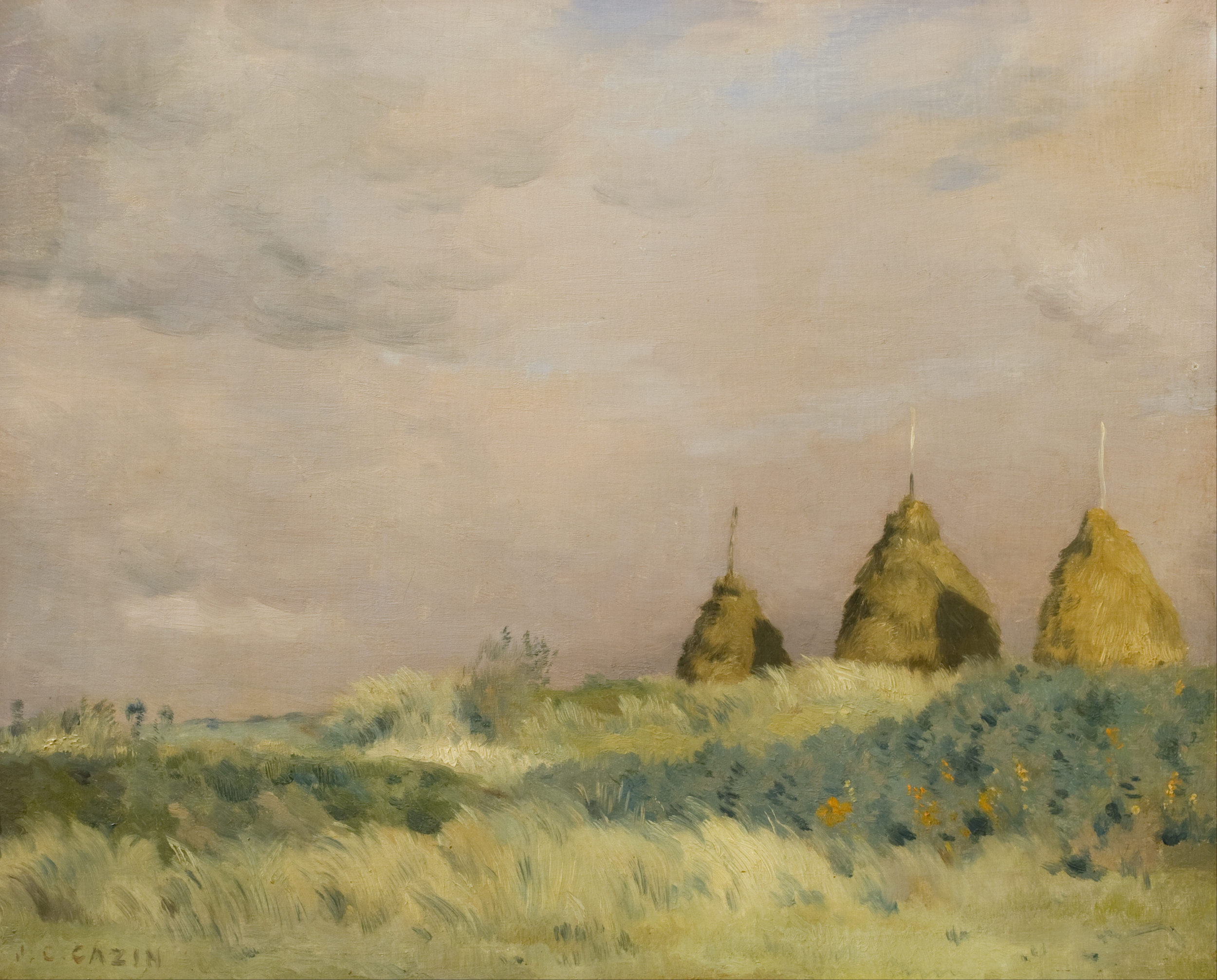
 Here are some paintings of the French painter Jean Charles Cazin who died in 1901 (h/t Giovanni Patriarca). He is not painting in the Impressionist style, but in a more naturalistic style. The Impressionists gave a much more generally looser rendition of the subject matter and were inclined to exaggerate colour. These examples are drawing on a different sort of 'impressionism' that of Velazquez which was studied in 19th century Paris , that we see in paintings of artists such as John Singer Sargent. In my opinion this form of impressionism is superior to that work of the Impressionists such as Monet. The idea here is to reflect much more accurately how we really perceive things. So in these paintings some areas are painted loosely and those parts which are the natural foci of interest in the composition are more detailed. This reflects how we look at things, casting our eyes more slowly and carefully over those parts in a scene before us that are of greater interest and so in our mind's eye which is really where we 'see', those parts are always more detailed. He was admired in his day for his 'poetical' treatment of landscape and especially the scenes with peasants working in the fields. Some of these subjects are a little too sentimental for my taste. I have included some that do appeal, which I find tend to be those in which there are no human figures, or if there are any they do not figure too prominently in the composition. The scenes are all rural France except for the urban scene which is of Paris.
Giovanni has written an article in which he talks of the problem of the frantic pace of modern life and how this habit of constant activity it engenders in us, even in recreation, acts to pull us away from meditation and contemplation in our prayer lives. For him, Cazin's rural scenes, especially those with workers resting in the fields are a visual inspiration that give us a sense of how to pause and give a moment to God. The article is published in Zenit here.
The Baroque Landscape
 After the 17th century, the sacred art of the academies, the baroque, declined. Landscape however, is an aspect of baroque art that not only did not decline, but actually developed in a way that was true to the original principles right through to the end of the 19th century. I will outline the basic form of landscape that established in the 17th century.
The form of the baroque landscape is based upon an assumption that mankind is the greatest of God’s creatures and has a uniquely privileged position within it. The rest of creation is made by God, so that we might know him through it. Creation’s beauty calls us to itself and then beyond, to the Creator. Man is made to apprehend the beauty of creation.
To illustrate, I quote from a section of Psalm 148: ‘Praise the Lord from the earth, sea creatures and all oceans, fire and hail, snow and mist, stormy winds that obey his word; all mountains and hills, all fruit trees and cedars…’
 None of these aspects of God’s creation is capable of responding to call of the psalm literally. The ‘praise’ is not theirs, but ours. Their beauty inspires and directs our praise. This is one purpose for it. The natural world is not just a collection of atoms conforming to the laws of physics and chemistry. All that it does, through grace, is in conformity to its divine purpose. Having said that, we live in a fallen world. Creation is beautiful yet, amazingly, because of the Fall, it is not as beautiful as it ought to be.
When man interacts with creation (when farming or gardening, for example) he should remember this part its divine purpose and so his work with it should be beautiful too, serving to restore it more fully to fulfillment of what it was meant to be. This is why farmland is profoundly natural and when we farm well (as with anything done well) the result is beautiful.
Once this is accepted then the Christian artist who is painting the landscape should seek to reveal all these truths about Creation. As with all art this is done by consideration of both the content and the form.
The baroque landscape artist, just as I described in my piece about still lives - here - paints in such as way that it gives us information in the way that we naturally look to receive it. As the eye roves around any scene, we spend more time on those aspects which are of greater interest. Our interest reflects the natural hierarchy of being. So we are more interested in farmland than untouched areas, in animal rather than plant life, and more interested in man than a animals. The composition of the painting ought to reflect this. Even if a person is apparently a minor element in a rural scene, the artist should be aware that it is a detail that will catch the eye of the observer.
 The form reflects this too. The artist varies the focus and the intensity of colour. (Again for more detail on this see the previously mentioned article.) Those areas that give the greatest amount of visual information are in sharpest focus and have the greatest colour and these are made the primary foci of the painting. The areas of least interest are rendered in monochrome and out of focus. The beauty of the painting depends upon a harmonious arrangement of these principle foci of interest (usually no more than three or four).
This is never easy but it can be easier in some situations than others. Consider the painting of Susanna Fourment by Rubens, left. This is set in a landscape, but because it is really just a backdrop of what is intended to be a portrait, he has it in a loose focus, largely tonal description.
The baroque developed firstly as a form of sacred art, with a focus on the human person and quickly mastered how to apply these principles to that subject. The greatest focus is in the area of the face and especially the eyes of the individual. (See this article on portraiture for more detail.)
When faced with a beautiful view in all its complexity – beyond anything a man is capable of reproducing exactly – the artist is forced to summarise. He will select those areas of greater interest and supply more detail and colour in these; visually summarise to a greater degree those areas of secondary interest.
 The big problem is the one that is there for all Christian art – the balance of the particular and the general. While clouds in the sky, for example, can be represented as large forms, the problem is particularly acute with the representation of foliage. Trees, shrubs, grassland have to be represented as a collection of the particular: we are aware that a tree, for example, has many individual leaves and this must be indicated; and the general form: a tree forms a massed, cloud-like shape that must be seen as such as well.
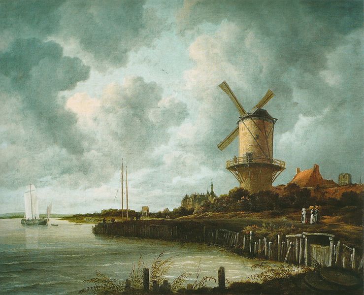
The Dutch artists, who were not Catholic and so had less of a focus on sacred art, applied these principles to landscape with greater energy. Although I love the Dutch landscapes of this period, my personal feeling is that even they never mastered these problems in every respect with regard to foliage. If we look at the landscape by Ruisdael of Bentheim castle, above right, the trees are too feathery. There is too much focus on the particular and not enough of the general. Future articles will describe how later artists overcame this problem.
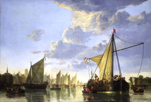 Seascapes pose a different problem, somewhat easier to overcome. The sea and clouds in the sky are more easily seen as large forms (though still requiring great skill to portray successfully if one wishes to conform to the baroque ideals). If we place a boats can be the foci, even in the distance, and then the sky and the sea can be made secondary to the composition and toned down and put evenly out of focus.
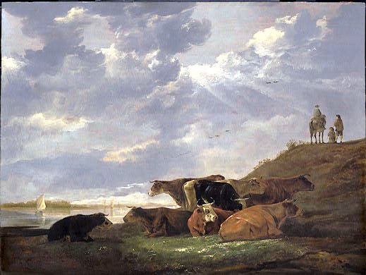
The great Dutch painter Aelbert Cuyp seemed to get around the problems by avoiding trees. He painted wonderful seascapes (see example above left) His pastoral scenes tend to be fields, or even cows standing the water! Nevertheless looking at his painting below, we see the classic baroque variation in focus and colour with even the grass pale brown except in the focal points.
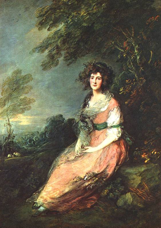
The other problem relates to the variation in colour. As I mentioned, those areas of least interest are rendered tonally. The baroque tradition, with its emphasis coming from the language of light and dark in sacred art, tended to render the tonal areas in sepia, changing to blue for distant areas. The reliance on sepia works well for portraits, but landscapes with large tonal impressions sepia always give the impression of being deep shadow. It makes it difficult to paint a bright sunny day. All these paintings appear to me as though the shadows are in deep shaded woodland. Later artist began to vary the base colour of these tonal areas to blue-greys and green-greys rather than sepia. We will see in later articles how later artists, such as Corot, overcame this. It took some time for them to do so. Looking, below, at the landscape (and portrait) of a later British artist, Thomas Gainsborough, who although working in the 18th century nevertheless continued for the most part to paint in the classic baroque form, we still see this deep sepia shadow and feathery portrayal of tree foliage.
Other paintings shown are top, windmill and seascape by van Ruisdael; and second from top, Landscape with Rainbow by Rubens
Making the Workplace Beautiful - A Seascape in Oakland, CA
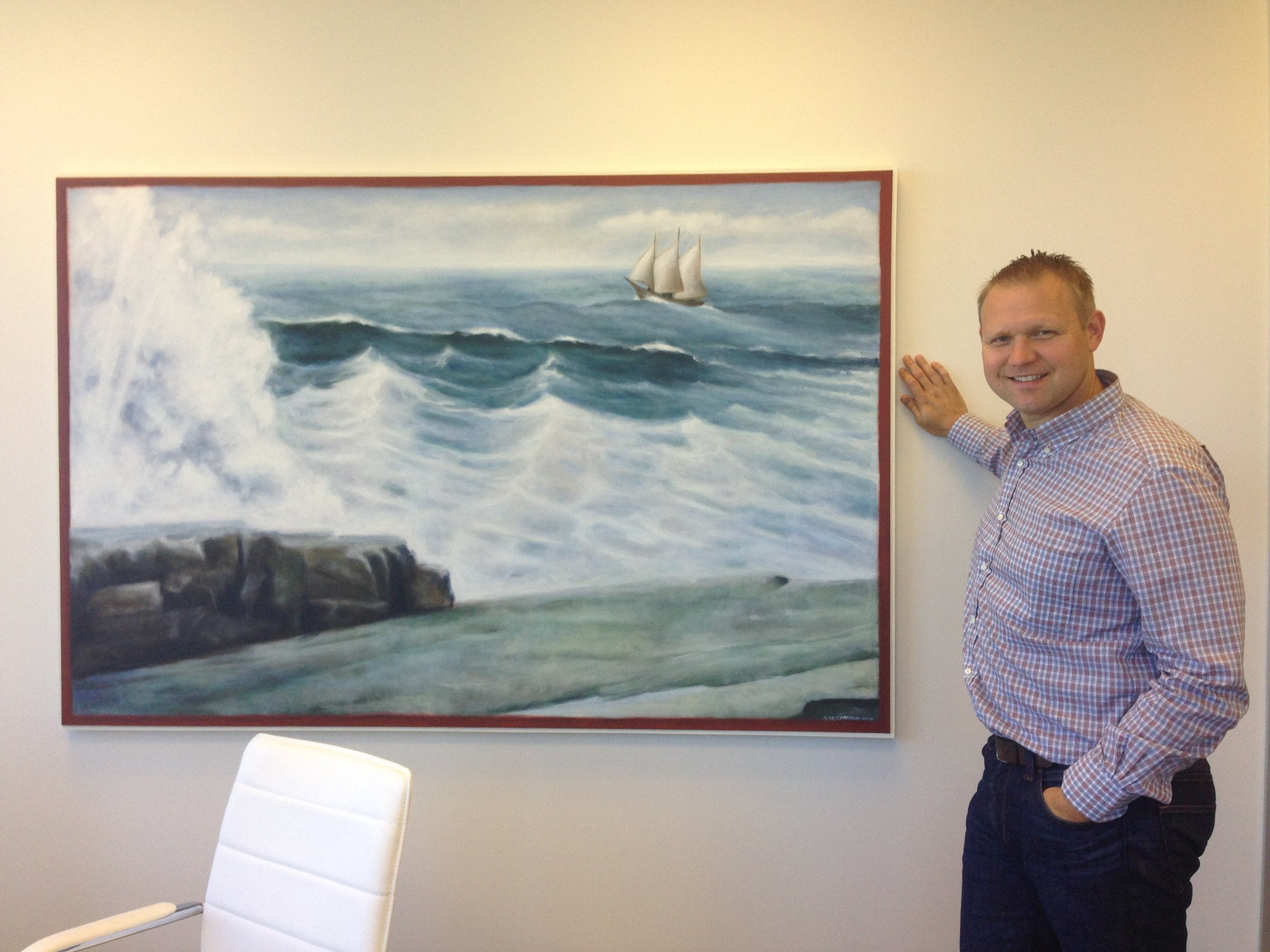
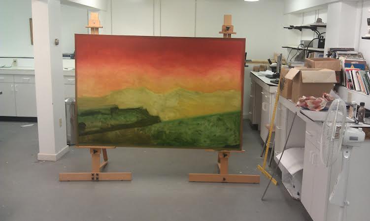
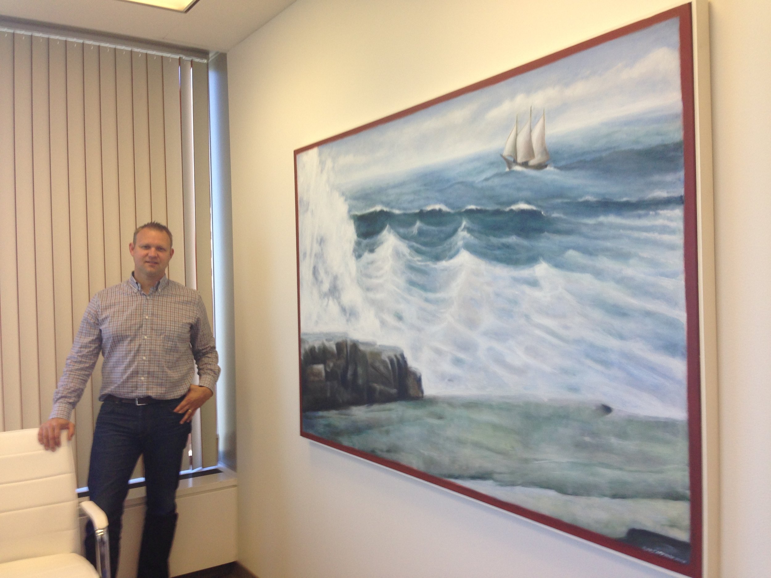
I now have some pictures of the seascape I painted for Ray Tittman, a Catholic lawyer in Oakland in situ. 
Below you can see a number of shots of Ray in the office and the office building in Oakland, just across the Plaza from the recently completed Catholic cathedral. This is an ultra modern cityscape and the task was to put something in there that might raise it up without fighting against it. I wrote about the commissioning and painting process in an article here From the Atelier of Thomas More College
Pictures below: Ray with the art in the office itself'; the office building and the nearby Catholic Cathedral of Christ the Light.
From the Atelier of Thomas More College, A Major Commission for an Oakland law firm
 A collaboration between Catholic patron and artist demonstrates how even the decor of the office of a law firm can contribute to the New Evangelization
Just before Christmas I was contacted by Ray Tittman who is founding partner of the California office of law firm Edison, McDowell & Hetherington. Ray, a Catholic, wanted a large oil painting for his office. He told me he wanted something appropriate for this modern office block in downtown Oakland (the Kaiser Building about a 100 yards from the new cathedral). This meant, he thought, that it should have a contemporary feel to it, but at the same time he wanted something that would be consistent with the Faith and which would in some way bear witness to it. He didn't feel that the modern art he was being presented with was explicit enough, however, as he put it to me, he thought that to go to the other extreme and have a six foot painting of Our Lady would not be right either.
I suggested that I visit him in California and have a look at the office and the color schemes being used; after talking to him and considering his personal tastes I would come up with some suggestions. I enjoyed this part of the process very much. Ray had a good sense of what he wanted and what would suit his clients and the other members of the office, but at the same he was open to ideas. The final result therefore really is the product of collaboration, I feel.
What we came up with was the idea of an abstracted landscape with a color scheme that would set a mood for the room in harmony with the existing colors of the walls and furniture. The would be sufficient focus for it to be recognizably a natural scene, but it was important that this wasn't too detailed - if it was it would distract. After all, this picture is not meant to be the main attraction, so to speak, but rather a support for Ray in his good work as a lawyer. It was vital, we agreed that in order to fulfill its function that the painting should be beautiful.
Compositionally, through the arrangement of the parts within it, it should point beyond itself to Ray at his desk. Then I suggested, he should discretely place in his personal space a small piece of obviously Christian devotional art (rather as one does with photographs of loved ones). Ideally this would have the face of Our Lord clearly visible. I suggested that he put in behind the desk and on wall facing seated clients and clearly visible. I believe that it is through his work as a good lawyer that Ray most powerfully bears witness to Christ, but people are helped to make that connection with Our Lord by the presence of this piece of devotional work and a beautiful office in which all aspects are, to the best that one can achieve it, participating in divine Beauty.
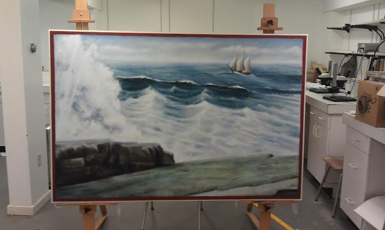
For this large oil painting, Ray said he wanted a seascape - appropriate for the California coast. We had to decide on the degree of abstraction so I sent him a selection of paintings from highly abstracted, through to very detailed. In the end he decided to go for something at the middle level of abstraction as seen in a landscape I painted several years ago (shown below).
After this, I was left to produce the painting.
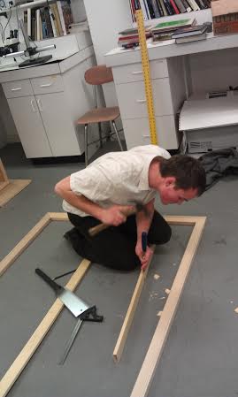
In producing this painting I needed the help of students from Thomas More College's woodworking guild, the Guild of St Joseph in stretching a canvas. Local artist Josh O'Donnell (who trained at the Ingbretson Studios) directed students from the Guild in building the frame and stretching the canvas. We see him here with students Oliver Kress and Mary Tardiff.
Then I did the painting working through from underpainting to final version. You may be surprised at the colors of first application, given the final look!
You'll notice in the above picture, there is a fine cream line that borders the painting. This was added by the Guild of St Joseph. In the final week, visiting artisan Tom Ford directed TMC student Lachelle Scott from the Guild of St Joseph in making and painting a wooden edging to the canvas (in the modern style of framing).
Winslow Homer
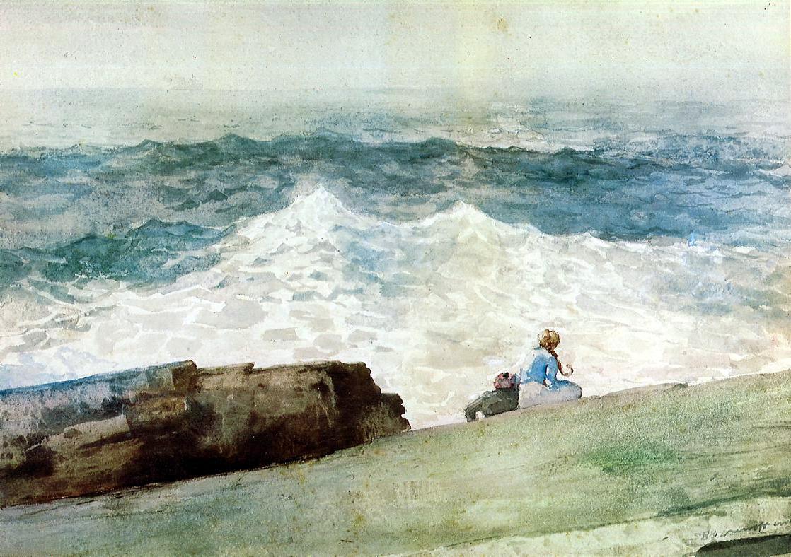
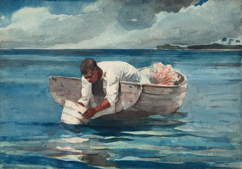
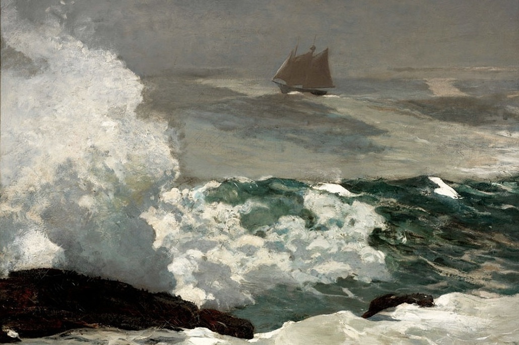 Here are some paintings by the 19th century American artist Winslow Homer. He was born in Boston and died in 1910 at the age of 74. He is perhaps best known for seascapes featuring the New England shore, especially Maine. His Wikipedia entry is here.
It is interesting to note that he is largely self taught but worked as an illustrator for mazazines for many years before he began painting in earnest. Illustration is a great training and formation for an artist and something worth considering today when so few art degrees actually involve teaching the skills of drawing and paitning.
Homer controls his use of colour and focus very much in line with the baroque way of looking at things, although no 17th century baroque artist would have painted precisely as he did. I think of him as one of those 19th century artists who continued to work in landscape especially in such way that it actually builds on what happened 200 years earlier in a constructive way. Another example of such an artist for me would be John Singer Sargent. So while much that was happening in the 19th century was not good - especially in sacred art - in landscape especially a few artists are worth of study.
Homer has a great compositional sense. He often paints with lateral lines, perhaps waves rolling into the shore, but then introduces sweeping diagonals that move the eye up and down and open up the whole painting to the natural passage of the eye it follows the lines of strong tonal and colour contrast. In the example above, it is with the foam and spray of a wave crash on a rock that takes the eye up and down. In other examples he might have the boat being thrown around in a choppy sea so that the bow breaks the horizon line while the stern extends into the foreground.
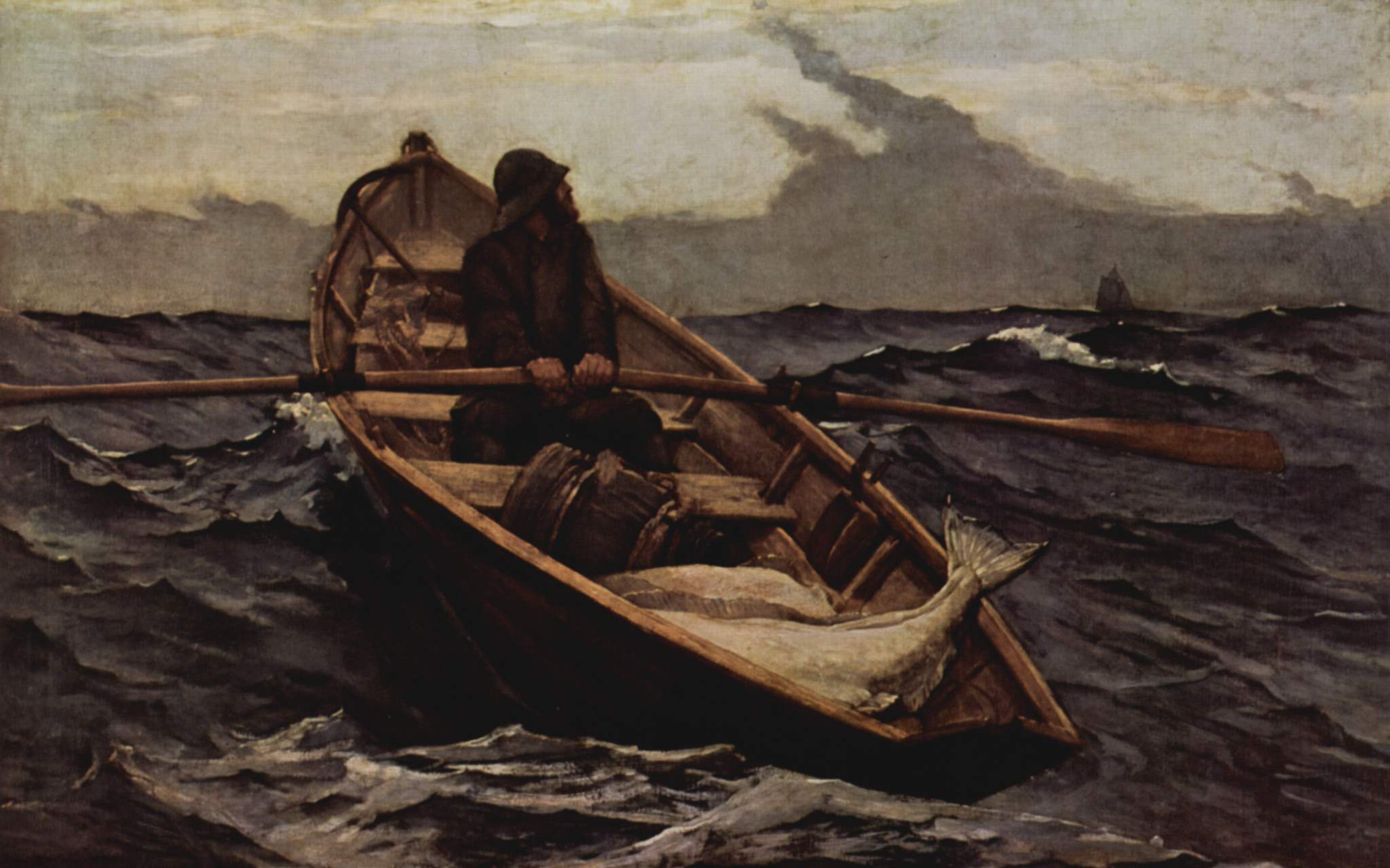 Also we are fortunate in that we many examples of watercolours as well a oils. I am guessing that the watercolours are the more spontaneously painted, while the oils will be more studio based. Watercolours are useful because they are painted relatively quickly and so indicate the intuitive response (I mean visual not emotional - I am talking about how he sees) of the artist to nature and how he approaches capturing that visual impression.
It seems that it was two years spent in the northeast of England that changed him from an illustrator and poor painter into a mature artist. During this period his did nothing but paint watercolours. On his return to the US critics noted the change. His palette was more restrained and the compositions more powerful. The first painting shown below is painted in England. It is of fisherwomen in Cullercoats (in the modern county of Tyne and Weir).
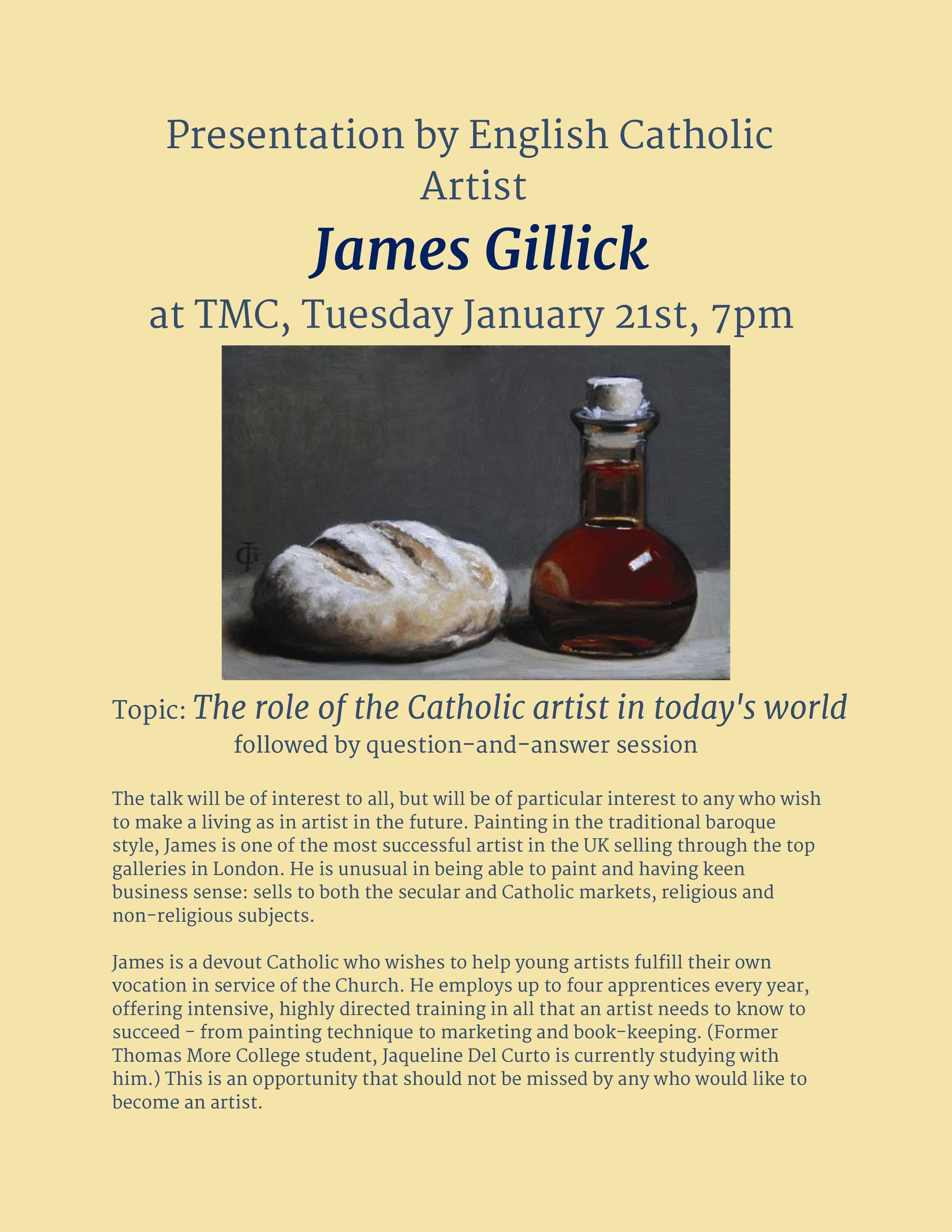
English Catholic Artist James Gillick Speaking at Thomas More College on January 21st
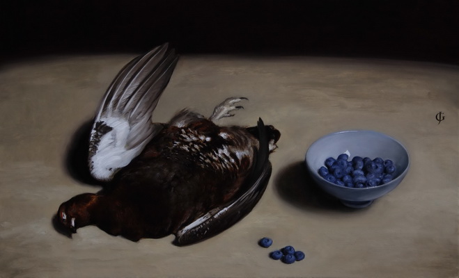 James Gillick one of the UK's most successful artists, will be speaking at Thomas More College in the library building at the campus in Merrimack, NH this coming Tuesday at 7pm. Jim, who is a good friend of mine and a devout Catholic, paints both mundane and sacred subjects. He is devoted to the re-establishment of a culture of beauty, not only through his own work, but by teaching. He offers up to four working apprenticeships a year. This is an intensive course in which apprentices are expected to work very hard. He teaches not only technique, but also the business skills of being an artist such as marketing and book-keeping.
His talk is open to the public and will be of interest to any who are interested in the arts, but will be of particular value to those who really want to make it as and artist. James is not precious about what he does - he has a refreshing, down-to-earth practicality about his work and the way he discusses it. He is based in Lincolnshire in England and sells through the top galleries in London.
He is largely self taught (although he has the advantage of coming from a family of working artists) and his Catholicism informs his work - he consciously paints in the baroque style . I am particularly fond of his still lives.
When we look at any scene, we do not take it all in, in a single glance. Rather the eye, which has an angle of focus of only about 15 degrees roves around the scene, gathering information that is stored in the memory. We tend naturally to spend more time on those aspects of what is in front of us that we are most interested in and so we have most information about those areas. Those areas that are of less interest we pass over quickly. At any moment, the image on the retina of the eye has a central region that is in sharp focus, and has the greater colour. Peripheral vision is, in contrast, blurred and depleted of colour (the cells in that part of the retina can only transmit tonal information). The reason that we are not conscious of this is that the picture we see in our mind’s eye is supplemented by information given to it by the brain and which is supplied by the memory. If the memory does not have information about this particular scene, then the brain will supplement the picture, so to speak, with what it feels ought to be there based upon what has been seen in elsewhere. This is usually pretty reliable, but not always. (Illusionists manipulate this, for example, by tricking the mind to supply a picture of something that isn’t there.)
The naturalistic painting of the baroque period (the 17th century), developed a balance of focus and colour that mimicked this natural way of looking at things. The assumption behind it was that mankind is hardwired to appreciate the hand of the Creator in his creation and if the artist works in harmony with the way we see, then the well painted artwork will similarly, through its beauty, point us to the ultimate source of inspiration of the artist. Those areas that are of primary interest in the composition are rendered in sharper focus and contain more detailed information. Similarly, most of the painting, which the artist intends for us to see in peripheral vision is depleted of colour and rendered in monochrome (usually sepia). When this is handled skillfully the artist controls the passage of the eye over the canvas using the interplay of sharp contrast in tone and sharp edges, and supplies greatest detail and colour in those areas that are naturally of greatest interest. They are also the areas that contain most colour.
The academic method of drawing and painting, which was the basis of the baroque style, is gaining ground again, but this baroque balance of focus and tone is not always understood, and even more rarely properly applied. (I am likely to be making this point many times in this blog.) However, James Gillick (who interestingly did not learn his craft one of today’s ateliers of Florence or the US) is certainly someone who is pointing the way to something good for the future: his muted palette and sharp contrast of light and dark is sensitive to the methods of the Old Masters. You can see more of his work at www.gillick-artist.com .
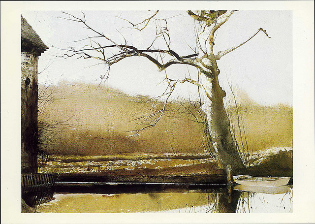
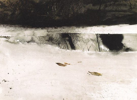
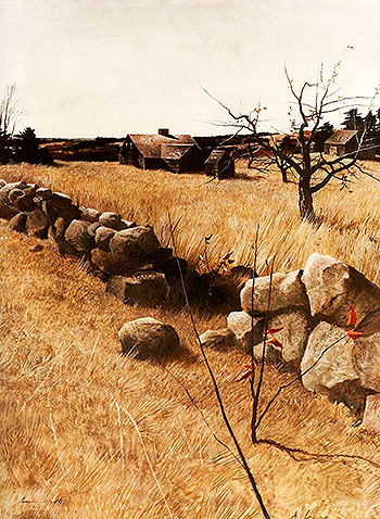
Andrew Wyeth an American Master Who Shows that Even in the 21st Century Beauty will Sell
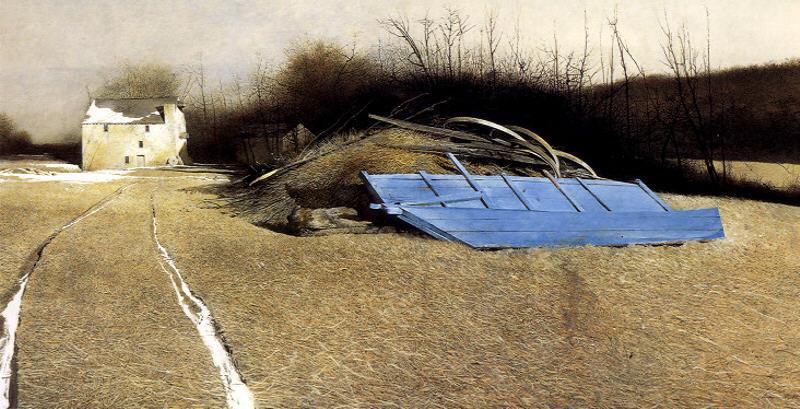 Last week I did a feature on an American artist who lived in the 20th century yet made his name painting in the naturalistic tradition. This week there is another. Andrew Wyeth died just a couple of years ago and lived in Pennsylvania. Like Hopper he would spend his summers in Maine and so his landscapes feature this beautiful coastline as well.
Wyeth is in my opinion a master of the highest quality. Unlike Hopper, he is more traditional in his use colour. Whereas Hopper would paint the whole canvas brightly coloured, Wyeth is is content to leave large areas of the painting muted in colour, rendering them tonally; and then giving more colour and contrast in those areas of primary contrast. He handles this balance masterfully. Many of his paintings are in the medium of in egg tempera - this is the one that icon painters use. This dries very quickly and is difficult to blend. In order to create a blurred effect, Wyeth tends to treat the paint as a crayon in which he blends using multiple strokes that become more dispersed in those areas that he intends to more diffuse. He also paints beautiful watercolours.
In painting grass and trees, he tends to supply more detail than Hopper. Part of this is the consequence of using egge tempera in which every stroke is so clearly dilineated. In order to avoid the sense of a painting overloaded with detail, he relies far more on muting the colour and the contrast in comparison to those areas of primary focus. I think it is interesting that despite the fact that so much of his paintings are brown, black and white, we don't feel a sense of a lack of colour, because he knows the crucial focal points in which he must supply it.
The success of Wyeth as a painter - his work was always popular and he was recognised in his lifetime with awards from the American government for achievement - demonstrates to us artists that if we produce work of high enough quality, we can succeed. And if we are not successful...it is most likely because we are not good enough and should aim to get better!
Edward Hopper - the Art of Summary
 Edward Hopper is an American artist who died quite recently - 1967 - and is worth looking at. His style is clearly influenced by 20th century forms with his strong colouration. He is famous for his paintings of city scenes, such as the laundromats and diners and I have shown one or two these here, however, it is his landscapes and seascapes that I love particularly. These portray New England, and especially Maine and so there are plenty of examples of his work on display in the museums around Thomas More College. He has managed to use high register, ie light and bright, colouration without it looking unnatural. The effect is of bright sunlight. The quality of light he portrays is exactly what you see in Maine.
Another characteristic of his approach is that he summarises form very well, in my opinion. If you have to paint something that in reality is immensely detailed such as a tree, with all its leaves, or even a field with every blade of grass; it takes great skill to make it convincing. On the one hand you need enough suggestion of detail, leaves and branches in the case of a tree, so that you know it isn't just an amorphous sponge on the end of a stick; on the other, we have to have a sense of the broad shape of the tree so that there is a unity to it. If there is too much detail so that every leaf is painted individually then we feel as though it is overloaded (the Victorian pre-Raphaelites tended to do this).
In the spectrum of balancing broad form against representation of detail, Hopper tends to towards summarisation and a stronger sense of the broad form. Nevertheless he gives us enough sense of detail so that they are convincing representations.
Chinese Landscapes in Berkeley, CA
 I spent Easter Week in Berkeley, CA recently and so as I always try to do when visiting a town I went to visit the local art gallery. It is amazing what treasures even a local gallery can have sometimes. Berkeley is the home of hippies and is where the Sixties began, so I was ready also for plenty of whacky stuff. However, it is also the gallery of one of the most famous and wealthiest universities in the US which was founded well before this so hoped for at least something good. The website even mentioned that there was a Rubens in the collection.
It didn't look to hopeful when we approached the gallery and the exterior looked like this...
There are some buildings that, like a pearl inside the oyster shell have beautiful interiors despite their exteriors. This wasn't one of them. It was bare concrete on the outside and bare concrete on the inside. It really could have done with a few good pictures to spruce it up a bit. However, what we were presented with, for the most part, managed against all odds to make it even worse. The whole gallery was given over to an exhibition called 'Silence' which was based upon John Cage's 1950s composition 4'33''. For those who don't know this is a 'composition' in which the musicians sit in front of a blank score for this period of time and follow the instructions to do nothing, ie sit in silence.
As we progressed, it didn't look too hopeful. For example there was I mime artist lying on the ground rolling around in slow motion. It wasn't even interesting enough to affront. Not wanting to cause offence I just quietly walked past as though I hadn't noticed he was there. Most of the rest of stuff is the sort of avant garde modernist stuff that I used to pretend to be interested in order to look arty. Isn't all of this past it's sell by date yet? The was some traditional art - this being the Bay Area lots of Buddhist art. I don't remember any explicitly Christian art of course - they are liberal, but not that liberal.
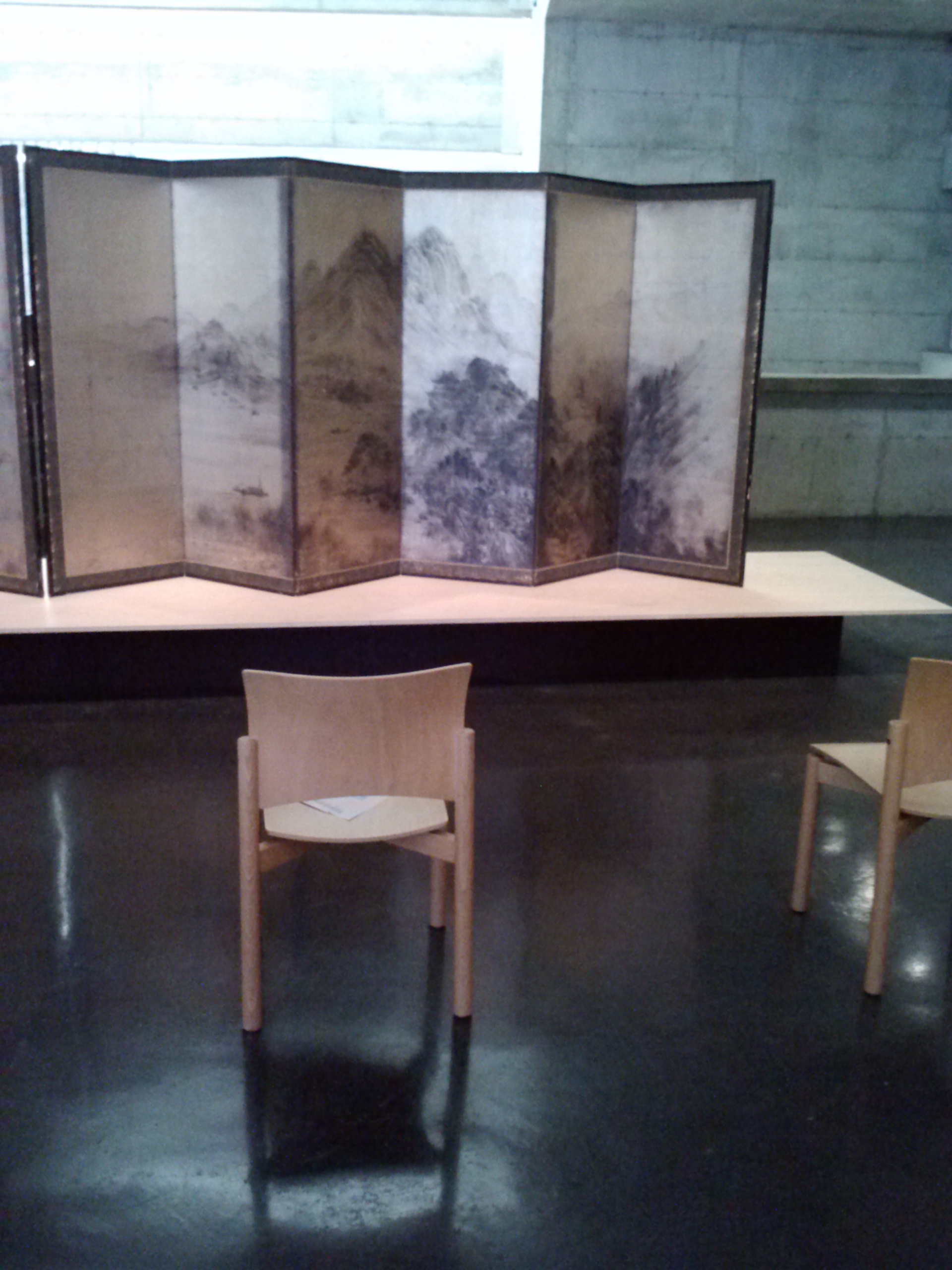
I was just beginning to wonder if the curator might have been better advised to have followed John Cage's example and present us with a series of empty rooms, when I turned the corner and saw a room of traditional Chinese landscapes on screens.
The monochrome landscapes are worthy of study even by those who wish to work in the Western tradition. The skill in varying the focus, having some areas clearly defined and others hazy, yet maintaining a unified image is great.
What was interesting to me also was the fact that the reverse side of the big screen shown above had a geometric pattern on it, which could have come straight from a Romanesque tiles floor.
So while I can't say that the exhibition is worth travelling a long way to see, these examples made it worthwhile crossing the town.
A Traditional Artistic Training Method for Landscape Painting - How We Can Apply This Today
 When I decided I wanted to be an artist, I knew that I needed to train, but I had no idea where to go. I was so clueless that I started by looking for Catholic Art School under 'C' in the telephone directory. Pretty quickly I realised that no such place existed and as I searched and talked to people it became clear that I was going to have to work out how to train myself. I began by studying the traditional methods used to train artists and set about trying to apply these methods to myself. Where I knew that help existed I would go to people who could help me with specific requirements and ask. Most of these people wanted to see the preservation and development of their tradition, and once they realised that I wanted that too were enthusiastic to work with me.
I was lucky in coming across Aidan Hart very early in my painting education (even before I was received into the Church). Aidan was self taught and when I attended a number of his week-long icon painting classes, he not only taught us what he knew but how he taught himself. So he was equipping those of us who wanted to know these things, with the insights that would enable us to continue development after the class. My own research and what I learned from Aidan and others seemed to confirm were common to all traditional training methods were written in an article: The Principles of a Traditional Art Education for Today.
This had benefits in other artistic areas as well. I recently decided that I wanted to develop my landscape painting skills. I am interested particularly in the landscape tradition of the English watercolourists such as Constable, Turner, Cotman. I was ready apply these to myself so was going to start of programme that involved copying works of the these masters and direct observation of nature while trying to understand what the artists were aiming to communicate.
By chance, I had a catalogue of an exhibition in London of the work of the Thomas Girtin, a contemporary of William Turner) at Tate Britain and in it there was a detailed description of how he was trained. Interestingly it was exactly academic theory and practice (as taught in the training of figurative art in the ateliers and academies of Europe) but applied to landscape. Reading this reinforced what I thought and also gave me insights that I could use of training for any other form, sacred art. Here is a summary.
 Thomas Girtin trained in England in the late 18th century and trained for three years from the ages of 14-19. He was apprenticed to the established artist Edward Dayes and began by doing supporting work (grinding pigments etc) and by watching his master painting. Only later he was allowed to copy his master's work. He was expected at this stage to pick up the idiosyncrasies of his teacher's style as a necessary stage in the longer term goal of his emerging with a similar but independent style. From the start he was given talks about art and especially the moral purpose of art. Consistent with academic theory and following Joshua Reynolds in his Discources given to the Royal Academy, Dayes announced that the artist only selects the best parts of the natural world in order to reflect an idealised Nature. In addition, Girtin was expected to read in order to form his taste.
For his painting training, he would be introduced to colour by being asked to colour prints (so don't hesitate to photocopy and colour-in today!). He then progressed on to his own landscapes by working in the studio and creating amalgamations of different works by Dayes and others and drawings and sketches.
In painting from nature, he would start to observe and sketch doing either line drawings or broad tonal renditions depicting scenes using sweeps in monochrome; through this he could start to control the sense of space by changing the intensity of shadow according the to distance from which it was viewed. He would also do repeated studies of individual items - bushes, trees and so on - both from works of others and direct from nature.
After his apprenticeship, he was given patronage by the amateur artist James Moore and as part of this was given the job of converting Moore's drawings into finished paintings. This would be done in the studio. In his early work Girtin seems to have worked by creating a grey monochrome underpainting and then overlaid colour washes. In his later work he put colour directly onto the paper adding individual tints for shadows.
As far as I can tell, paintings were not finished in situ, but in the studio. This is consistent with one stream of academic art (the classical baroque artists such as Caracci and Poussin) in which all finished paintings were studio works based upon drawings from life. this meant that all finished paintings were two steps from observed nature.
Why an account of teaching landscape painting in this regular column about sacred art?
First, it exemplifies some general principles that can be applies by those wishing to teach or learn (by teaching themselves) and form art, including sacred art.
 Second, how demonstrates how part, at least, how an aspect of the wider culture can be a mundane expression of a culture that has the liturgy at its centre. Here is an artistic form that is derived from and pointing to the liturgical forms. It also shows how in regard to this part of it, there is no detachment between the culture of faith and the wider culture as had begun already in other areas and was to occur much more generally soon afterwards as the 19th century progressed.
Third, we should note this is protestant England. The artists themselves may not have even been aware of the fact, or wished to acknowledge it, but they are agents of cultural evangelisation. The principles they are using is a direct transposition of those developed for the the liturgical forms of the 17th century baroque as part of the Catholic counter-reformation 200 years earlier. It is a demonstration of how when those forms that are integrated with the liturgy, and the liturgy is authentic, then it has power. What drove this was the sheer radiance of the beauty of the liturgical forms. Those who saw it and decided that they wanted art just like that. Conscious that it was a Catholic form underpinned by Catholic principles, they simply created stated them in a way that didn't change the sense, but meant that they weren't overtly Catholic. It was the Dutch who did this first in the context of landscape. This is the exact opposite of what happened in the 20th century, where so many Catholic artists looked at the popular secular forms (reflecting an anti-Christian ethos) and tried to express sacred subjects using these forms, leading to the disaster we are recovering from now. Interestingly, just as with their earlier Italian counterparts, the highest form of landscape was the architectural landscape. With relatively few Roman ruins to paint, they would look to the medieval castles and gothic cathedrals and abbeys around the countryside, many of course in ruins. So whether it was conscious or not, these artists were making an ideal out of the earlier great age of architecture, which unlike those in Rome, was an authentic Catholic architecture. Who knows how this might have affected the mood of the day?
This last point is a cause for optimism today. We are undergoing a liturgical reform and we see, albeit in the early stages, a productive dialogue between Catholic artists, musicians and the Church that will in time create authentic forms that are integrated with the liturgy. When we see a flowering of this, I have confidence that the wider culture will be transformed too, just as happened in the baroque of the 17th century.
Paintings from top: Bamburgh Castle, Northumberland; tonal study painted in situ; Guisborough Priory, Yorkshire. Below: colour washes overlaying a grey monochrome underpainting
Below: Durham Cathedral; the White House, Chelsea; Yorkshire scene;
Greens often fade in time, so while this is based, in the baroque mode on a sepia monochrome tonal underpainting, it is possible that the foreground would have been greener than it is now.
Above: a Scottish border scene; and below: Kirkstall Abbey, Yorkshire.
19th Century Japanese Landscapes from Worcester Art Museum
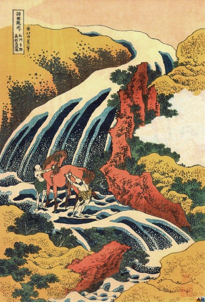
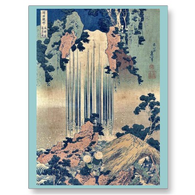
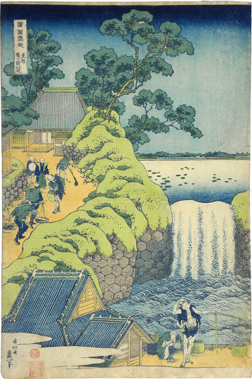 Here is a series of 18th century prints by the Japanese artist called Katsushika Hokusai(1760-1849). I saw them recently as a new display at the permanent collection of the Worcester Art Museum in Worcester, Massachusetts. Chinese and Japanese landscape is worthy of study even by those interested in painting landscape in the Western tradition. The composition is consistent with the Christian view that nature is beautiful and hierarchical and points to something greater beyond itself, with man at the pinnacle of the natural world, whether he is a subject within the painting, or the observer seeing nature through the eyes of the artist.
This is a series of prints called A Tour of Waterfalls in the Provinces made in 1833. This is a new display at the Worcester Art Museum and it has been very nicely handled, so that the series appears as a body of work, with each print angled upwards so that it is easily visible and reducing glare of the protective glass.
Worcester Art Museum is one of a number of small museums based upon the private collection of wealthy industrialist, now available to the public. It is small enough that one can easily see all on display in its three floors of galleries in a morning and good enough that one wants to. it also saves the parking and travelling difficulties of trying to get to galleries in the centre of large cities. We will feature more works from this gallery in a number of upcoming posts.
Pilgrimage to a Forgotten Ancient Church in Matera, Italy
 Matera is in southern Italy (just inland from the arch in the boot-shaped country). In the later classical period and through to the Middle Ages it has been occupied by Romans, Lombards, Byzantines, Germans and Normans and the handover was usually less than peaceful. The area is known for its underground churches, rather like the catacombs but dating much later. My former teacher when I was studying the academic method in Florence, Matt Collins, now lives there. Matt is an American and one of the few people around that I know who has applied his academic training to painting in the baroque style (as distinct from the 19th century). As well as oils, he is an expert in the technique of fresco and runs regular classes in Italy teaching this ancient and very durable technique.
The underground churches of Matera contain many frescoes and they have survived the Romans and all the waves of conquerers, only to be damaged recently by modern-day vandals and graffiti artist. What a shame! Matt describes them in his blog and it is his pilgrimage that the title refers to. The painting shown is Matt's landscape of the approach to the entrance of two underground churches. To read more about his, go to his article by following the link here. You can also see more of his work there too.
The photograph above is of the entrance to the ravine, and below, of the entrance to one of the churches in the hillside.

Inside with the apse with niche and altar

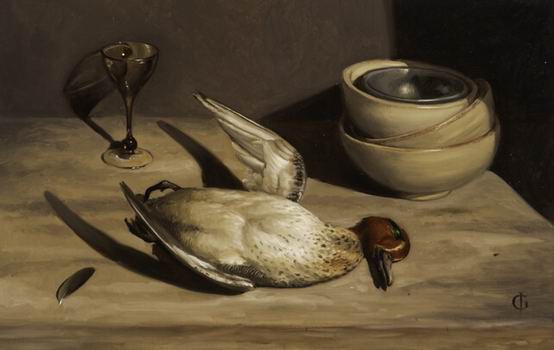
And finally, just if any are wondering what Matt's art is like here is a beautiful still life displaying the classic baroque stylistic element that readers of this blog will recognise - the variation in focus; the depletion of colour and reduction of contrast away from the natural foci of the composition.


