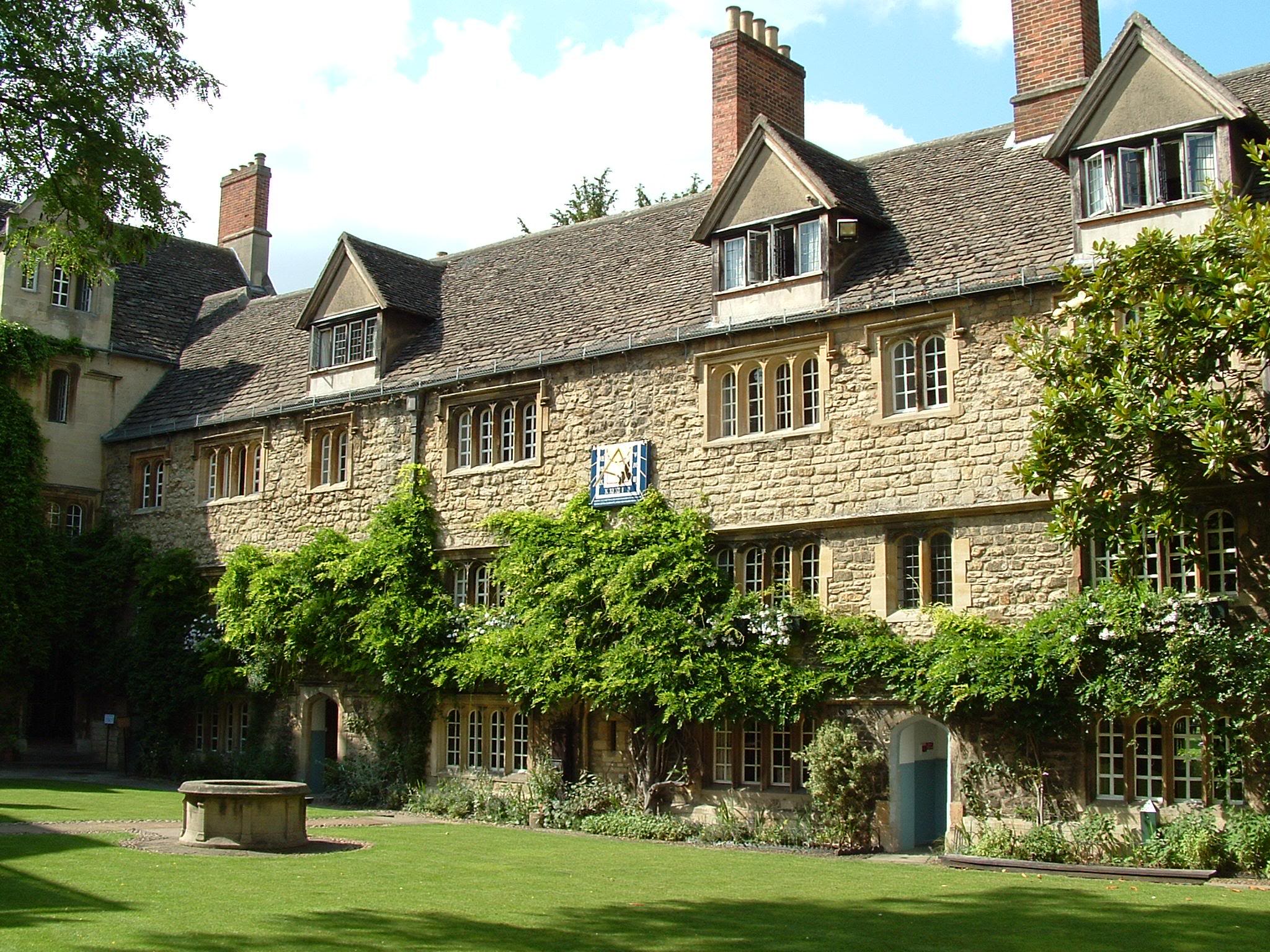
 Even mass housing can be made uplifting by using traditional proportions
What makes a beautiful building? I would say that traditional proportionality is one vital component that is virtually ignored by all modern architects. The new online course of the Way of Beauty (see the page of that name on this blog) gives the most detailed answer to this question yet. It's all about traditional proportion and harmony which was principle, derived from the patterns of the liturgy, that was used to govern the whole of the culture. All of time and space, not just the beautiful buildings of the past, were ordered according to its principles.
This is why the building above left, built in the 18th century, is not only still standing, but is also a listed building and is sought after by professionals in the North of England as a fashionable place to live; but many of the equivalent mass housing projects of the 20 century, like the one show below, are already being knocked down. The one shown was Rockwell Gardens which was demolished in 2003 and didn't even last 50 years.
The traditional idea is that certain combinations of dimensions of a building speak to us more clearly than others because they are more beautiful. The modern idea, in contrast, is that there is an infinite range of ratios and proportionalities to choose from and one is no more valid than any other, it’s just a matter of opinion.
The Christian tradition says that certain proportions are beautiful because they reflect the divine order; and the Creator hardwired us to recognize them. When we see something as beautiful in the natural world for example, it is this is divine order – the thumbprint of the Creator in His work – is what we are responding to. The work of man can reflect this as well, with God’s grace and humility and good sense on the part of man. These proportions were used in architecture almost without question through to the end of the 19th century. (To get more information take the online course from this blog or sign on direct here.) By the end of the 19th century, its use seems to have been disconnected from the Christian understanding. When traditional taste was challenged, those who wished to resist the destruction of the old methods were not equipped with underlying principles to defent their case. The Bauhaus movement in Austria at the turn of the last century, for example, vigorously challenged tradition. they defined themselves as much by what they were not, as by what they were. The challenge was effective and by the period after the Second World War barely any architects used the traditional proportions.
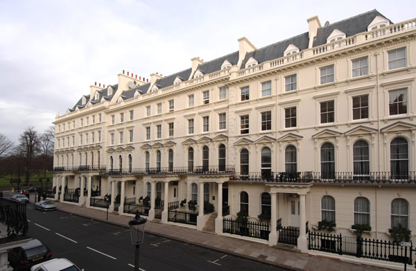 I have picked out some examples to illustrate my points. Consider first the elegant housing, right, in upmarket South Kensington in London dating from the Victorian period. Notice how each storey is has a different dimension. There is a rhythmical progression: the first is to the second as the second is to the third and so on. We pick this up naturally and the effect is pleasing, but those harmonies will have been carefully calculated by the architect.
In the ideal there will be a minimum of three stories. A single relationship is created by two parties. In the context of dimensions two lengths together this relationship is called a ‘ratio’. In order to get a measure of the ratio we need another to compare it to. So a minimum of three stories is needed to create two ratios. That is, the first is to the second, as the second is to the first. A ‘proportion’ is a relationship between two or more ratios. So when the two ratios combine well, we have harmonious ‘proportion’. Consider a musical analogy. While combinations of two notes can be pleasing as harmonious intervals, the chord structure is generally based upon combinations of three notes. This was housing made for the well-to-do in Victorian England. If more than three stories are required, then the architect might continue to diminish the size of each successive storey, repeating the progression each time (as we see in these South Kensington houses). Alternatively, they repeat the dimension of the second for all storeys except the last. So the effect is of a large stable base, a number of storeys of even size, and then a cap which is the smaller than the other two. We see this in the 19th century mill building shown below: Salt's Mill in Yorkshire, England.
Contrast it with modern apartments which were built for a today’s smart set in Chelsea Harbour, right. When this development was built the talk was of the film stars who bought the upper level apartments with the views of London's River Thames. Lady Diana used to work out at the fashionable gym here. Yet I think they were short changed on style. Immediately one can see how each storey is identically spaced and the effect, to my eye, is one of sterility and dullness in comparison with the earlier structures. The point here is that the architects, if they had the knowledge, could just as easily have conformed to the harmonious proportion. If they had, my guess is that the value of these houses would be much higher, because they would be more sought after.
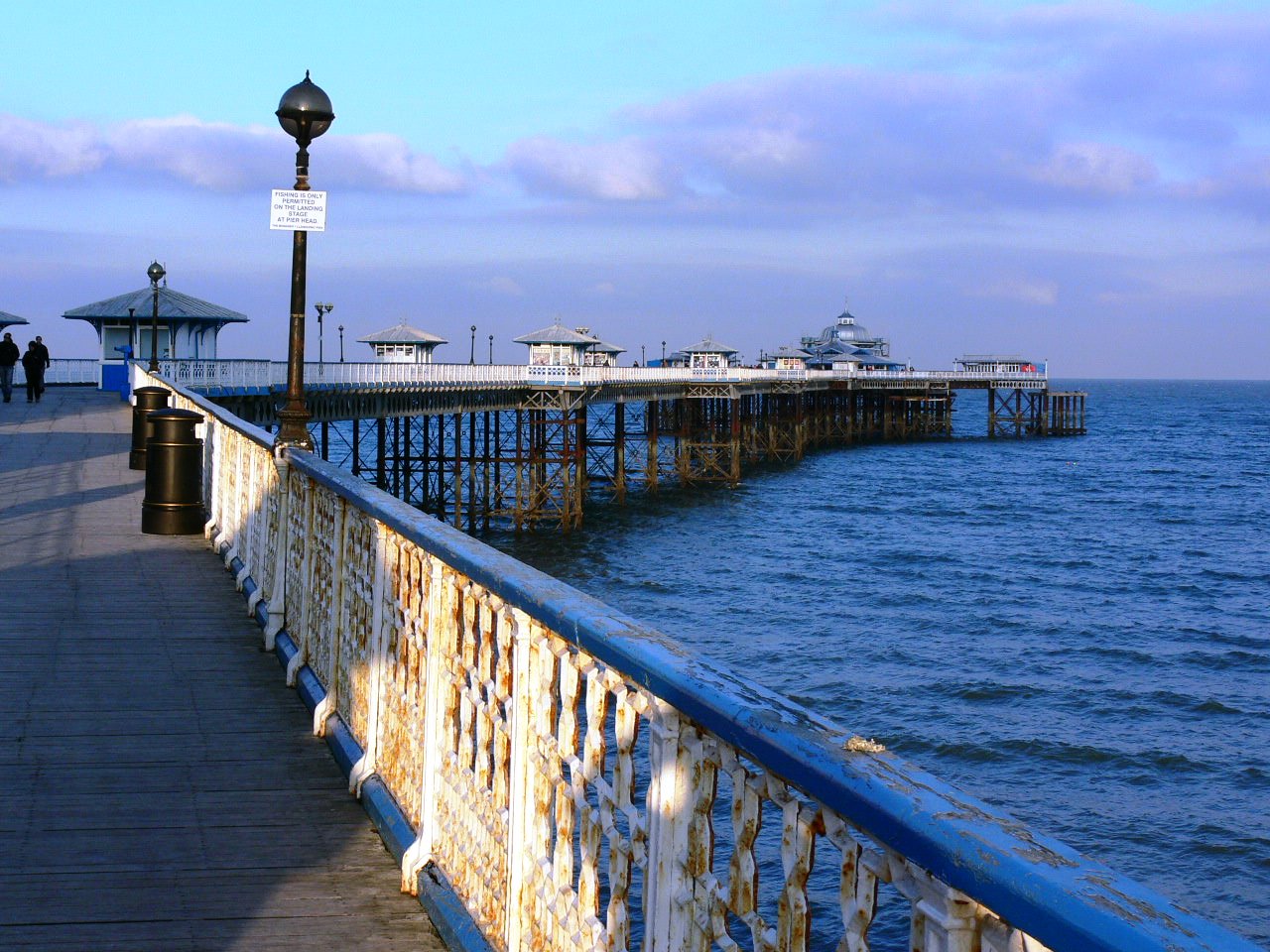
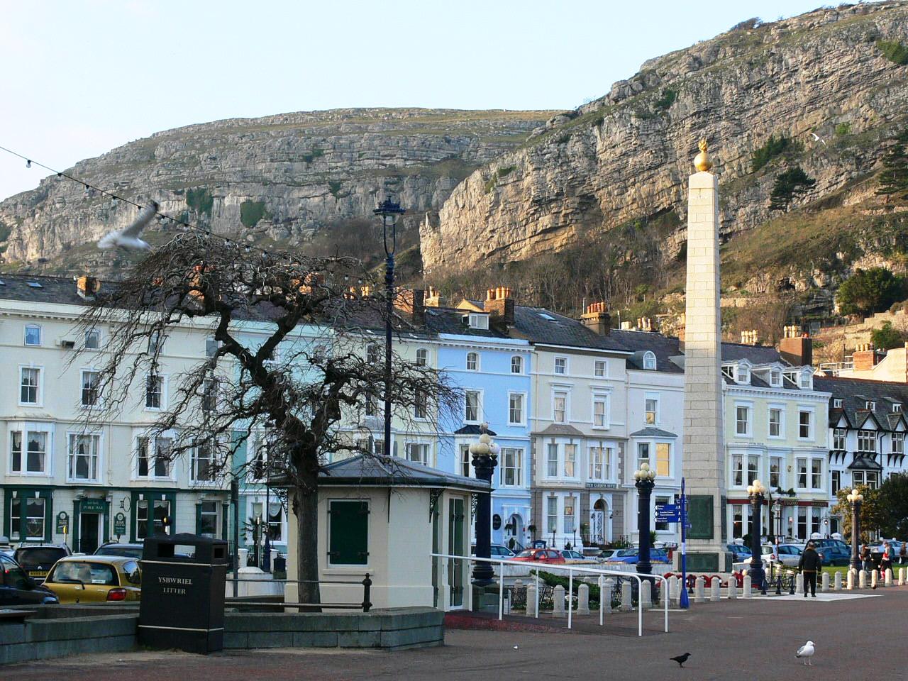
With the establishment of railways in Victorian Britain, seaside town grew up as day trip or holiday destinations a train ride from the main population centres. I grew up in the northwest of England, near the cities of Liverpool and Manchester. Llandudno, on the coast of North Wales is such a resort that grew to serve these populations. The buildings shown left are seafront hotels and one can see the same variation in the stories as we saw in South Kensington. Just to give people a sense of the place (and because it reminds me of home and like to look at them) I have included at the bottom some more photos. They are taken. Even the pier has octagonal geometric art, which looks as though its straight from Islamic Marrakesh on the cast iron railings (complete with seagull).
 I would like to make an appeal to architects to start reincorporating these proportional ideas into their designs. How much better might the environment of our inner cities be if even mass housing conformed to them? And just to inspire you, here is mass housing from the 19th century. These workers cottages, shown at the top and below left, were built by a mill owner, Titus Salt in Yorkshire in northern England. The mill he made, shown left and above, is so beautiful that it is now an art gallery and this and the village he built for the workers is designated a World Heritage Site. The end terrace at the top of this article is one such home. Those that have only two stories are the cheapest housing and smallest homes. Nevertheless, the architects still went to the trouble of varying the storey size according to traditional ideas. And they are appealing enough to be desirable homes if placed on today's open market. These simply followed design rules not only improve the environment, they add value!
The entrepreneurial spirit of 19th century Britain tends to get a bad press nowadays. No doubt the conditions of Titus Salt’s mill workers would not have been the same as those of today, but these houses do not speak of a mill owner who is seeking to exploit his workforce.
William Blake wrote in a much quoted line of England’s ‘dark, satanic, mills’. I would prefer to think that the end of the poem is more accurate and that Jerusalem was ‘builded here’. Furthermore, Titus Salt is an example that we can follow and try to build Jerusalem today.
The Way of Beauty course costs $99 for 25 hours continuing education credit from Thomas More College of Liberal Arts, read more about it on the Online Course page of this blog or sign on direct by following the link here.










 How busy people can strive for the ideal of praying continuously. The Divine Office for lay people, part 2 (
 If all times in the day and all human activity (no matter how mundane) can be sanctified by praying the liturgy of the hours, as the Church tells us, then this is this is a wonderful gift by which we can open ourselves up to God’s inspiration and consolation in all we do, and the degree that we cooperate, all our activities will be good and beautiful; and will be infused with new ideas and creativity. And we will have joy.
 Even if we accept this and want to benefit from it, it is a huge problem for most lay people. If you get the full cycle of prayer of seven Offices in the day for seven days of every week in the year it adds up to a three or four volume set. Priests and religious who are obliged to pray it, devote a huge part of their lives to praying the liturgy of the hours. Benedictine monks can spend up to six hours a day singing the psalms in church. One might expect them to be able to cope as that is their special calling, but what about the rest of us?
 Mark the Hours
 So this is what I did: for the most part I tried to keep to the standard form of each Office as in the Liturgy of the Hours book I had been given (which was according the Roman Rite, it said in the front) and from that to the schedule of Compline at night and Lauds in the morning. However, in between I marked the hour with a short memorised prayer, sometimes just the Our Father, Hail Mary and Glory Be. If I could remember any, I tried to have just a line from a psalm. The ideal would be to memorise one psalm (and some are short!). This habit of continual prayer is what opens the door to the possibility of continuous prayer. The publication
  The experience of doing this has been so positive that I can't imagine not wanting to pray at least part of the Hours each day. As someone said to me recently, he found that the praying of the liturgy of the hours was like regular physical exercise: although it meant an investment of time, there was a sense that in doing so, time was created because work seemed more efficient and productive and things just seemed to go more smoothly during the day. We both felt the same. We couldn’t prove it, but once we had tried it, we were convinced of its value.
 An ancient beautiful prayer that leads us to joy, and opens us up to inspiration and creativity; part 1,
  If we pray in harmony with rhythms and patterns of the cosmos, especially the cycles of the the sun, the moon and the stars, then the whole person, body and soul, is conforming to the order of heaven. The daily repetitions, the weekly, monthly and season cycles of the liturgy allow us to do just that. In his book, the Spirit of the Liturgy, Pope Benedict XVI calls our apprehension of this order, when we see the beauty of Creation a glimpse into 'the mind of the Creator'. This conformity in prayer opens us up so that we are drawing in the breath of the Spirit, so to speak, as God chooses to exhale. It increases our receptivity to inspiration and God’s consoling grace and leads us more deeply into the mystery of the Mass.