Blog

Creating an Icon of a Modern Saint

With the announcement of the beatification of John Paul II someone sent to me this icon of him in which Christ presents the world to him. Painting an icon of a well known figure raises a number of considerations for an artist. How should an icon painter represent a likeness, especially when the person is someone whose face is so commonly recognized from photography, which doesn’t conform to the iconographic form? When painting someone for whom there is already an established prototype in the tradition, such as Christ or the Apostles, the artist relies on that.

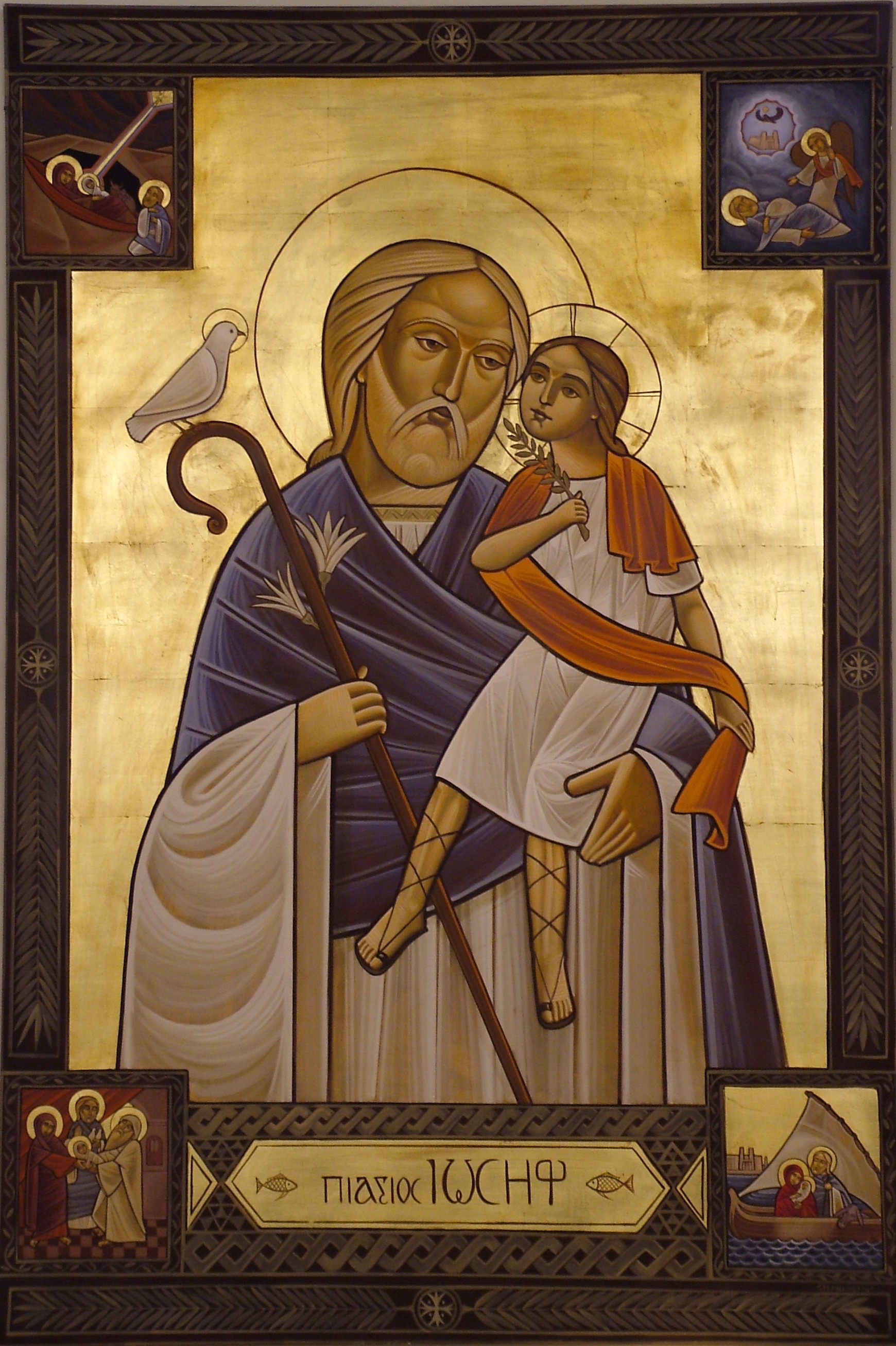
The two requirements for a holy image were set out by Theodore the Studite. He is the great Father of the East whose writing, perhaps even more than John of Damascus, closed the iconoclastic period in the 9th century. The first requirement is that the image bears the name of the person depicted; and the second is that it captures his or her ‘characteristics’. I have written in more detail about this here. When we talk about ‘characteristics’ in this context, we are referring  not so much to a photographic likeness, but rather to those key elements (which might include physical attributes) that characterize the person and contribute to his or her uniqueness as a person. So it would include, for example, the physical attribute of shaggy hair and beard of the prophet Isaias; but also the tongs and hot coal that touched his mouth before he prophesied for the first time.

When painting an icon of a modern figure for whom there no established iconographic prototype, the painter will have to judge what those characteristics are. Then he will have to decide how much of a ‘portrait’ it will be. I have seen some icons of figures such as St Therese of Lisieux in which a naturalistic photographic-portrait like face stares out from a painting in which everything is else iconographic. There is a clash of styles and is a blend of naturalism and iconography that doesn’t make sense to me.

In this example, the iconographer seems to have resisted this temptation and has created something that is consistent with his own iconographic style. In doing this he has sacrificed elements of a more conventional likeness. I think this is the better approach. Notice how similar the facial features of John Paul II are to those of Christ. I don’t know if this has been done consciously, or if it is just the iconographic style of the painter coming through naturally in both. Either way, to my mind the effect works. Christ is the Everyman, the model for all humanity, so it is right that all saints, especially, participate in his humanity. This is done without sacrificing the individuality of the John Paul II. We see….

I have a similar problem to grapple with as I continue to paint large scale works for the chapel at Thomas More College of Liberal Arts. In the next few months I will begin an image of St Thomas More himself. This issue here is not that his photographic image is well known, but that his naturalistic portrait is. The familiar painting by Hans Holbein the Younger, is the definitive face of Thomas More. As a portrait it is wonderful, but it is not right for an icon. At this stage, my intention, rather like the this artist, is to make sure that the name, the characteristics of man and the style are all preserved (in this case I will be attempting to work in a gothic style rather than iconographic). There is a line drawing study for a painting of the whole family that Holbein made. Given that iconography and the early gothic tends to describe form with line (in contrast, baroque and High Renaissance art describes form with tone) this maybe easier for me work from. We shall see!

Below I show a larger image of the icon above.

Concert of Music from the Sarum Rite

This is sacred music from pre-Reformation England. Sarum is old name for the town of Salisbury and it disappeared as a form of the Church's liturgy after the Council of Trent. However, it was retained in some form as it became the basis of Anglican church music and for the Book of Common Prayer.  The concert takes place in a New York Episcopalian church - Trinity Church. I heard about it because it was posted onto my Facebook page by a TMC student who is currently out in Rome - thanks Taylor! Access the video through the image of Salisbury Cathedral below.

The Liturgical Life that will Create the Culture of Beauty

My colleague at the New Liturgical Movement website, Shawn Tribe, has posted a simple but truly wonderful and inspiring article about what he calls the 'pillars' of a liturgical life.He describes not a theoretical discussion for experts in liturgy, but rather simple practices for parish and family. It is a spiritual life based upon the Mass, the Liturgy of the Hours and study of scripture, especially through lectio divina. This, in my opinion, is the basis for cultural renewal. Shawn's article is a must read for anyone committed to the re-establishment of a culture of beauty in the West, especially those associated with the liturgical arts (and frankly for that matter everyone else too). This is the sort of practice of the Faith that has been called for by Popes (just to my knowledge) ever since Pius X at the end of the 19th century and right up to Pope Benedict XVI today. He emphasises particularly the importance of something so often neglected by lay people, the Liturgy of the Hours otherwise called the Divine Office. Passing on a practical way of such a fruitful participation in the liturgy is the primary aim of the weekend retreat at Thomas More College of Liberal Arts this summer. It not only teaches about Shawn's pillars, but how to participate. It is expected that many will already have a strong sense of this in the Mass; but knowledge of a practical way that busy lay people can participate in the Liturgy of the Hours, and how Catholic culture is rooted in the whole of the liturgy is less well known. It is designed so that not only will everyone be able to continue practising what they learn after they leave, but will be able teach others in their family and parish.

Although what is offered is at the grassroots level of one person praying with another. The ambition and hope we have of this high - the transformation of society. Any culture points to the cult at its centre, in the case of Catholics that is the liturgy. Accordingly, the demise of Catholic culture in the past points to large scale demise in the liturgical life in the Church militant (and we are talking about something here that happened long before the 1960s); and conversely the primary driving force for any cultural renewal will be liturgical renewal. What Shawn is describing is the basis, therefore, not only of the basis of liturgical renewal, but also cultural renewal.

The TMC weekend retreat is aiming to fulfill the final pillar listed by Shawn in his piece, and which informs the other three, that is 'mystagogy'. Mystagogy is, to quote Stratford Caldecott, 'the stage of exploratory catechesis that comes after apologetics, after evangelization, and after the sacraments of initiation (baptism, Eucharist, and confirmation) have been received' And it is necessary (here quoting Benedict XVI) because '"The Church's great liturgical tradition teaches us that fruitful participation in the liturgy requires that one be personally conformed to the mystery being celebrated, offering one's life to God in unity with the sacrifice of Christ for the salvation of the whole world. For this reason, the Synod of Bishops asked that the faithful be helped to make their interior dispositions correspond to their gestures and words. Otherwise, however carefully planned and executed our liturgies may be, they would risk falling into a certain ritualism.'

Read Shawn Tribe's article here.

..and here is a newly discovered 15th-century Coptic icon

Shawn Tribe who writes at the New Liturgical Movement website just posted this image. It is a newly discovered ancient icon. Having described  Stephane Rene's neo-Coptic style as a more polished form of the 'folksy' original Coptic style, here comes something to disprove my point! This is 15th century but it reflects high level of drawing skill. One of the great difficulties when I paint in the iconographic or the gothic style is conforming to the style, yet still managing to have the figure to read anatomically and the clothing to drape naturally so that the folds reflect the figure underneath. The artist seems to have taken great care, for example, with the blue shawl of Our Lady to do this.

The Coptic Church is one of the Oriental Orthodox churches.  The Oriental Orthodox churches are those Christian bodies that broke away with Rome in the wake of the Council of Chalcedon in 451, over disagreements on the christological doctrines affirmed by that council. The Oriental Orthodox churches include the Armenian Apostolic, Syrian, and Coptic Orthodox—but not the larger Russian, Greek, and other Orthodox churches of the Byzantine tradition. The Pope has fostered dialogue with these ancient churches. CatholicCulture.org writes about this here.

Two More Neo Coptic Icons by Dr Stephane Rene

Further to the recent posting about a Coptic style Stella Maris icon, here are two more icons by Dr Stephane Rene in his ‘neo-Coptic’ style. They were sent to me by two people who read the previous article. St Joseph of the House of David and Mary Mother of the City are in St Joseph’s Catholic church, in Bunhill Row in the City of London. I remember this Church because it is just around the corner from the offices of the Catholic Herald, where I once worked. They come courtesy of a reader who brought them to my notice. So if you're reading thank you Martin Pendergast, and to you Sr Jean for supplying the images.

The name derives from the fact that St Joseph, although poor was of the Royal House of David. There are four narrative scenes from the gospel in each corner. The one of the Holy Family in a boat is depicting them on the Nile - representing the period of exile. Notice also the beautiful patterned border that Dr Rene has designed.


In this huge icon (3 metres x 2 metres). Mary is shown coming from an enclosed garden (a reference to the sybolism in the Song of Songs). The peacock is a traditional symbol of eternal life. The stream flowing from a cave represents the womb from which Christ emerged to live among us and give us the living water.

Where can Catholics Go to Learn to Paint in the Naturalistic Tradition?

If you are interested in the baroque, where do you go to learn to paint? In a past article I wrote about possible places to study the iconographic technique in depth. However, the baroque is also one of the three liturgical artistic traditions of the Church (the third is the gothic) and anyone who is serious about being an artist for the Church should consider whether they want to learn this form. One place to consider is Ingbretson Studio in Manchester, New Hampshire.

The ideal education would consist of the following: first, a Catholic formation (perhaps studying a liberal arts degree at a Catholic college); second a sound knowledge of the Catholic traditions in art. For those who wish to learn this aspect in isolation the Maryvale Institute’s excellent distance-learning programme Art, Inspiration and Beauty from a Catholic Perspective is recommended. They are about to offer this in the US, through the Diocese of Kansas City, which saves students on this side of the Atlantic from a trip over to the UK for the one weekend residential requirement. Full-time undergraduate-level students can receive both of these aspects at the Thomas More College of Liberal Arts in New Hampshire by taking their liberal arts degree which includes my Way of Beauty program as part of the core syllabus.

The third aspect is to learn the drawing and painting skills. The skills are those of the academic method. This is the rigorous drawing method that is named after the schools that were created in the 16th and 17th centuries (especially that of the Annabale Carraci, his brother Agostino and his cousin Ludovico. The method has its roots in the methods used by the Masters of the High Renaissance going back to Leonardo. This method is different and far more rigorous than that offered in the drawing classes in a mainstream college-level art department.

This training usually begins with cast drawings because casts have no colour and so the eye learns to ‘see’ in tonal values. The cast are carefully chosen to be model examples of beautiful sculpture. This way the taste of the student is developed as well as his skills. After this students progress onto the use of colour; perhaps through portrait painting or still life (I did portrait painting). The value of an academic training cannot be underestimated. It is being able to draw and paint accurately that enables the artist to realize his ideas. Whatever style he seeks to work in he needs a high level of skill so that he can create an image that conforms to what it ought to be, corresponding to the well conceived idea in the mind of the artist. Even my icon painting teacher Aidan Hart encouraged me to study naturalistic art for a year in Florence saying that all the best icon painters were also skilled draughtsmen. I do not regret following his advice.

Most of the schools that teach this method now are termed ‘ateliers’ after the French word for workshop. They are small schools in which the main teacher is a Master painter. A few were established in the 1970s by individuals taught by an artist called R.H. Ives Gammell in Boston, who at that stage was an octogenarian. Gammell, who trained as a young man in the early years of the 20th century, almost singlehandedly kept the academic tradition going after all the art schools in Europe and the US had ceased to teach it. The best teachers of today that I know of (on both sides of the Atlantic) received their training from him.

If you want to investigate the available ateliers yourself, a starting point is the Art Renewal Centre website, where you can run down the list of approved ateliers. Do be discerning. Have a look at the work by students and teachers in their galleries - this will indicate the style that they will teach you. It is important that you respect what is going to be passed on to you. From my point of view, while many of these ateliers will train you to draw, there is a danger in some tend to push a particular version of 19th century academic art that is detached from Christian worldview. If you are not careful this could affect your style detrimentally. The result will be either the extreme of a cold, sterile detachment (a form of neo-classicism) or a the end of a saccharine sentimentality.

If, on the other hand, you are armed with a full knowledge of the Christian context of this tradition (such as the courses at TMC or the Maryvale Institute would give you) you should be able to make good use of the skills you learn. You can contrast some aspects of 19th century atelier art with the baroque style of the 17thcentury by reading these two articles, written earlier, here and here respectively.

Another problem which would be a concern for some is that one cannot assume that a taste in traditional art necessarily means that a traditional attitude to faith and morality pervades in the atelier you attend. Many have a hostile attitude to the Catholic faith and morality, and students will have to be ready to face this just as they would in more conventional art schools. Quite apart that an immoral atmosphere is undesirable in itself, the worldview of the artist affects the style in which he paints, whether done consciously or not. When studying n an atelier, we take precise direction via the critiques of the Master who runs it. For the period that you are his student, your work reflects his taste and style. Having the humility to be told what to do in such minute detail is a necessary aspect of the training. However, if this taste and style reflect values that are flat contrary to your own, then the learning process is not such a happy one. As a quick test, take a look again at the online galleries of work, especially paintings of the human person, at those same ateliers listed on the Art Renewal Centre. Ask yourself in each case if you think that the figure has been portrayed with the dignity that reflects the Catholic understanding of the human person.

The one place that I know of in which the training is of the highest quality and that Catholics can flourish without compromising their faith in any way is Ingbretson Studios in Manchester, New Hampshire. Paul Ingbretson is a modern Master of the Boston school and is one of those I mentioned who was given his training by Ives Gammell in the 1970s. He has been teaching ever since. His school has an international reputation (we were all well aware of it, for example, when we were studying in Florence).

For those who are about to go to college but don’t want to leave their art behind while they study a traditional liberal arts programme at a Catholic college, Thomas More College of Liberal Arts is the one place where you can study both. By coincidence Ingbretson Studios is just 10 minutes drive from the TMC campus. This semester, undergraduates have been able to choose to study academic drawing for a full day a week. Those who have a strong enough interest will also have an opportunity to train full time for three solid months each summer if they wish to do so. This is part of the college art guild of St Luke in which students are able to learn also traditional iconography and sacred geometry.

The painting at the top is The Incredulity of St Thomas painted in 1620 by Gerrit van Honthorst, which is in Madrid's Prado.

The photographs above are of the first drawings by students on the Thomas More College summer programme, which is taught by Henry Wingate, a former student of Paul Ingbretson, and which is repeated this summer. These represent about 5 full days' work.

The photographs below are of Thomas More College students on their first day at the Ingbretson Studio this past week. Notice how when they draw they are not looking at the cast. They are drawing from memory. Standing a few feet back, the compare drawing and cast and decide what original mark or correction to make, then they walk forward and draw it. Having done this they then retreat, once again to compare drawing and cast to see if what they did was correct. And the process is repeated over and over again.


The photograph above is of a still life setup by a more senior student at the Ingbretson Studio, and below are a couple of finished student cast drawings.

A Coptic Icon of Stella Maris

Dr Stephane Rene, who painted this icon, is a contemporary artist trained in the Coptic tradition. He is based in London and teaches at the Prince’s School of Traditional Arts. Many Coptic icons I have seen have a rough folksy feel to them. Stephane Rene’s however have a flow, grace and polish that goes beyond that and he describes his style as ‘neo Coptic’. This particular icon has been blessed by Pope Benedict XVI. I especially like the monochrome designs in the decorative border (for those who are surprised that this should be on an icon, I refer you to a previous article ‘Why Frame a Picture?’.

I could not get hold of a large image to paste into this article. But readers can see one here as well as an article about the commission from the Apostleship of the Sea, which presented it to the Pope in Rome to be blessed.


Coptic icon of Christ and St Mena, 6th century

Glory Be to God for the Brompton Oratory

The magazine Dappled Things asked me to write about an occasion when I had been affected by the beauty of a sacred place. I decided to write about my first ever experience of the liturgy at the London Oratory (also known at the Brompton Oratory). This sublime experience opened the door first to my conversion and then, beyond that inspired me to try to contribute to the re-establishment of a Catholic culture of beauty rooted in the liturgy. (I have always had an attitude that if you aim high then even if you only make it half way, that that's still quite good.) Normally people have to subscribe to their online edition, but they decided to make an exception for this special edition. It is one of the features under the heading Sacred Places.


Relief Carving - Painting in Shadow

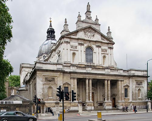
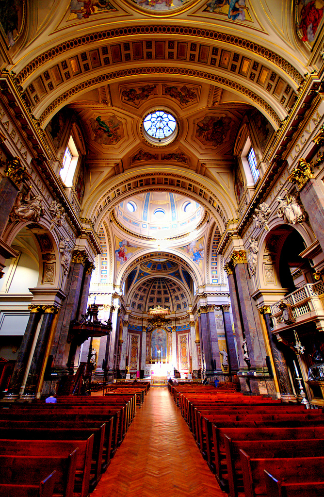
The tradition of the Eastern Church is not to have statues in its churches. A statue occupies three-dimensions of space, unlike a painting, which only occupies two-dimensions (but can create the illusion of a third). Given that the iconographic form, which is the only artistic liturgical tradition that the Eastern Church will permit, seeks to eliminate as far as possible even the illusion of a third dimension, that is depth, it is hard to imagine how statues (in which the third dimension fully exists) could be created in accordance with the iconographic form. The development of statues for churches came in the West in tandem with the desire to create the illusion of space in two-dimensional representations, generally identified with the beginning of the gothic period in about the 12th century. This did not cause the tradition of relief carving to die out in the West. It has always flourished in both Eastern and Western churches

Relief carving in effect, is a monochrome painting in shadow. So although there is a physical deviation from a strict two-dimensional representation not as a statue does, by imitating the three-dimensional shape, but rather by creating the illusion of depth by altering the tone of the shadow. Where the shadow is to be black (or darkest) the cut is deep and the surface angle close to perpendicular to the broad plane of the image. Where a grey or mid-tone is required, the cut is less deep and the surface angle somewhere in between, depending on how dark or light the artist wishes to make it appear. Where the tone required is white (or lightest possible) the surface faces us directly and is parallel to the broad plane of the image.

The conventional classification of relief carving is a division into bas relief (bas in French is low) and alto (ie high) relief. In the first the cut is shallow and there is no undercutting so that representation is never more than half in the round. Alto relief is where there is undercutting and so there are some elements that are carved more than half in the round. Sunken relief, or intaglio, is where the negative space around the figures is flat and the figures are cut out from it below that surface. For more information on this see article here.

Some might point out that the reason we can perceive form in a conventional statue that is not painted, for example all marble is due to shadow too. This is true. But the difference here is that the shadow is revealing is the true shape of the statue, which in turn imitates the idea in the mind of the artist. Whereas, in relief carving it paints, so to speak, the illusion of depth.

As with all these things, the division between the different techniques is never absolute. Bernini, the great baroque sculptor used to deviate from a strict representation of appearances in his statues and exaggerate certain elements by cutting deep into the stone and creating sharper contrast. He would say that as he didn’t have colour to manipulate the gaze of the viewer, shadow was the main tool that he had.

Below and above, Byzantine 10th century, St Demetrios


6th century Armenian, Virgin and Child

The Magi, Amiens Cathedral, 13th century

From the baptistry doors in Florence, early-mid 15th century, gilded bronze by Ghiberti.

Station of the Cross: the English artist, Eric Gill, 20th century, Westminster Cathedral


Thomas More Students Learn Academic Drawing at Internationally Known Atelier

Thomas More College Adds Academic Drawing to its Way of Beauty Program I am delighted to announce new developments in the Way of Beauty program for undergraduates at The Thomas More College of Liberal Arts’ in New Hampshire. It is partnering with the internationally renowned Ingbretson Studio to expand the Way of Beauty Program to include a series of weekly classes in the academic method of naturalistic drawing, which has its roots in the baroque and the High Renaissance, including the known methods of Leonardo da Vinci. This is a significant addition to its college courses and summer programs in sacred art.

This new initiative directly challenges modern art theories and seeks to renew in aspiring artists an appreciation for Catholic principles in sacred and secular art.

Students participating in the program will spend one day each week at Ingbretson Studio in Manchester, NH—a fifteen minute drive from Thomas More College’s campus. In addition to the practical method, they will study the philosophy behind academic drawing and painting.

Paul Ingbretson is himself a modern master of the Boston School Tradition, which seeks to combine the truth of impressionist color with good draughtsmanship, sound composition, and skillful paint handling.  His studio is known internationally and has trained some of the best known artists painting today, including Catholic portrait painter Henry Wingate, who teaches at the Way of Beauty Atelier summer program.

Ingbretson was taught in Boston in the 1970s by R. Ives Gammell, who is the teacher, writer, and painter who almost single-handedly kept alive the traditional atelier method of painting instruction.

Through Gammel, Ingbretson can trace a line through the Boston School, to the Parisateliers of the 19th century, and to the 17th century baroque. His students tread a path taken by such masters as the great American artist John Singer Sargent and the Spanish 17th Master, Velazquez.

This partnership with Ingbretson Studio helps the College achieve one of the primary objectives of the Way of Beauty Program—to form a new generation of professional artists that produce art that lifts the soul to God.

It is imperative that aspiring Catholic artists obtain, as well as the skills, a firm understanding of the Western tradition, which Thomas More College provides through its curriculum.  It is further imperative that aspiring Catholic artists receive firm spiritual formation from which they can derive inspiration, which again, is available at the college.

During their four years at TMC students will attend a series of courses in Catholic art and architecture; experience art first-hand during our semester in Rome; produce an icon of their own through our St. Luke Sacred Art Guild, assist me in producing sacred art for our chapel; and further hone their skills through opportunities like the one now available through Ingbretson Studios.

The Thomas More College of Liberal Arts provides a four-year undergraduate education which develops young people intellectually, ethically, and spiritually in the Catholic tradition and in faithfulness to the Magisterium of the Roman Catholic Church.  Thomas More College introduces its students to the central questions of Western Civilization—and to the Church’s response.  It teaches students how to reason, engage in academic discourse, and to write. Students from Thomas More College are shaped into becoming faithful leaders who will be able to pursue the individual vocations which God has given each of them.

All the artwork shown is the product an academic training. The charcoal drawing above is my own work; the painting of the two children is by John Singer Sargent; the portrait below is by Henry Wingate. The paintings below that are by the 19th century master of the Boston school, Joseph DeCamp

Russian Icon of the Mother of God of Fatima

Here is an interesting icon. Painted by a Russian Orthodox icon painter in collaboration with a Catholic priest. It is a beautiful image. The image is, in part, inspired by one of the Immaculate Heart of Mary. In order to accomodate the sensibilities of the Orthodox painter, the image doesn't show a picture of a heart, but show's Mary pointing the the word Sense (Heart) where her heart would be.  


You can read more about the development of the image here.


Summary of the Kenrick Seminary talks on art

By Mark Scott Abeln on his Rome of the West blog For any who are wondering whether or not it's worth the effort to watch them, here is a summary of the four talks at the Kenrick-Glennon seminary by Mark Scott Abeln. His blog is worth a look. He is a skilled photographer and he has insights how the principles I have been articulating in art and architecture apply in the art of photographer. The 'Rome of the West' for those of you, like me, who didn't know is his home town of St Louis. Photograph: the Cathedral Basilica of  St Louis, in St Louis, Missouri.

Glazes and Scumbles - Creating or Destroying Depth in a Painting

In good sacred art, even the appearance of the negative space around the figure is controlled by the artist The iconographic tradition portrays the heavenly realm, which is outside time and crucially (in this context) space. In order to convey a sense of the heavenly order in an earthly image, all sense of depth beyond the plane of the painting is deliberately eliminated. There is no superfluous background in an icon and the negative space around a figure is meant to appear flat. The naturalistic tradition, in contrast, seeks to do precisely the opposite. It is portraying Historical man, that is man after the Fall but not yet redeemed. This is the world of time and space that we live in. When painting in this tradition, the artist deliberately sets out, therefore, to create the illusion of space. There are a number of ways that an artist can do this. One way is to draw a scene with conventional perspective (and the icon painter can do the converse by using inverse perspective). However, in order to use either form of perspective, there must be a background scene painted in the area around the main figures onto which the artist would apply it. If there is not background scene the artists must use other means to control our sense of how the negative space appears: as either a three-dimensional space or a flat surround in the plane of the painting.

One is the choice of medium or media used in the painting. One option is to gild, which always looks flat. (You can see this 12th century Greek icon Moses at the burning bush, above.) If the background is painted rather than gilded, then egg tempera, fresco and mosaic always tend to look flat too, whereas oil paint, especially when used for painting shadow, always creates a strong sense of space beyond the plane of the painting.

Just to illustrate, compare the two paintings first and second below: and icon of Our Lady and Our Lord painted by Gregory Kroug in the 20th century; and Bellini’s Sacred Conversation painted in 1490. Neither has scenery painted around the figure, yet first has a white background that is designed to eliminate, as far as possible any sense of space beyond the plane of the painting. Bellini on the other hand, has painted a dark background that plunges into the depths, and gives a sense of almost infinite space – there is a gaping chasm beyond the figures.

The next painting (below, left) painted just 4 years before Bellini's by Carlo Crivelli in 1486 demonstrates why the standard choice of medium became oil rather than egg tempera. In this painting of the Annunciation, Crivelli uses single point perspective in order to create a sense that the pathway on the left is receding into the deep distance. The draughtsmanship is fine, but for me the painting just doesn't work. I have seen the original many times in the National Gallery in London and every time I see it what strikes me is that although the size those tiny figures in the background and all the perspective lines pointing to them tell me that they are in the distance, they just don't look distant. They look small. The reason, I feel, is the medium that Crivelli is using is egg tempera.

Even beyond the choice of medium, there are ways of manipulating the paint also that it can enhance or reduce the natural look of the paint in this respect. These are ‘glazes’ and ‘scumbles’. I do not know for certain, but as far as one can tell from the reproductions, my guess is that this is what Kroug and Bellini were using. Certainly, if I was trying to create the same effect, this is what I would do.

Glazes and scumbles are created when a translucent layer of paint is painted over another. When the tone of the upper layer is darker than that of the lower, it is called a glaze; when the tone of the upper layer is lighter than the lower layer it is called a scumble. If I were seeking to create the Bellini effect I would use a glaze in the background; and if seeking to create the Kroug effect, I would use a scumble.

When light hits the surface of the painting, some light and some is transmitted through to the next layer of paint deeper into the painting, and some is absorbed and re-emitted back outwards. This re-emitted light bears the character of the layer that absorbed it. It is why, for example, when you shine blue light on paint, that it appears blue. Consider now the light that was not absorbed, but which passed through the layer of paint. It is then incident upon the layer of paint underneath. At this interface the same thing happens again: some is transmitted and some absorbed and re-emitted. This goes on right until some of the light penetrates all the way through to the ground. If the ground of the painting is white and so very reflective, good part of the incident light comes back out of the painting.

When we look at a painting, what the eye sees is the aggregate of different rays of light emerging from differing points within the paint layer and bearing the mark of the layer that last absorbed and re-emitted it. When I paint with tempera, which can be diluted into thin washes of paint, the final effect is the cumulated effect of as many as 15 layers of paint of varying tones and colours. If you shine a light directly onto the painting then the optical effect is that the painting is itself a source of light. It is especially beautiful if the light is a flickering candle.

If you use a glaze with tempera, the usual medium for icons, it creates richer, jewel like surface. I you apply one in oil, the effect is even more dramatic. It causes the surface to appear to sink into the deep distance. The shadows of baroque art, such as we see in a Rembrandts, seem to sink into the infinite. This is effect, is created by a glazes and it is perfect for the numinous, mysterious feel that baroque artists sought. The painting right is Rembrandt's St Bartholomew.

A scumble, on the other hand creates the opposite effect. The upper layer appears to float on the surface. Generally, it is less often useful to an artist and so you don’t hear the term used very often by artists. However, it is extremely useful to any icon painters wishing to create this Kroug effect. You simply ensure that the final layer of paint is the lightest in tone. If the layers underneath are a combination of glazes and scumbles it still looks interesting and varied, but it thrust forward, rather than sinking back into the painting. What I find so lovely about Kroug’s works is the huge variety of washes of tone and colour that he applies underneath the upper layer, be it glaze or scumble.

So many modern attempts at icon painting that you see don’t do this. The colours are flat, dull and lifeless because they are created by the painting of a number of thick layers of the same paint. Like do-it-yourself decorator painting a wall.

(The painting below is The Virgin at Prayer by the Italian artist Sassoferrato. This baroque artist is using oil to create sinking depths in the negative space around the Virgin. What a wonderful painting! This is in the National Gallery too, and every time I visit, I make a point of going to look at it.)

Four talks on Sacred Art at Kenrick Seminary, St Louis

This autumn I was invited to address the seminarians at the Kenrick Seminary in St Louis. I gave four lectures on sacred art and liturgy. Here are four podcasts, posted on the seminary website. They are enhanced -  you hear my voice and see the slides I am describing. Harmony and Proportion - linking culture to the cult

Iconographic art

Baroque art

Gothic art

Sacred Heart Icon Promoted by Cardinal Burke at TMC

Cardinal Archbishop Raymond Burke visited New England recently as keynote speaker at the annual President's Council Dinner of Thomas More College of Liberal Arts. For those who are interested, you can read the text of his speech and see a video here. Afterwards, Cardinal Burke handed out small prayer cards to everyone who spoke with him. These were an image of the Sacred Heart of Jesus. There is a connection here. The college had been inspired to enthrone the Sacred Heart of Jesus in its chapel, in large part, under the inspiration of then Archbishop Burke's writings on the subject (the commission by the college of a Sacred Heart image that was the subject of the first article in this series).

The image that the Cardinal was handing out was of the one commissioned for the shrine in St Louis as a focus for this ancient Church devotion. The St Louis Sacred Heart image is a mosaic and strikingly similar in form to the Maryvale Institute’s Sacred Heart images (which are based upon the visions of St Gertrude in the 13thcentury). The housing of the Shrine was designed by Duncan Stroik (with some input from New Liturgical Movement’s own Matthew Alderman, see here)

Photographs below are of the Shrine in St Louis, including the mosaic; and at the bottom of the two Maryvale Sacred Heart images, a panel painting and a window, which are in the same vein.

As a postscript: the Cardinal has agreed to work with the President William Fahey of Thomas More College in New Hampshire on the production a children's catechesis for the Sacred Heart I will do the illustrations for the book. It is the third in a series of catechetical books for children, the last one God's Covenant with You, was written by Scott Hahn.

Pope points to Mary as the door to the Way of Beauty

In an address made on December 17th, Pope Benedict XVI highlighted the role of Mary, who is all beauty -  'tota pulchra' - in guiding us to the Way of Beauty, the 'via pulchritudinis'. Once again, and echoing John Paul II before him in his Letter to Artists, Benedict highlights the importance of art united to the liturgy and manifesting theology. 'I take advantage of this occasion to invite experts in theology and Mariology to follow the via pulchritudinis, and I hope that, also in our days, thanks to a greater collaboration between theologians, liturgists and artists, incisive and effective messages can be offered to the admiration and contemplation of all.'

The full text of the address is here

He also suggests that to this end we should contemplate two images. First the apse of St Mary Major (above). A virtual tour of the church is available here. Secondly he points us to the mosaics at Santa Maria in Trastevere. Two are shown below. They are 13th century (the annunciation is by Pietro Cavallini).

The Creation of a New Icon - the Merciful Jesus

When writing about Aidan Hart's work last week I noticed this icon. It represents an interesting postscript to the recent discussion of the portrayal of the Sacred Heart in the iconographic style. Aidan Hart was approached by someone who wished to commission a Sacred Heart image. As an Orthodox Christian he explained that he would be happier to paint an icon of Christ that communicated the themes of mercy and compassion but without making the heart visible. As he put it: 'My solution was to relate it to Christ's appearance to Thomas (hence the doors in the icon and Christ showing his wounded side). The wound summarizes Christ's compassion (sacred heart) for us in suffering and dying for us. The rays of light come from his whole person, although radiating from the direction of his heart.' This is interesting to me in a number of ways. First it is a beautiful image that does indeed communicate to me a sense of mercy and compassion; second, the story of its origin gives us a sense of how a new iconographic image is created; and third, if there are any Catholic artists out there looking to paint a Divine Mercy or Sacred Heart image, this is something that it could be based upon.

From a technical point of view, it is difficult to paint a robe that is all white and avoid creating something that is dull and lifeless. The interplay of different colours is one way in which the artist avoids this, and the scope for this is limited in an all white robe. Aidan has approached this by putting dark colours on the ground and then painting the white form over it. The ground colours show through faintly and give it variety, life and interest.

Christmas Cards from Daniel Mitsui

I just received Daniel's newsletter and included were these pictures which are for sale as Christmas cards. If you're interested, you can get further details from www.danielmitsui.com I like his style very much indeed. It is very refreshing to hear him freely admit that he has areas where he feels he could improve (he says his figure illustrations). I can only pass on advice that was given to me.  I was told that skill comes with work. To some it comes easily, some not so easily, but if you work for it, then you'll get there. And, I was told, if you love what you do, you will put in the work. 

This is the second feature I have written about Daniel's work (first is here). I am taken with his style and would like to encourage him to keep on getting better and better.

Learn to live the Way of Beauty at a weekend course

You’ve heard about The Way of Beauty, now learn how to walk the path This summer the Way of Beauty Atelier is running a long-weekend retreat: Traditional Paths to Inspiration and Creativity. Based upon the methods by which artists were trained to apprehend beauty and open themselves to inspiration, this has been adapted for everyone and has application in all activities. No special experience of ability is assumed. So artistic or not, creative or not, young or old alike, it doesn’t matter. Creativity and inspiration are great things whatever you do. It will be a weekend of prayer, traditional chant, talks, discussion and reflection. For more information and to sign up, go here and once there scroll down to the bottom of the page.

The painting shown, by the way, is Schedoni's Holy Family teaching Jesus to read. Schedoni lived in Italy in the late 16th and early 17th century. Here are some more images in a similar vein. From the top, Raphael; Annigoni's 20th century St Joseph teaching the boy Jesus carpentry; and de Grebber's Virgin teaching the infant Christ to read from about 1630