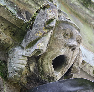
 I could't help a bit of fun last time, so here's the less frivolous version for those who take their gargoyles seriously! No gurning in this one I promise.
John Scotus Eriugena wrote in the 9th century how sometimes the presence of ugly details within a broader setting allows us to recognise all the more the beauty of the whole: "For anything that is considered deformed in itself as part of a whole not only becomes beautiful in the totality, because it is well ordered, but is also a cause of Beauty in general; thus wisdom is illuminated by the relation to foolishness, knowledge by comparison with ignorance, which is merely imperfection and wanting, life by death, light by the opposition of shadows, worthy things by the lack of praise for them, and to be brief, all virtues only win praise by comparison with the opposite vices but without this comparison they would not be worthy of praise...As is the case with a beautiful painting, for example. For all that is ordered according to the design of divine Providence is good, beautiful and just. Indeed what could be better than the fact that the comparison of opposites lets us sing the ineffable praises of both the universe and the Creator?' (De divisione naturae, V; quoted in The History of Beauty by Umberto Eco).
It seems to me that there are two principles being described here. The first is that our ability to apprehend beauty is heightened when it is contrasted with ugliness. I think that this is a concession, albeit a welcome one, to those of us who are not fully developed in our ability to apprehend beauty. The greater that ability, the more we are able to recognise it as a good in itself and the less we need contrast to do so.
The second point that seems to be coming out here is slightly different, that local deviations from perfect order contribute to the a greater beauty in the whole. It occurs to met that this is similar to the idea that evil is permitted because it allows a greater good to come forth from it. So an evil that is known only in isolation can seem pointless, but were we to know the full truth or, as the expression goes were we able to 'see the bigger picture', we could see the greater good is that will come out of it and so the knowledge of this makes the wider horizon even more beautiful to the eye.
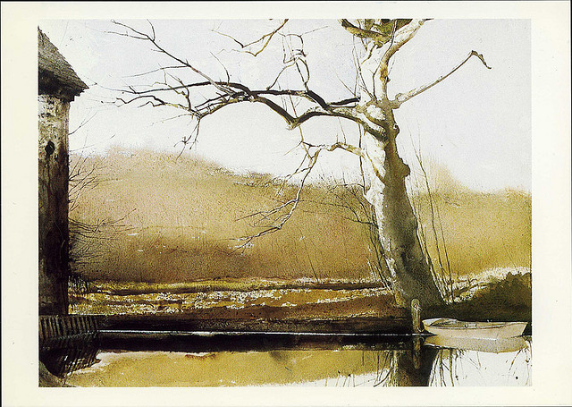
There are a number of thoughts of how, at a very practical level, these principles come into play in the composition design of paintings. I was taught that while there should be an overall sense of order and symmetry that runs through the painting, one does not want to impose formulae for proportions and harmony absolutely rigidly. Rather, one uses them as a first guide in the planning process, then at the end you look the whole and ask yourself the basic question 'how does it look?' At that point you should be prepared to modify it subtly so that at an intuitive level it just looks right (without reference to mathematics). So it is a combination of step by step reason and intuitive judgement that produces the finished article. If one the work of the artist is too rigidly fomulaic, then the finished painting tends to look sterile and dull. I was told that this is just like the human face. While faces are symmetrical, broadly speaking, when one examines closely no face is perfectly symmetrical. And if we draw faces that are perfectly symmetrical they do not look human - they look as though they belong to an android.

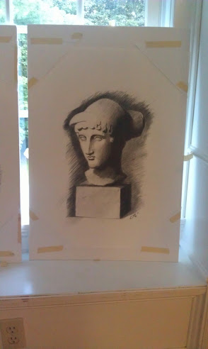
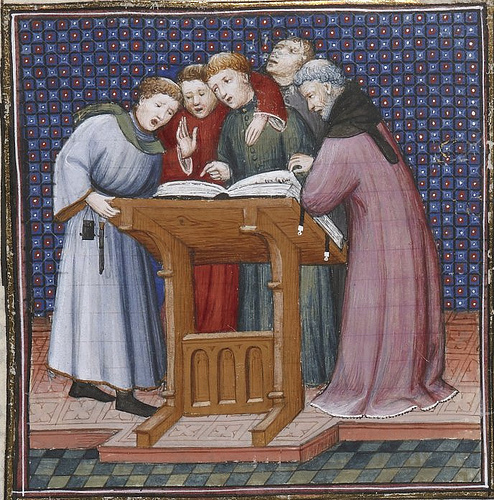
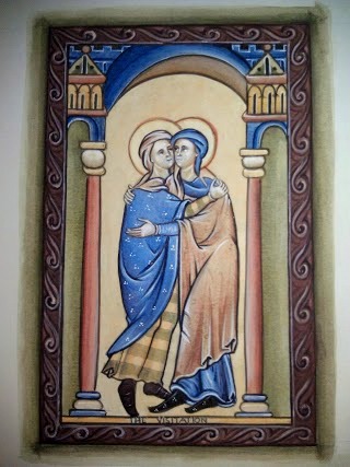
Also, we are often told that monks deliberately introduced 'errors' into their illuminations and the justification is theological: it demonstrates that the work of man is always imperfect next to the work of God. However, this seems to suggest that there is a complementary aesthetic argument for their inclusion as well. That is an illumination is more beautiful for the inclusion of the odd dislocation. I say that we are often told this, and I do not doubt that it is the case but when I look at illuminated manuscripts it never occurs to me that there are errors and mismatches there unless I break the spell, so to speak, and deliberately try and look for them. This is just anecdotal of course, but this is what suggests to me that the deviations from rigid symmetry are driven by an aesthetic sense (as my teacher Aidan was) as much as by a theology. So when I look at this 10th century manuscript I can see that the ornate design of the stylised plants in each corner and the columns are broadly symmetrical, but not perfectly so. However, the deviation, if it is deliberate, is controlled enough so that the overall sense of harmony is maintained.
In music, this seems to suggest to me that introducing occasional moments of dissonance is not altogether out of place, provided that it does not dominate and that ultimately the overall sense of the piece in context is that there is a resolution. This may be one reason why organum is so striking. As the chant melody floats above the steady drone most are the variations retain a harmonious relationship between the two. Occasionally it hops out of this cozy relationship and then just as quickly returns, like a fish leaping out of water and then falling back.
Now to gargoyles - do they represent ugliness in the context of beauty on a gothic cathedral? Perhaps, I suppose. For while one might say that the subject matter is ugly, one might also argue that the skill of the craftsman is still great and the work of art has a beauty to it. That is, it is a beautiful representation of something ugly (St Bonaventure, for example, wrote of this, and I think therefore we might return to this theme and develop a bit in a future posting). I do think, however, that the relation to the rest of the cathedral is important in our appreciation of both cathedral and gargoyle. If the whole schema of the sculptures in a church were as contorted as the gargoyles it would be overwhelming. What always occurs to me is that a much as consideration of order, harmony and symmetry in the abstract, there is, by virtue of what is portrayed, an element of an emotional contrast provided in many cases. Again, this is just my personal reaction (I have no further information to back it up) but when I look at gargoyles, I always think that it shows that the craftsmen who made them had a sense of humour. These look like artists' jokes done for a bit of fun and tucked away in corners so that we might enjoy a diversion from time to time when we discover them.


.jpg)


 Here's some more work from the summer painting course I taught in Kansas City, Kansas at the Savior Pastoral Center Kansas. It was sponsored by the Diocese of Kansas City, Kansas which runs the center. I thought I would show some of the work done by students. This is unusual in that we focussed on 13th century gothic illuminated manuscripts from the School of St Albans. The original is shown top left and the work of the class below. Apologies to those whose work isn't featured - I really haven't deliberately cut anyone out. For some reason I didn't arrive home with photographs of everybody's work.
We have already booked up to do two more courses next summer, so those who are interested might even contact the center now. This year the places went quickly and we could have filled the class more than twice over. The center website is here.
Here's some more work from the summer painting course I taught in Kansas City, Kansas at the Savior Pastoral Center Kansas. It was sponsored by the Diocese of Kansas City, Kansas which runs the center. I thought I would show some of the work done by students. This is unusual in that we focussed on 13th century gothic illuminated manuscripts from the School of St Albans. The original is shown top left and the work of the class below. Apologies to those whose work isn't featured - I really haven't deliberately cut anyone out. For some reason I didn't arrive home with photographs of everybody's work.
We have already booked up to do two more courses next summer, so those who are interested might even contact the center now. This year the places went quickly and we could have filled the class more than twice over. The center website is here.


 Here is the work produced by the students who attended the summer that took place at Thomas More College of Liberal Arts. It was a two week course offered in conjunction with the


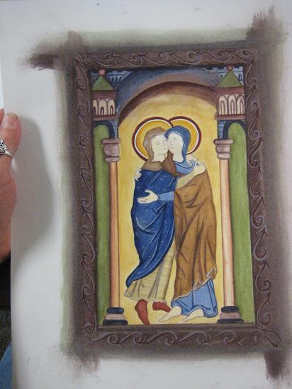
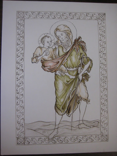
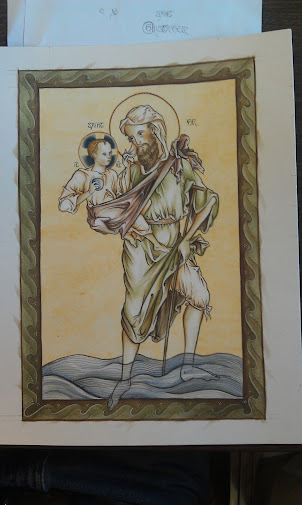
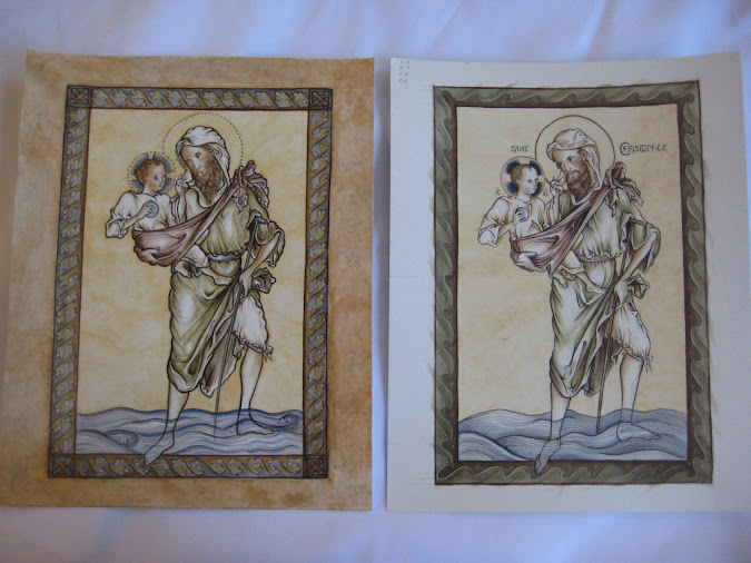
 This summer we held a painting course in Kansas City, Kansas at the Savior Pastoral Center Kansas. I taught it and it was sponsored by the Diocese of Kansas City, Kansas which runs the center. I thought I would show some of the work done by students. This is unusual in that we focussed on 13th century gothic illuminated manuscripts from the School of St Albans. This one is a St Christopher painted by a master of the school called Matthew Paris.
The students, Paul Jentz and his mother Christi (who kindly took and sent me the photographs) worked from the image shown top left. They constructed a grid as a help but drew the design by hand. While giving them guidance, I gave each freedom to vary the border and the colour schemes. I think you'll agree that they did a good job.
This summer we held a painting course in Kansas City, Kansas at the Savior Pastoral Center Kansas. I taught it and it was sponsored by the Diocese of Kansas City, Kansas which runs the center. I thought I would show some of the work done by students. This is unusual in that we focussed on 13th century gothic illuminated manuscripts from the School of St Albans. This one is a St Christopher painted by a master of the school called Matthew Paris.
The students, Paul Jentz and his mother Christi (who kindly took and sent me the photographs) worked from the image shown top left. They constructed a grid as a help but drew the design by hand. While giving them guidance, I gave each freedom to vary the border and the colour schemes. I think you'll agree that they did a good job.
 .
.


.jpg)

