Blog

St Matthew the Evangelist from the Lindisfarne Gospels - lessons for all who wish to pray...and for all who wish to paint

Matthew.LindisfarneTo mark the Feast of St Matthew here is the illumination from the 8th century British manuscript (the original is in the British Library). There are profound lessons here for those who wish to pray, and for those who wish to paint...or both. This simple painting, which is over 1200 years old and was created by an obscure monk working on a bleak island of the northeast coast of England in the North Sea can tell us so much. It reveals truths about St Matthew, and from its style we can discern things about the whole history of Christian art. These are lessons that budding artists can apply today, even if we want to paint in completely different styles such as the baroque. Matthew.Lindisfarne

To be able to see these things in the painting we will look first at the historical context. This little painting even tells us about the history of Britain! Art historians - (and the font of all knowledge, Wikipedia of course!) - will describe the style of this art as 'insular' or 'hiberno-saxon'. This refers to the Celtic style of art and literature of the Christians who remained in the British Isles and Ireland after the retreat of the Romans. It is viewed as 'insular' in two ways - first more literally as it belongs to the islands of Britain and Ireland; and secondly because it is often viewed as a style that is distinct from others of this period. There is a third reason particular to this gospel, in that Lindisfarne, the site of an abbey, is an remote island off the coast of Northumberland in northeast England. The artist of this painting was a monk called Eadfrith and he later became the abbot of Lindisfarne Abbey.

lindisfarne-priory

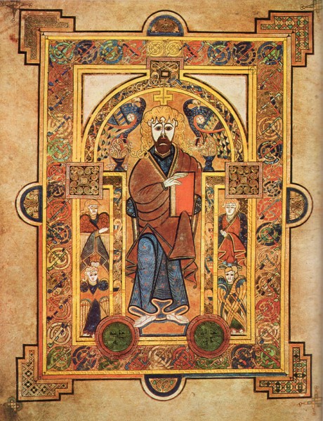
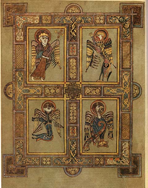
The British islanders who remained after the retreat of Roman troops in the 5th century were culturally Roman and so wrote in Latin. Gradually over the following centuries they were overwhelmed by the incursions of German and Nordic tribes. Even in the 8th century, there were pockets of Latin culture left and most of the Lindisfarne Gospel is written in Latin. In this page 'Mattheus' is in Latin and he is referred to as a saint with the word 'Hagios' (Greek). Matthew is depicted writing his gospel with the figure of the winged man, the symbol of Matthew, standing on his shoulder (imago hominus - the image of a man). This, is one of the four faces of the cherub described by Ezekiel in his vision. Over time Germanic and Viking culture dominated more and more and by the 9th century Latin was not so widely spoken; and so on other pages the original Latin gospel text is translated into the vernacular in red ink. The curtains are present to indicate that the person is inside and are drawn back to reveal the scene to the observer. Some commentaries refer to this as a symbolic unveiling by which the truth is revealed. I have to be honest and say I do not know who the figure peeping out from behind the curtain is. Can anyone help me here? The painting is ink on vellum, made from the skin of sheep. Vellum is a material that is resistant to decay over time and was also very expensive and so rare. This is one reason, incidentally, that so many Icelandic sagas remain I found out recently - because there were so many sheep on Iceland and such a small population, vellum was more plentiful and so unusually they recorded a much higher proportion of their folk tales on vellum and this is how we know of so many today. Tolkien was an expert in all of these ancient forms of British and of the Icelandic language and literature - so this is the world that fired his imagination so strongly. Back to this painting - the style of Lindisfarne gospels art is certainly distinctive. While retaining its unique look, it still conforms largely to the iconographic prototype, which governed Christian art, East and West from about the 5th century through to the 13th century. This is a Western variant, so while it doesn't look like a Russian icon, it still conforms in many ways to the same prototype. So this has the characteristic flatness and lack of perspective that one expects in an icons, revealing the heavenly dimension which is outside space. In order to emphasize this the bench upon which Matthew is sitting is in inverse perspective. He has his feet on a pedestal indicating a holy person. There is one little anomaly however. A feature that pulls it away from strict conformity to the icon is the fact that the symbolic winged man is in profile. Generally, in icons faces are in three quarter profile or full face (like the other two figures) indicative of a saint who is happy to reveal is person to the viewer because in his purified state he has nothing to hide. Generally images from this period conformed fully to the iconographic prototype. Here is a portrayal of the symbol of St Matthew along with those of the four evangelists in the Book of Kells, which was produced about 100 years later and is considered of the same period and style. We can see St Matthew portrayed in three quarter profile, the standard for human forms. I don't know why Eadfrith departed from this in his version. It might be a mistake or even an act of defiance, or perhaps a little bit of ignorance. Kells There is another aspect to this and it relates to how we know what an icon is. What is it that makes an icon rather part of the gothic tradition? Anyone who has done an icon painting class or read a book about icons is aware that there are stylistic principles which govern what they do. What many do not know is that the rules that they are being given are a modern construct. They were for the most part written and popularized in the 20th century. I have researched and asked many people and am not aware of any writings prior to the recent period that represent a codification of the stylistic elements that make in icon an icon, rather than, say, a piece of gothic art. There are no writings by Church Fathers for example. The rules that you come across in the books were devised by a group of Russian ex-patriots in Paris, especially influential were two men called Ouspensky and Lossky. They looked at the images that they judged to be good and worthy of veneration and the devised a set of rules that seem to apply to them to aid people to create art in a similar style in the future. To my knowledge no such code was in existence in writing when Eadfrith was active. We do not know the degree to which the style, which seems to have been preserved by force of tradition, was directly linked to the theology of style in the way that it is presented today. Perhaps, in fact, there was more leeway than we imagine and Eadfrith was just making what would have seemed a legitimate artistic decision. Make no mistake, people such as Ouspensky and Lossky did a great job, in my opinion. they provided a set of guidelines by we have seen the re-establishment of what was in the 19th century a wayward tradition in Russian and Greece, into a strong and clearly defined form so that  icon painters today can be every bit as good as the top icon painters of the past. These Russians were not without their own agenda in setting this down however. They were Eastern Orthodox and deliberately set down the rules so as to reflect their belief that the Western forms of art were inferior ('degenerate' is the term I have heard used to refer to the gothic and the baroque for example) . Catholics should be aware of this. The idea that all sacred art has to look like an icon is, from the point of view of the Catholic Church flat wrong. Unfortunately that doesn't stop many Catholics unquestioningly accepting and repeating the anti-Catholic rhetoric that they have heard in their icon painting class. Contemporary Orthodox commentators are motivated to make Western forms that were created prior to the schism between East and Western Church (around 1000AD) , such as this example of insular art, fit in with the iconographic prototype because it supports and argument that Christian culture was unified before the schism and then fragmented afterwards. Then, the argument runs, we can see that the Eastern Churches remain faithful to the original forms of Christianity, while it is the Roman Church that has veered away. We don't have space here to give the full theology of the image that governs the Western traditions in art, but to give you a general picture of what is legitimate for the liturgy and what is not, I take my lead from Benedict XVI. He said in his book, the Spirit of the Liturgy that the icon is appropriate for the liturgy (in this he agrees with the Orthodox) but in addition, he says, for the Roman Rite, the gothic and the baroque styles are appropriate too. So you can continue to enjoy and worship with paintings in the style of people such as Duccio and George De La Tours. I would say that the one thing where the Eastern Church does lead the West is in the reestablishment of these traditions. We are 60 years behind in propogating a theology of style of the uniquely Western styles, in the way that it has been done for icons. My book, the Way of Beauty, was an attempt to do for the theory of the gothic and the baroque traditions what Lossky and Ouspensky did for the iconographic tradition. Below, classic baroque - St Matthew and the Angel by Guido Reni of the 17th century - with the angel...legitimately... in profile; and the same evangelist by Duccio
— ♦—

My book the Way of Beauty is available from Angelico Press and Amazon.

Guido_Reni_-_St_Matthew_and_the_Angel_-_WGA19308   Duccio     Matthew.Lindisfarne

Film review: the War Room - portraying a suburban alternative to the Benedict Option

War-Room_300It also proves that Christian morality sells - the film making is not that great, but the message is good and that is why it is popular! I went to see this film because I noticed that it has been in the top three in box office receipts since it was released; and because it is clearly Christian in inspiration and is pushing a moral and spiritual message.

The War Room is about a troubled marriage in which the wife begins to pray for her husband and we see how this changes her and in turn her interaction with her husband and their daughter for the good. The plot is simple, the message is moral and uplifting and the portrayal of the prayer, if  a little on the protestant charismatic side of things for my temperament, is authentic, I think. There are no appearances of angels or visions - which while they do happen in reality are not the experience of most people in their relationship with God and so this helps to give the film a down to earth reality. The prayers are answered with happy results that work their way through via positive outcomes in ordinary events. All negative turns in the plot were neatly and happily resolved (and perhaps over simply treated).

The reviews of the film are mixed. Some critics, I sense, are reacting to the message itself which is good and overtly Christian. This can work both ways depending on the personal belief of the critic. Others do seem to be trying to detach from their personal beliefs and critique the quality of the film making. Most of the latter do not like it. Even in my inexpert opinion it could have been a lot better - the dialogue is wooden, the interplay between the characters is superficial and unsophisticated and the jokes are fairly obvious. This is no Christian Woody Allen film...but still, I do think it is worth seeing! I can see why it is popular and despite the negatives, I found myself genuinely enjoying it. I was uplifted by the message and it transmitted a strong affirming message of faith.

War room 16b25577-6c36-4459-a9ad-c1337371f31c

I am pleased that such a film was made and is so popular. What this tells me is that the market for good films is huge and if something like this, notwithstanding the negatives can be so popular, then anything that has the essential elements of truth and is at the same time well made cannot help but be a box office smash. Furthermore, it seems to me, if it were in addition overtly Catholic, then it would have the popularity of the Sound of Music and It's a Wonderful Life all rolled into one.

warroom-mv-2

The 'war room' of the title is the converted closet that became he inner sanctuary of prayer. The young wife in the family posted prayer requests on the wall, prayed and then checked them when they were answered. She had been instructed by an elder mentor to develop a prayer strategy in the real war, which was not as she supposed, against her husband, but against the devil and his influence.

There is a point here for those of the Benedict Option mentality who wish to retreat from society, re-group and then emerge at some point in the future when the next Charlemagne creates a safe environment to be openly Christian. This film is about personal transformation and engagement, rather than withdrawal. I do think that retreat is needed but it is not geographical or cultural, but spiritual. The wilderness is the place where we meet the devil and we deal with him in prayer, then we emerge to engage with society wherever we are now, transformed by prayer. The inner room is the symbol of the place inside ourselves where we pray and engage with our demons. As I was watching I was thinking how a similar film could show the person engaging in the pattern of prayer described by Benedict XVI in his paper on the New Evangelization, and the person was praying not in the broom closet, but to the home altar or icon corner! The film strikes me as being closer to the Benedict XVI Option of personal transformation in Christ by which we transfigure the culture right where we are now; than it is the Benedict Option.

War room

Interestingly, there was an, apparently inadvertent, reference to the need for praying for the dead. I don't know if the protestant film producers did this consciously but as my friend Fr Nick, with whom I went to see the film, pointed out, it probably wasn't  a deliberate pitch for the existing of purgatory (which it can only have reflected in logic). Rather, it reflected something that is innate, a desire to pray for those who are gone, which has been planted in us by God.

I doubt that this film is going to convert many non-Christians, but I think it would act to help reinforce a lukewarm faith - this seemed to be what it was trying to do. The protagonists were just that, people of faith who were not fervent until the events of the story caught up with them. Nevertheless, it is heartening that a film is of ordinary quality in other ways should be so successful. It demonstrates, perhaps, that, despite what Hollywood is supposed to believe, morality sells!

War-Room_300


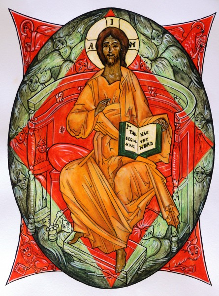
Images from the Way of Beauty: Christ Enthroned and the Quincunx - Symbolic Images of the Gospels

Santa_Croce_in_Gerusalemme_Kosmaten_2009-600x450This week we show images, one is representational are and one is geometric art. First is Christ Enthroned. I painted this for the childrens coloring book, Meet the Angels. It went on the back cover. It shows Christ, as described in the vision of Ezekiel and the Book of Revelaton, enthroned with the four faces of the Cherubim in each corner. Around the throne also are many six-winged seraphim - just wings and faces - and who are transparent so the colours of the background show through. This is a standard iconographic image and if you look on Google images for 'Christ Enthroned' or 'Christ in Majesty' you will see many in this style. It is painted in egg tempera. The almond shape around Christ is called a Mandorla (Italian for almond!) and represents the cosmos.


Christ-Enthroned-JPEG-445x600 (1)


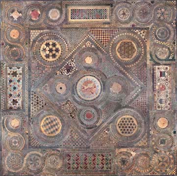
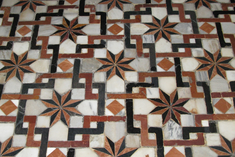
The other images are examples of cut stone floorwork and are geometric designs in the 'Cosmatesque' or 'Cosmati' style. It is named after the Cosmati family which, over several generations, developed this distinctive style of work. If they were covering a large area, such as a whole church floor, they worked on three scales. For the grand form they tended to compartmentalize into rectilinear shapes. Then the sub-form would be a geometric design consisting of faceted polygons or interconnected circles. The final stage would be an infill of with very small repeated regular geometric shapes such as squares, triangles of hexagons (which are the three forms that can put together without creating gaps).

One of the standard designs is the ‘quincunx’. This the generic name for the arrangement of five equivalent shapes that has four arranged symmetrically around the fifth which is centrally place (it is also a game-winning word in Scrabble so it'll pay to remember this, if for no other reason). The five dots on dice, for example, are in a quincunx shape. I understand the name comes from the Latin for five-twelfths, a coin of this fraction value of the currency had this name and often had this arrangement of dots on it.

This one is in Westminster Abbey:

Westminster Abbey, Cosmati floor, photomosaic


..and this is in Santa Croce in Rome:

Santa_Croce_in_Gerusalemme_Kosmaten_2009-600x450


In the context of geometric patterned art, it is the shape of four smaller circles spinning of larger secondary one was not limited to the Cosmati craftsmen. It is seen in both Eastern and Western Churches and across many centuries and was seen in Roman floor mosaics.

What is the connection between the geometric and representational forms?

The answer is that both sybolize the Word of God being taken to the world through the gospels. Around the central image of the enthroned Christ we see four figures representing the four evangelists carrying the Word to the four corners of the world. Wikipedia describes the source as follows:.

'Matthew the Evangelist, the author of the first gospel account is symbolized by a winged man, or angel. Matthew's gospel starts with Joseph's genealogy from Abraham; it represents Jesus' Incarnation, and so Christ's human nature. This signifies that Christians should use their reason for salvation.

Mark the Evangelist, the author of the second gospel account is symbolized by a winged lion – a figure of courage and monarchy. The lion also represents Jesus' Resurrection (because lions were believed to sleep with open eyes, a comparison with Christ in the tomb), and Christ as king. This signifies that Christians should be courageous on the path of salvation.

Luke the Evangelist, the author of the third gospel account (and the Acts of the Apostles) is symbolized by a winged ox or bull – a figure of sacrifice, service and strength. Luke's account begins with the duties of Zacharias in the temple; it represents Jesus' sacrifice in His Passion and Crucifixion, as well as Christ being High priest (this also represents Mary's obedience). The ox signifies that Christians should be prepared to sacrifice themselves in following Christ.

John the Evangelist, the author of the fourth gospel account is symbolized by an eagle – a figure of the sky, and believed by Christian scholars to be able to look straight into the sun. John starts with an eternal overview of Jesus the Logos and goes on to describe many things with a "higher" christology than the other three (synoptic) gospels; it represents Jesus' Ascension, and Christ's divine nature. This symbolises that Christians should look on eternity without flinching as they journey towards their goal of union with God.'

One of the reasons that the Church settled on four gospels was to emphasis this symbolism (see St Irenaeus writing in the 2nd century AD in Against Heresies). The quincunx also symbolizes Creation, as the number four represents the cosmos. The symbolism is of, again the four corners of the world - Christ spoke of the 'four winds' and the symbolism of the four points of the compass comes from this.

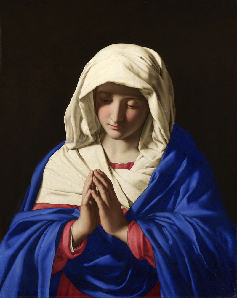
Sassoferrato's Virgin at Prayer - for the Nativity of the Blessed Virgin Mary

Sassoferrato_-_Jungfrun_i_bönFor today's Feast of the Birthday of the Blessed Virgin Mary here is the Virgin at Prayer by the Italian artist Giovanni Battista Salvi da Sassoferrato who is generally known simply as Sassoferrato. He lived from 1609 to 1685. Records of the commemoration of the Nativity of the Blessed Virgin Mary on September 8th go back to the 6th century. The Solemnity of the Immaculate Conception of Mary was later fixed at December 8, nine months prior.

There is a commentary on the Feast from the following information is drawn, here, by Fr Matthew Mauriello: 'The primary theme portrayed in the liturgical celebration of this feast day is that the world had been in the darkness of sin and with the arrival of Mary begins a glimmer of light. That light which appears at Mary's holy birth preannounces the arrival of Christ, the Light of the World. Her birth is the beginning of a better world: "Origo mundi melioris." The antiphon for the Canticle of Zechariah at Morning Prayer expressed these sentiments in the following way: "Your birth, O Virgin Mother of God, proclaims joy to the whole world, for from you arose the glorious Sun of Justice, Christ our God; He freed us from the age-old curse and filled us with holiness; he destroyed death and gave us eternal life.

'The second reading of the Office of Readings is taken from one of the four sermons written by St. Andrew of Crete ( 660-740 ) on Mary's Nativity. He too used the image of light: "...This radiant and manifest coming of God to men needed a joyful prelude to introduce the great gift of salvation to us...Darkness yields before the coming of light."

This painting, like the painting of Gregory the Great by Vignali, described last week, is in the baroque style of the 17th century. Again, we see the sharp contrast between light and dark symbolizing the Light overcoming the darkness, and again like the Vignali, the face is in partial shadow ensuring that this is distinct in style from a portrait (I described the reasons behind this in more detail in the earlier posting). There is an additional element here in the portrayal of the face that was not so strongly present in Vignali's painting. The facial features are highly idealized and bear the likeness of the ancient Greek classical ideal.

Sassoferrato_-_Jungfrun_i_bön Sassoferrato's training and influences were all in the classical baroque school. This is a stream within baroque art that looks to Raphael from 100 years before as its inspiration. Raphael's faces, in turn, strongly reflected the classical Greek ideal and this was picked up by the Caraccis in the late 16th century (most famously Annibale) who founded a school from which most of line of influential figures in the classical baroque line emerged.

All Christian sacred art must have a balance of idealism, which points to what we might become; and naturalism which roots the image in the particular and what we see and know in the here and now. The different styles of Christian sacred art look different from each other because they look to different sources for their ideal, and because of the exact balance of idealism and naturalism they reflect. Baroque classicism is called so to distinguish it from 'baroque naturalism' in which, though still partially idealized in accordance with what is good for Christian sacred art, has a greater emphasis on natural appearances. Ribera would be an example of the naturalistic school and Poussin was one of the most famous proponents of baroque classicism.

We can see the similarities in the facial features of the Sassoferrato Virgin, Raphael's Alba Madonna (which I describe in more detail in a posting here) and the ancient Greek statue the Venus of Arles from the Louvre. This strong idealization is another way that the artist ensures that portrayal of Our Lady is a piece of sacred art and avoids it looking like a portrait of the girl from next door dressed in historical costume.

600px-RaphaelAlba

Here is the Venus of Arles:

Venus_of_Arles_Louvre_Ma439_n04

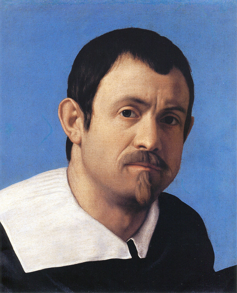
We can see the difference between the way in which sacred art and mundane art are painted by contrasting what these works with Sassoferrato's self portrait. Notice how in the portrait the image engages the viewer much more directly and we look deeply into his eyes, the deep shadow is absent and background is blue rather than black so the contrast between light and dark is not so pronounced. There is still some shadow in the face certainly - this necessary in order to describe form - but it is not so marked. Also there is not such an obvious fusion of the natural features of the face with those of the Greek ideal as we would see in the sacred art.

Sassoferrato Sassoferrato's Virgin is in the National Gallery in London and I have a great fondness for it, even long before my conversion, it was one of those paintings that I always made a point of going to look at every time I visited the gallery. As a gallery that has no entrance fee, I often used to just drop in for 20 minutes on my way home from work, or even sometimes just to escape the rain! The peaceful repose and expression of Our Lady, which is even more apparent if you see the original, always drew me in.

Sassoferrato_-_Jungfrun_i_bön

— ♦—

My book the Way of Beauty is available from Angelico Press and Amazon.

JAY W. RICHARDS, Editor of the Stream and Lecturer at the Business School of the Catholic University of America said about it: “In The Way of Beauty, David Clayton offers us a mini-liberal arts education. The book is a counter-offensive against a culture that so often seems to have capitulated to a ‘will to ugliness.’ He shows us the power in beauty not just where we might expect it — in the visual arts and music — but in domains as diverse as math, theology, morality, physics, astronomy, cosmology, and liturgy. But more than that, his study of beauty makes clear the connection between liturgy, culture, and evangelization, and offers a way to reinvigorate our commitment to the Good, the True, and the Beautiful in the twenty-first century. I am grateful for this book and hope many will take its lessons to heart.”

More About the Images from the Way of Beauty book - the Trinity Shield

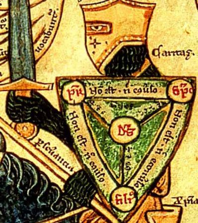
Trinity_knight_shield The Trinity Shield is a diagrammatical way of representing the Trinity. This is useful in couple of ways:

First, pedagogically - ie as a teaching tool - it demonstrates simply the idea that there is one God but three distinct persons, and that each person is always in relation to another (being in relation to another is the essence of being a person, in fact).

Second, it is way of representing the Trinity artistically while avoiding what can be a tricky debate over what is appropriate for imagery when representing the persons of the Trinity directly. To be true, the image must be consistent with the idea that Christ is one person, both human and divine in nature; and that the Father and the Holy Spirit are both spirit. It took about 500 years for that to be resolved dogmatically by the Church in regard to Christ, and almost another 500 years for the implications of this in regard to sacred images of Christ. Even if we feel that we have now clearly sorted out the issue of whether or not images of Christ are legitimate, some might still object to the idea of representing what are in truth spiritual beings  - the Father and the Holy Spirit - as a agrey-haired old man and a dove, for example. I discuss this in greater detail in a past article, Should We Paint God the Father. Even if we agree that representing them in this way is legitimate, we might decide that it not prudential today, given the difficulty many modern people have in reading a symbolic language and the tendency to see things a literal and material. Anything that would make people thing that the Father really is a man - ie to 'anthropomorphize' Him' would be unwise.

In the following example we can see how it explains the nature of the Trinity so clearly. We can read the shield as follows: each person, Father, Son and Holy Spirit (Pater, Filius, Sanctus Spiritus) is not (non est) either of the other two, but each is God (est Deus).

Trinity_triangle_(Shield_of_Trinity_diagram)_1896

This diagram was popular in France and England in the middle ages and the illumination in the Way of Beauty is a detail from a 13th century manuscript by and artist called William Peraldus. It shows the knight armed with the shield of the Trinity preparing for battle with the seven vices. It is similar in style to the gothic 'School of St Albans' style from a similar period and which relies heavily on line drawing to describe the image and the uses washes of colour in moderation.

Peraldus_Vices_and_Virtues


— ♦—

My book the Way of Beauty is available from Angelico Press and Amazon.

JAY W. RICHARDS, Editor of the Stream and Lecturer at the Business School of the Catholic University of America said about it: “In The Way of Beauty, David Clayton offers us a mini-liberal arts education. The book is a counter-offensive against a culture that so often seems to have capitulated to a ‘will to ugliness.’ He shows us the power in beauty not just where we might expect it — in the visual arts and music — but in domains as diverse as math, theology, morality, physics, astronomy, cosmology, and liturgy. But more than that, his study of beauty makes clear the connection between liturgy, culture, and evangelization, and offers a way to reinvigorate our commitment to the Good, the True, and the Beautiful in the twenty-first century. I am grateful for this book and hope many will take its lessons to heart.”

A Painting for Today's Feast - St Gregory the Great by Jacopo Vignali

Jacopo_Vignali_-_Saint_Gregory_the_Great_-_Walters_372530And How It Reveals the Supernatural End of All Education Today is the Feast of one of the four great early Latin Church Fathers and Doctors of the Church, St Gregory the Great. The others are Ss. Jerome, Ambrose and Augustine.

A Benedictine monk, Gregory was known as the Father of Christian Worship because of his reforms to the Roman liturgy and of course gregorian chant is named after him (although the degree to which he actually composed it is not so certain). He is the patron saint of musician, singers, teachers and students.

Universalis.com, which has the full office for the day, gives the following reflection on him to accompany the Hours of his feast day:

'He was born in Rome and followed the career of public service that was usual for the son of an aristocratic family, finally becoming Prefect of the City of Rome, a post he held for some years. He founded a monastery in Rome and some others in Sicily, then became a monk himself. He was ordained deacon and sent as an envoy to Constantinople, on a mission that lasted five years.

'He was elected Pope on 3 September 590, the first monk to be elected to this office. He reformed the administration of the Church’s estates and devoted the resulting surplus to the assistance of the poor and the ransoming of prisoners. He negotiated treaties with the Lombard tribes who were ravaging northern Italy, and by cultivating good relations with these and other barbarians he was able to keep the Church’s position secure in areas where Roman rule had broken down. His works for the propagation of the faith include the sending of Augustine and his monks as missionaries to England in 596, providing them with continuing advice and support and (in 601) sending reinforcements. He wrote extensively on pastoral care, spirituality, and morals, and designated himself “servant of the servants of God.

'He died on 12 March 604, but as this date always falls within Lent, his feast is celebrated on the date of his election as Pope.'

Jacopo_Vignali_-_Saint_Gregory_the_Great_-_Walters_372530


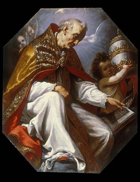
This painting by Jacopo Vignali is on the ceiling of the library of Dominican monastery of Santa Maria Novella in Florence. It was painted in about 1630 is one of a set of four, which contains the four Latin Fathers mentioned earlier. He is shown from below and is there for the contemplation of the studying monks. We see an angel holding the papal tiara and the dove of the Holy Spirit coming down to him to inspire him in his writings. One imagines that the monks would look at this painting and hope that Divine Wisdom would be given to them also.

Stylistically it is classic 17th century baroque: we see the contrast of light and dark which is part of the visual vocabulary of the baroque - symbolizing the Light of the World overcoming the darkness.

It is interesting to note that the face of St Gregory is in shadow. If this were a portrait, the artist would focus very strongly on the facial features. However, in naturalistic baroque sacred art the artist emphasizes the facial features less than if he were painting a portrait of the same person. This is because the purpose of the two genres is different.

A portrait seeks to emphasize the individuality of the person, what makes him distinct from all others. Sacred art, on the other hand, seeks to emphasize those aspects that are common to all of us. The desire of the artist is to create an image that inspires us to emulate the deeds of the saint. We can never emulate those aspects that are peculiar to Gregory, only those qualities in him that are common to all of humanity. So, baroque sacred art seeks to emphasize the whole person. In this respect it is a question of balance, the artist does not wish to remove the sense of an individual altogether for we always ascertain the general through the particular. But we don't want to overemphasize the particular to the degree that the perception of his general human characteristics are lost.

This is a mistake that many contemporary artists make who have been trained as portrait painters and who then turn their hand to sacred art. Very often the work will be skillfully rendered but in reflecting portrait artist's craft there can be too great an emphasis on the facial features. The end result is of something that looks not like a saint, but of a contemporary man - perhaps the artists' neighbor - dressed up in biblical costume. It resembles a Victorian tableau.

If the face is not a main area of focus, then it introduces new problems for the artist. He must try to indicate some sense of emotion and mood, and usually he would do this through facial expression. As this is not available to him in the same way he will tend to resort to other means. We also discern the mood of a person through body language, or as the art critic would call it 'gesture'. So it is through gesture - displayed in the body posture, the stance and especially the what he is doing with his hands and arms that the artist portrays emotion. This is one reason why the dramatic poses we associate with baroque art are present. The artist does not always put the face in shadow as markedly as we see here, but if there is strong gesture, then we tend to focus less on the face when we look at the painting.

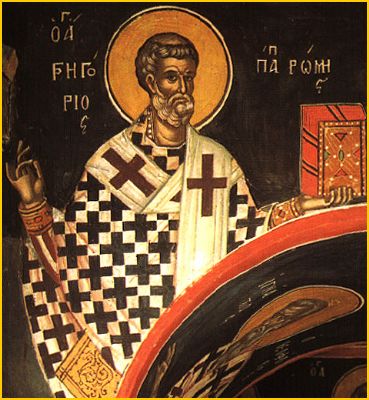
Vignali's painting is not the dramatic action shot that we might see in the lives of others saints - the conversion of St Paul comes to mind - but still he is trying to convey a sense of the person through the pose. Compare his painting with this painting of St Gregory which is in the iconographic tradition. This is less naturalistic and more highly stylized (and so less inclined to look like a portrait), so we can have more emphasis on the face. Therefore there is less need to convey information through the gesture and consequently it is much more restrained.

20051013034724!GregoryGreat3


One question that one might ask in regard to Vignali's painting is this - is this really sacred art? Do we need to follow the principles of sacred art when decorating a library? I would say yes, because the end of all education is supernatural and the Sacred Liturgy cannot be separated from it. Every education ought to be placed in the context of enhancing our love of God and love of God through love of neighbor. This means therefore, that regardless of the actual subject taught, the worship of God in the Sacred Liturgy is the ultimate end, in this life, of all education. By this we are transfigured and can bring the love of God and divine wisdom into our daily activities, whatever they may be. An education that is not in accord with this, even if it is Catholic doctrine that is being learned, is not a real education at all. It is sacred learning that points us to the place of the greatest teacher who works though the words and actions of the liturgy. This is why in the medieval colleges, such as we can still see in Oxford, the main quadrangle contained the three most important buildings - the chapel, the library and the dining hall. Each is beautifully decorated and in design the two lesser pointing to and derived from the higher. This painting is telling those Dominican friars exactly that point in regard to study. Writing in 1929, Pius XI wrote the following in his encyclical on education Divini illius magistri: 'The proper and immediate end of Christian education is to cooperate with divine grace in forming the true and perfect Christian, that is, to form Christ Himself in those regenerated by Baptism...For precisely this reason, Christian education takes in the whole aggregate of human life, physical and spiritual, intellectual and moral, individual, domestic and social, not with a view of reducing it in any way, but in order to elevate, regulate and perfect it.' In education, as in all things, the Sacred Liturgy is both the source of grace from which we start and the highest summit towards which it is directed.

— ♦—

My book the Way of Beauty is available from Angelico Press and Amazon.

JAY W. RICHARDS, Editor of the Stream and Lecturer at the Business School of the Catholic University of America said about it: “In The Way of Beauty, David Clayton offers us a mini-liberal arts education. The book is a counter-offensive against a culture that so often seems to have capitulated to a ‘will to ugliness.’ He shows us the power in beauty not just where we might expect it — in the visual arts and music — but in domains as diverse as math, theology, morality, physics, astronomy, cosmology, and liturgy. But more than that, his study of beauty makes clear the connection between liturgy, culture, and evangelization, and offers a way to reinvigorate our commitment to the Good, the True, and the Beautiful in the twenty-first century. I am grateful for this book and hope many will take its lessons to heart.”

Mass for the Third Anniversary of the Anglican Use Community of St Gregory the Great in Massachusetts, September 3rd

The Anglican Ordinariate community of St Gregory the Great will be have a special Mass for its third Feast of Title and Dedication at St Patrick's Parish in Stoneham, Massachusetts on September 3rd. It promises to be particularly beautiful, see the poster below or go to their website for more information, www.saintgregoryordinariate.org.


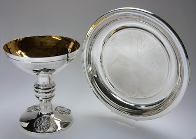
On another but connected note, some readers may remember that I featured the commissioning of chalice and paten by the community which was made in silver. The original article was here. This set has just been given an award by the journal Faith and Form in conjunction with the Interfaith Forum on Religion, Art and Architecture. The designer and maker of the set, silversmith Vincent Hawley will be presented with the award at the May 2016 National Convention of the American Institute of Architects in Philadelphia, PA. His website is www.vwhjewelry.com. Congratulations Vincent!

It is great to see an Anglican Use community flourishing like this!


I'm trying not to think of Danny Kaye...the chalice with the palace has the wine which is fine....:) No sorry, I couldn't avoid it... https://youtu.be/TJ9f2rnjB84


— ♦—

My book the Way of Beauty is available from Angelico Press and Amazon.

JAY W. RICHARDS, Editor of the Stream and Lecturer at the Business School of the Catholic University of America said about it: “In The Way of Beauty, David Clayton offers us a mini-liberal arts education. The book is a counter-offensive against a culture that so often seems to have capitulated to a ‘will to ugliness.’ He shows us the power in beauty not just where we might expect it — in the visual arts and music — but in domains as diverse as math, theology, morality, physics, astronomy, cosmology, and liturgy. But more than that, his study of beauty makes clear the connection between liturgy, culture, and evangelization, and offers a way to reinvigorate our commitment to the Good, the True, and the Beautiful in the twenty-first century. I am grateful for this book and hope many will take its lessons to heart.”

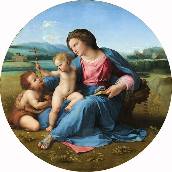
Images from the Way of Beauty book: the Alba Madonna by Raphael

600px-RaphaelAlbaMost of the images in my new book, the Way of Beauty are reproduced in black and white. For any readers who wish to see them in colour, the publisher, Angelico Press has posted all of them on the book webpage, here (scroll down past the reviews and you'll see them). I plan to do a series of postings highlighting these paintings, indicating their importance in the book and also offering a little more about the artists and the history of the painting itself. The first featured is the Alba Madonna by Raphael. I used this painting in the book to illustrate the idea that the geometric shape can be used to enhance the beauty. In this case it is the idea of unity which is communicated through the circular shape. As I explain in the book we know that Raphael was aware of the idea of number symbolism and of traditional harmony and proportion and that he used it in his paintings. He incorporated these elements into his designs not because he wanted to build in a secret code, but rather because he felt that they were intrinsic to the subject portrayed and so would enhance the beauty of the painting, perceived intuitively,  and its power to communicate the truth.

This particular painting shows Our Lady with the young Jesus and John the Baptist. Raphael's work characterizes the High Renaissance style of the early 16th century and it's style is drawn, consciously, from that of ancient Greek and Roman statues and art - the facial features of Our Lady for example, bear a striking resemblance to a classical Venus. This painting reflects another departure from what was the norm in Christian sacred art for centuries, and that is to place the figures in a landscape that is painted so as to create the illusion of space. The gothic and iconographic styles for example would generally have had a flat background in order to communicate the heavenly dimension that is outside time and space. He paints in oil paint because this is a medium that has special properties (in contrast to egg tempera or mosaic) that helps the artist create the illusion of space .

Raphael uses perspective very skillfully - the objects in the distance are smaller than the objects in the foreground. He also uses colour perspective. The more distant the object is, the bluer it gets. I always thought that Raphael had exaggerated this until I spent time in Italy myself. There is something about the Italian landscape itself that makes this effect more pronounced than I was used to seeing in England. This effect doesn't come out in photographs so strongly as it appears in nature, and as Raphael, Leonardo et al faithfully reflect in their paintings. I did wonder if the reason for this was that the Cyprus and olive trees that dominate the Italian landscape have a bluish green foliage, but I don't really know why this should be.

One last story in connection with this painting. It is in the National Gallery in Washington DC. Once some years ago, when visiting the gallery I was admiring it and thought I would take a photograph for my own use. I had been told by someone that the gallery had recently changed their policy and you were now allowed to do so. This is quite a common policy now, but at one time it was unknown and I was skeptical about whether it was really true. So tentatively I took my camera out and glanced up to see a security standing at the door. He didn't seem to be objecting so I carried on. I was just sizing up the composition of the photo when I felt a tap on my shoulder. The security guard was standing next to me. I was ready to be chastised and so was about to explain that I had been told by something that this was allowed. Before I could do so he spoke: 'Excuse me sir, but I think you'll find that the photograph will turn out better if you use the flash.'

In fact even with the flash, the photo wasn't good enough - you can still see the shadow from the overhead lights on the photo I took:

Raphael with flash


So here's a better version of the picture for you to study. For even more understanding of the High Renaissance style of art by my book, the Way of Beauty.

600px-RaphaelAlba

— ♦—

My book the Way of Beauty is available from Angelico Press and Amazon.

JAY W. RICHARDS, Editor of the Stream and Lecturer at the Business School of the Catholic University of America said about it: “In The Way of Beauty, David Clayton offers us a mini-liberal arts education. The book is a counter-offensive against a culture that so often seems to have capitulated to a ‘will to ugliness.’ He shows us the power in beauty not just where we might expect it — in the visual arts and music — but in domains as diverse as math, theology, morality, physics, astronomy, cosmology, and liturgy. But more than that, his study of beauty makes clear the connection between liturgy, culture, and evangelization, and offers a way to reinvigorate our commitment to the Good, the True, and the Beautiful in the twenty-first century. I am grateful for this book and hope many will take its lessons to heart.”


Woody Allen's Irrational Man - the film that Crimes and Misdemeanors should have been?

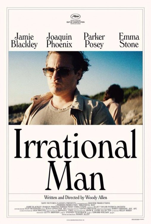
irrational_manWoody Allen is a filmmaker who I always wish was a Catholic. He observes human nature brilliantly and knows how to portray that in film; he has an erudite wit and he seems to be able to write this into the dialogue of his characters without it coming across as forced or affected; and he knows how to reflect a philosophical outlook in that dialogue in such a way that even if you don't agree with it, you find yourself enjoying the film and laughing at his jokes. The problem with many of his films is that while he very often knows how to portray the absurdity of modern philosophy, he does not always leave you with a good alternative. Sometimes, from the message portrayed in his films, you wonder if he is unsure himself what the answers are. When he does seem to offer answers, it has looked to me as if he is trying to justify whatever aspect of his tumultuous personal life most recently hit the news. If only he was a Catholic, or alternatively we had Catholics who knew how to make films like Woody Allen, how much greater would those films be. Also, I would say in order to encourage any Catholic filmmakers out there, the films would be even more successful as a result because they would now represent more fully what is good and what is true. When any art form does this well, then it will have mass appeal for it will have greater beauty too.

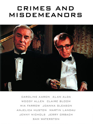
When I saw Woody Allen's latest film, the Irrational Man I wondered if (at the age of 79), he is changing. You will have to watch the film to see the plot, but in general terms, this one struck me as a new version of his 1989 film Crimes and Misdemeanors.  Both have the well crafted dialogue and nicely observed human interactions in the context of the confused sexual politics of the liberal elite. And both have a murder in which the film examines the how the conscience of the murderer reacts and changes over time, placing this in the context of right and wrong.

There are two differences. First, the Irrational Man is not as funny - in this sense it is a little disappointing, but perhaps you need to the comic genius Allen himself or Alan Alda, who star in the earlier film, to deliver the lines. It seems that although there are a few chuckles as you go along, but I think that perhaps this wasn't Allen's intention with Irrational Man. Joaquin Phoenix, who plays a bitter and philandering (and murderous) philosophy professor in a Rhode Island college, plays it just right for me in a more serious role and doesn't make the mistake of trying to a replacement for Woody Allen in the way that he plays it.

download (1)

The other is the nature of the philosophical message of the resolution of the film. In this respect I liked Irrational Man much more. In Crimes and Misdemeanors, the conscience of the murderer, played by Martin Landau, is at first tortured, but in time, the discomfort disappears and the film closes with him a scene of him laughing heartily and saying to friend that he has nothing on his mind that he regrets - in time he indicates, all guilt disappears. This was reinforced by the line from character played by Alan Alda, who said that in the end all comedy is just 'tragedy plus time' - ie the worse it is initially, the funnier it is in the end.

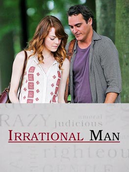
I remember thinking at the time that this was a dangerous message - it was saying that there is no objective right and wrong. No matter how bad something seems, its just the perception, and time if nothing else can change that. I am convert and part of what brought me to the faith was the realization that there was only one thing that would appease my conscience and that was the mercy of God. My experience was that no matter how I tried to tell myself I was good person, I did not believe it until I had confessed my wrong doing. If I had listened to the message of Crimes and Misdemeanors, I thought, I might have found it attractive initially, but I would still be hanging around just waiting until I felt better, feeling miserable and heading, very likely, for hell. tumblr_m6p3gjQZmT1rzj6jyo1_400 In the Irrational Man, on the other hand, the murderer is initially exhilarated by what he has done as he believes his own hype but as time progresses things get worse and his crime, so to speak, catches up with him. The voice of his conscience is the student with whom he is having an affair, played by Emma Stone, who is initially in thrall to his reputation and all that he does. Gradually, she realizes what he has done and reacts against his justifications and the philosophical theories that underpin them. Unlike the plot in Crimes and Misdemeanors, the effect on the murderer of his past action will not go away in time. It becomes clear that he must face a choice. Either acknowledge what he has done truthfully, or else continue the lie and try to erase the voice of his conscience. From the point of view of moral law, he makes the wrong choice and attempts to do the latter. The outcome of the protaganist here, again, unlike that of Crimes and Misdemeanors, is a just reward for his actions. So as I saw it, the film resolves itself in support of natural law, objective good and bad and a condemnation of the modern philosophy that the professor espoused in the classroom to his students.

What is interesting is to me is to see how the mainstream film critics reviewed each film. They had just about the opposite reaction to me! They loved Crimes and Misdemeanors and at the time it was nominated for host of awards - best actor, best film, best director, best screenplay...the list goes on. But they hated the Irrational Man. I don't know if the differing reviews are a reflection of the differing quality of the films, or of the worldview of the critics. I suspect the latter! IrrationalMan_300415_263x351


— ♦—

My book the Way of Beauty is available from Angelico Press and Amazon.

JAY W. RICHARDS, Editor of the Stream and Lecturer at the Business School fo the Catholic University of America said about it: “In The Way of Beauty, David Clayton offers us a mini-liberal arts education. The book is a counter-offensive against a culture that so often seems to have capitulated to a ‘will to ugliness.’ He shows us the power in beauty not just where we might expect it — in the visual arts and music — but in domains as diverse as math, theology, morality, physics, astronomy, cosmology, and liturgy. But more than that, his study of beauty makes clear the connection between liturgy, culture, and evangelization, and offers a way to reinvigorate our commitment to the Good, the True, and the Beautiful in the twenty-first century. I am grateful for this book and hope many will take its lessons to heart.”

Talk on John Singer Sargent at the Ingbretson Studios, Manchester, NH this Thursday August 27

Paul Ingbretson is opening up his painting school the Ingbretson Studios, on Thursday to give a talk on one of the great artists of the naturalistic tradition, John Singer Sargent and the movement that was inspired to a large degree by his influence, the Boston School of the latter part of the 19th century and early 20th century.


John Singer Sargent was not a religious man, was not known for sacred art and neither was the Boston School. However, I recommend this talk for two reasons. First, because stylistically Sargent was an anachronism. Although he was trained in Paris in the 19th century, under the influence of his teacher Charles Durand (known as Carolus-Duran) he rejected the sterile neo-classicicism of the French academy and its corollary, the overly emotional portrayals of the Romantics and strove to follow the style of the great Spanish master of the 17th century baroque, Velasquez. This was not a theological or philosophical decision, as far as I am aware, it was based upon personal taste. He wanted to paint like Velazquez because he preferred his style. After training with Duran in Paris he went to the Prado in Madrid and taught himself further by copying every Velazquez on display in the museum. So, in his portraits and landscapes he incorporates the essential elements of the style of the baroque, which is an authentically Christian style, and can be accounted for by a Christian worldview. This style is rooted in the religious art that grew out of the Catholic counter-Reformation of the period. Therefore, anyone who wishes to understand the balance between natural appearances and idealization that must be present in all genuine Christian art, could do worse than study the work of Sargent.


Idealized naturalism is as much about what you don't show as much it is about what you do. The artist controls the focus, the intensity of colour and contrast of light and dark to draw your attention to the important points of interest, which must coincide with those which we would look at naturally if we were presented with the scene itself. We are made by God to curious about important things and uninterested in unimportant things and the artist must understand this.


The other reason for highlighting this is to give a profile to Paul Ingbretson. One of the most important reasons that there are any ateliers teaching the academic style at all today is the group of young men trained in Boston in the 1970s under the guidance of almost the only remaining teacher of the academic style at that time, an octogenarian called Ives-Gammell. Paul was one of these young men who went on to devote himself to passing on what he learnt to others.

Paul is not Catholic but he is, as far as I am aware, Christian. Certainly, his strong libertarian views mean that he encourages people of faith to connect this with their art when he teaches. This is not true of all the ateliers around, which can be just as aggressively secular in their worldviews as any other modern art school. Some of you may be aware of the Catholic painter based in Virginia, Henry Wingate. Henry, who paints portraits, still lives and sacred art, is one of Paul's star pupils.


The paintings shown are by Sargent, the first is Gassed, which comes from his work as a war artist during the First World War and shows soldier who have survived mustard gas and are blind being led from the battle ground. The second is Venetian Interior in which we can see how much Sargent communicates by his use of colour (or deliberate lack of it), focus and contrast.


David Clayton's book, the Way of Beauty, which contains a description of theological basis of the form of Western naturalistic art is now available from Angelico Press and Amazon.com.