Blog

Using the Principles of the Liturgy and Beauty in Retail

High Shelf Esteem! When James Woodward, owner of Woodward Menswear, decided to open a second high-end men’s clothes shop he wanted to model it upon the principles he had read about in the Way of Beauty. He had already started to put some of the principles into practice in his first shop, in Oxted in Surrey, England and had been encouraged the results. Because he was beginning with a blank page in this new venture, he saw the opening of his second shop in Banstead, also in Surrey, as an opportunity to use them more fully. I received a telephone call from him earlier this year asking for ideas about the layout and decoration of the new place. He had already been trying some of these things out in the first shop, but hadn’t been able to implement them properly because a lot of the things were already set differently when he had thought about introducing them. Nevertheless the changes that he was able to make had made an impact he thought. The local bank manager had told him at one point, in the deepest part of the recession, that his was the only business on his books that showed any significant signs of growth. ‘I had been making money and I felt that this had contributed. The growth of the business is helping to fund the investment in this new shop. But it isn’t just the money,’ he told me. ‘The principles that I had been able to try seemed to show me a way of having the values of my Catholic faith penetrate much more deeply than before the everyday activities of business.’

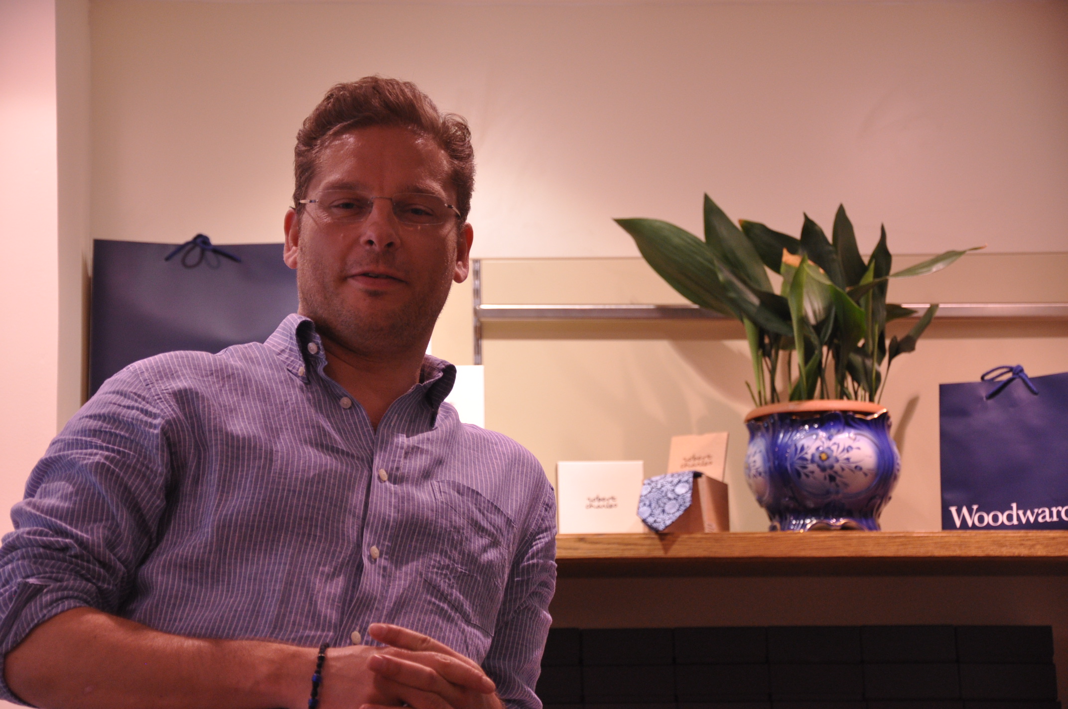
James is a Catholic convert of about 10 years. I had known him for several years because we both attended the London Oratory when I lived in London. We had had conversations about the Way of Beauty over the years, just as a result of staying in touch and his curiosity about what I was up to over here. At some point he started to ask me how he might introduce into what he was doing in his first shop. Even so, I was surprised to be asked recently to contribute so much to the new project.

So what has he done? As a starting point I suggested that whatever he does he constantly ask himself the question, is this beautiful? And to be prepared to go against the trend of modern design if necessary. I did offer some specific points:

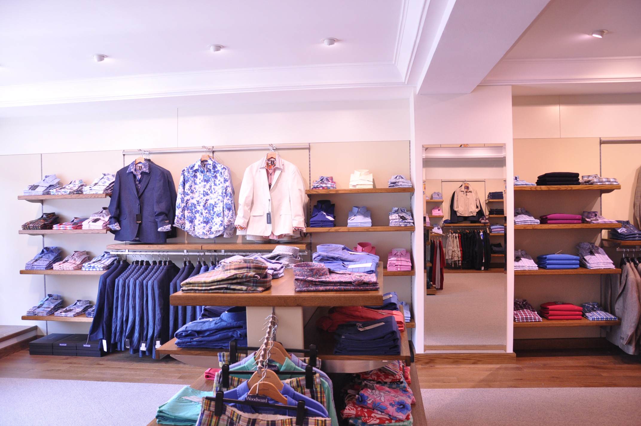
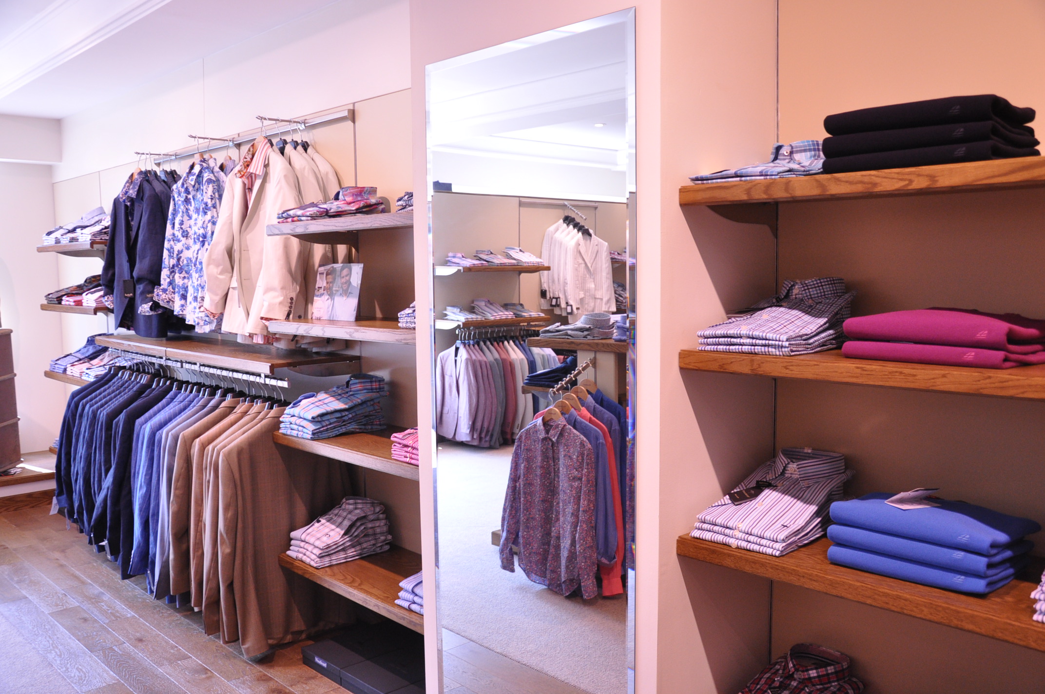
  • The general layout is one that gives a general impression of symmetry and order. I suggested that he introduce some details of asymmetry. If it is too rigidly symmetrical it would be cold and sterile. He went directly against the advice of his retail designers here, who were recommending more sweeping and turning curves in the layout; and asymmetry ordered to the personal intuition of the designer. I suggest that the colour scheme should be based around natural earth colours if possible.
  • The clothes are presented on shelves and I suggested that the spacing of the shelves should not be even, but should vary so that the largest spacing is at the bottom and smallest at the top, mimicking the proportions of storey size in traditional architecture.
  • He has the natural beauty of plants in the shop too, either pot plants or cut flowers. Because there are people walking around the shop, this meant that he had to design into the layout spaces and shelves just for this purpose so that the arrangements could be placed without impeding the flow of people or the views of the clothes he was selling.
  • I told him to try to avoid pop or rock music and again, if you have music to opt for something that is beautiful. I am not completely against all pop music per se, but even good music that is designed for dancing at midnight is unlikely to promote calm and peace, which is what we were aiming for here. In the end James opted for no music at all. He was really sticking his neck out here. Almost all retailers install music systems and have background music constantly. The outfitters cite scientific studies that prove that when you play such music, people stay for a shorter period of time and buy more quickly. Also the staff initially wanted it too for their own entertainment. He is not certain he wants to maintain the silent vigil and is considering using classical music.
  • I felt it was important to have the face of Christ as a focus in the décor (a good principle for all main rooms in a building). In the end he bought a small icon of the mandylion and put it on the wall behind the till. This meant that every customer who went to the counter would see it. In his previous shop James put also a nativity scene in the window every Christmas and he intends to the same here. Aside from any thoughts about décor, he wanted to bear witness to his faith in an open, but quiet way.  Again, the advice of the professionals on this one was the exact opposit! It would offend and put off non-Christians he was told. He has had no complaints from customers since he did this, and several complementary remarks. Small children were pulling their parents into the shop as a result of the nativity in the window.
  • Finally, I had suggested that he pray the Liturgy of the Hours as part of his spiritual life and even if he couldn’t pray all the hours, try to mark each Office with a prayer of some sort. He might, I thought, consciously dedicate this prayer as a sacrifice for the well being of his employees and customers.

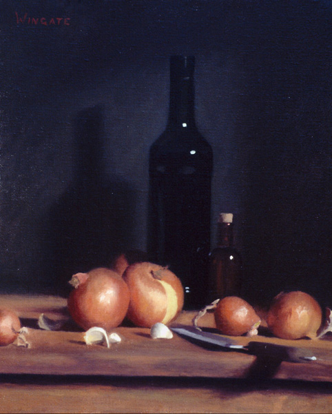
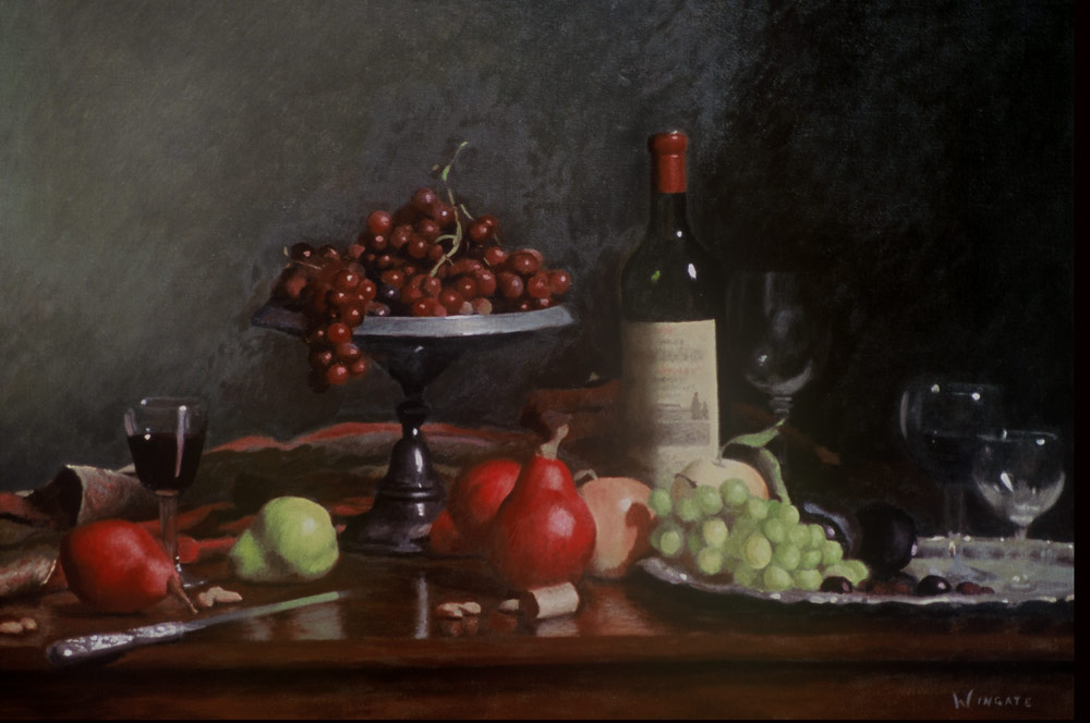
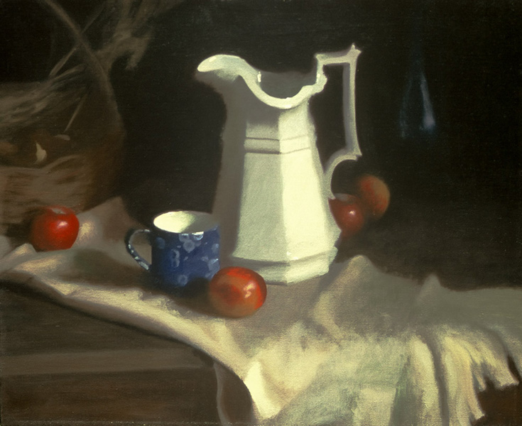
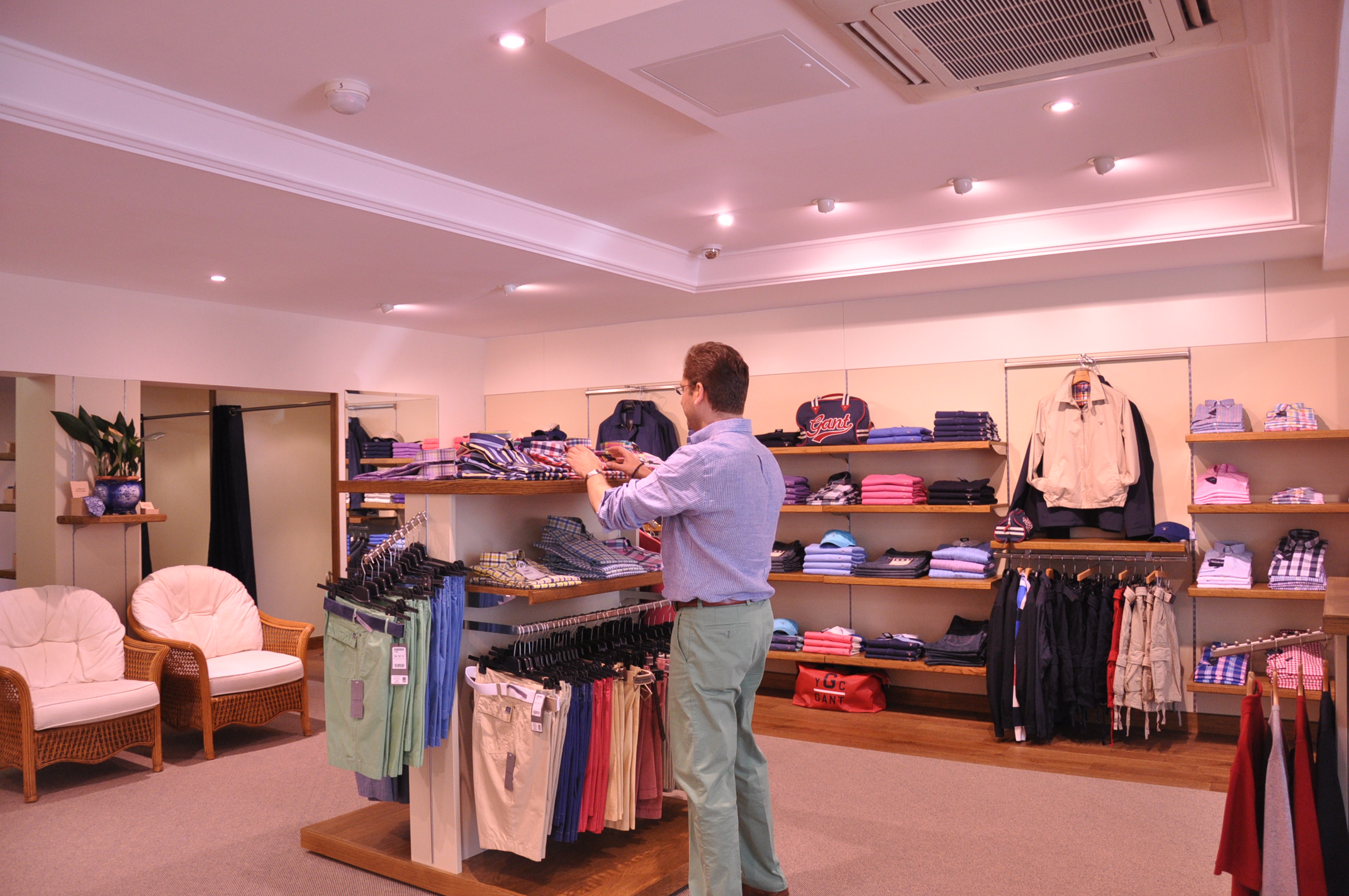
The photographs of the shop and are shown, so you can make your own mind up about the look. The shelves are solid oak veneer and the flooring is solid oak coupled with pure-wool carpeting.  The paintwork is all natural-pigment traditional paint (produced to re-create eighteenth-century decorative schemes). What strikes me is that although traditional proportions and materials have been used, it has a clean-cut modern look. This is not trying to recreate and Italian villa or a Georgian town house. The modifications are subtle.

Clearly,  using these high quality materials involves a greater outlay than the usual materials. He has now been going for about three months and when I spoke to him recently I was interested to know: did he feel the extra investment had been worthwhile?

‘The look of the place has had an impact. Several customers and other local retailers have complimented the shop actually using the word “beautiful”. For example I was at the local newsagents and the lady behind the till engaged me conversation. When she realized I was from the new Woodward Menswear she immediately told me that people had been saying to her how beautiful the shop was.

‘Many customers have told me how comfortable and inviting the shop is and one top-notch fellow fashion retailer said it was a really beautiful shop and “very calming”. What I find so interesting is that they can't really tell why it is. they respond to the overall look but they can't say why. I haven't made it look like a Victorian shop or anything, the look is similar in many respects to other shops, but the modifications are subtle. I think that unless it was pointed out to them, for example, they wouldn't know that the shelves are spaced differently to other places.’

And the bottom line?

‘It’s early days of course, but I am very pleased. We are already making as much money as my first shop, which I bought as a business of 30 years standing and have been running for several years. This is better than I had expected. Of course, these beautiful features are not the only thing that will be contributing to the business.  I have learnt a lot about retail while running my first shop and so have put many lessons in to practice in this second. I still had to get the location and the stock right along with all the other business variables. However, if it’s only for the comments and my own pleasure at working in such a lovely environment, I definitely feel that it has been worthwhile.’

What about the future? James pointed out to me that this was done on the basis of reading blog articles and an hour’s telephone conversation. He wants to know more about the Way of Beauty.

‘I am impressed by the impact that this has had and I get the feeling that I am scratching the surface here. I do my best but I don’t know much about the Liturgy of the Hours or how to pray it and I definitely could learn more about how these proportions are linked to the liturgy. I am planning on coming over to the creativity retreat at Thomas More College in New Hampshire in August. And I will probably pay a visit to the menswear shops in Boston while I’m here too, just to see how they do it over there!’

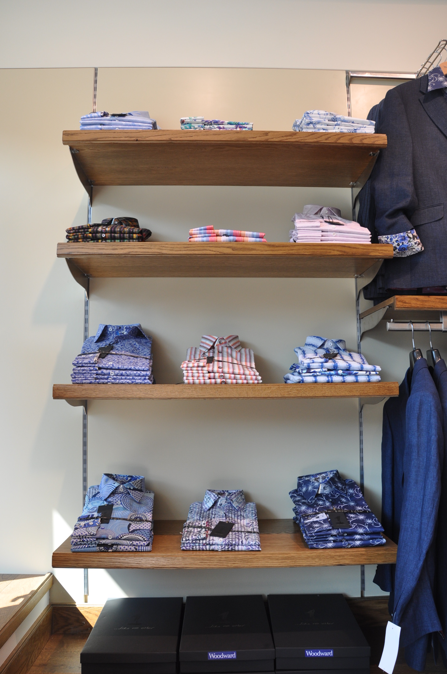
Clothes fit for a Church Father - Boethian proportions were used for the shelf spacing.


Thomas More College Students Artwork - Academic Drawing

Here are examples of cast drawings by freshman students at Thomas More College of Liberal Arts. They study the academic method of drawing. This is a method that developed in the High Renaissance and can be traced back to Leonardo. The name comes from the art academies of the 16th and 17th centuries that established it. We are lucky to have the world renowned Ingbretson Studio closeby in Manchester, New Hampshire. During the spring semester, students spent each Saturday at the studio. This is a large sacrifice of time as they received no concessions in regard to their other studies. The results are excellent, I think you'll agree.


The method involves setting the easel up next to the cast and then retreating several feet so that that both drawing and cast can be seen in the same angle of vision. This allows for a systematic build up of the image. The artist looks at the two, decides what aspect he needs to draw and then moves forward and draws from memory. He then retreats back to the marked position to compare his work with the cast again. Through this steady motion, moving forwards and backwards, the picture is created.


The introduction to this method is through cast drawing because the plaster cast has no colour, and is stationary. This means that the student can learn to see in tonal shapes. The introduction of colour comes once modelling in tone has been mastered.

You can learn the academic method at Thomas More College this summer from Henry Wingate, who studied for 5 years at the Ingbretson Studio before going on to be an internationally known portrait artist. Henry is going to be teaching at the Way of Beauty Atelier from June 27th - July 9th. For more details follow link here.

Changing Appearances According to the Audience

When depicting Christ or Our Lady one always has to consider their individual characterics (handed down to us by tradition); but at the same time the artist will always consider modifying the appearance so that those who are likely to see the painting will identify with Him or her. Here are some paintings by Chinese Christians. The first, left, dates from the 14th century and the second from the turn of the last century. Christ is the Everyman, the model for all humanity. When He (or indeed Our Lady and the saints) are painted, the image must also participate in a model of humanity that the audience can relate to. All sacred art is a balance of the general and the particular. If those who are going to see the painting are going to be almost exclusively Chinese, then it is a legitimate approach, I would argue, to portray Christ and Our Lady as Chinese.

This principle is used famously, in a different way, in the Isenheim altarpiece painted in the early 16th century in the gothic style by the German artist Matthias Grunewald. Christ is horribly disfigured, but not as he would have been disfigured by the passion. This painting was made for a hospital in which people were suffering from an illness caused by fungus in the rye grain used in the bread eaten locally. The cause was not known at the time and so the illness was incurable. The symptoms match exactly those that Christ has in the painting. This is clearly intended to offer solace to the patients to communicate to them that Christ is suffering with them and for them.

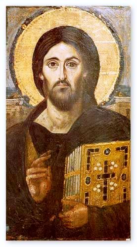
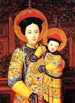
There are many depictions of Christ by Western European artists that show him as Western European for the same reasons. When I showed my students the Christ pantocrator, below, many assumed that this was painted in Western Europe too, and were surprised to learn that it was from Mt Sinai in Egypt. I could only offer a speculation as to why his skin tone is paler than one would expect of a working man, a carpenter, in the Middle East, which would surely have been known to the Egytians who saw this image in the 6th century. I suggested that as this was in the iconographic form, the artist would shown the uncreated, heavenly light emanating from the person of Christ. So the lightening of the skin tone is linked, perhaps, along with the other familiar features such as the halo to the depiction of this. As usual I will be interested to see if there any readers who can enlighten us (if you’ll forgive the pun) on this matter.

Even if my suggestion is correct. It doesn’t apply universally. The last two are from Russia. So in this case the skin tone reflects neither the uncreated light, nor that of those who are likely to see the icon. I once had lessons from an icon painter in England who had been at one time a student of the famous Russian iconographer, Ouspensky. She told me to use predominantly the green-brown colour that we see there (called ‘avana ochre’) with highlights used sparingly in yellow ochre and white specifically because it matched the olive-brown Mediterranean complexion.

It seems that an artist has a choice in these matters. The governing principle is that he should aim to maximize his chances of communicating the person of Christ to those who are likely to see his work.

The Isenheim altarpiece

Caravaggio's Flagellation of Christ

Mt Sinai, Christ Pantocrator


Thomas More College Students' Art Work - Geometry

Student work from the Guild of St Luke We have just finished the academic year here at Thomas More College. As part of the graduation ceremonies we had an exhibition of the student art work done by the college's Guild of St Luke. I will show parts of this over the next couple of weeks. Today we see geometric patterned art done by freshmen at the college. In the spring semester the students study Euclidean geometry as part of their introduction to logic. The way that Euclid is taught generally in liberal art schools is that students are expected to memorise and on demand be able to demonstrate proofs to the professor and class in the classroom and then be able to respond to questions and discuss the proof. We do this at Thomas More College too. In addition, however, as a deepening of the learning experience we create some of the Euclidean constructions, using the traditional toools of a pair of compasses and a straight edge. From this foundation the students go on to study geometric patterned art. We look at Islamic patterns and then how Christians have incorporated these designs into churches in the past. For example at the 12th century Capella Palatine in Sicily. The first two examples shown below are exercises where I asked the students to create a simple Islamic tile design. They were required to present it as formed by strips passing over and under each other is a loose weave. I asked them to work out for themselves how a border could be incorporated into what they were doing. Two examples are shown below.


Then I set the students a project to create a design for either the floor of nave or sanctuary in a simple basilica style church. They had to use either the quincunx (four circles coming out of one) or the guilloche - a series of interconnected circles. The infill could be drawn from a series of Romanesque traditional designs that I presented to them. In accordance with the gothic style of pavement design they were encourage to piece it together in orthogonal boxes. The results are very impressive. After one semester they are producing church floor designs that would grace any church in the country and which are more involved than most churches built in the last hundred years at least. The students are Jacqueline Del Curto, Elizabeth Rochon, Devin King, Kristina Landry, Bridget Skidd, and Catherine Mazerella. Well done!


The Carvings of Andrew Wilson Smith

Here are photos of work in progress by American sculptor Andrew Wilson Smith. They are for capitals at Our Lady of the Annunciation Benedictine monastery at Clear Creek in Oklahoma (well worth a visit at any time). His style here reminds me of medieval relief carvings. Andrew tells me that he expects to be finished in a couple of months. We have been promised fresh pictures at that point and I can't wait to see what they will look like.

Looking at his work, his commissions have required him to tackle quite a range of subjects and some in a more naturalistic style. Through all of these it is possible to his own mark coming through in a natural and appropriate way. I feel that his individual style sits well within the gothic form and I would love to see him receive more commissions of this type. This view is, no doubt, heavily skewed by my own love of gothic art and architecture!

For those who wish to read more about him, Smith was interviewed by Matthew Alderman for the current issue of Dappled Things.


The Liturgy and Community

Our own sense of who and what we are is based upon the relationships we have with others. If you go around a group of people and ask them to describe themselves, apart from their name they will talk about themselves in terms of their relationships with others: for example, ‘I work with this company’, ‘I am a father and I have three children’. This is the essence of a person, as distinct from an individual. A human person is always in relation with others, starting from birth. No one, by choice, disengages from society altogether (not even a hermit) and is happy. This understanding of the human person has a profound effect on how we view what society is. A relationship of the sort we are now envisioning is always between two subjects, that is two people freely cooperating as moral agents. This is termed covenantal and is based upon mutual self-sacrifice on behalf of the other - love. This freedom to respond as a person is one of the essential elements of society. Society therefore is the vector sum of the relationships within it. It is not a collective of self-contained individuals.

A human relationship is an entity in itself. Two people create, through the properly ordered love between them, a relationship that is distinct from each person, and does not destroy either’s integrity.

It is analogous, I think, to a chord created by two notes played simultaneously. We perceive the chord as something distinct created by the proximity of two notes, but the integrity of each note is not diminished by it. Something has been created out of nothing. This creation out of nothing is ‘superabundance’; love is always superabundantly fruitful (an example is the creation of the third person in a family). A loving relationship is created out of the harmony that exists between two hearts when each acts for the good of the other. There is a song (by U2 I think) that describes love as two hearts beating ‘as one’. In fact it might be more accurate to say that when love is present, two hearts beat not as one, but as three.

By using the word ‘love’ I do not always have in mind profoundly deep relationships. Any relationship, however casual, can reflect a motive for the good of the other. Even a cheery hello to a shopkeeper can reflect either a loving or self-centred motive. This means that whatever I do I bring to the party, so to speak, an aspect of every relationship that I have. I represent to some degree every community of which I am part – family, work, parish, tennis club and so on.

Liturgical activity is an act of love, in which I participate in the sacrifice made by Christ for all humanity. In participation of this supreme act of love is a transforming experience that by degrees changes me and makes me a better lover (and God knows, there is much room for improvement). This means that through every relationship I have, every other person and community with whom I relate benefits profoundly from my participation. Participation in the liturgy is a sacrifice of love their behalf. The effect is through what one hopes subsequently might be a more loving direct interactions with each person; but also because I am transformed through this participation, the relationship that exists between us and my prayers and intentions for them in the liturgy facilitate a supernatural transformation to the same degree and through my intentions for those people in the liturgy.

The liturgy therefore is the binding principle of society and those communities in which I participate. Family, friends, parish, Church, workplace, living quarters, country – will all benefit from my participation in the liturgy. This is so even when I am the only person who is doing this and no one else knows of my participation. When I go to Mass or pray the liturgy of the hours, I try to remember to consciously dedicate that day’s prayer to all those groups and individuals with whom I relate.

There is a maxim that the family that prays together, prays together. In the encyclical Marialis Cultus (On the Right Ordering and Development of Devotion to the Blessed Virgin Mary), as well as describing how praying with Christ in the Liturgy is the fullest expression of devotion to Mary, Paul VI calls the Liturgy of the Hours the 'highpoint which family prayer can reach'.(54)

By extension, I suggest, this is true for all communities. The benefit of this liturgical participation in the sacrifice of Christ is magnified if the community prays in community. Unless its raison d’être is communal prayer it is rare that in any community every single member can or would even want to pray regularly with his fellows. But by degrees it is possible to move towards this ideal anywhere. If practicalities allow (and we must be aware that often they will not) a visible posting of regular times that the Liturgy of the Hours is prayed with an invitation for any member to join, would invoke the public nature of liturgy. If that invitation extends to the general public to attend the community prayer, the better still. At Thomas More College we are lucky to have priests who can say daily Mass; in addition a core of devotees to the Liturgy of the Hours have organized a rota by which we do our best to ensure that two or three of us at least pray Lauds and Vespers each day for the community.

Culture reflects the cult that is at the core of it. However modest the fulfilment of this ideal, this is the means by which the culture of community or organization can be transformed to a Catholic culture that will be in harmony with all other institutions and social groups and work for the common good. It is no surprise, therefore, that any organization, such as many businesses which typically give no thought to liturgical piety at all, reflect a secular culture. So much so, that it doesn’t even occur to many people that the workplace can be or can even aspire to be a community. Consequently it is taken for granted that while it might contribute to the financial support of the families who work there, that it is intrinsic to business that it will undermine the family (for example through demands of time) and so many other aspects of an ordered culture. I do not accept this.

This suggests though that any attempt to change things in a community or organization that does not consider its culture and what culture really is will be dealing with symptoms not causes; and the problems even if apparently solved will eventually reappear elsewhere or in a different form. It is like the Tom and Jerry cartoons when Tom has hit on the head with a giant mallet and has a huge bump on his head. In response he puts his hand on the top of it and pushes it down until the scalp is once again smooth. The only problem is that as the first bump diminishes, a second appears on the side of his head and grows. The end result is that the bump has simply moved. Most organizational change I have seen in the workplace has struck me as bump moving, rather than bump healing.

In the end, I suggest, that answer is always the same: to change a culture you must change the cult.


Cosmic Onions? What does a Still Life Have to Do with the Liturgy

It is said that all the great art movements begin on the altar. So, for example, the gothic style began as the style for gothic churches and cathedrals in harmony with the liturgy. However, very quickly the architecture of mundane buildings of the period reflected that form too, adapted as appropriate to the purpose of the building (the colleges of Oxford and Cambridge immediately come to mind). Similarly, the baroque style of art and architecture, which began as liturgical forms, became the model for all building and art of the period, with for example, the portraits and landscapes of the 17thcentury reflecting the stylistic forms of the liturgical art of Ribera, Velazquez and Rubens. This is not just an arbitrary extension of style into non religious subjects. It is consistent with the idea that the whole of the cosmos reflects and points to the rhythms and patterns of the heavenly liturgy. So any art form that is in harmony with the liturgy, will also be harmony with the cosmos. The cosmos, in the context of this discussion, is the mundane. I repeat a remark made to me recently (and no doubt will do so in the future, for it says it so well): the Mass is a jewel in its setting, which is the Liturgy of the Hours; and in turn the liturgy as a whole is itself a jewel in its setting, which is the cosmos. When we perceive God's creation as a thing of wonder and beauty, we are recognizing at a deeply intuitive level, the harmonious relationships between all aspects of the cosmos and the heavenly order. The heavens point to Heaven and circle is completed.

The work of man, through God's grace can, simply through its beauty, participate in this cosmic order and therefore direct the souls of mankind to the heavenly order too, believer and non-believer alike. It is through the mundane aspects of Catholic culture that we look to therefore, to lay the groundwork, so to speak, of drawing the non-believers to God, for it will be very likely the first aspect of Catholic culture that they will have contact with. A beautiful landscape or still life can open up the souls so that they might become fertile ground for the later sowing of the seed of the word.

The baroque painting of the 17th century, is a naturalistic form that is every bit as integrated with the Catholic worldview as the iconographic. The baroque portrays our naturalistic world as imperfect, fallen, but nevertheless still good. It's aim is to acknowledge the presence of evil and suffering, while offering hope through Christ that transcends it. Much of the visual vocabulary of the tradition is linked to contrast of despair and the hope that transcends it for example in the symbolism of light contrasted with darkness; of variation of focus in which those areas of primary interest are sharper and crisper than those of secondary interest; and of variation in colour in which those areas of primary interest are rendered in naturalistic colour, while those of secondary interest are rendered tonally in monochrome. In the context of sacred art, I have written about it, for example here.

A simple still life, therefore, can portray the work of God or man (inspired by God) and it does so by employing the same visual tools. Whereas a landscape looks at the broad horizon in wonder, the still life invites contemplation of the small and ordinary aspects of everyday life. through them we can see how even these small otherwise unremarkable details of the day conform to and participate in the same liturgical dynamic as the grand cosmos. The Christian artist can create cosmic vegetables, or cosmic pots and pans that, in the words of the Canticle of Daniel, ‘give praise to Lord’.

The model to look to in this regard is the French 18th century artist, Jean Baptiste Simeon Chardin. His is the painting shown above. The person who drew my attention to Chardin is Henry Wingate, a Catholic and Virginia-based artist who is a wonderful painter of portraits and still lives. (He is also a gifted teacher who his teaching the naturalistic drawing class at the Thomas More College summer program this year.)

I show below an example of a still life by Wingate which reflects, in my opinion, the baroque vision of the world. I you wish to see more I posted a series of his still lives recently, here; and for those who are interested, I have written about his portraits here.

Above: still life by Henry Wingate; below: Jar of Olives and Silver Cup, by Chardin (1699 - 1779)

The Still Lives of Henry Wingate - teacher at the TMC Summer Program

Henry Wingate is an internationally known artist in the Western naturalistic tradition. Based in Virginia, he excels particularly at portraits (he is has a waiting list of commissions) and still lives. I have written in the past about how his portraits reflect the baroque form. Here are some examples of his still lives. Henry is also a a gifted teacher who will once again direct students in the naturalistic drawing class this summer at the Thomas More College's Way of Beauty Atelier this summer. The two-week drawing course will not only teach the traditional academic method (which has its roots in the methods developed by Leonardo Da Vinci) but will supported by regular talks by myself and Henry about the tradition, which is a form fully integrated with the Catholic worldview as well as traditional compositional design and proportion.


Illumination of the Prayer of Dona Ximena in the Poem of El Cid by Alana Kelley, student at Thomas More College

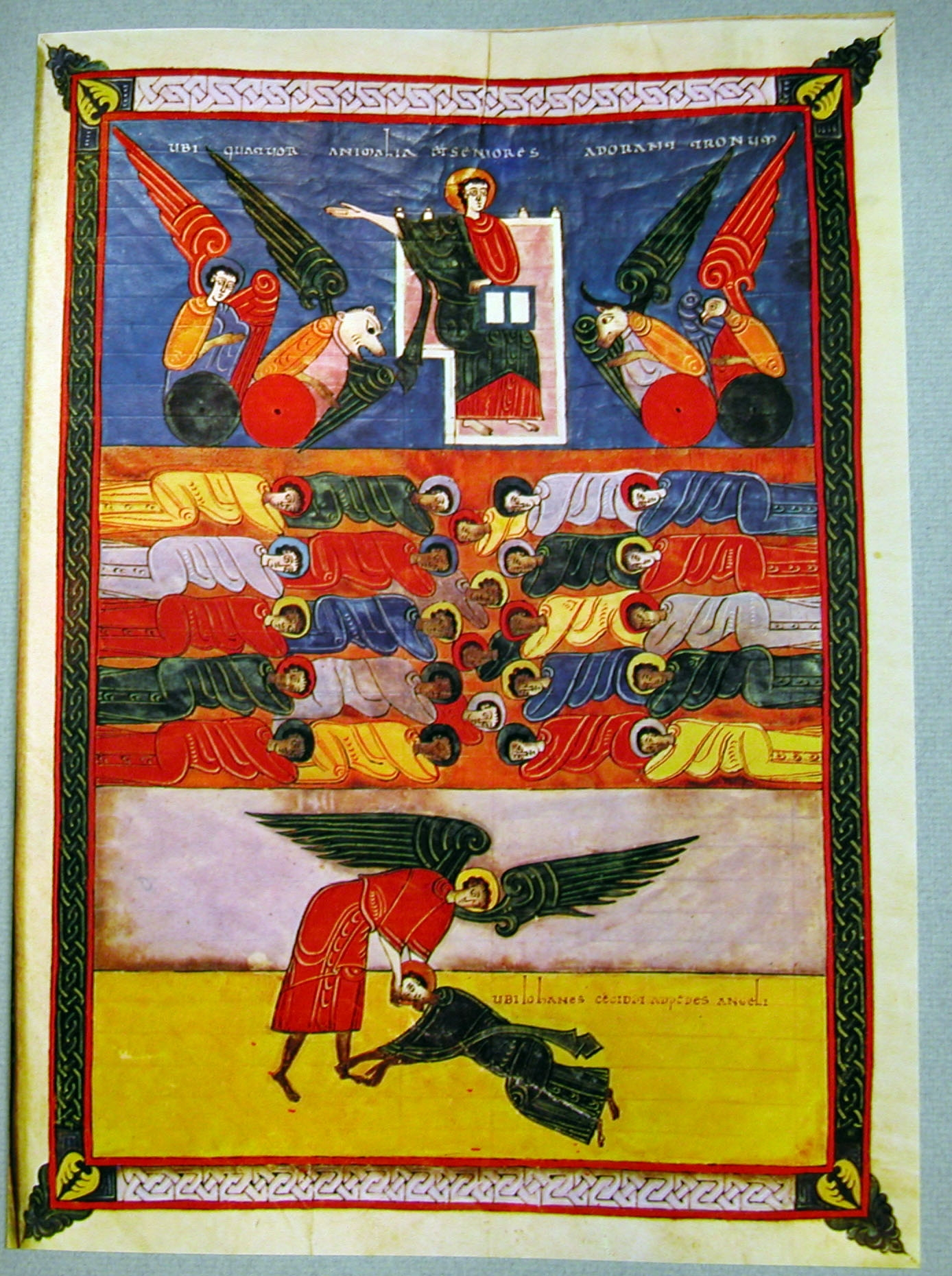
An original work of art in the Spanish Romanesque style of the Morgan Beatus Manuscript. My colleague at Thomas More College Dr Christopher Blum called me into his office the other day. He was keen to ask my opinion on a piece of art work handed in by student, Alana Kelley for his medieval literature class. He showed me the manuscript shown left.   I immediately recognized this as the Spanish, Romanesque style as exemplified in the 10th century Morgan Beatus manuscript. She has created an original work of art in this style to illustrate the Spanish classic poem of El Cid. There are some examples of the Spanish illuminations below.

Alana is a gifted artist who has now attended two icon painting classes of mine at the college and devoted a semester of Saturdays learning academic drawing at the Ingbretson Studio. What is particularly gratifying for me is how intelligently she has made use of the techniques she had learnt and produced something that is in harmony with literature she is studying. In regard to this particular piece it was all without any input from me at all – it was submitted at part of a medieval literature class, not an art class.

Dr Blum told me: ‘It was in response to an assignment that invited the students to create an original work of art modeled upon or inspired by the medieval texts that we studied.  As well as Alana’s painting there were a number of conventional essays submitted, but also four lengthy poems, three plays, two paintings, two illustrated books, two recitations (from memory, of course) of medieval verse, one performance of medieval songs, and an original piano sonata inspired by the First Crusade's Liberation of Jerusalem. What most impressed me about the whole class's response to the assignment is that they plainly understood that the cultural achievements of the past are not museum pieces meant to be dead on a wall, but living works, continually inspiring our own reflection upon the good, the true, and the beautiful.

‘As to Alana's painting: I was especially delighted in her choice of theme, because the prayer of Dona Ximena in the Poem of El Cid is, to my mind, one of the most stirring examples of the way in which the Christian faith shaped the imagination of our medieval ancestors.  The prayer places the human drama in the context of the whole of salvation history and the divine order of the universe, and Miss Kelley's manuscript, by making the text of the prayer a kind of link or middle between the celestial and the earthly realms, reflects the deep Christian identity of the anonymous Castilian poet who left us the Cantar de Mio Cid.’

Looking at it with my artist’s eye, what struck me is how Alana has adopted the compositional style of the Beatus and used orthogonal division of the space. The practicalities of the class meant that she had to work in acrylic, but she investigated additives that would allow her to paint glazes (a dark transparent layer over a lighter) in order to get the effects that I had shown her using egg tempera in the icon painting class. By using successive glazes she has introduced subtle variety and interest into areas that would otherwise by flat monochrome; and by varying the local contrast, for example around the script and around the figures, she has ensured that the eye is drawn to the most important aspects of the composition. The patterned border is typical of Romanesque work and not seen in Eastern icons so often but, again, wholly appropriate for this work.

Alan Kelley's illumination, above, and, below, examples of Romanesque illuminations from the period


EWTN Documentary about the Making of JPII Play

EWTN are to screen a documentary about Leonie Caldecott’s new play about John Paul II, The Quality of Mercy. Performed over three nights preceding the beatification (on Divine Mercy Sunday) at the Oxford University Catholic Chaplaincy, the play - which also incorporated music and dance - was written in less than four months. It was directed by Tessa Caldecott, Leonie's daughter, with choreography by Anna Maria Mendell (a former Thomas More College student) and music by Benedict Nichols. Stratford Caldecott, who with Leonie directs Thomas More College's Oxford Centre for Faith and Culture described it to me as follows:

'It is part theatre of the Word and part ballet of the Word, a multi-levelled theo-drama about youth and age, despair and hope, the crisis of modernity, the vocations to marriage and to celibacy. It wove together the poetry of John Paul II and the techniques of his Rhapsodic Theatre with Shakespeare’s Merchant of Venice and passages from Scripture beautifully adapted by Dr Carl Schmidt of Balliol College, Oxford. It exposed the spiritual warfare taking place in the lives of young people and their families in the modernworld. It contained the late Pope’s teaching on Mercy, and on his Theology of the Body. These themes were held together by a strong story about a group of youngsters on a hike to the shrine of Manoppello in the Abruzzi, during the last days of John Paul’s life, accompanied by a mysterious stranger who leads each of them to a deeper understanding of themselves and of God’s love. This was a work that took seriously what John Paul had said in his Letter to Artists (1999): “unless faith becomes culture, it has not been really welcomed, fully lived, humanly rethought.” It even found a place for the theology of Hans Urs von Balthasar, the late Pope's favourite theologian. The relationship of Faith, Hope, and Love to the Logos was played out by a kind of Greek chorus, revealing the theological dimension of everyday life and the immense significance of the most seemingly trivial relationships.'


This is the second play by Divine Comedy Productions. The first A Theresian Mystery Play, performed last year at the Oxford Oratory, was about St Therese of Lisieux.


The EWTN documentary about the making of the play, The Quality of Mercy, will be shown in the US on 7th May, 10pm Eastern time, 7 pm Pacific, and in Europeon 3rd May, at 8 pm London time.

There are various interviews and articles about the play on the Forum page of the Second Spring web-site.


Stratford and Leonie Caldecott are the British editors of the journal of faith and culture Second Spring; are the directors of Thomas More College of Liberal Arts' Center for Faith and Culture; and of the annual Oxford Studies Program for TMC's undergraduates.


A scene from the play set on Holy Thursday, Charity offers 'Charlie' the chalice of Gethsemane.

Faces by Matthew James Collins

Demonstrating the contrast been portraiture and the baroque style of sacred art. I have written in the past about the different approaches to portraiture and sacred art in the Western naturalistic form of the baroque (in the article: Is Some Modern Sacred Art too Naturalistic?) . I this I discussed the fact that many examples of sacred art are painted as though they are portraits and end up looking like a staged tableau in which the boy or girl nextdoor is dressed up in old fashioned clothing. Consider the work of someone I met when I was studying the academic method in Florence, Matthew James Collins. I know of know one else who knows more about the art of the baroque and High Renaissance periods. Matt is an American who still lives and works in Italy. His portfolio ishere (look at his sculpture and landscapes of the Italian countryside too) I was looking at this portfolio a few days ago and several paintings of faces caught my eye. First this portrait left. It has all the right elements: it is painted in some areas loosely, and in some with more detail and tighter control, but always with precision. The variation in focus and colour content reflect the Christian understanding of the human person: those areas that we look at most, especially the eyes and the mouth, and which reveal emotion and thought and aspects of the soul, are those we look at the most when we look at someone. These are the parts that contain the most detail and the most natural colouring.

If you look at the right side of the face, the part that in this portrait is more distant than the other. To make this read properly, the artist must make everything on this side of the face slightly smaller than the left; and the right edge must be blurred enough to give a sense of a turning edge, but still sharp enough to retain the right sense of contrast with the background. This is terrifically difficult to get right - even Titian and Rembrandt (for the most part absolute Masters) got it wrong occasionally. In this portrait Matt has captured it. Notice how even the glint on each eye varies to reflect the slight perspective - the right eye is more distant and the glint is smaller and less bright. These tiny specks of white can make or break a portrait.

Part of the essence of the baroque style is a strong emphasis on tonal description and the reduction of natural colour in all but the main focal points of the painting. Even if you master this, which is hard enough, then there is very often a problem in that the shadow areas look flat and dull. Matt has introduced some energy into the shadow by using a different of colours in any one area that are, broadly speaking, tonally equivalent (ie if you took a black and white photo there would be very little contrast) but of slightly different colours. This gives life and variety to the composition.

Notice also how he varies the background tone in order to enhance local contrast, so next to some dark edges of the head the background is slightly lighter and the opposite for light edges. However, he does so while avoiding a distracting, exaggerated patchiness and maintaining a unified impression.

It is an exceptional portrait, in my opinion. But the focus on the individual that we see here and is necessary in portraits would not be appropriate for sacred art. And this is the difficulty for many artists today who are trained primarily as portrait painters.

Contrast it with the first head study shown below. All the essentials elements are here too and handled just as well. However, this is not a portrait. It is one of a series of studies that Matt is doing to develop his skill in allegorical or explicitly sacred art. Matt has deliberately chosen to lessen the portrait elements of the face. This is the same device used by the baroque masters of the 17th century to paint the faces of saints. It causes to focus less on the individual, and more on those general characteristics that are common to all of us but are exemplified in an exceptional way in saints. Again this is difficult to do: it is a question of a shift of emphasis, rather than featuring one aspect to the exclusion of the other). Think of any of the paintings of St Francis of Assisi by the Spanish baroque painter Zurburan. The psychological aspects are communicated through posture and gesture as much as facial expressions but if this is overdone, the result is sentimentality, or even melodrama. This emphasis on the general can be seen, for example, one of the most famous pieces of sacred art produced in the 17th century, by Velazquez. The face of Christ is in shadow and is clearly very different from a portrait (I have put a detail of the face from this painting at the bottom.)

The reason that I bring this to your notice is that here we have an artist is unusual in that he understands this subtle distinction between the two styles.

Matt does not have a large portfolio of sacred art to point to at the moment. He is a working artist with a young family portraiture and landscape are his staples. He mentioned to me ruefully, that even when people do commission sacred art, they want the 19th century style and so most of his sacred art has more of this negative aspect than he would choose to paint if he was not painting for sale.

I would encourage people who are looking to commission works of sacred art in the naturalistic style to ask explicitly for this 17th-century style. I have talked to him at length about this distinction and I know that it is something that he has been developing on his own work even since he first tackled the work show below (Christ Carrying the Cross) which was shown at an exhibition put on by the Foundation for the Sacred Arts.
I have included below also his Triumph of Hermes. I am not drawn to the genre of the classical myth/allegorical paintings and would not choose this to hang on my wall. I it here because it is a narrative scene that does, I feel, avoid that boy-nextdoor-all-dressed-up-in-old-fashioned-clothing syndrome.Works shown below, first: head study; third: Christ Carrying the Cross; fourth: The Triumph of Hermes. All are by Matthew James Collins. The final images are of the crucifixion by Velazquez.

Japanese Gardens

Here are some photographs of Japanese gardens, recently sent to me (by Shawn Tribe my colleague at the New Liturgical Movement). I do not remember what we were discussing (no doubt something seriously liturgical!) when as a complete non-sequitur he started sending a string of photos to me with a 'How do you like these?'. He said he had just found them and thought they were beautiful and that was his only justification for sending them. I do not know anything about the Japanese philosophy of gardening and so haven't got much to offer beyond the photos themselves - I post these for sheer enjoyment. Looking at them though, there is so much more to these than the Zen raked-gravel-with-single-profound-boulder garden (typical of many of the 'Japanese' recreations in Western museums that I have seen). My uninformed speculation is that they reflect a desire to create idealised rural landscapes  - a sense of what nature ought to be. In this respect not dissimilar to the 18th century English landscaped gardens of designers such as Capability Brown.

The following passage is taken from a website produced by Columbia University, here. If it is a fair overview, then it what it describes is consistent with the Christian belief that the untamed wilderness is not the perfect standard of beauty (which is what so many modern Westerners seem to believe). Rather, that man,  through God's grace (for the Christian) can improve the wilderness and mould it into something closer to what it ought to be. Buildings, therefore, are not to be thought of as unnatural aberrations but (provided they are built well) as another aspect of properly ordered nature.

The Japanese garden embodies native values, their cultural beliefs and religious principles. This is why there is no one prototype for the Japanese garden, just as there is no one native philosophy or aesthetic. In this way, similar to other forms of Japanese art, landscape design is constantly evolving because of the influx of mainland, namely Chinese, influences as well as the changing aesthetic tastes and values of the patrons.
Edo Period Heian Period Ukiyo- e
The line between garden and its surrounding landscape is not distinct. The two embody each other in that every aspect of the landscape is in itself a garden. Also, when observing the garden, the visitor should not distinguish the garden from its architecture. Gardens incorporate natural and artificial elements and thus, fuse the elements of nature and architecture.
In order to appreciate and understand the Japanese garden, the viewer should consider nature as a picture frame into which the garden, or the man- made work of art, is inserted. It is in this way the garden also helps the visitor understand his surroundings.

I do not know the location of every picture. I give details for those that I do.

Himeji-jo Castle, Himeji, Kinki


Garden Staircase, Kyoto, Japan


Kinkakuji Temple, Kyoto, Japan


Ninnaji Temple, Kyoto

And, having been so rude about Western attempts to recreate Japanese gardens, here is one that proves me wrong! It is at the University of British Columbia.

Perhaps the maples shown in the last photo are not Japanese but Canadian. It reminds me of a story from when I was eleven. We had a beautiful ornamental Japanese maple in our garden at home. I used to ask my dad about it so often that as a joke he taught me the Latin name for it - acer palmatum dissectum atropurpureum. I can remember him laughing when I parroted the phrase back at him. About a week later I was in the garden of a family friend who by coincidence was watering a red-leafed Japanese maple that looked just like the one at home. 'Ah,' I said solemnly. 'I see you have an acer palmatum dissectum atropurpureum.' He looked at me in astonishment. What an insufferable little boy I must have been. (And before anyone says it, still am no doubt!)

Our Lady, Star of Evangelisation

Here is a authentic Catholic icon by Marek Czarnecki who is based in Connecticut in the United States. He is trained in the Russian style and he works firmly within the principles of the iconographic tradition. A look at his gallery indicates that he is able to portray Western saints without stepping outside the bounds of the tradition . He is by all accounts and excellent teacher as well. This was commissioned by the Franciscan friars at Steubenville to illustrate John Paul II's characterisation of Our Lady as the 'Star of Evangelisation'. The painter is drawing on Western artistic traditions as well as Eastern in doing this. The style of the eight-pointed star, which is created by drawing two squares, is a common theme in the Western, Romanesque iconographic form (though not exclusive to it) and is seen, for example, in the geometric patterned art at the 12th century Capella Palatina in Sicily. Eight-pointed stars symbolise, the 'eighth day' of creation, the incarnation, passion, death and resurrection of Our Lord. Sunday is simultaneously the first day of the next week and the eight day of the previous. The Octave of Easter, such a special time in the liturgical calendar, could be thought of perhaps, as eight consecutive days of eighth days.

Below: opus sectile work from the Capalla Palatina.

The Way of Beauty and the New Evangelisation

Why an education in beauty and the Liturgy of the Hours are important in the formation of lay people as part of the New Evangelisation. Thomas More College of Liberal Arts was treated to a lecture by a husband-and-wife team of theologians who both teach at St John's Seminary at Boston. David and Angela Franks run the newly established Masters of Theological Studies for the New Evangelization. Although based at the Seminary, this is aimed at lay formation and can be taken on a part-time basis. It is the first new programme of the Seminary's newly established, Theological Institute for the New Evangelisation (TINE). David and Angela inspired our students (and myself!) with the vision that the Church has for the role of lay people in evangelising the modern world, charactererised by John Paul II as the New Evangelisation. All this is invaluable in itself, but what surprised and interested me particularly was their assertion that an education in beauty is an essential element in the formation of the individual who is going to be carry out their mission of taking the Word to the world. Furthermore, they highlighted the importance of the Liturgy of the Hours in this education.

They described a process that is both active and reactive. The active role is one of living the life of faith, which is ultimately living the life of love that God intends for us. And we should do so, they said, without apologising for it!

There is a description in the Acts of the Apostles of the growth of the early Church in which people were attracted to the Christian life, we are told, 'because they loved each other'. When we lead a life of love then our lives will be beacons of light that will arouse curiosity in this secular society. Love is not so much a set of feelings but rather a set of actions motivated for the good of the other. That requires fortitude especially because it is precisely this that will cause us to stand out in the crowd and because, as David puts it, we live in an age when 'powerful forces are arrayed against true love'.

That light will be brightest when we are answering most completely the personal vocation that God has made to us (aside from following the commandments of the Church). The determination of this personal vocation is an important early step therefore. I was lucky in my own life in being given some inspired guidance in trying to discern what this might be. This has ended up in me doing what I am now at Thomas More College. I have described the process here. The programme at the St John's Seminary offers guidance also in this first step.

The second part is reactive. When people see a life of love it arouses curiosity and they ask questions. At this point we need to be able to answer them truthfully and prudently. Part of the programme at St John's is about equipping people with knowledge of the truth - we must know what the Church teaches, or at the very least, where to go to find out what the Church teaches.

But also, we must present this information in such a way that it continues to attract people. Force of logic will only take you so far. It is not just what you say, but how you say it. Prudence guides this. While knowing what to say and when can be trained in some ways directly, so much of this is about developing an intuitive sense of it. A key principle in operation here is beauty. When we do something attractively, we are doing it beautifully. This is why a training in beauty is so important, we were told. It develops that instantaneous intuitive sense of knowing what to do best.

After the talk there was a lively question and answer session and one student asked directly. What should we be aiming for in our spiritual lives in order to be able to achieve this? To my great delight, David answered without hesitation, that beyond the basic requirements of the sacramental life, he felt that the Liturgy of the Hours was a powerful and 'supremely effective' form of prayer.

David and Angela invite everyone who might be interested to take a look at the exciting opportunities for lay people offered by St John's Seminary. You can find out more by going to the www.sjs.edu and clicking on the 'TINE' logo.


For a growing series of articles about the Liturgy of the Hours as part of The Way of Beauty, see here.

Thomas More College of Liberal Arts offers a traditional education in beauty, incorporating the Liturgy of the Hours as one of the key components of the spiritual life of the college. The course, The Way of Beauty is part of its core curriculum with the intention of offering our students to best chance of coming out as ambassadors of the New Evangelisation.

In addition, our summer programme has short courses open to everyone to teach precisely this. Artists and musicians can learn it in conjunction with the skills of icon painting, academic drawing or Gregorian chant in our two-week programmes in July. Our weekend retreat in creativity and inspiration in August offers everyone else the chance to learn the traditional education in beauty - developed as part of the training of artists - but without having to learn the artistic skills. For more information about all of these courses see here.


Images Top and bottom: The Calling of St Matthew by Hendrick ter Brugghen, 1621; candles at the Birmingham Oratory, England; The Presentation of Jesus at the Temple (Candlemass) by Tintoretto, c1550

The Derision of Christ by Anthony Van Dyck

Here is an offering for Good Friday. Van Dyck painted this in 1620. It has all the classic baroque elements that reflect the Catholic worldview as discussed in previously in regard to, for example, Procaccini's Scourging of Christ.
Consider it in the context of the difference between portrait and sacred art  as discussed in another earlier article, here. Van Dyck is one of the greatest portrait artists ever, yet he is careful not paint any of these figures as portraits. In a portrait, the face is the most important aspect. Yet here, each face is either in profile or shadow. The psychological aspects are transmitted through gesture rather than dramatic or exaggerated facial expression. Notice how, for example, he directs our thoughts towards the person of Christ by putting his face in shadow. It is not that he wants us to ignore Our Lord's face, but rather, given our natural tendency always to focus more on the face of the person, if it is downplayed relative to the rest, it results in a more balanced appreciation of whole person and the general human characteristics with which we can identify.
If you want to learn first hand more about the baroque style, the one authentic naturalistic artistic tradition of the Church, then we run a summer program at Thomas More College of Liberal Arts in Merrimack, NH. You can spend two works learning by doing and learn the traditional academic method of the Old Masters - a systematic way of drawing that in two weeks will raise your drawing skills above those of any conventional modern mainstream art school in the country. The teacher is internationally known portrait painter Henry Wingate. A skilled teacher, Henry takes you from the level you are at. So this is suitable for experienced or inexperienced artists.
If you're not an artist, but want to know more about this anyway, come to the weekend course, at Thomas More College, which takes place in the first weekend of August.  We have called it  Traditional Paths to Creativity and Inspiration because it teaches all the things that artists need to know aside from their skills and so would be good for art lovers, or people wishing to enhance their creativity in whatever their work or passion happens to be.
As a meditation, here is a passage from the Office of Readings of Tuesday of Holy Week that struck a chord with me. The words are by St Basil and taken from the book On the Holy Spirit:

When mankind was estranged from him by disobedience, God our Saviour made a plan for raising us from our fall and restoring us to friendship with himself. According to this plan Christ came in the flesh, he showed us the gospel way of life, he suffered, died on the cross, was buried and rose from the dead. He did this so that we could be saved by imitation of him, and recover our original status as sons of God by adoption.

New Play About John Paul II to be Premiered in Oxford

My friend Stratford Caldecott has written to me recently about a new play that he is helping to put on in Oxford in England. Entitled  The Quality of Mercy, it is about John Paul II and is written by Leonie Caldecott. It is being performed at Oxford’s Catholic Chaplaincy on 26, 28, and 29 April. This is the second production from the Caldecotts' theatrical company, Divine Comedy Productions. The first, Divine Comedy: A Theresian Mystery Play, put on in the autumn of 2009, was sold out and helped prepare for the visit to Oxford of the relics of the ever-popular Saint Therese of Lisieux. This caused sufficient waves on this side of the Atlantic for EWTN to sent a film crew to Oxford to interview the Caldecott's about that and the upcoming production. The poster for the play, incidentally, is based on an drawing by Stratford and Leonie's daughter, Rose-Marie Caldecott. All the lines and shading (if you look at it closely) are made up of the words of John Paul II.

Stratford and Leonie Caldecott are the British editors of the journal of faith and culture Second Spring; are the directors of Thomas More College of Liberal Arts' Center for Faith and Culture; and of the annual Oxford Studies Program for TMC's undergraduates.

Stratford writes as follows:

"There is a great revival of Catholicism and Catholic culture going on in higher education in the United States right now. The resurgence of Thomas More College is just one example. Most people would agree that the revival began with Pope John Paul II, who is to be beatified at the beginning of May on the Feast of Divine Mercy. Here in Oxford we are marking the beatification with a dramatic tribute to the late Pope: a new musical play called The Quality of Mercy, written by Leonie Caldecott.

Karol Wojtyla is not being beatified because he was a pope, or even because he did so many remarkable things over his long life, which spanned both the Second World War and the rise and fall of Communism. He is being beatified because of the kind of man he was: one who gave his life over to God, and who reached out to others with love. 'They try to understand me from without,” he once said. “But I can only be understood from within.' It is this interior landscape that The Quality of Mercy seeks to portray.

The play takes place in the last week of John Paul II’s life, the week after Easter 2005, as a small group of young people gather in Rome for a pilgrimage to the shrine of Manoppello in the Abruzzi mountains, which contains a miraculous image of Christ’s face, right.  The priest they were expecting to accompany them doesn’t turn up, and instead they are guided through the mountains and forests by a mysterious stranger who calls himself Charlie. As they walk and talk with their companion, the pilgrims discover things about themselves and others that will transform their lives. But it is only in the wake of the Pope’s death that the picture will come fully into focus.

As a young man, Karol Wojtyla was heavily involved with theatre, since during the Nazi occupation Poles used the medium as a form of underground cultural resistance.  If he had not become a priest, Wojtyla would certainly have become an actor and director.  He wrote numerous plays of his own, and encouraged drama throughout his years as a priest and a bishop in Krakow. Our theatre company, Divine Comedy Productions, is inspired by his enthusiasm for theatre as a medium for the exploration of the human condition.

The Quality of Mercy uses a mixture of realistic dialogue, against a symbolic backdrop of choral and movement sequences which highlight the themes of the Passion and Resurrection, as well as other scriptural references. The play also features an original score by talented young composer Ben Nichols. The cast range from 11 to 25, and are attached to the Oxford Oratory, whose parish priest Fr Daniel Seward also performs in the play. Details with relevant links are here."

The photographs are scenes from the first production of the Divine Comedy company: in the Carmelite community, with her father and in a papal audience.

The Proportion of the Ark of the Covenant

And how it can be a principle of design of buildings. Most of my reading of scripture comes through the liturgy – that is the readings from both the Mass and the Liturgy of the Hours. I do my best to do some lectio divina each day (reading Shawn Tribe’s wonderful piece on the ‘Four Pillars’ of the new liturgical movement has given a recent boost to this effort) and even for this I draw on the liturgy, tending to use the readings from Mass for that day. What is amazing is how often the scripture or the commentary by the Church Fathers speaks to me about something that is on my mind. I have always thought that perhaps this is because the principles contained within scripture are applicable in every area of life and so any given passage is likely to contain lessons for my particular concern, if I am ready to look for them. Scripture is rooted in Truth, which is a single jewel, so to speak, but one that is seen that is seen as a multifaceted prism and one facet will be facing me square on no matter which direction I observe from. Enough of my musings of scripture – I am already out of my depth here. The point is of this article is not a profound lesson in life, but of one of a little help to my art. A passage from the Office of Readings for Friday of the 3rd week of Lent caught my eye in regard to, of all things, principles of proportion in gothic cathedrals; which in turn become a consideration for me in the composition design of works of art. The passage was Exodus 37 and it described the dimensions with which the Ark of the Covenant were to be constructed by an extraordinarily talented man called Bezalel (who seemed to good at just about everything to do with fine art). In cubits these were: 2.5 x 1.5 x 1.5. Similar dimensions were proscribed for the mercy seat on which it was to stand. The same week I heard a description of measurements of gothic cathedrals in which the ratio of 5:3 appears very often (within the bounds of accuracy when measuring the dimensions of a cathedral).

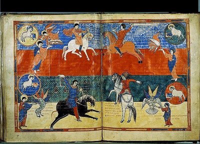
Interestingly, this ratio (5:3) appears also in the description of the construction of the Noah’s ark. St Augustine directly links the dimensions of Noah’s ark to the perfect proportions of a man, exemplified he says, in Christ. This echoes the classical proportions of the perfect man as described by the Roman Vitruvius in his textbook for architects. Furthermore, Boethius, in his book De Arithmetica, lists a series of 10 perfect proportions that he says came from Pythagoras, Plato, Aristotle and ‘later thinkers’. The final proportion of the series, called the Fourth of Four contains right at the beginning this ratio. (The references for these can be found in an article Harmonious Proportion in the Christian Tradition, here.)

Does this mean that this is the reasoning the gothic architects had in mind when they used this proportion? Perhaps. I am not aware of a gothic architect’s manuscript in which the connection is made directly so am hesitant to say so definitively. But we do know that geometry and proportion were important to them and they did use tradition which in turn drew on scripture, arithmetic and observation of nature to govern the use of those proportions. This all amounts to pretty strong evidence that, at the very least, it might be so.

Some suggest that as this ratio approximates to that contained within the Golden Section, and that this was what the gothic masons were aiming for. Again, this might be the case although I have not read of any account dating from this period or before that indicates that this proportion had symbolic meaning at the time or was used by masons. I would be very happy to be directed to any that readers might be aware of.

And does this mean that we should use the ratio 5:3 now? All of this does suggest to me that we should give it a try. If we accept the idea that some proportions are objectively more beautiful than others (as all architects did up to the 20th century), then this points to the idea that due proportion would include this ratio.

The final and most important test when deciding this is as follows: are things that are constructed to incorporate this dimension beautiful? That is down to each person to answer. I for one, when looking at those gothic cathedrals would say yes (whatever the symbolism in the mind of the architect was); and this is why is seek to use it in the design of my art. If I was an architect, I would incorporate it into my designs too.

Images: above, The Sacrifice of the Old Covenant, by Rubens; and below: Leornardo's rendition of the Vitruvian man; and details of Amiens cathedral.


Painting an Icon of a Contemporary Saint, written by Aidan Hart

I wrote a piece a while ago about the creation of an icon of a contemporary saint. I learnt about this from directly from my teacher Aidan Hart. I can remember once when I was visiting him he had created just such and icon - of New Martyr Elizabeth: a member of the Russian royal family who was murdered by the Bolsheviks. I thought I would ask Aidan to describe how he created this icon. What follows is his reply. Note how he is very clear that he is not aiming for a photographic-like likeness, but rather an image that infuses her physical characteristics with those elements of the iconographic form that will reveal more fully the true person. Aidan wrote as follows:

Icons depict people who are full of the Holy Spirit. These saints are radiant with the same divine glory seen by Peter, James and John when Christ was transfigured. Icons therefore depict a world seen not only with the eyes of the body, but with the eye of the spirit. They show us not just as a bush, but a burning bush.

This presents a challenge for iconographers called upon to paint a contemporary saint of whom photographs exist. On the one hand these saints are unique human persons, and their icons need to include at least some of their unique attributes.

On the other hand, icon painters are not called to paint naturalistic portraits. They are concerned not only with what the physical eyes see but also with what the spirit sees - the indwelling presence of Christ.

How then does an iconographer create an icon of a contemporary saint? They cannot ignore the saint's physical likeness as revealed in their photographs, nor can they simply reproduce it. They need somehow to affirm both visible and invisible realities.

What I briefly describe below is my own approach to this challenge, illustrated by a particular icon of New Martyr Elizabeth that I was commissioned to design and paint. St Elizabeth was martyred in 1918, and many photographs of her were readily available.

1. First I prayed. Saints are alive and well in Christ, and can help the iconographer to represent them worthily.

2. I then re-read Elizabeth's life, making notes about salient features of her character. Of these I selected what seemed to be the chief three: compassion, suffering, and deep inner composure. These were what I had to express more than anything else. While writing can expand on details, an image must distil the essence.

3. Beside these characteristics I jotted down possible ways of their being expressed in the icon. I find that this is best done by brainstorming - some ideas will be kept, many discarded.

4. I then sought out photographs and chose one or two that best expressed the saint's life.

5. The design work then began. The small panel size of the commission suggested a half length work, a bust. In the final design Elizabeth's right hand is raised in a gesture of both prayer and witness (the word martyr means witness). The other hand holds a cross, symbol of martyrdom. Elizabeth founded a hospital, and for cleanliness sake devised a white monastic habit for her nuns who served in the hospital. I therefore combined elements of this white habit with the more traditional black of the Orthodox nun. I included Elizabeth's abbatial cross, keeping the chain the same design but making the cross a little smaller.

6. Using iconographic techniques, I adapted the folds of her garments to suggest a more spiritual quality. Curves were made more angular, and highlighting was created by layering three distinct tones rather than using naturalistic modelling and blending. The face is the highest revelation of personhood, so the icon tradition simplifies garments to prevent them drawing attention away from the face.

7. Photographs revealed that Important features of St Elizabeth's face were a somewhat angular outline, deep eyes, and sorrowful eyebrows. I tried to incorporate these into the final design of the face, especially the angular outline which is emphasized by the close fitting veil.

8. While accommodating her likeness I did however change some facial proportions to emphasize her inner spiritual state. Such abstractions are a feature of the icon tradition. The organs of expression - lips and gestures for example - tend to be made smaller or refined. Why? Saints are full of divine power, so their words and deeds are very potent: they need not say or do a lot for a lot to happen. I therefore made Elizabeth's lips less wide and less full than in nature, and kept her gestures and facial expressions calm, without exaggeration.

9. By contrast, the organs of reception - eyes, ears, nose - are enlarged or elongated in icons. This is to show that a saint is one who contemplates divine mysteries, hears the word of God and does it, and smells the fragrance of paradise. I therefore emphasized St. Elizabeth's eyes and made her nose a bit narrower than life, which gives the effect of elongating it.

10. Our eyes give light - "the eye is the lamp of the soul" said Christ. But our eyes are also a window into our soul, the mouth of a cave with mysterious depths. Consequently the white of the eye is rarely white In icons. Its base is a dark shadow tone, which is then partially overlaid with a brown-grey made of raw umber and a little white. These deep tones evoke the mysterious depths of the human person, made in God's image. On top of these dark tones are painted two small crescents of nearly pure white. This white is the light of grace which shines out of the saint.

The icon is completed with the halo - a symbol of the indwelling Holy Spirit common to all saints - and the saint's name, a sacrament of the saint's uniqueness.

Aidan Hart is based in Shropshire in England and his website is http://www.aidanharticons.com/. He is an excellent teacher (which is why I kept on going back to him) and he is just putting the finishing touches to a book about the techniques of icon painting in egg tempera, fresco and secco, to be published later this year.